Structure in nature
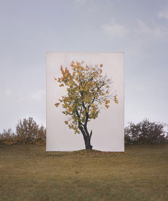
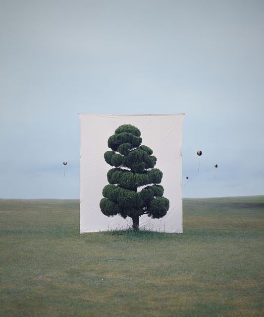
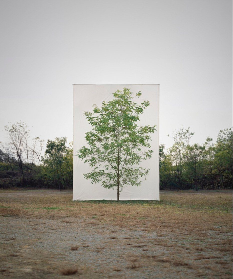
Myoung Ho Lee
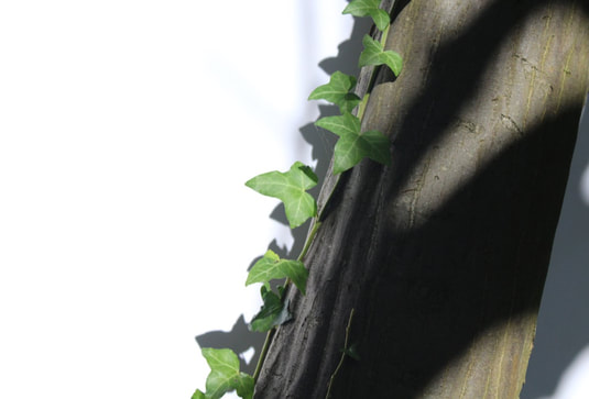
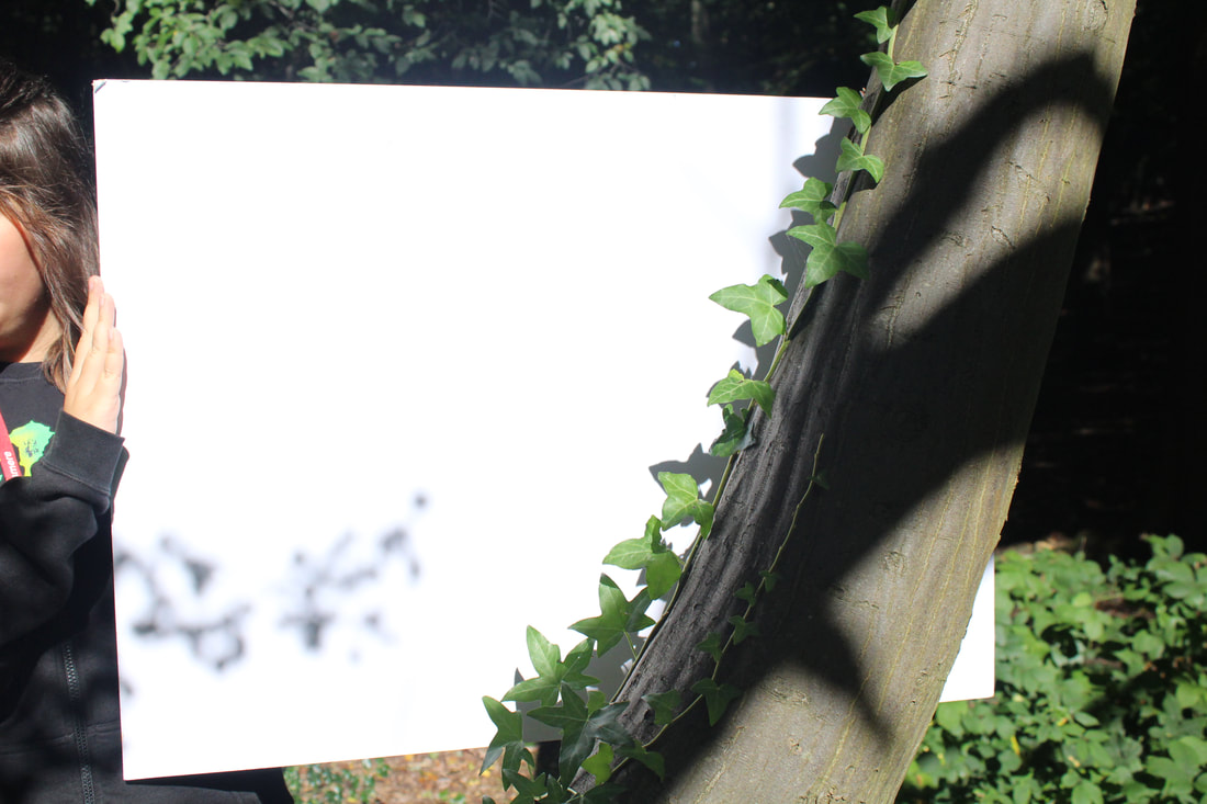
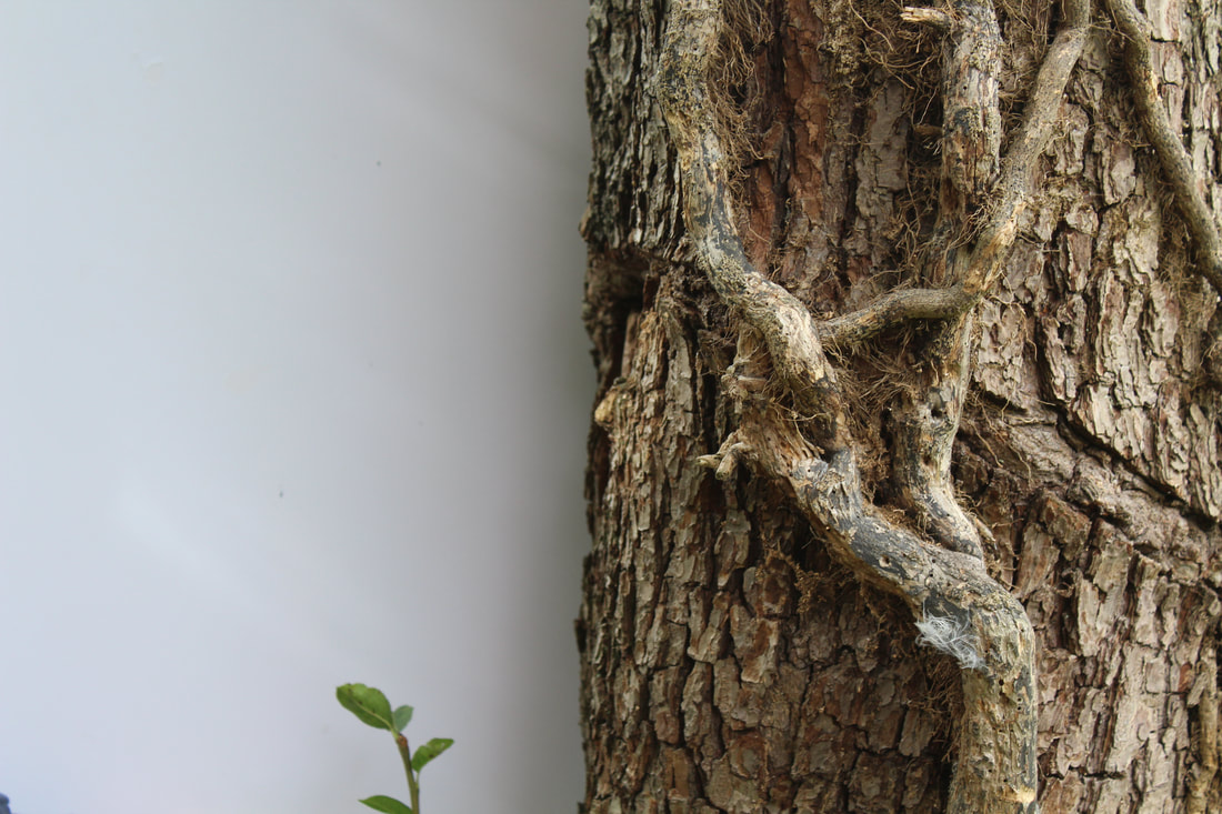
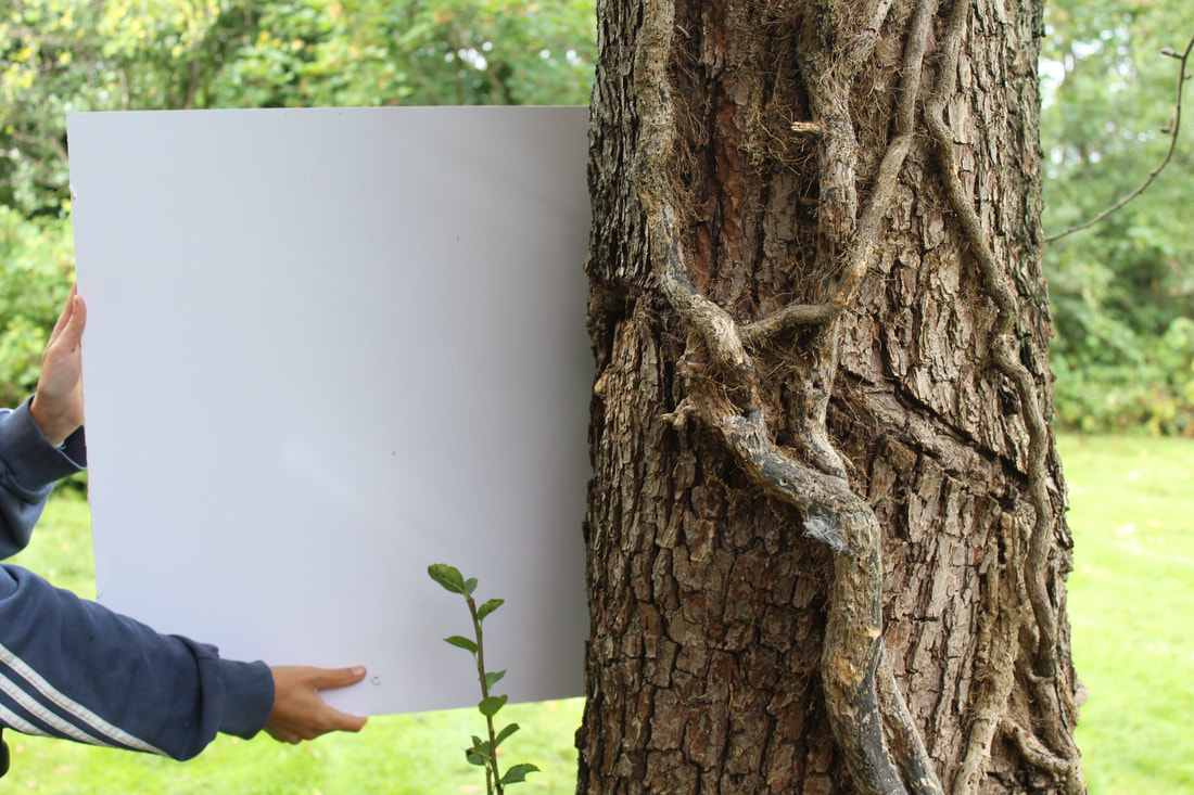
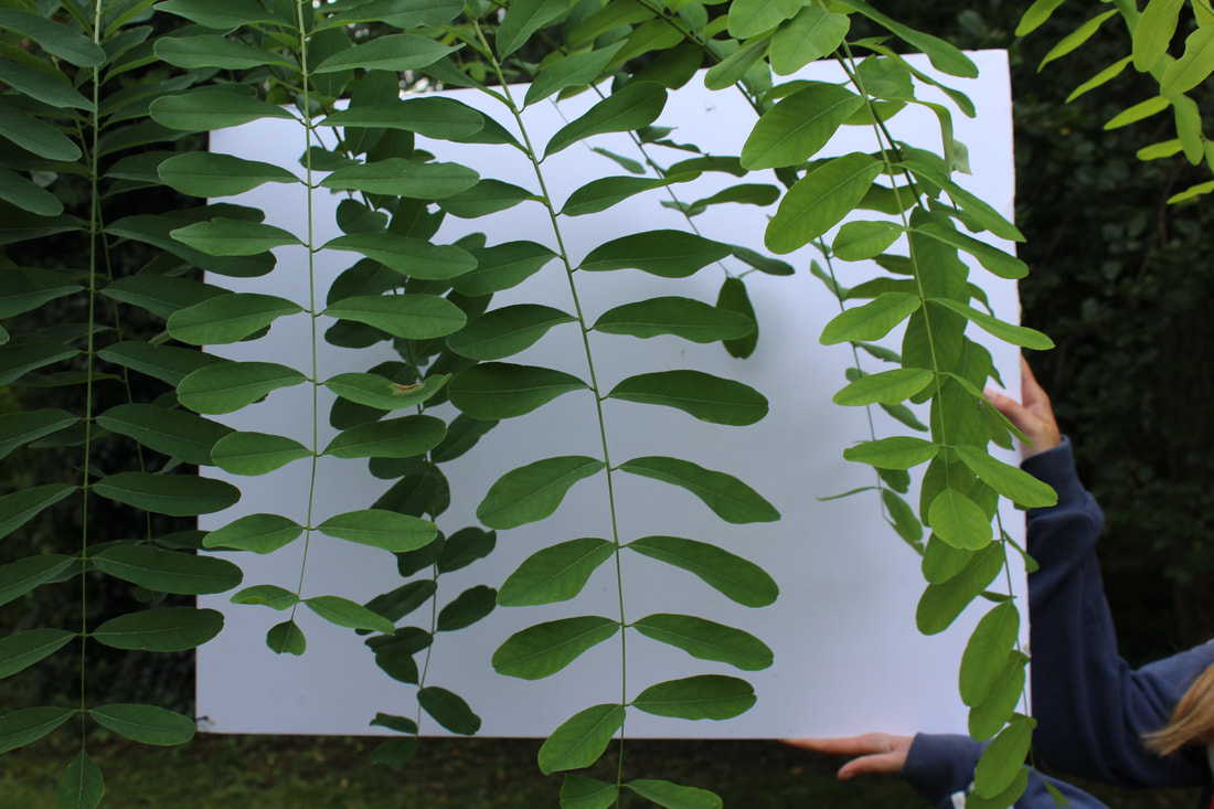
Myoung Ho Lee is a South Korean artist who created a series of photos where he removes a tree from it's natural environment and context by placing a large white screen behind the tree. The series, though simple in concept, allows us to question human perception of reality as the tree is made to seem like a painting or printed photo when placed in front of the white sheet, removing it from its natural context. Myoung Ho Lee's series is a prime example of structure in nature as the emphasis on the one tree allows more focus on its form and gives a natural environment a man made structure.
His works are largely composed by following four procedures:
1. Selection of The Subject
2. Separation of The Subject (meta-subject)
3. Photographing
4. Confirmation of The Separation
His works are largely composed by following four procedures:
1. Selection of The Subject
2. Separation of The Subject (meta-subject)
3. Photographing
4. Confirmation of The Separation
|
|
|
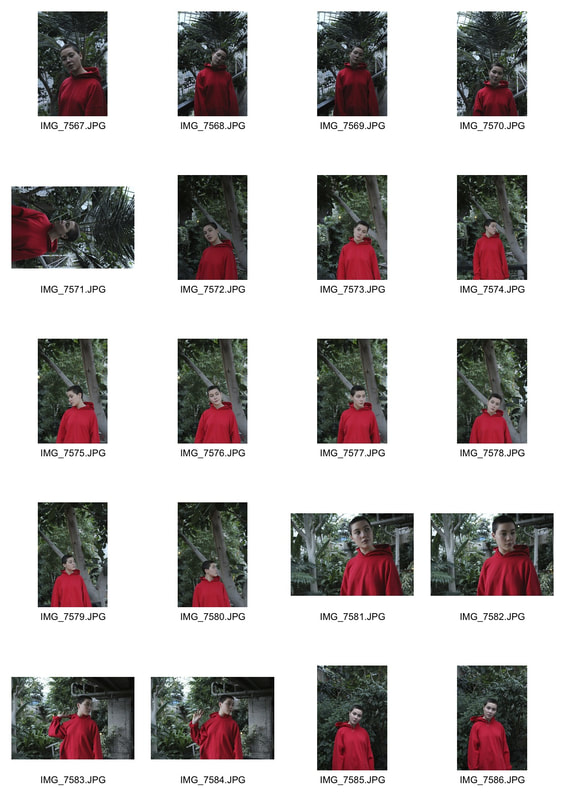
First Response
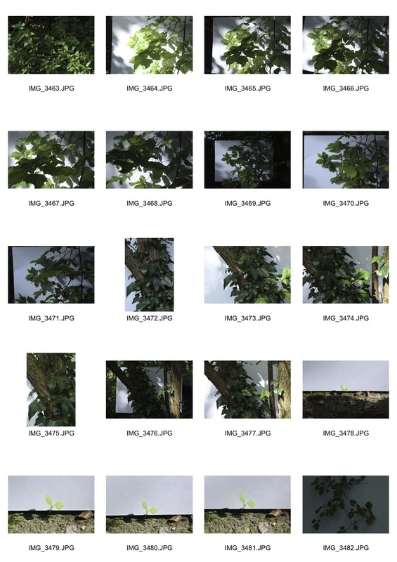
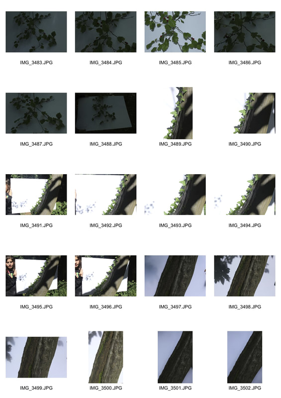
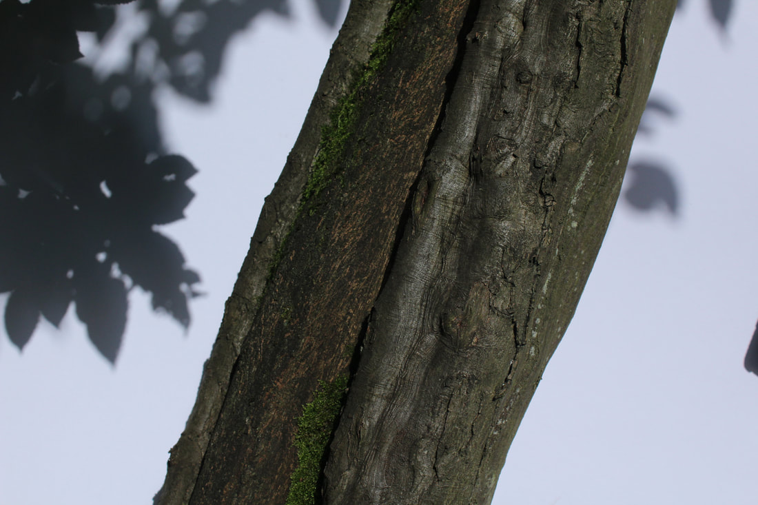
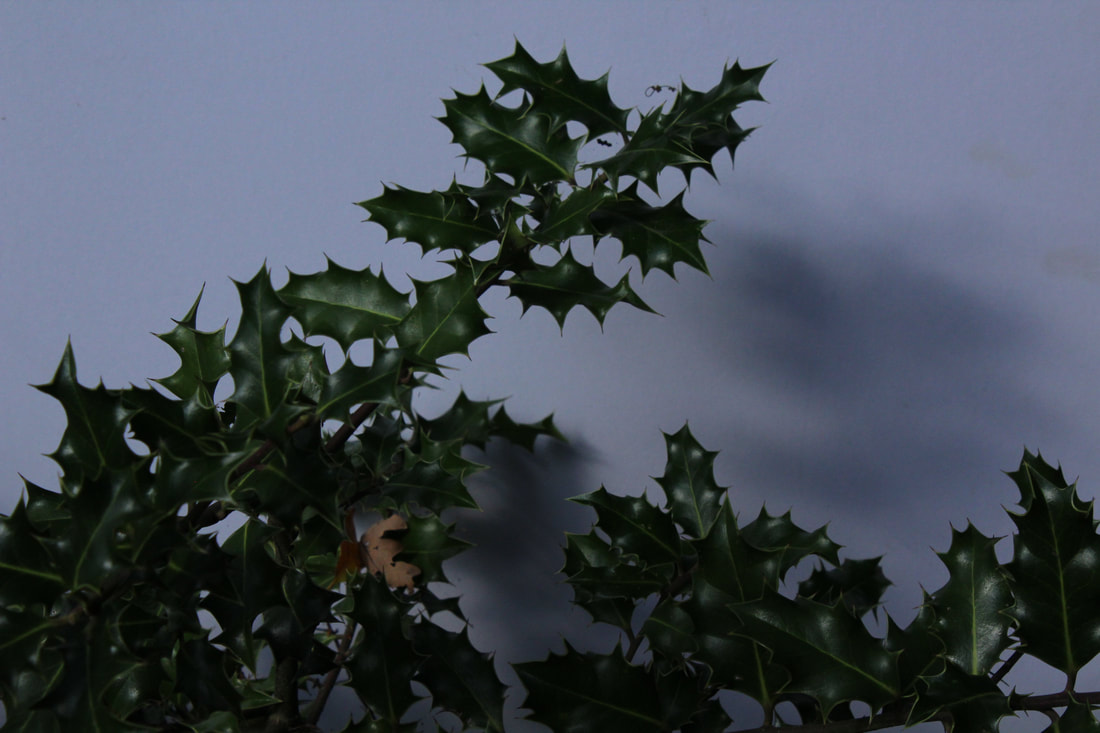
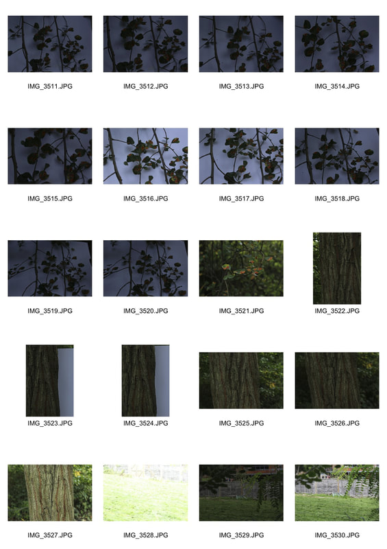
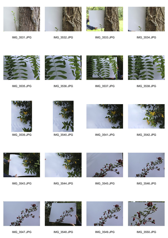
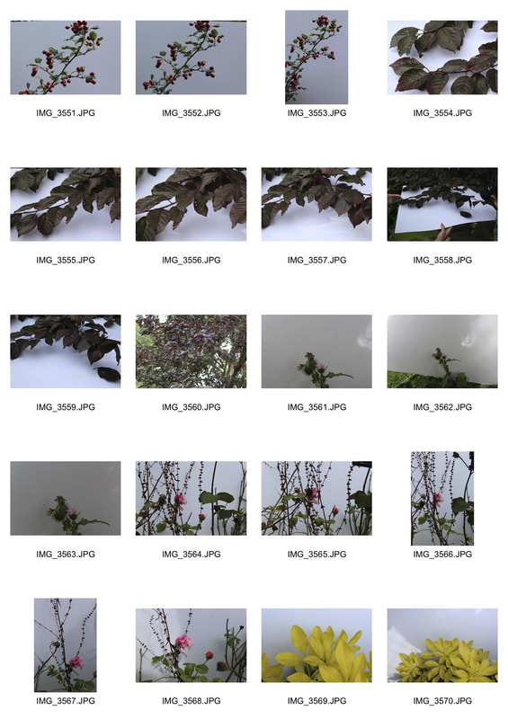
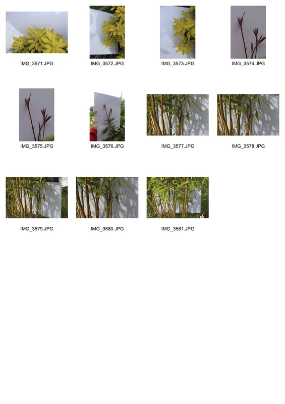
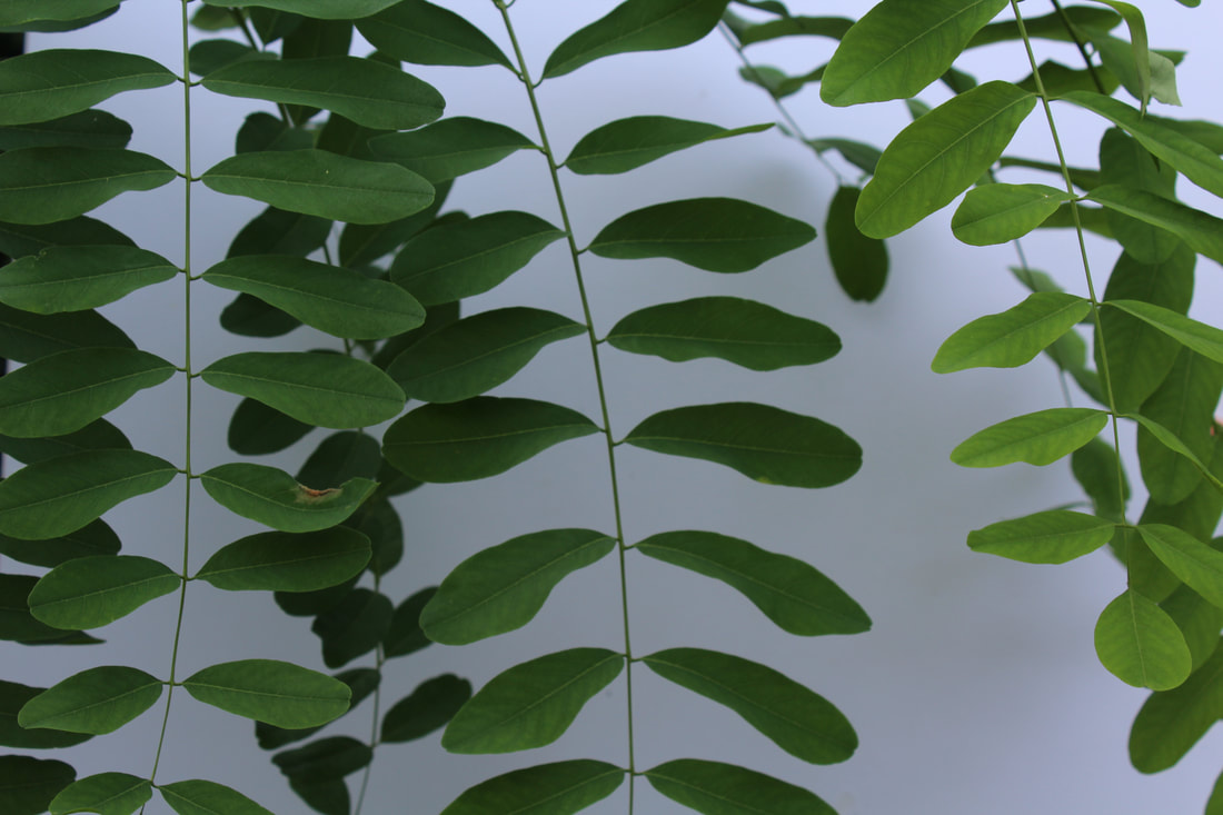
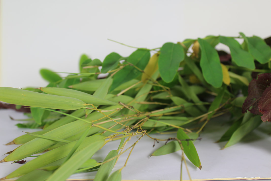
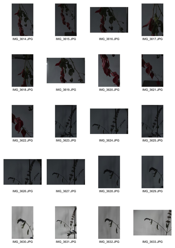
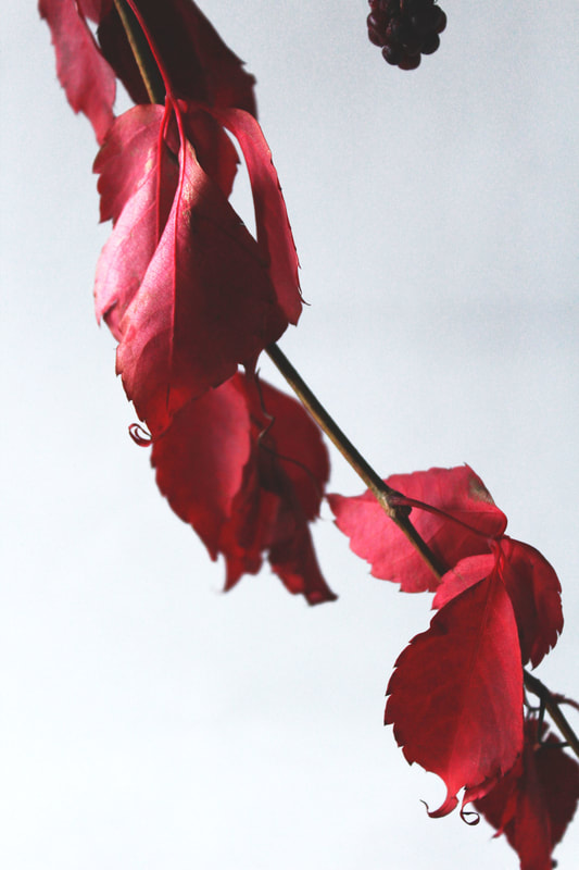
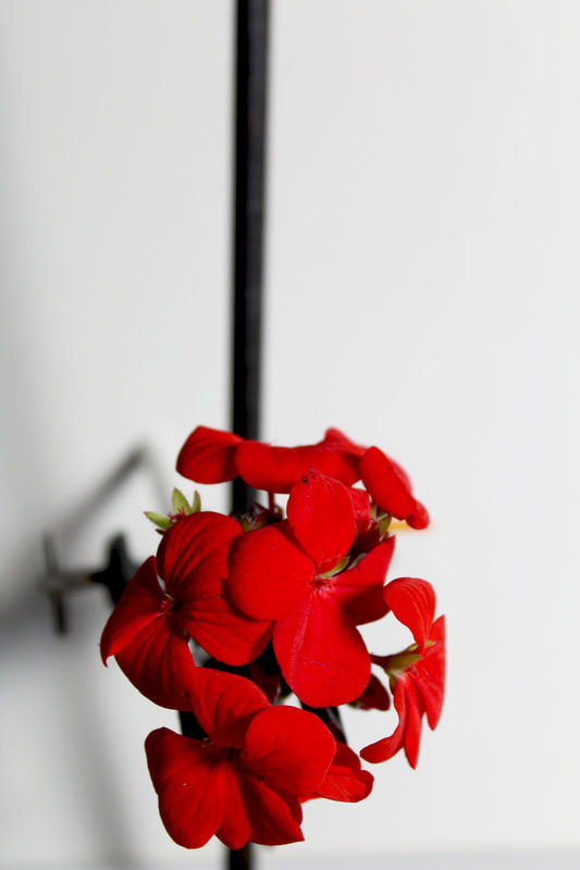
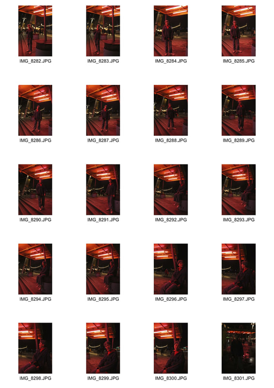
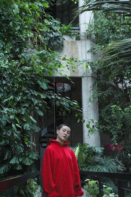
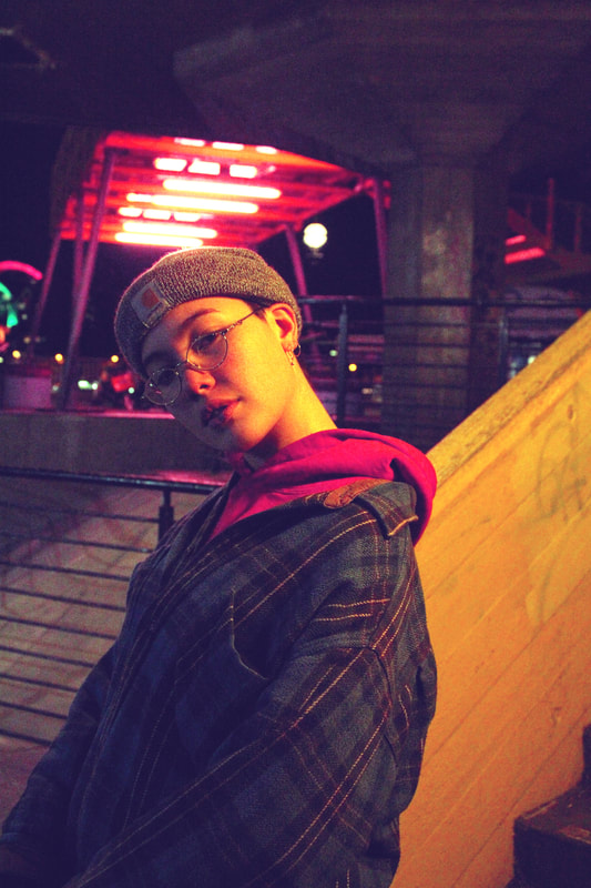
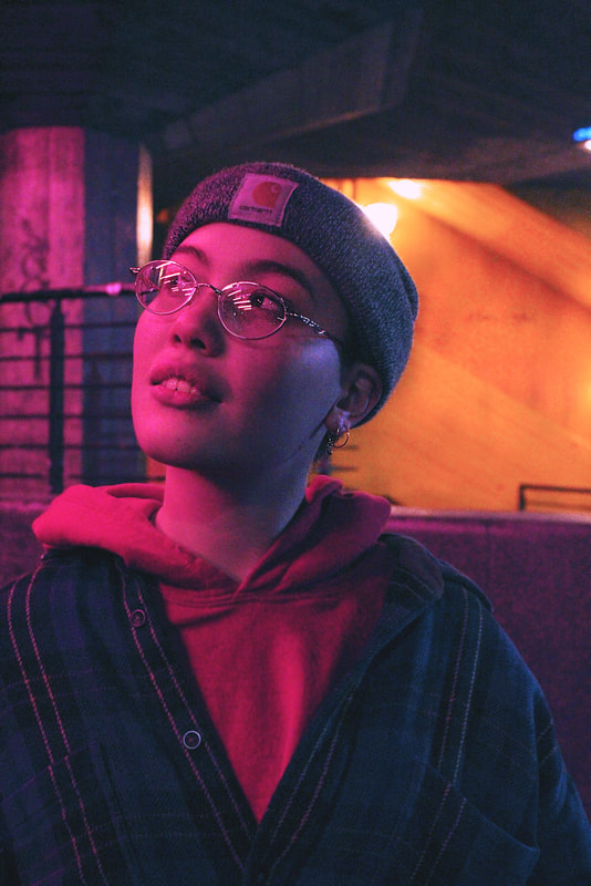
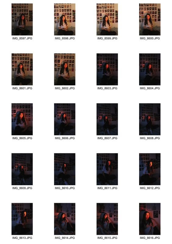
For our first response we went to a local woods and photographed nature that we could find, placing a large white sheet of paper behind it. Some of the plants were more effective than others, there was a lack of colour and more interesting structures that we could find. We experimented with having the white background fill the whole frame and then having some of the natural environment shown in the photo.
|
|
|
|
|
|
|
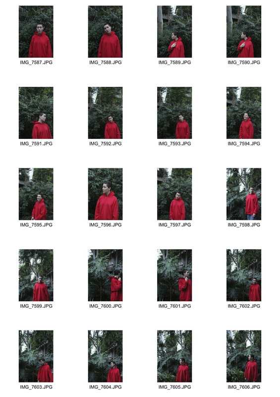
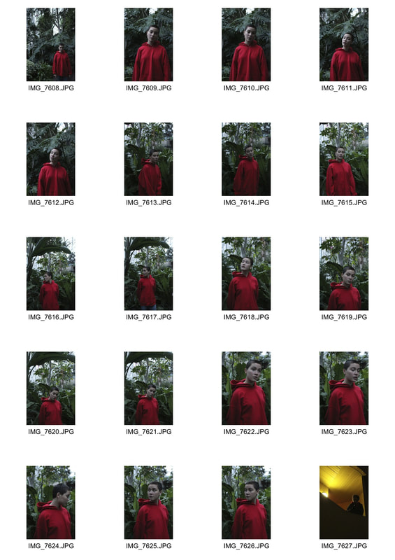
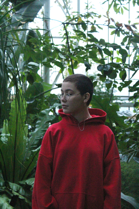
Second response
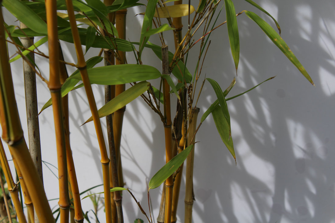
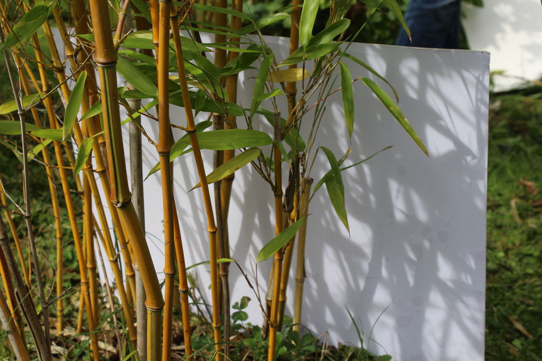
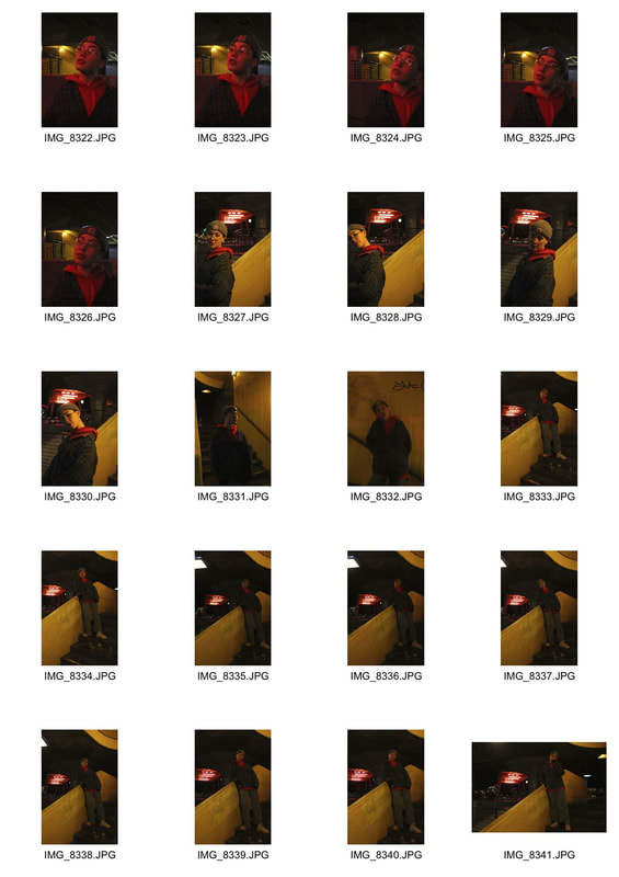
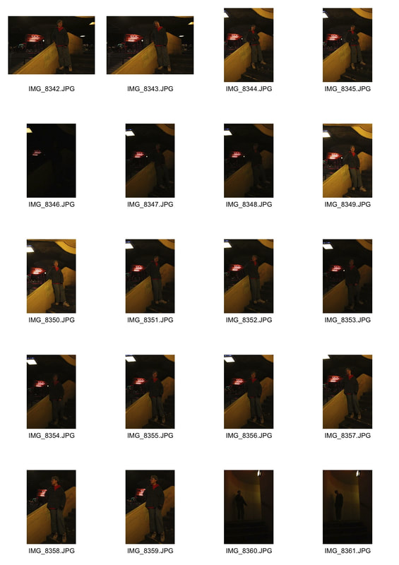
For our second response we went to the school's garden to photograph the nature there, in this response I think I captured a lot more interesting structures and colour, and paid more attention to getting the right lighting to bring out the plant in front of the white background.
|
|
|
|
|
|
|
|
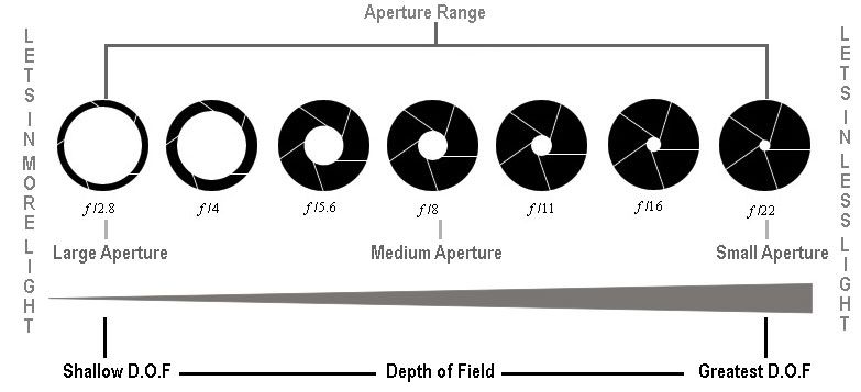
Aperture - Technical FocusThe technical focus for 'structure in nature' was aperture. Adjusting the aperture changes the focal range of the depth of field. It's measured in f-stops, the higher the f-stop number (e.g. f16) the smaller the aperture so less light is let into the sense hole, this means the depth of field is broadened and all of the objects are in focus.
|
|
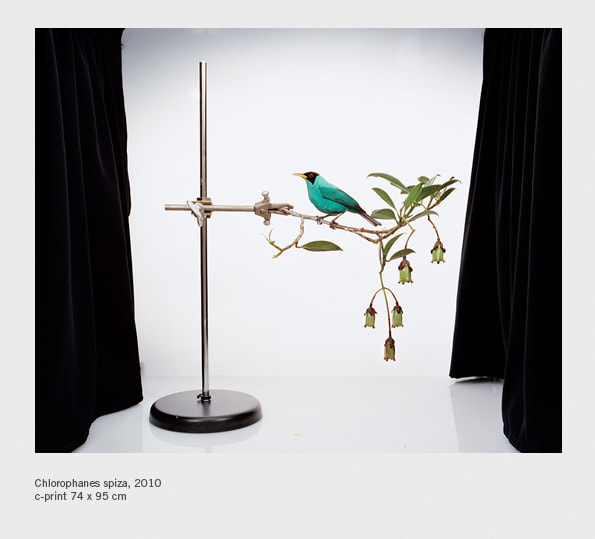
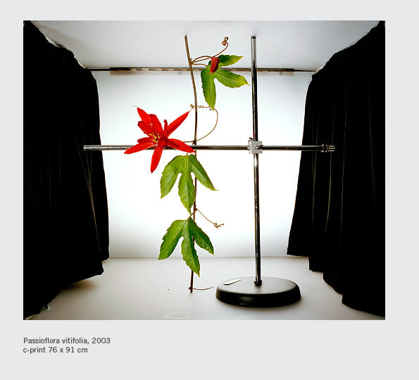
Sanna Kannisto
|
|
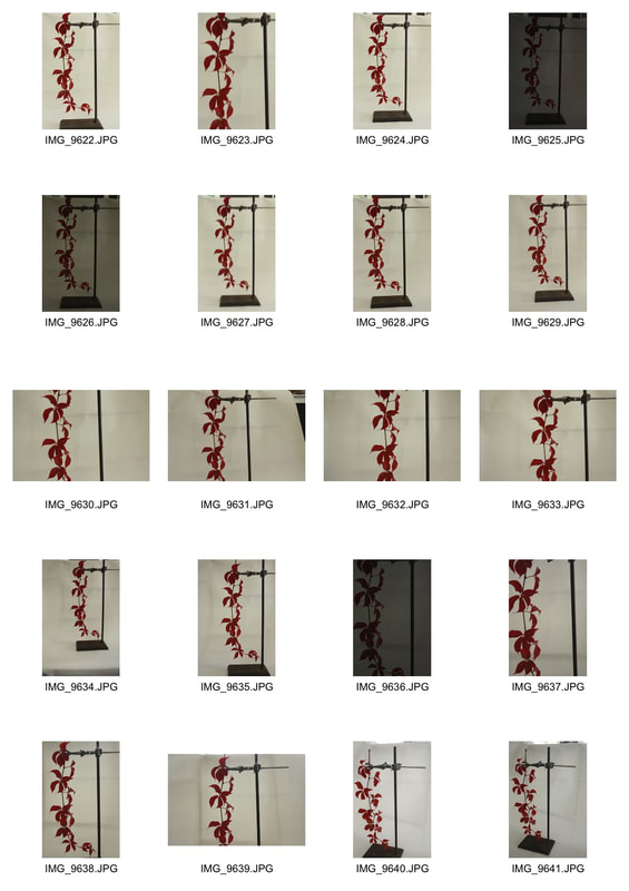
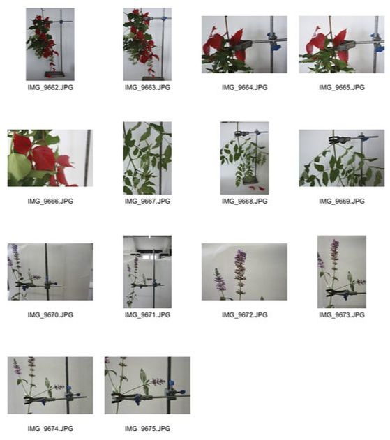
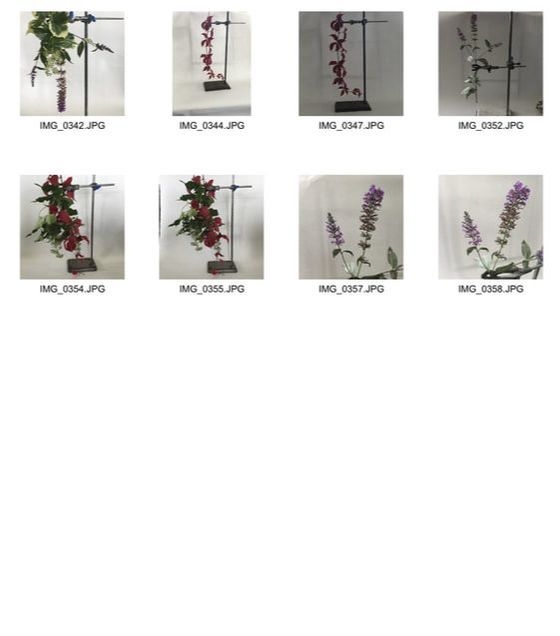
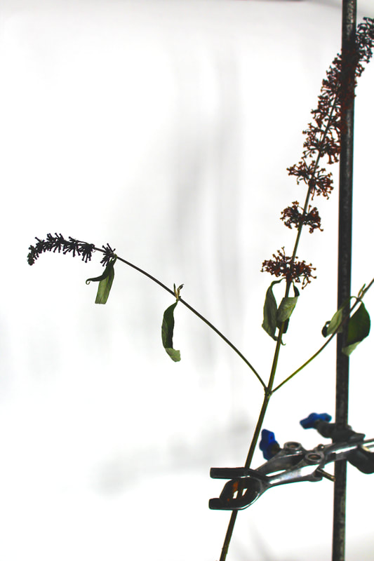
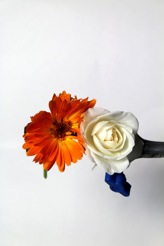
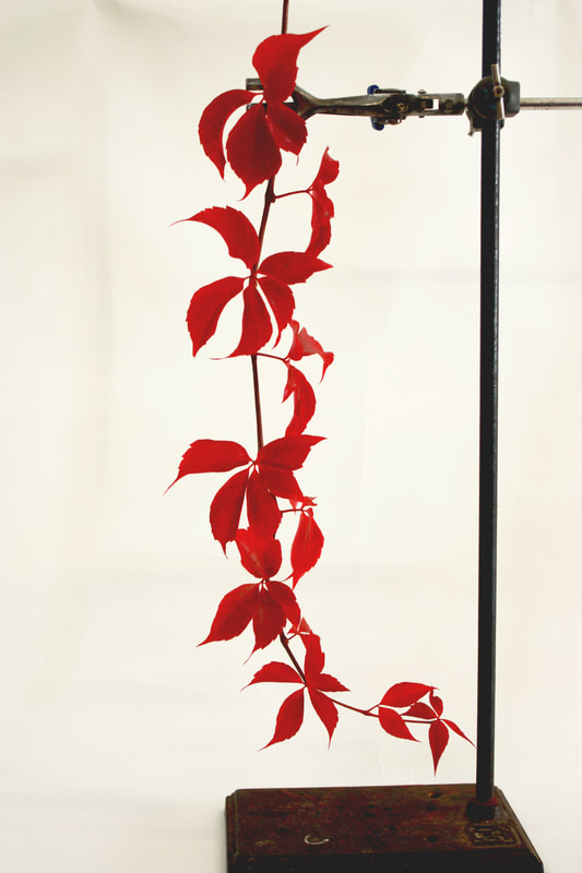
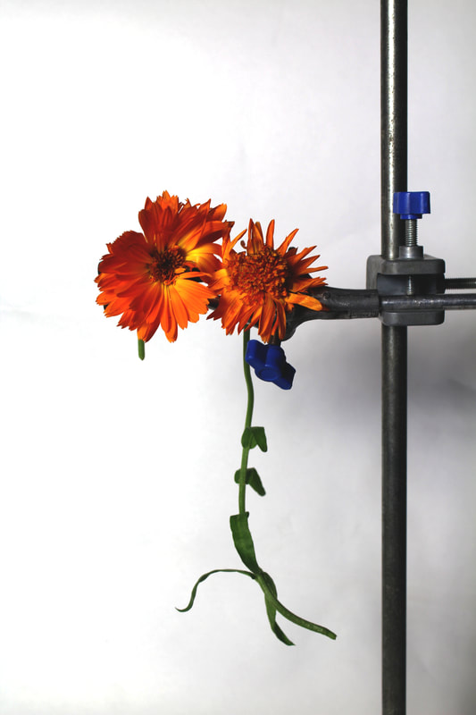
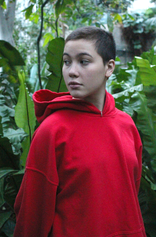
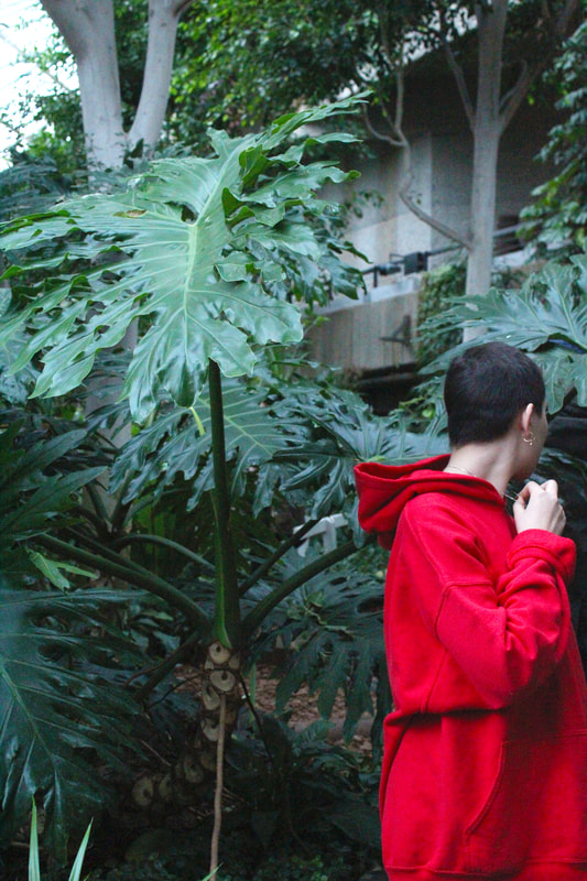
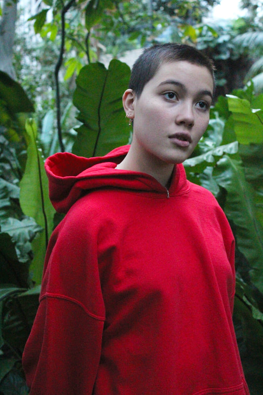
We also looked at the work of Sanna Kannisto, who places natural structures in man-made, scientific environments. We were asked to place natural forms like flowers and plants in clamps used in science. I tried to capture the delicate, intricate details of the plants in contrast with the bold and ugly lines of the clamp.
|
|
Photos from camera
|
Photos from phone
|
In editing I brighten the colours to emphasise the contrast, I also raise the exposure to make the background more white and clean. In terms of what went well I think there's a good variety of colours and shapes photographed that are accentuated by the white. To improve these photos I would use larger natural forms and take more photos further out to get a more impactful image.
|
|
Photograms
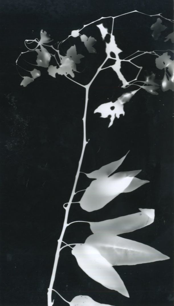
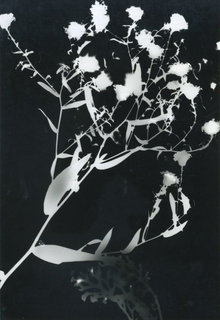
I then used the natural forms that I photographed in the studio to create these photograms in the darkroom. This task gave me the opportunity to explore darkroom techniques as well as demonstrating ideas of structure and shapes by creating a silhouette using minimal details.
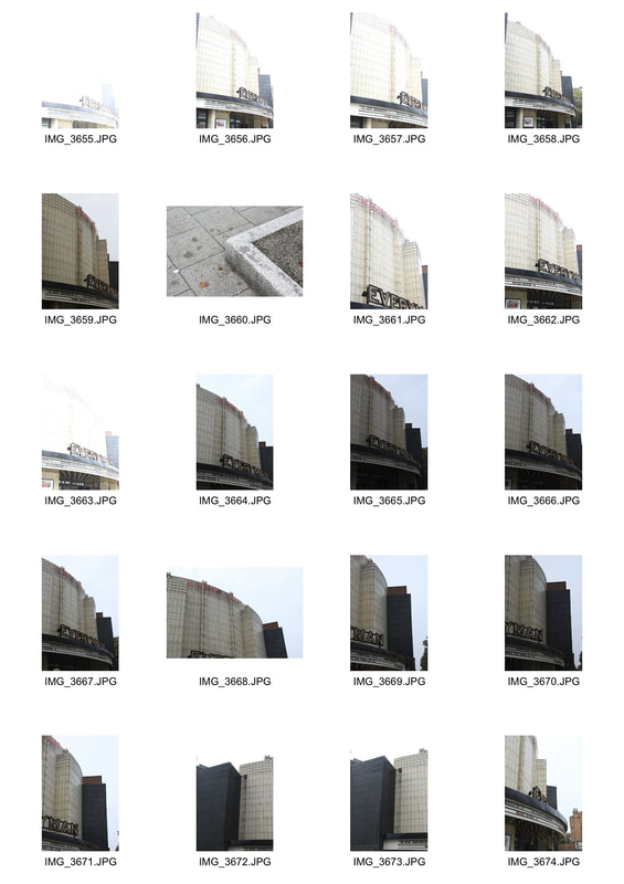
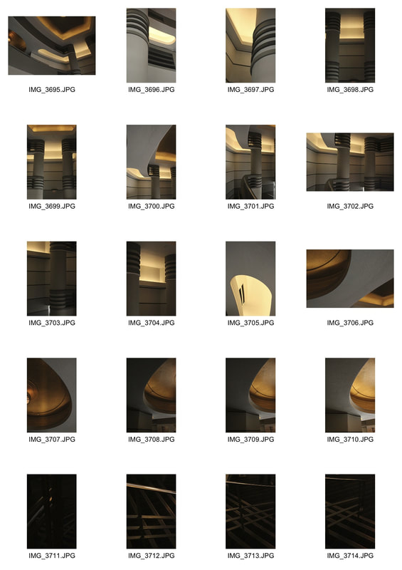
Structure in architecture
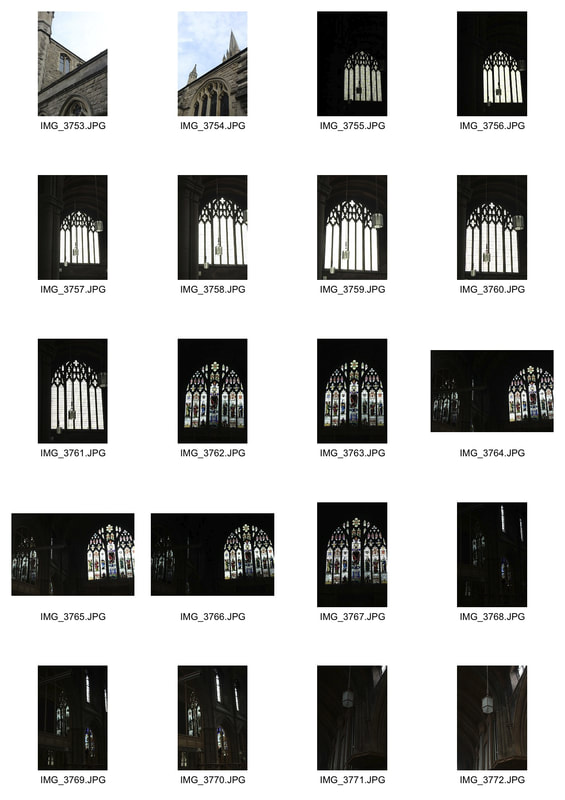
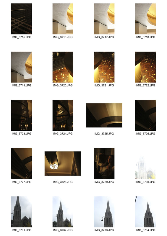
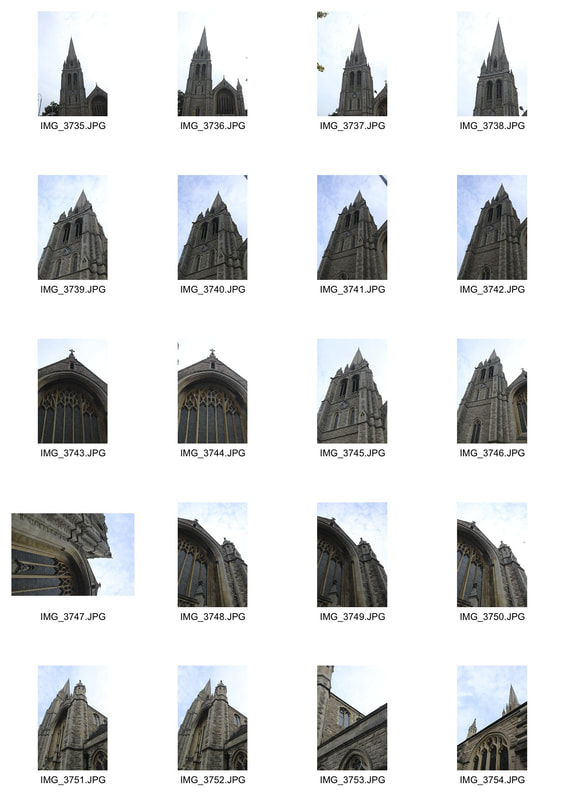
In this task we looked at structures within architecture, and how we could create abstract images using the shapes and forms in buildings. We went to St James' church and the Everyman Cinema in Muswell Hill to have a varied style of architecture. I found it interesting to select forms and structures in the Everyman especially, and photograph them using angles and composition to add an element of abstraction and make them more unusual and visually interesting.
|
|
|
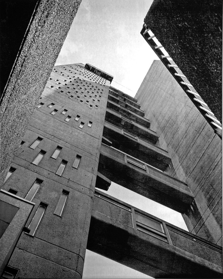
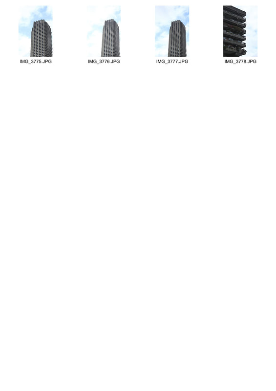
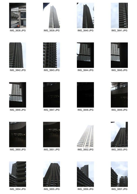
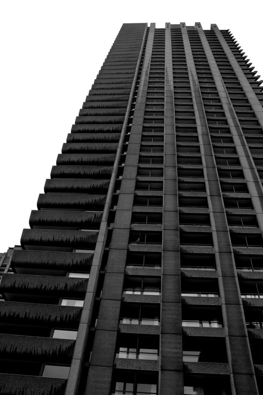
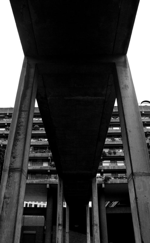
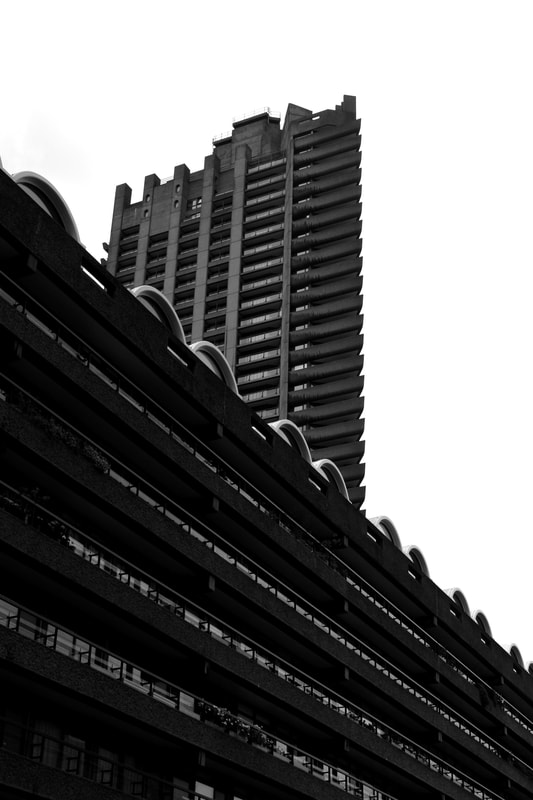
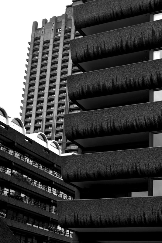
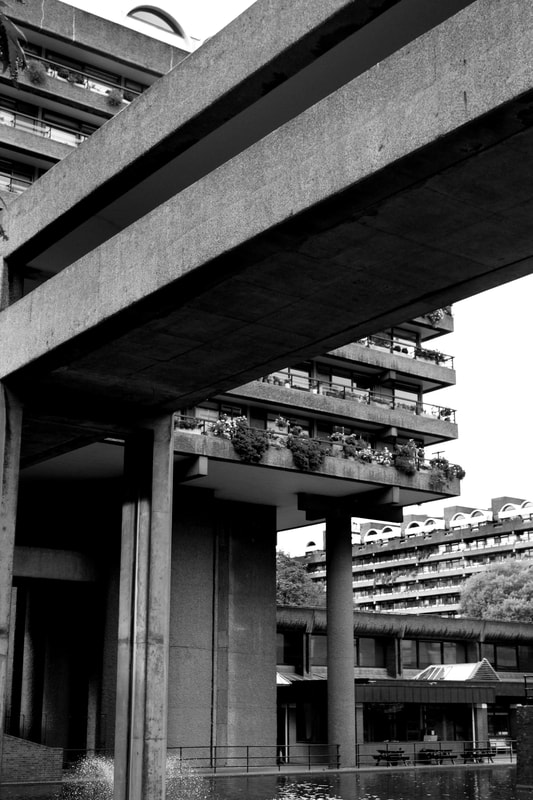
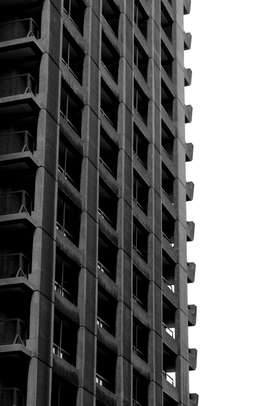
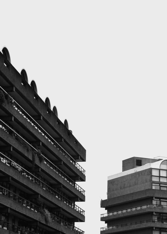
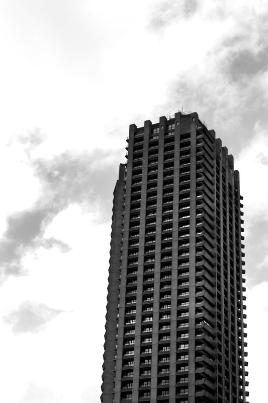
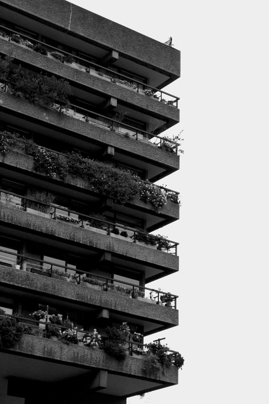
Simon Phipps
Simon Phipps is a UK based fine art photographer and is renowned for his brutalist architecture photography and abstraction of buildings using perspective and negative space.
|
|
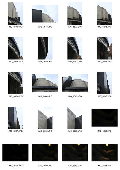
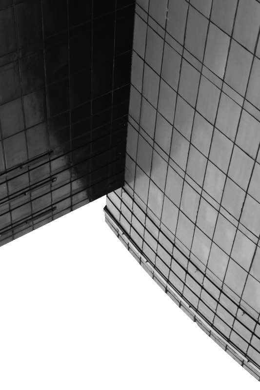
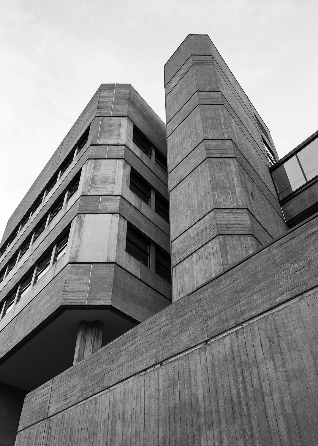
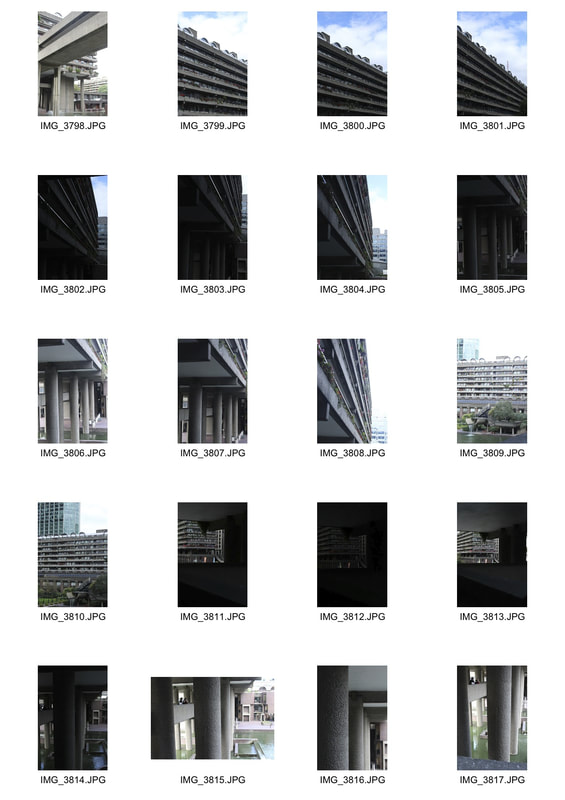
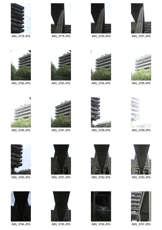
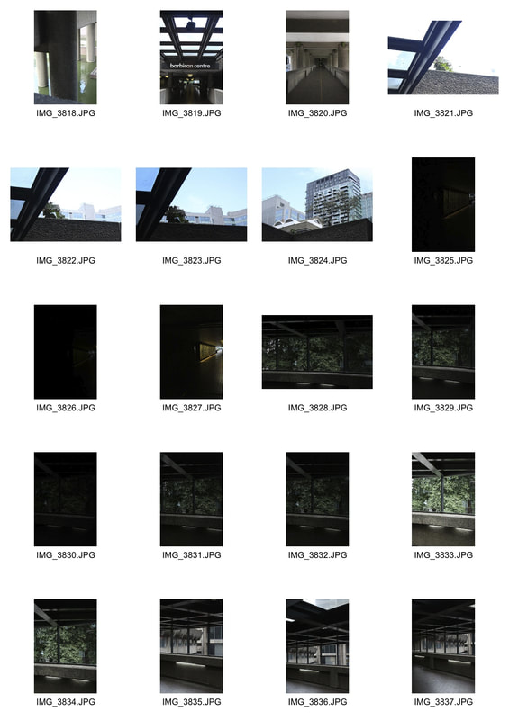
Brutalist architecture
In this task we were asked to visit a Brutalist structure or building and photograph it in terms of three headings; line and perspective, negative space and form/shape. We looked at the work of Simon Phipps as inspiration.
|
|
|
LINE AND PERSPECTIVE
|
|
|
FORM/SHAPE
|
|
|
NEGATIVE SPACE
|
|
|
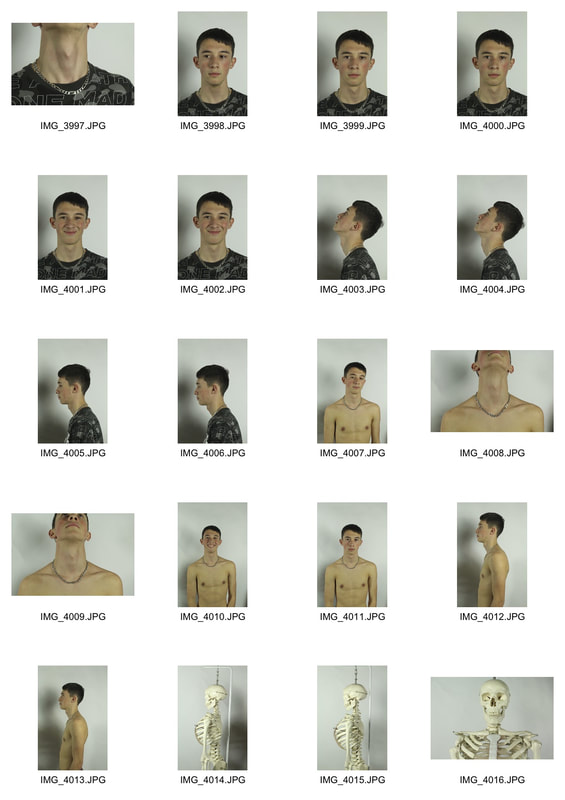
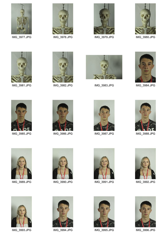
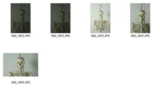
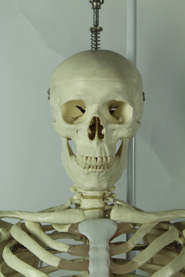
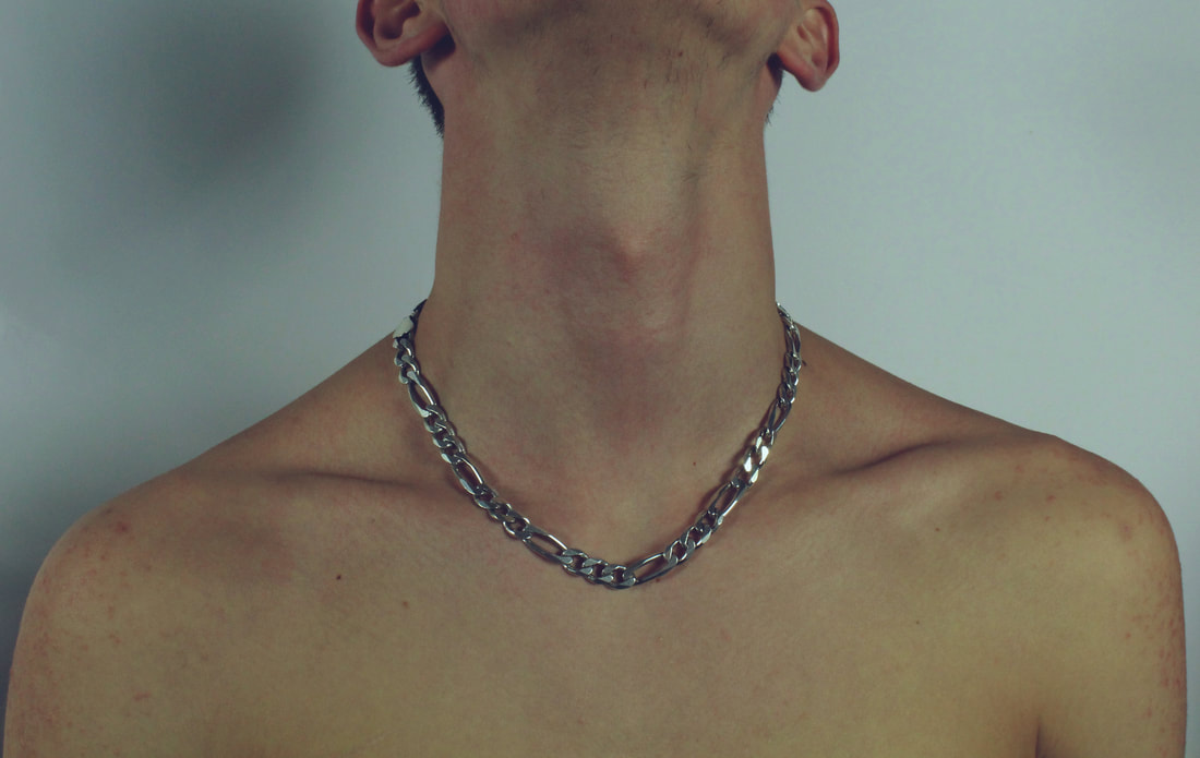
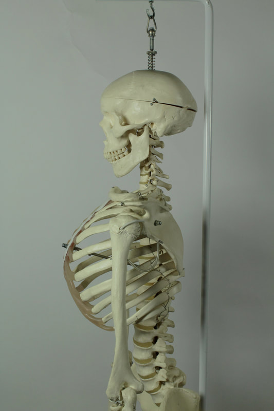
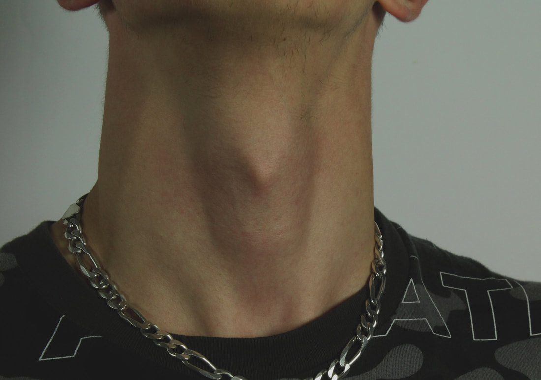
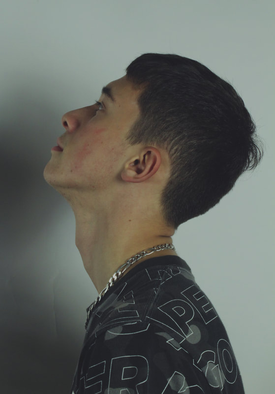
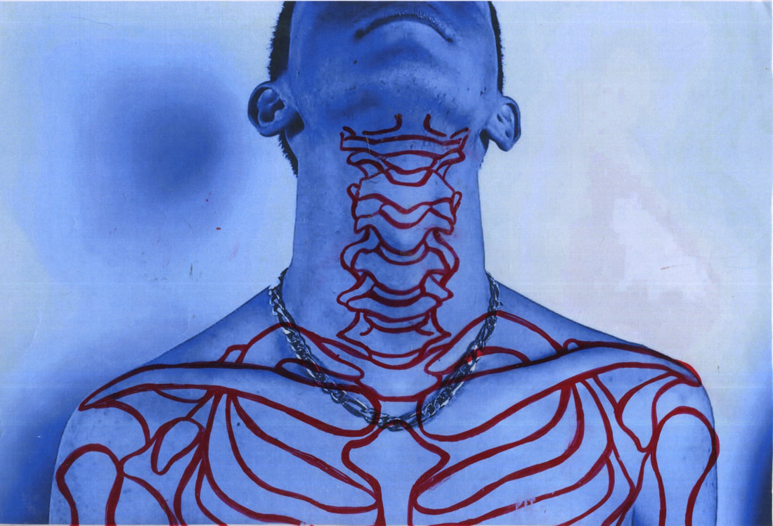
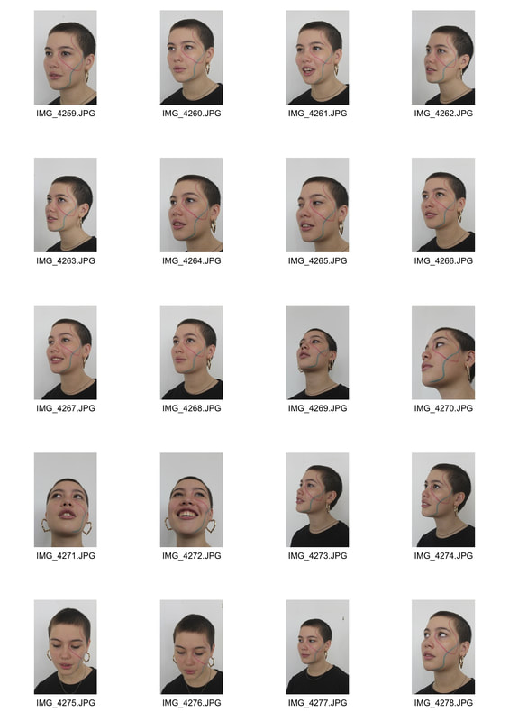
Structure of the human body
In this task we looked at the structure of the human body, particularly the skeleton and the way our body is formed around it. We photographed both human models and a skeleton model, and combined the two images to compare and contrast the shapes and forms within the body.
|
|
|
|

|
|
First Strand
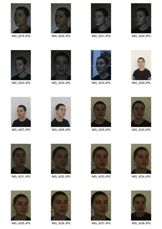
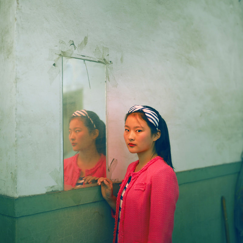
Structure in genetics and family
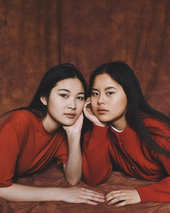
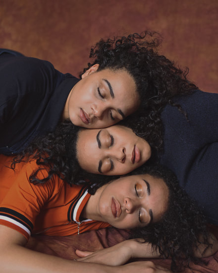
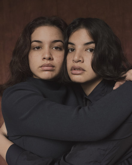
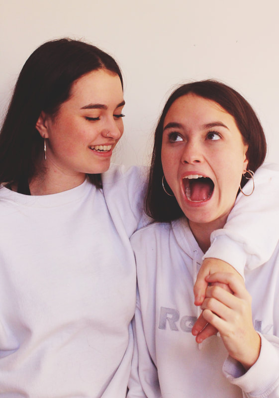
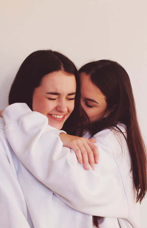
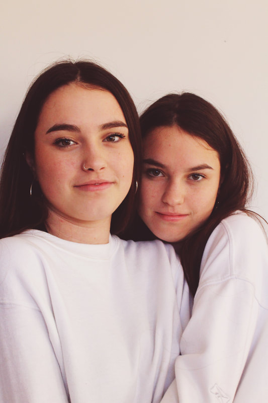
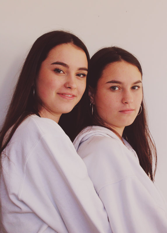
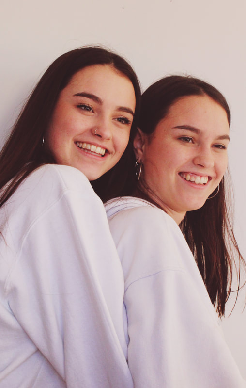
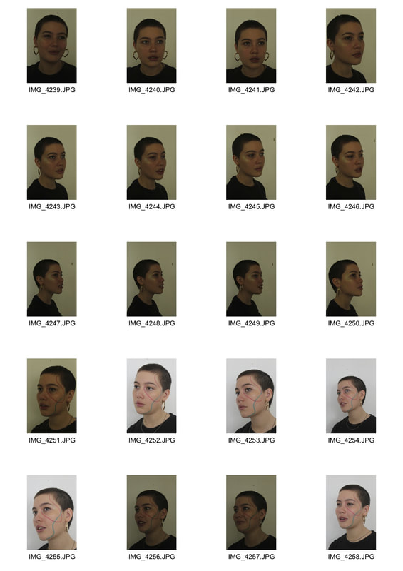
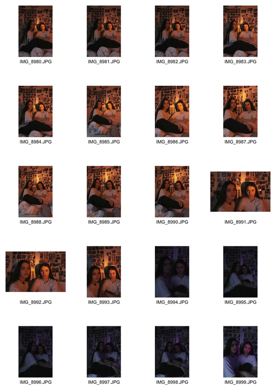
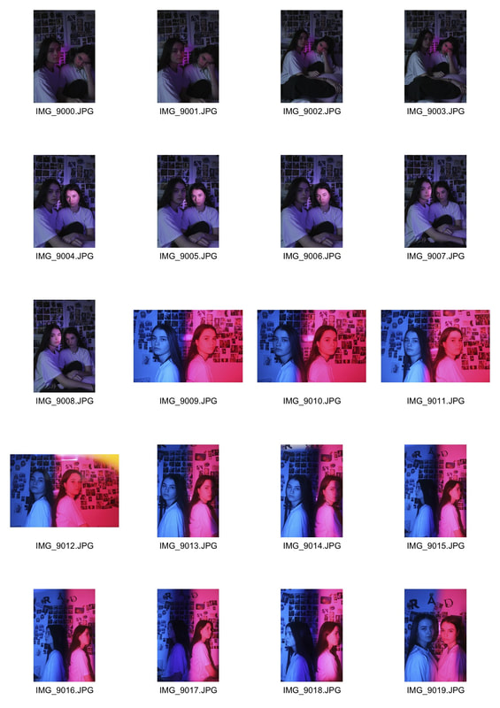
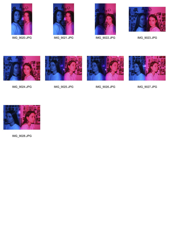
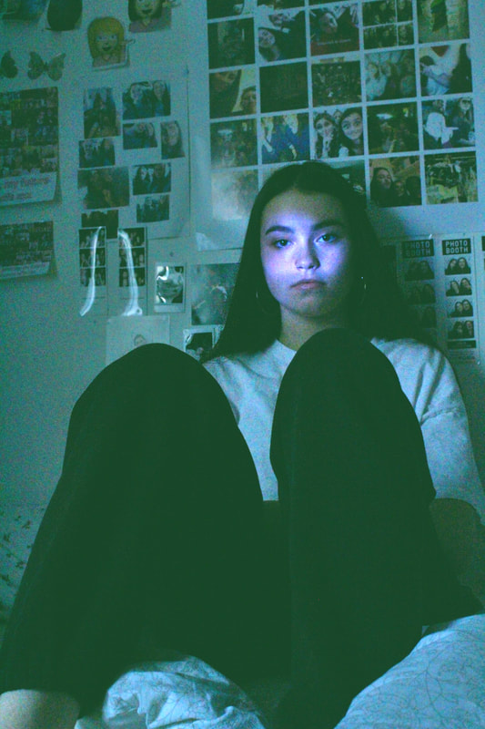
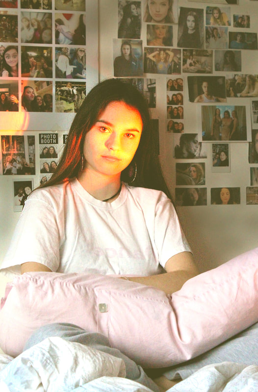
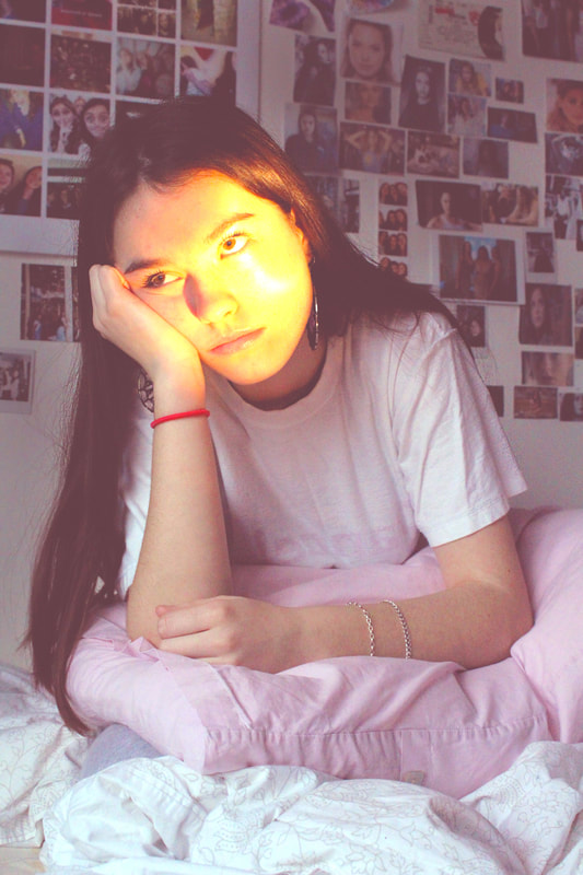
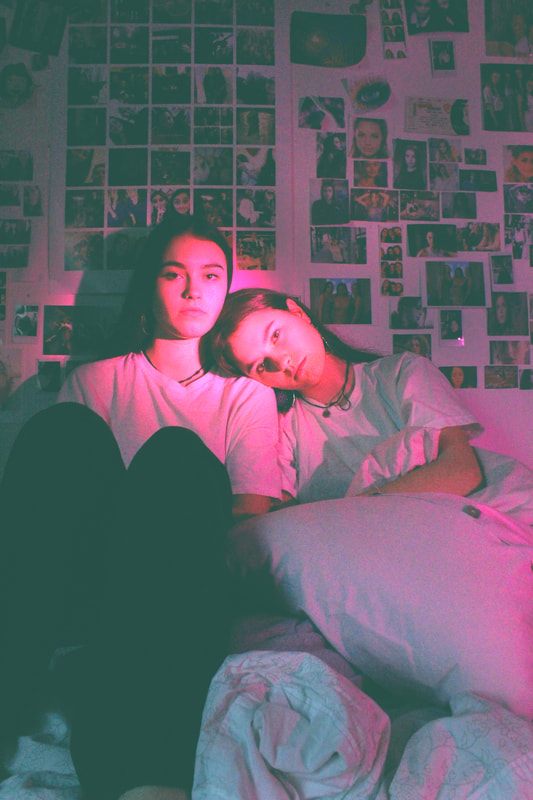
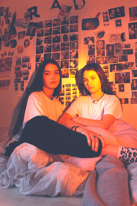
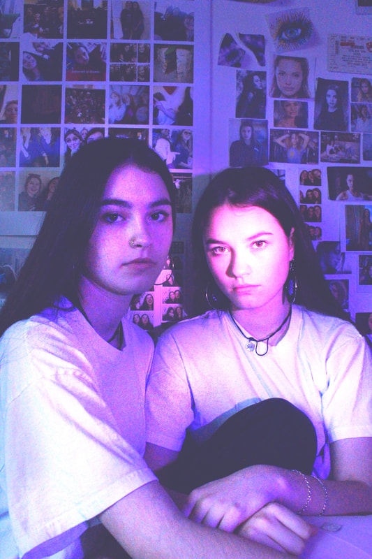
For my first strand I decided to look at the structure of genetics in families and how they are inherited from parents or shared with siblings. I decided to look at siblings and twins who share similar features because I wanted to explore how they appear similar of different when compared next to each other and how the structure of the face can be very subtly different. I also wanted to capture the intimacy and familiarity shared by siblings in the photo with their body language.
Nadine Ljewere
The photographer Nadine Ljewere produced a series of photos under the title 'Same//Difference', the project is a series of sibling portraits attempting to capture their similarities and differences. She also tries to capture the natural bond between siblings without forcing or posing it.
"I'm fascinated by genetics, and siblings who have the same parents but look completely different or very, very similar." - Nadine Ljewere
"I'm fascinated by genetics, and siblings who have the same parents but look completely different or very, very similar." - Nadine Ljewere
|
|
|
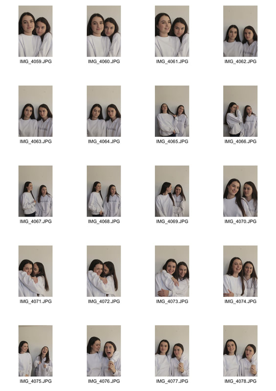
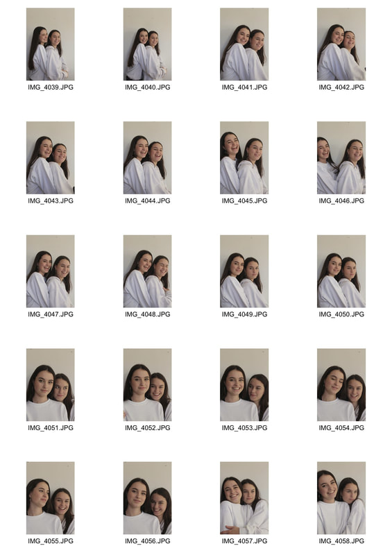
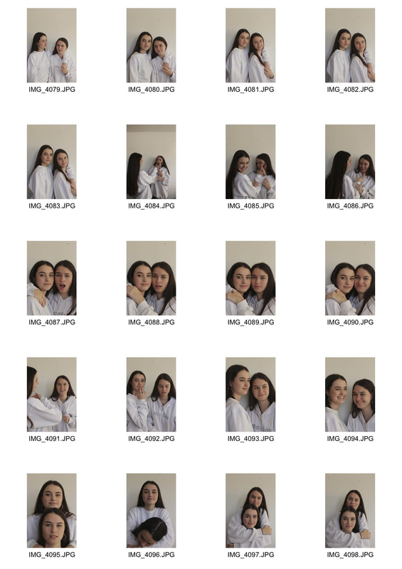
Response
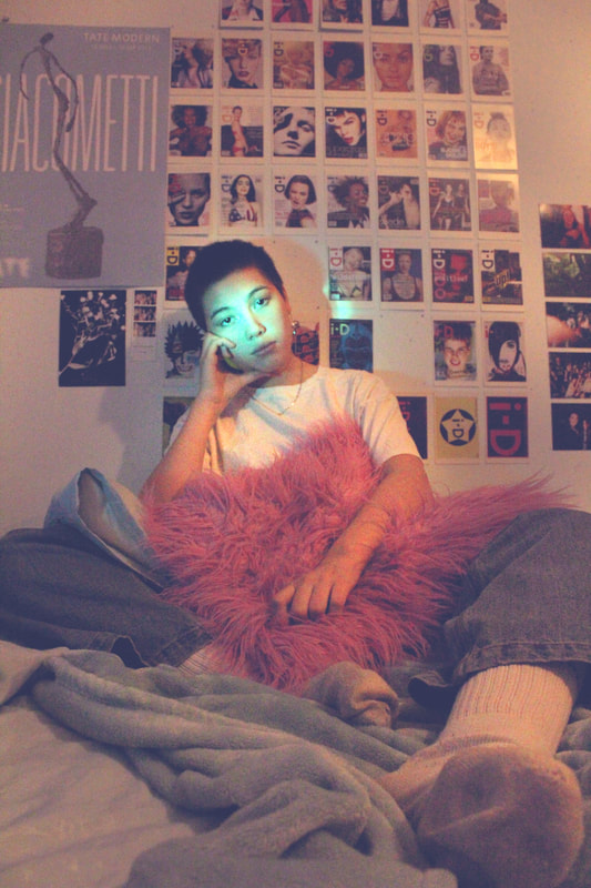
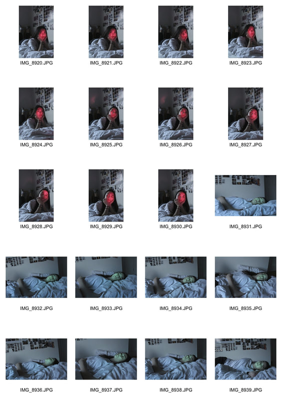
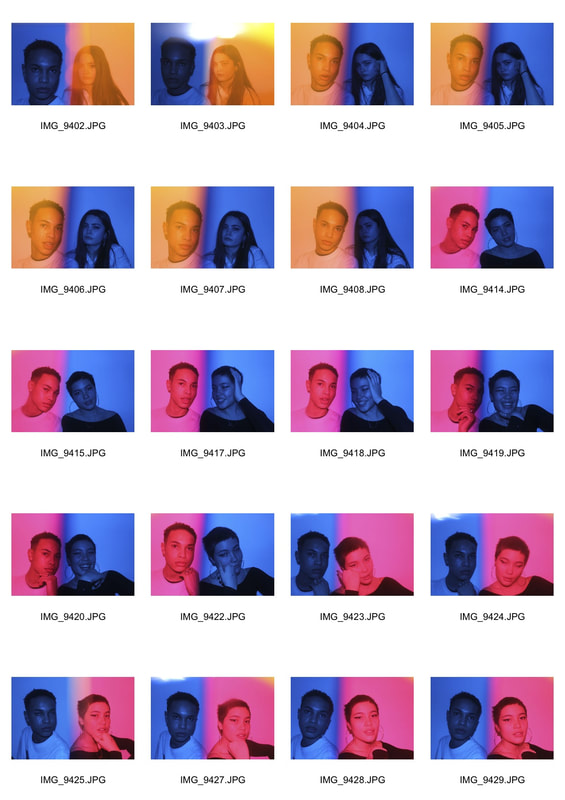
I chose to photograph my friend Emma and her identical twin sister Maddie. I asked them to wear matching colours and only gave them ideas of poses so that their natural bond and chemistry would control the shoot, however I tried to capture the intimacy and affection in their body language and at some points tried to frame their faces in parallel to emphasis their similar features. I used natural lighting to take the pictures with a low aperture so that the twins' faces were in focus.
|
|
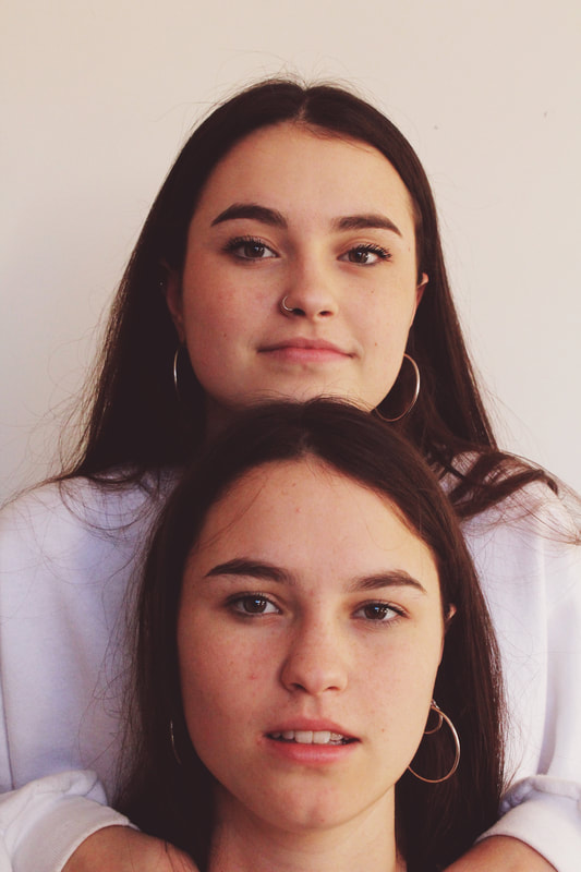
Edited Photos
I used natural lighting while taking my pictures and a plain white background, so in photoshop I tried to warm the colour palette in order to reflect the joy and familiarity felt through the pictures. I heightened the saturation and adjusted the highlights to magenta, as well as using the clone stamp tool to rid of some marks on the wall.
|
|
|
|
|
|
Second Strand
Structure of colour
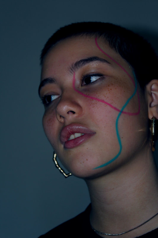
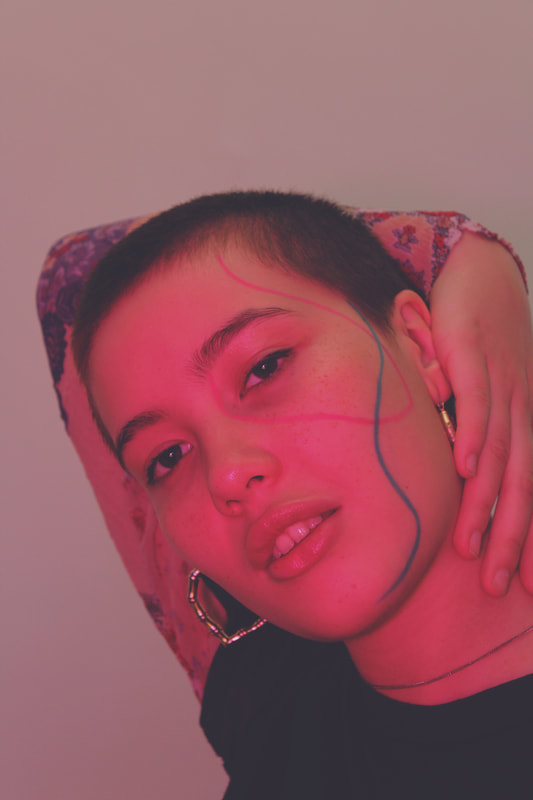
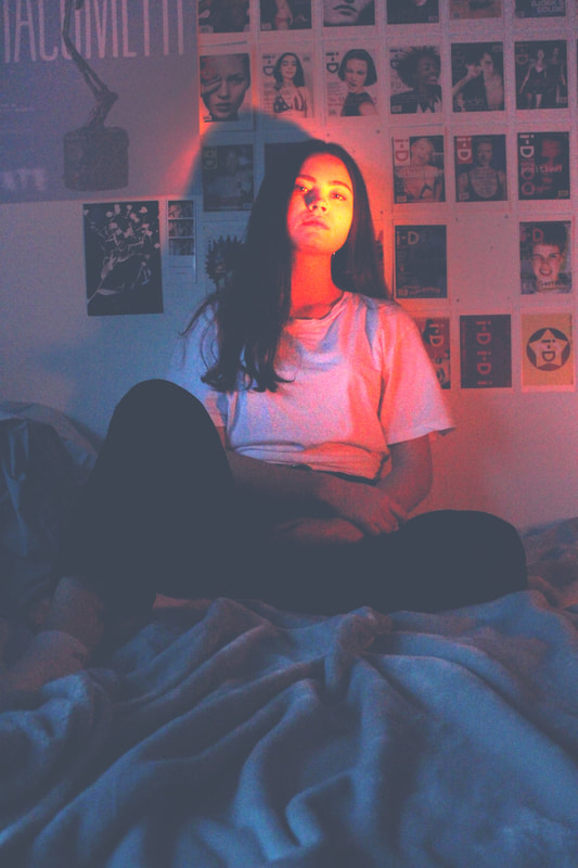
For my second strand I decided to explore the structure of colour; particularly complimentary and contrasting colours and also the breakdown of colour into the three fundamentals magenta, cyan and yellow.
Slava Semenyuta
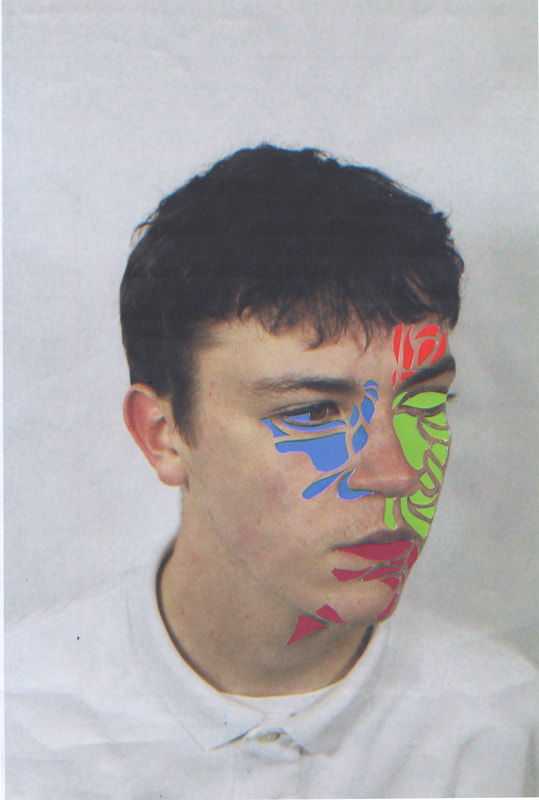
Slava Semenyuta, a Russian photographer, illustrator and retoucher. He uses body painting and digital art to capture his models with 'cosmic' colour.
I chose to look at his photos that used contrasting and complimentary colours on the shadows and highlights or coloured lines drawn on the model.
I chose to look at his photos that used contrasting and complimentary colours on the shadows and highlights or coloured lines drawn on the model.
|
|
Response
|
|
|
|
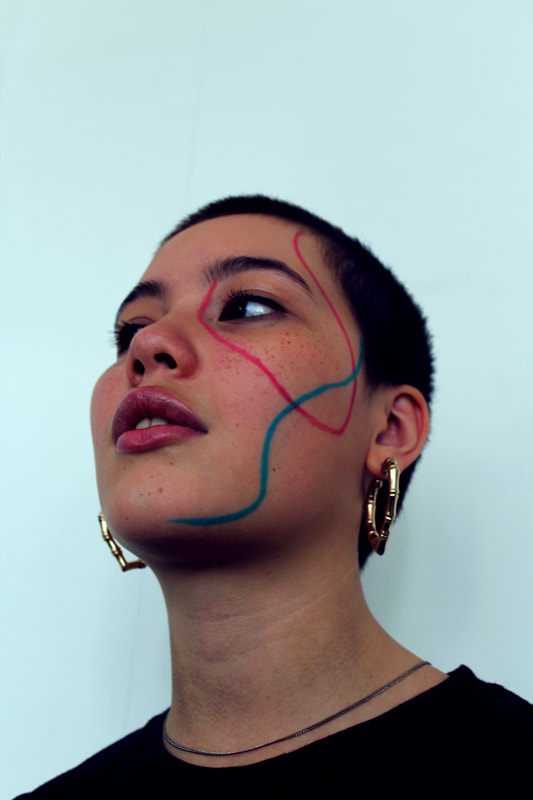
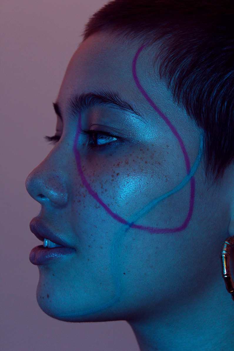
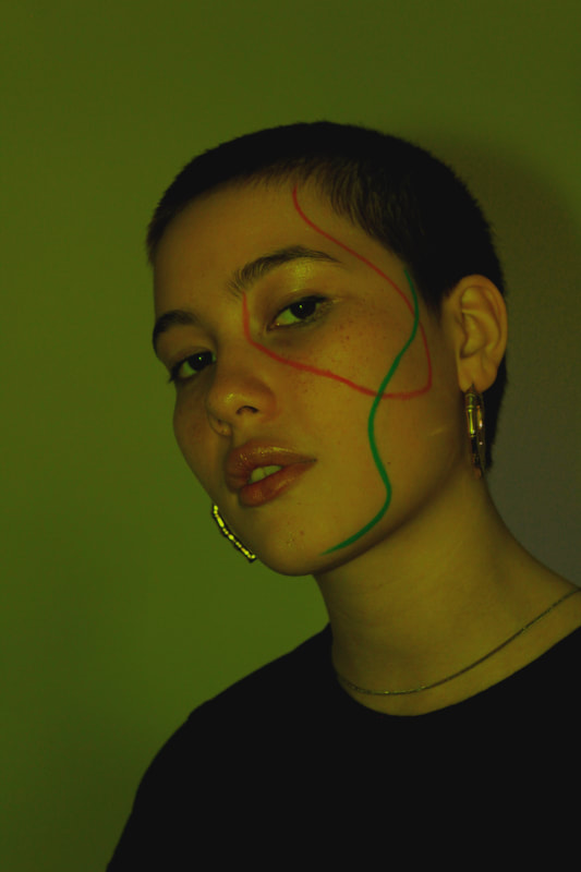
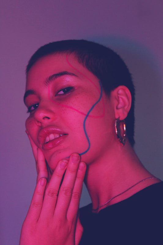
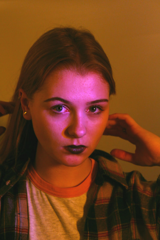
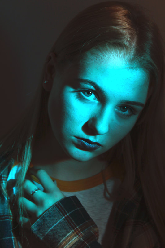
I chose to shoot a series of portraits with my friend using different experimentations with colour. I drew on her face with makeup, influenced by Slava Semenyutas neon lines and used coloured post it notes over the flash to experiment with coloured flashes and how they reacted with the colour of the makeup. I also used a variation of lightings to experiment with the vibrancy of the colours.
Edited Photos
On photoshop I experimented with a range of colour changes and emphasised the highlights and shadows. I used a low brightness and exposure influenced by Slava Semenyuta's dark lighting. I changed the colour balance on most of the photos to put two different colours together e.g. cyan and magenta to see how they balanced out. The atmosphere of the photos was definitely enhanced by how I edited the photos, the colours are much more vibrant and channel Slava Semenyuta's work. The emphasis of the highlights adds depth and contrast that resembles the artists work.
I'm very happy with the outcome of these photos, the different colours work effectively, the makeup appeared vibrantly against the different colours and almost after brightening it on photoshop, they give the illusion of glowing. I would really like to develop the idea of coloured lighting and drawing on the subject as well as the 'cosmic' and ethereal atmosphere. To improve these photos I would draw more on the subject using different colours to accentuate more of the features and add visual interest.
|
a good start and explanation , needs a www and ebi , good post production evaluation , good use of terminology , could expand comments.
|
|
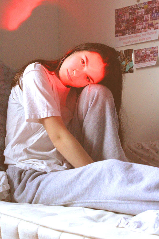
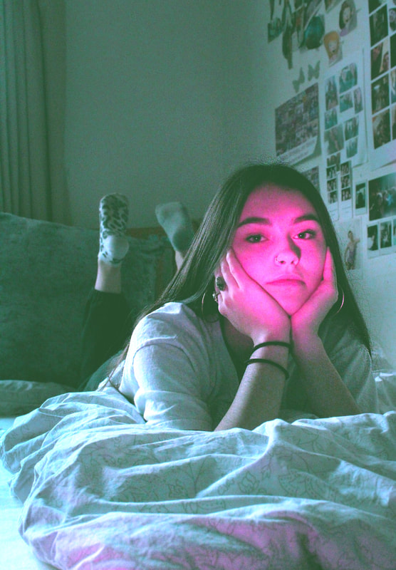
Third Strand
Structure of light and reflections
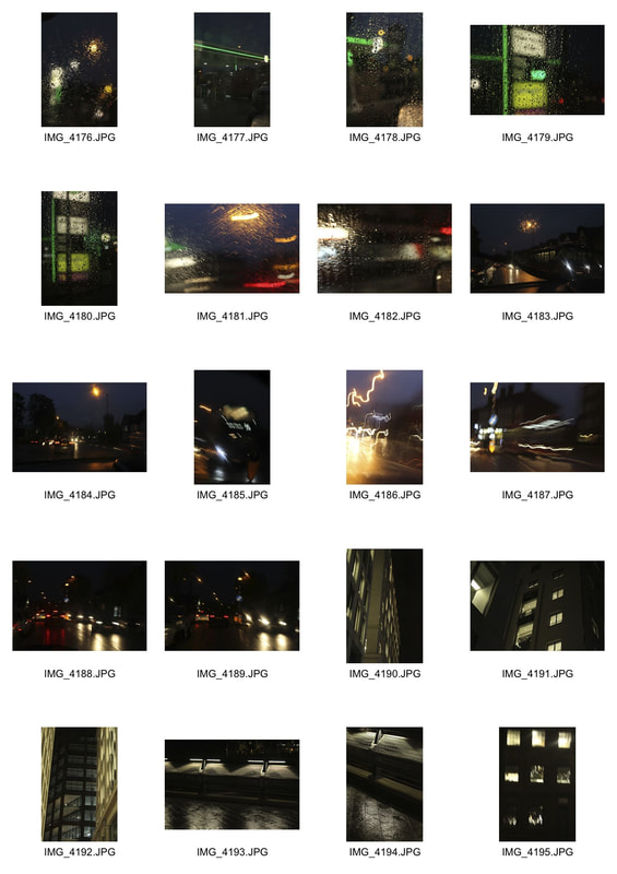
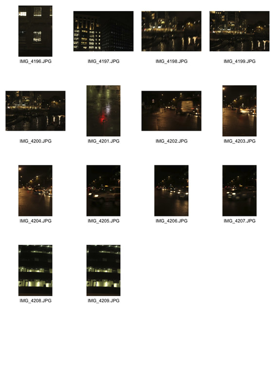
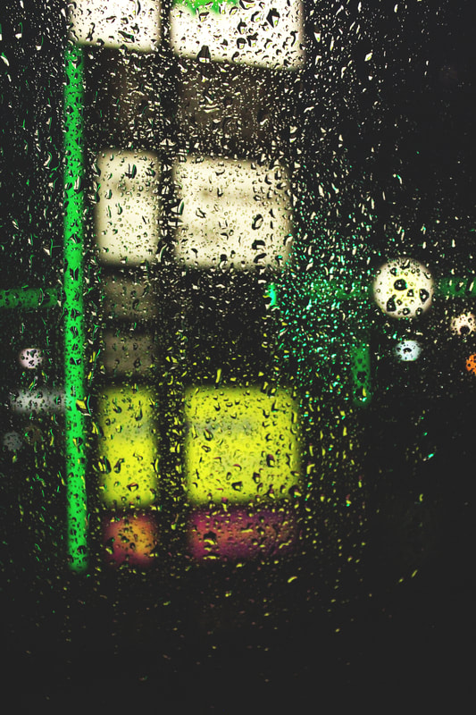
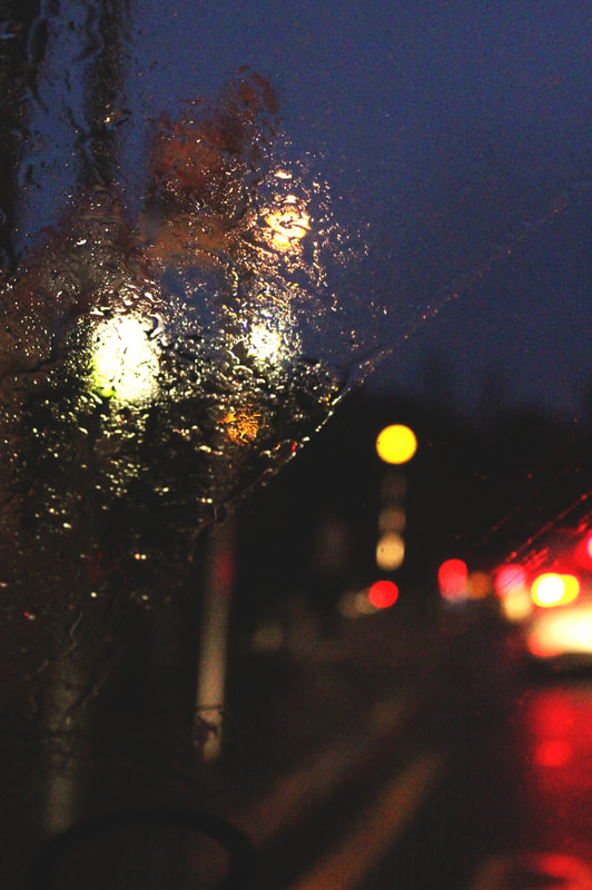
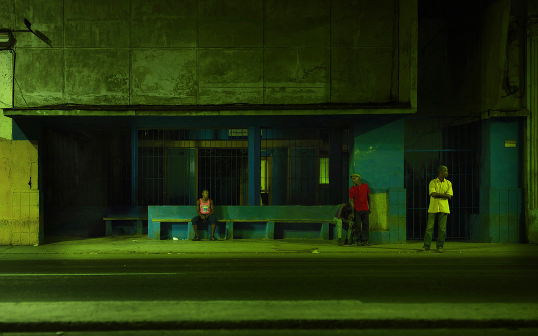
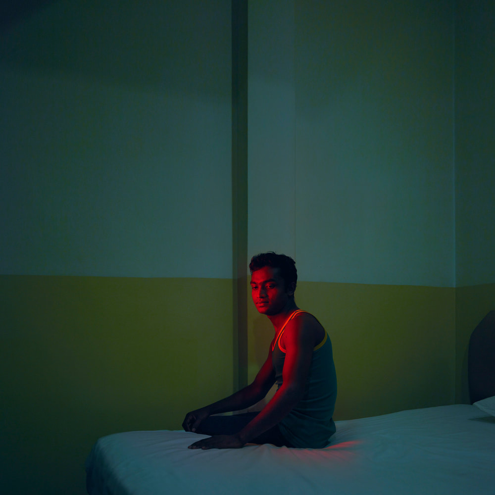
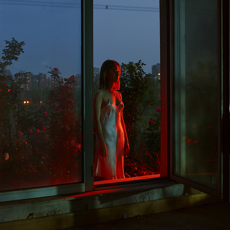
For my third strand I decided to look at the structure of light at night time, i also looked at the reflections and structure of light and rainwater.
For this strand I looked at two different photographers:
For this strand I looked at two different photographers:
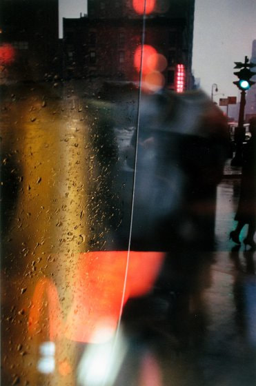
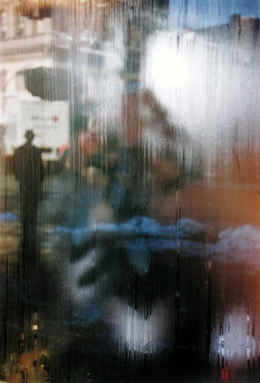
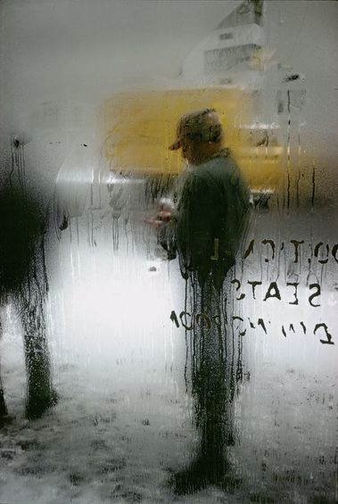
Saul Leiter
Saul Leiter was an American photographer who was renowned for his street photography and its honest and art like depiction of the world around him.
Leiter uses aspects of Abstract Expressionism like the vibrant colour painting in his photos and often frames the subject with accurate compositional choices, blurring them with windows wet with rain.
Leiter uses aspects of Abstract Expressionism like the vibrant colour painting in his photos and often frames the subject with accurate compositional choices, blurring them with windows wet with rain.
|
|
|
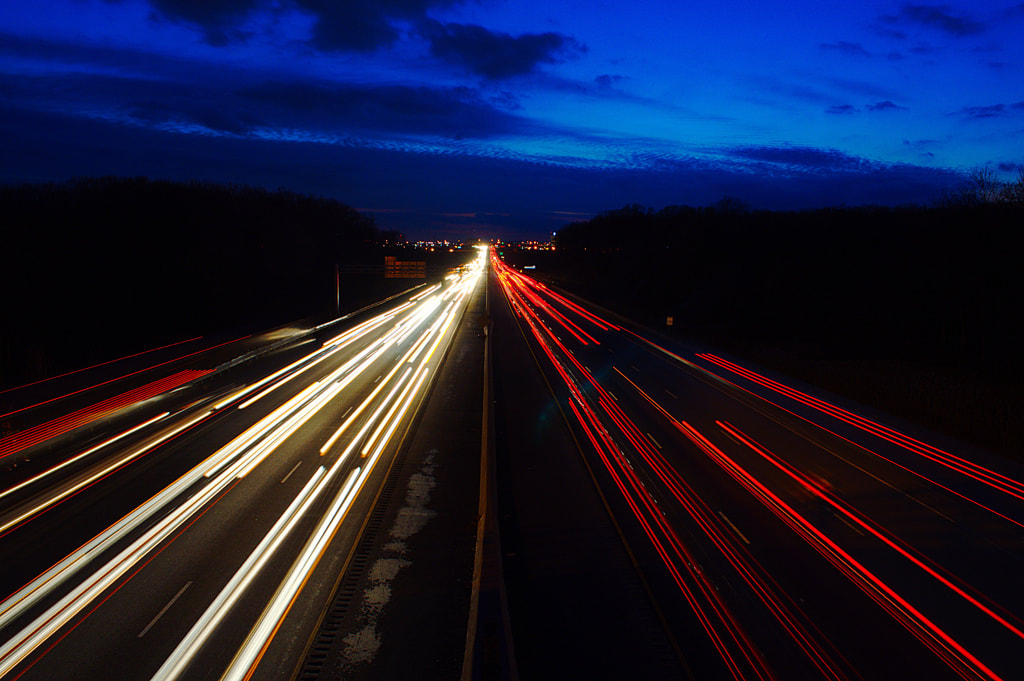
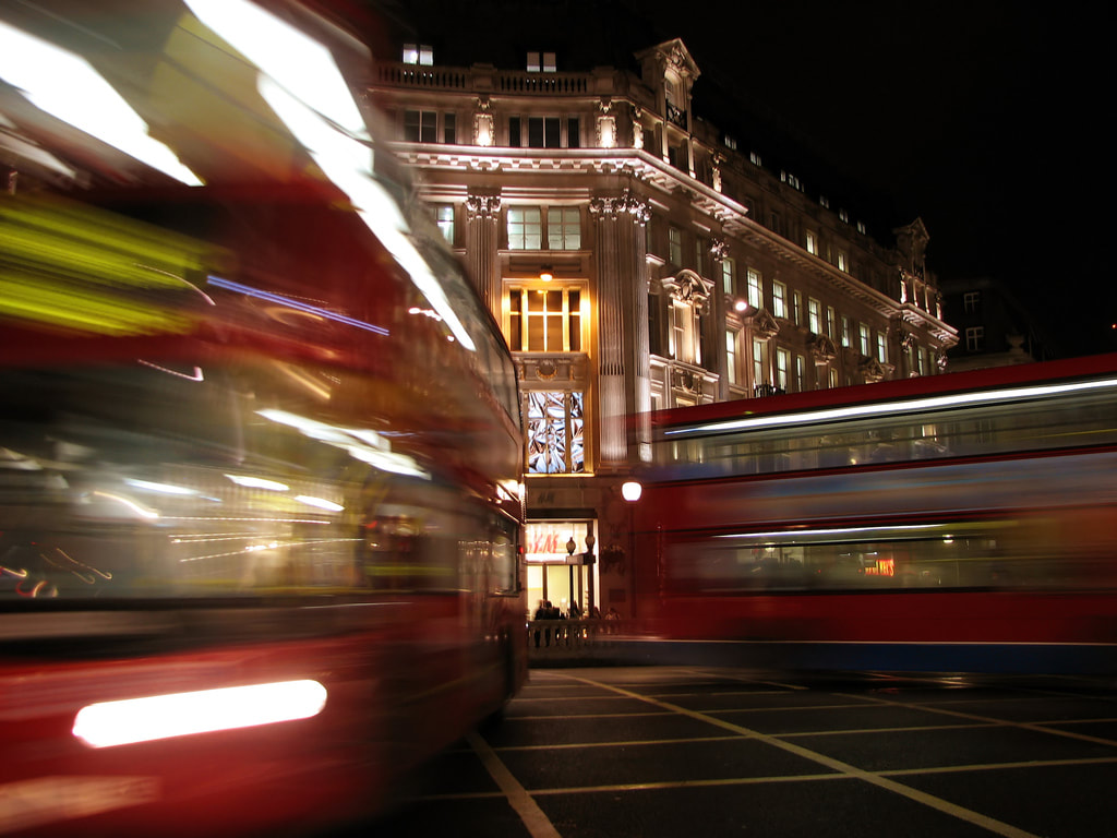
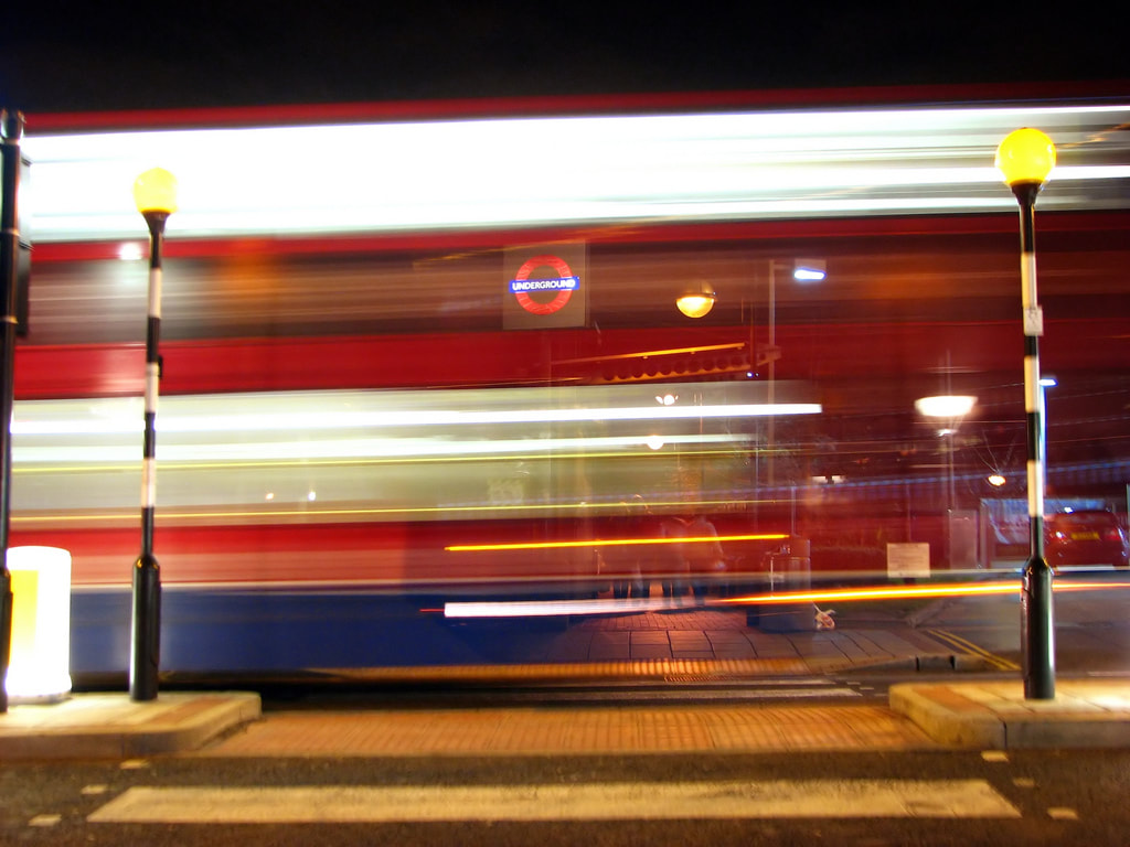
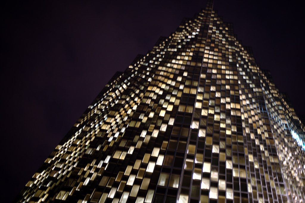
Ian Muttoo
The photographer Ian Muttoo produces series of photos in different cities across the world capturing the night life especially traffic with long exposures and structures in windows and buildings.
|
|
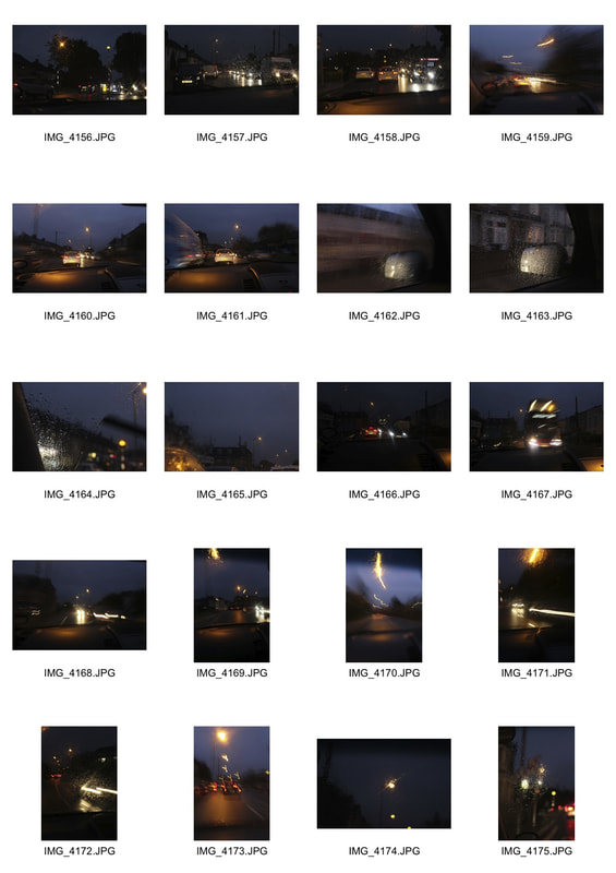
Response
|
|
|
Edited Photos
|
|
Strand development :
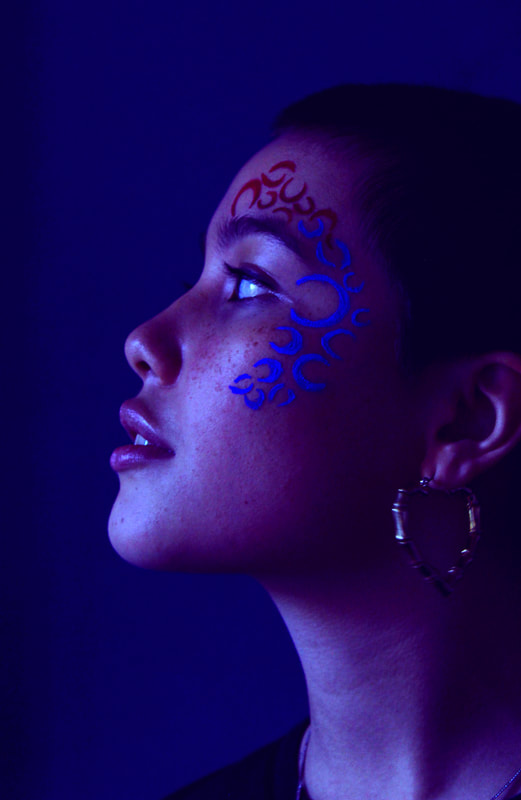
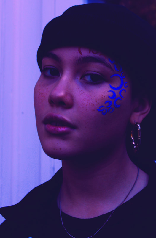
UV lighting
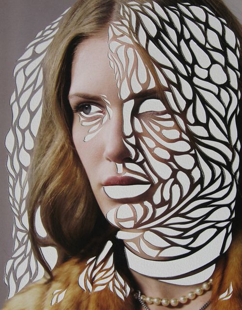
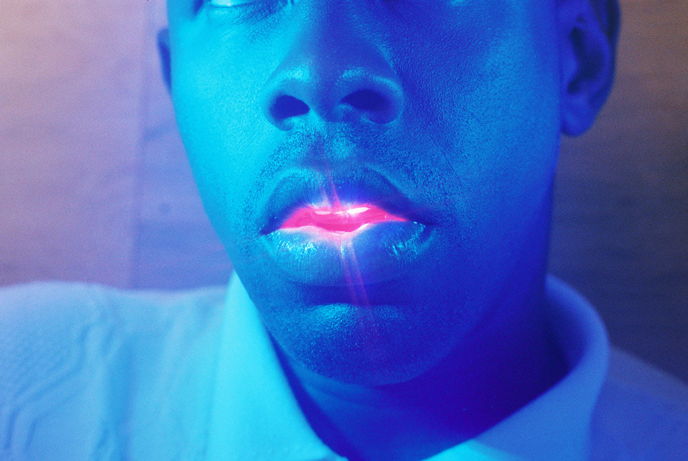
STRUCTURE IN COLOUR
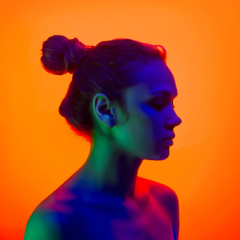
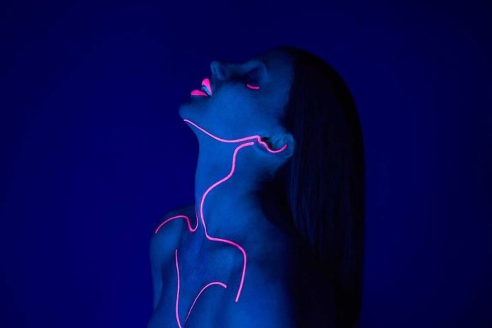
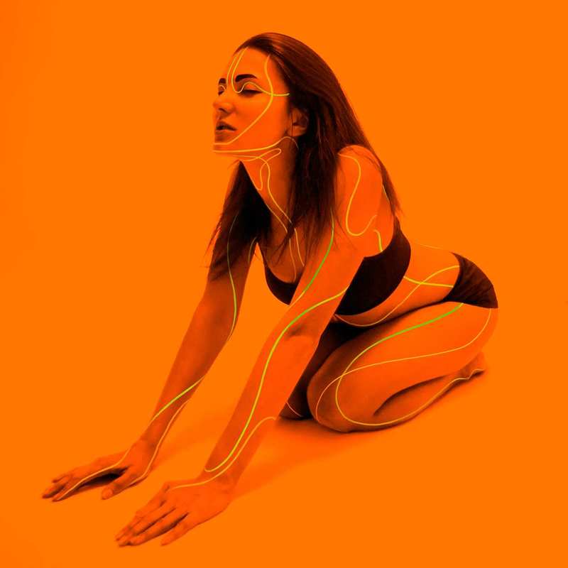
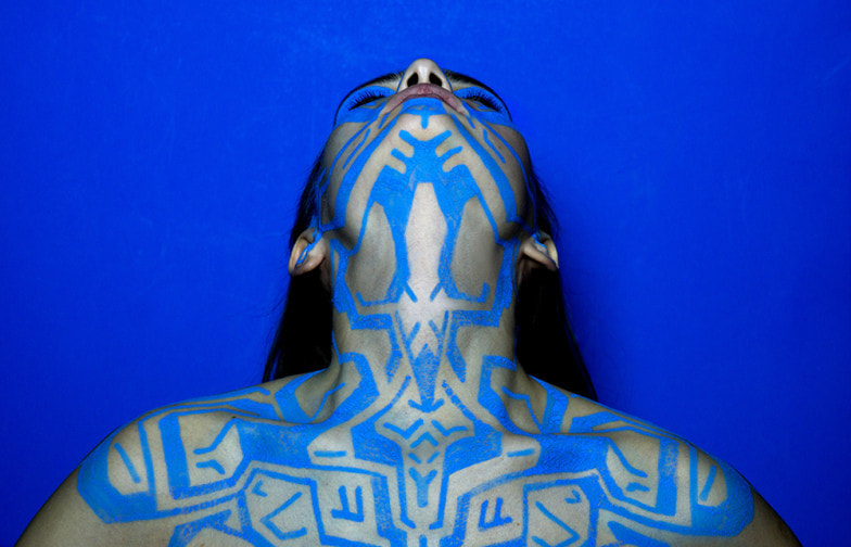
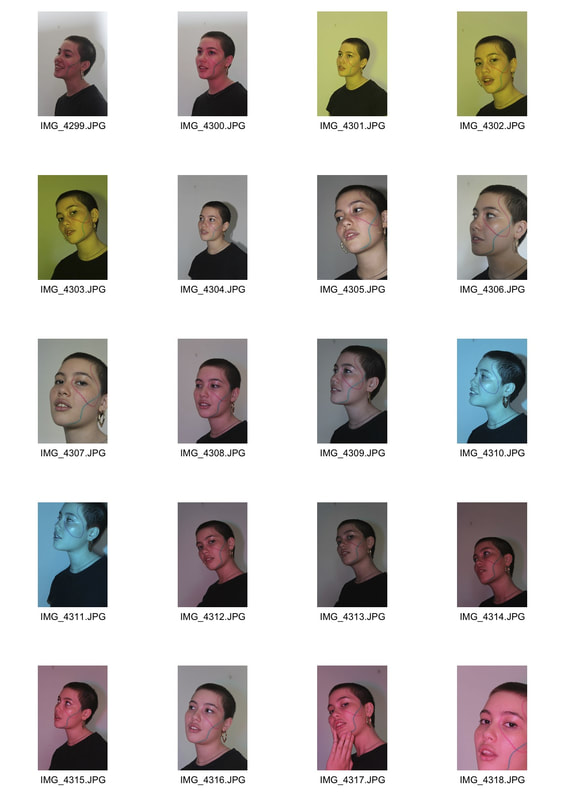
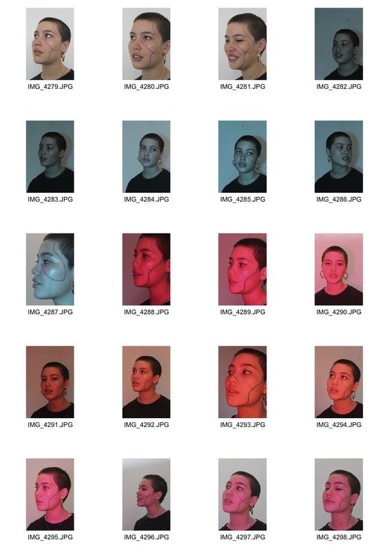
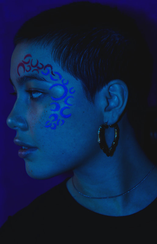
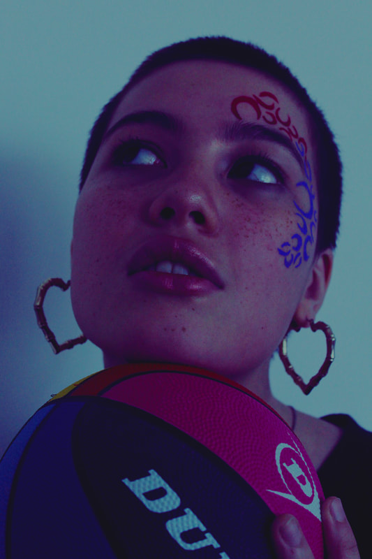
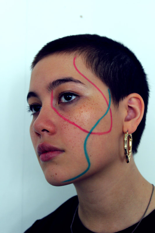
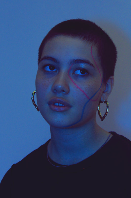
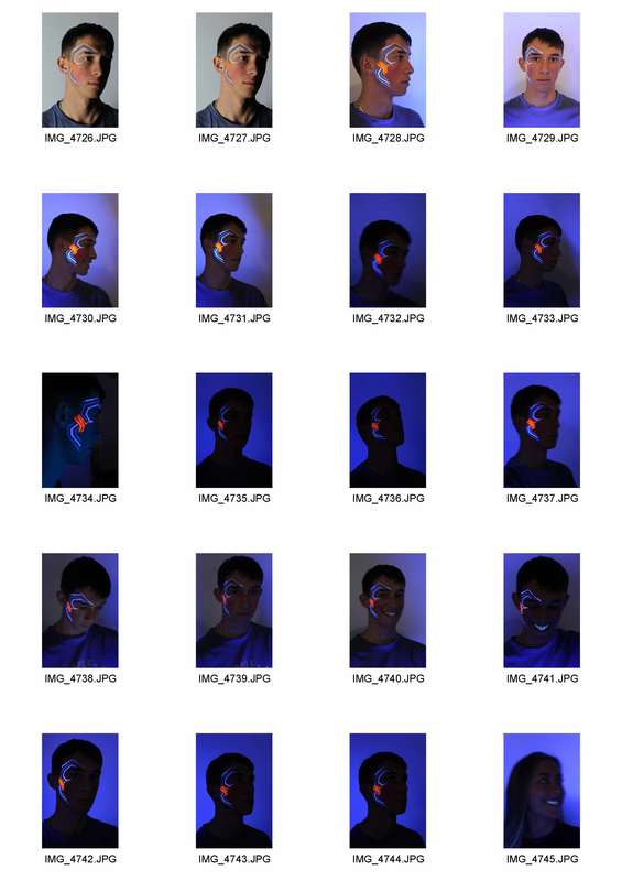
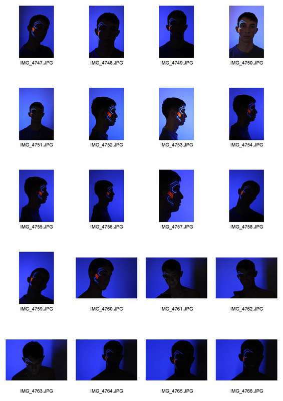
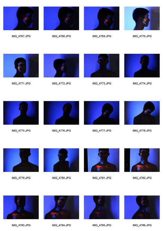
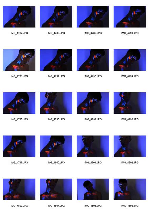
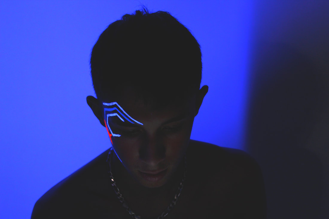
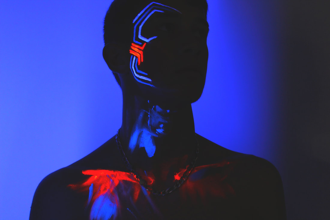
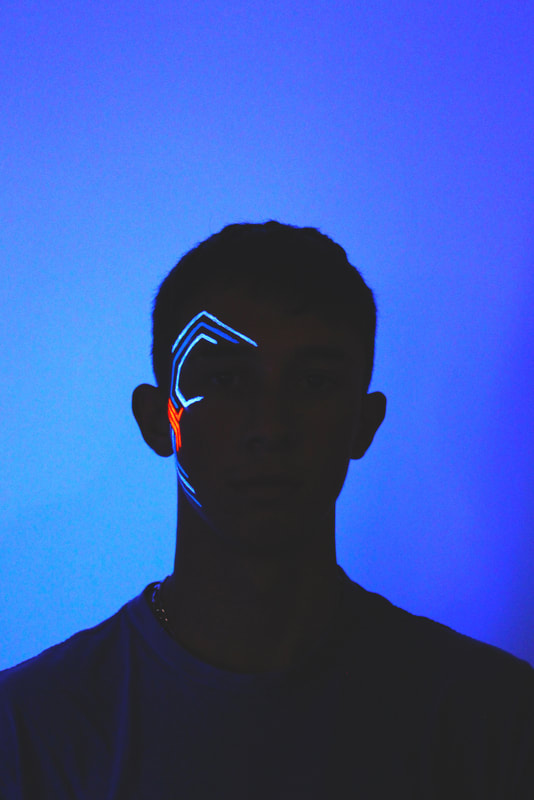
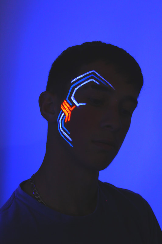
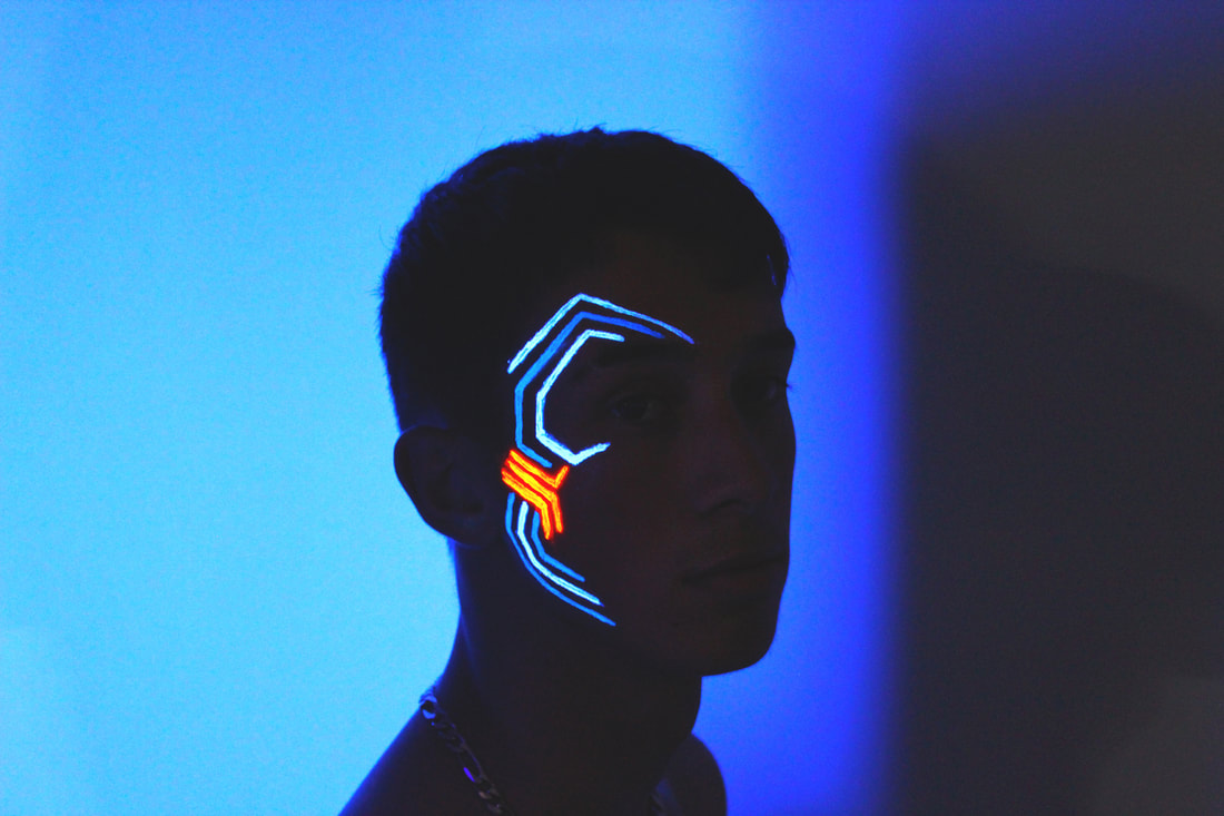
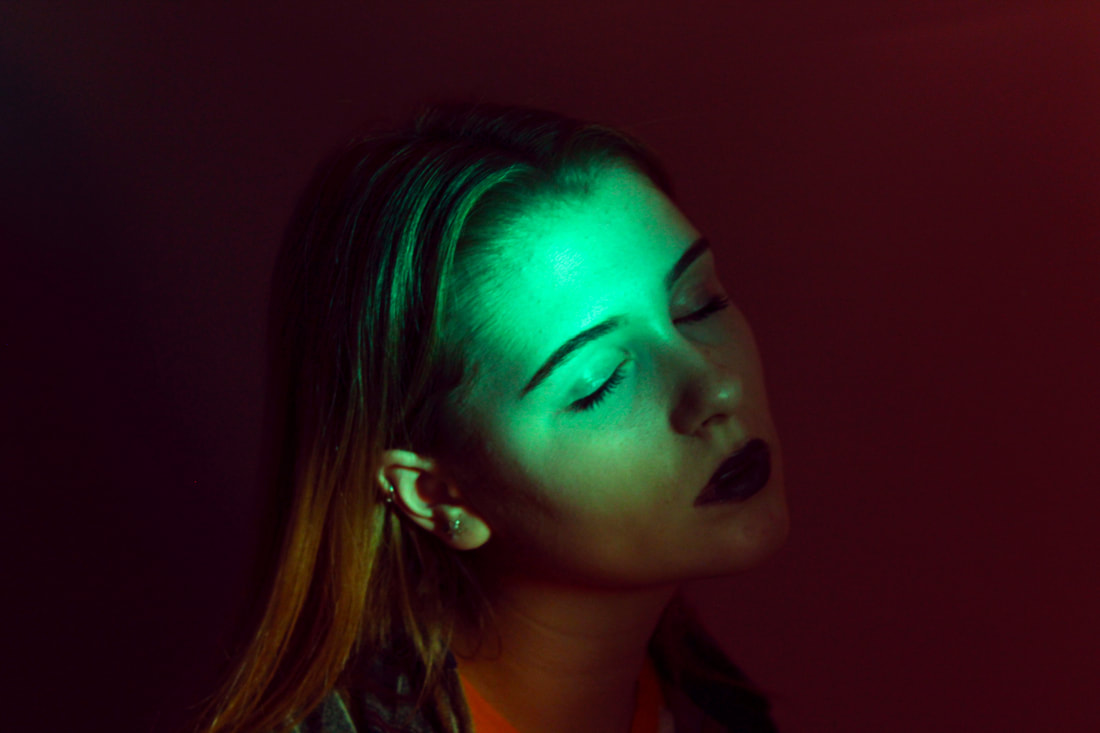
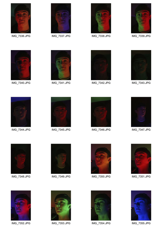
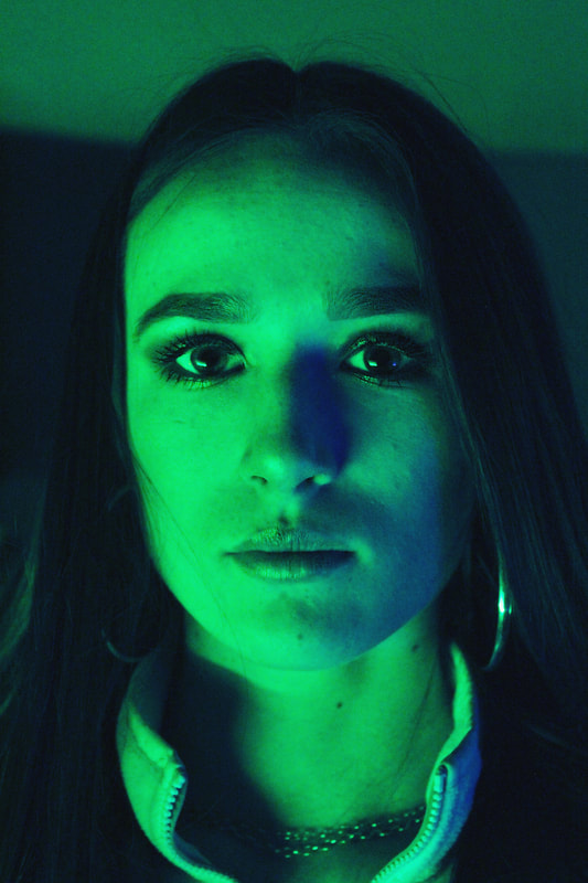
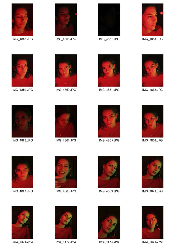
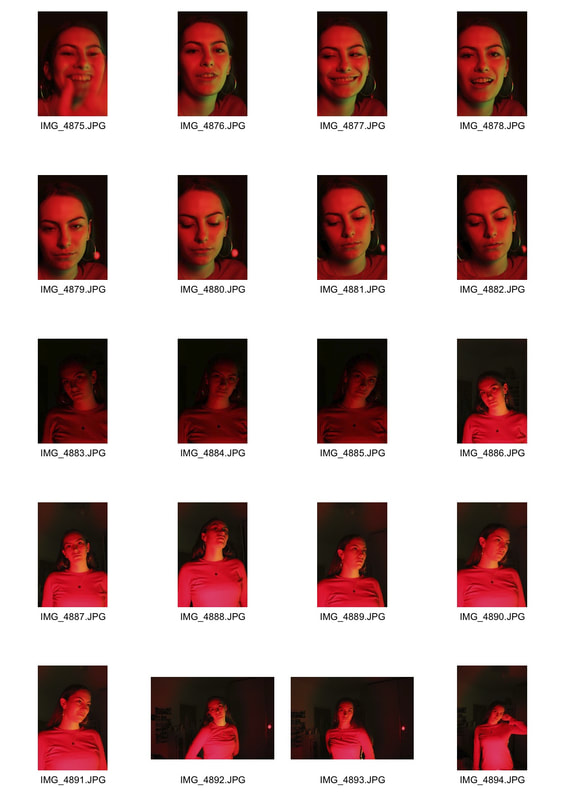
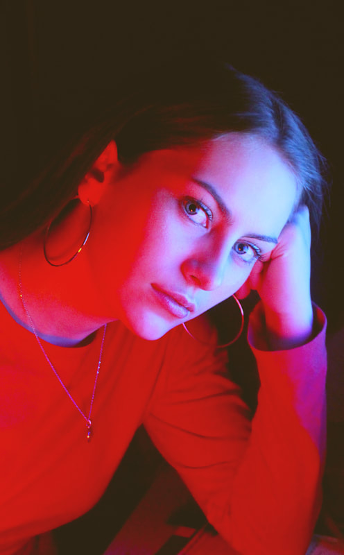
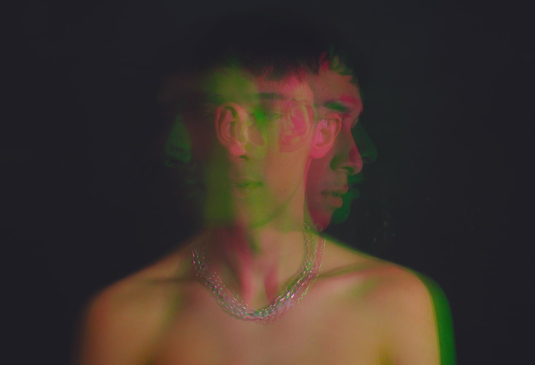
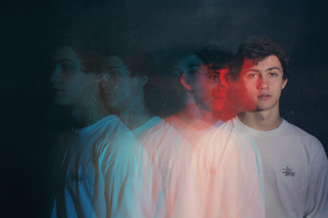
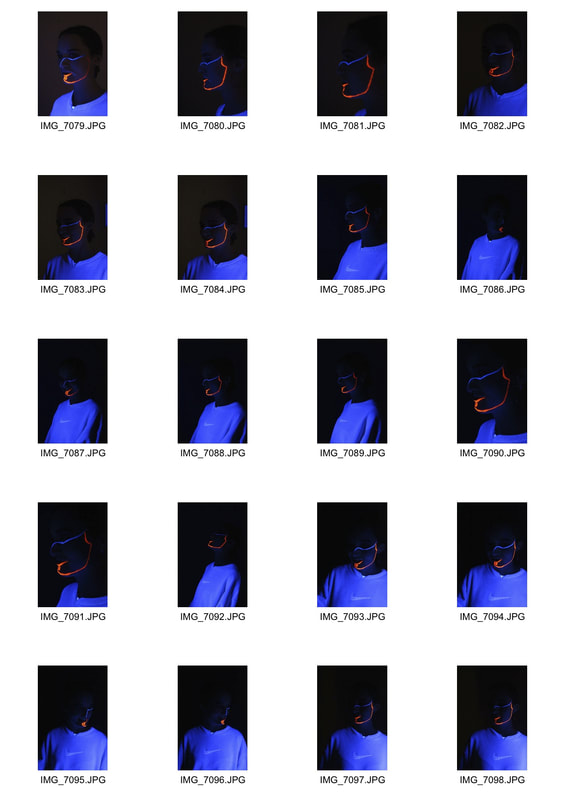
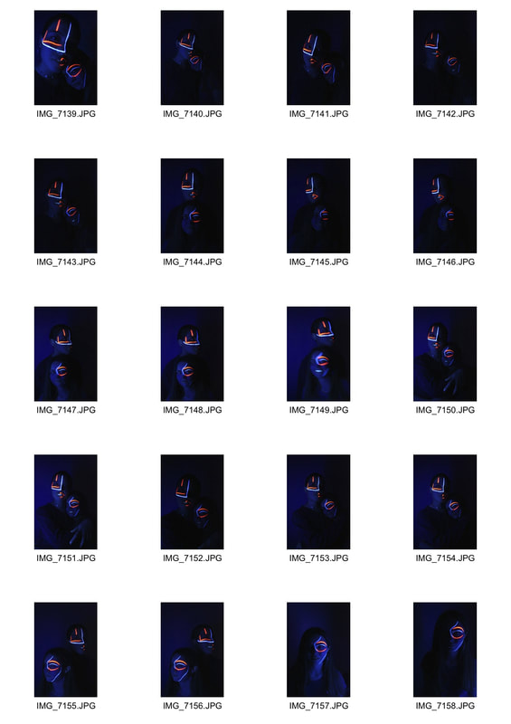
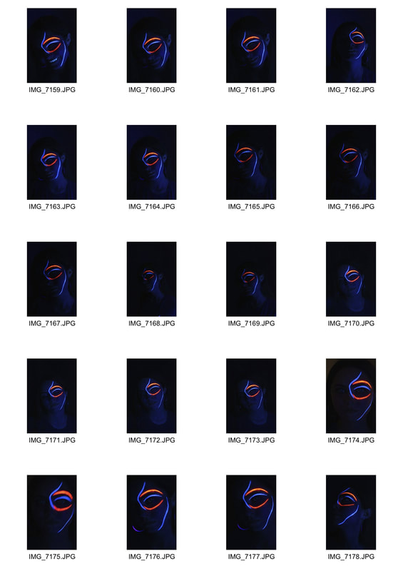
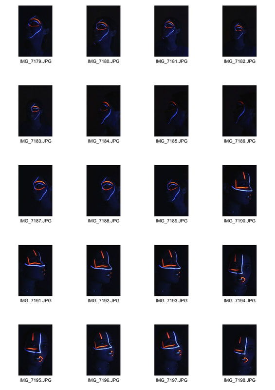
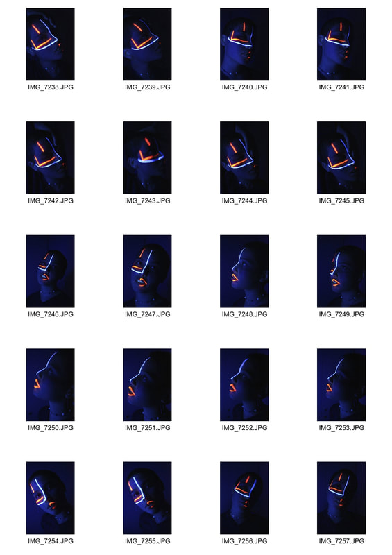
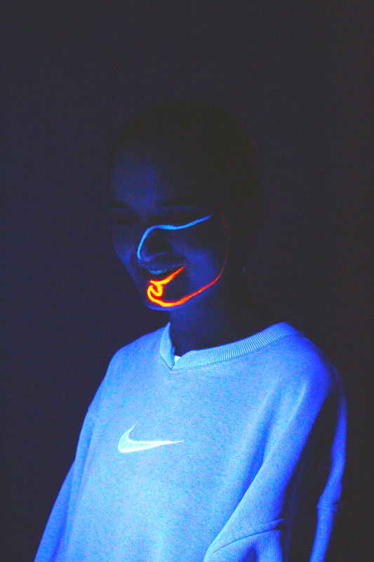
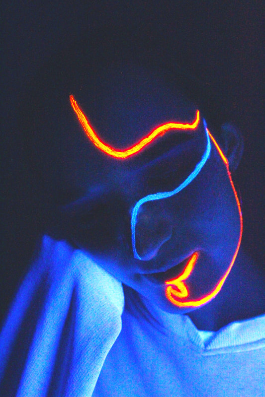
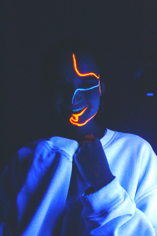
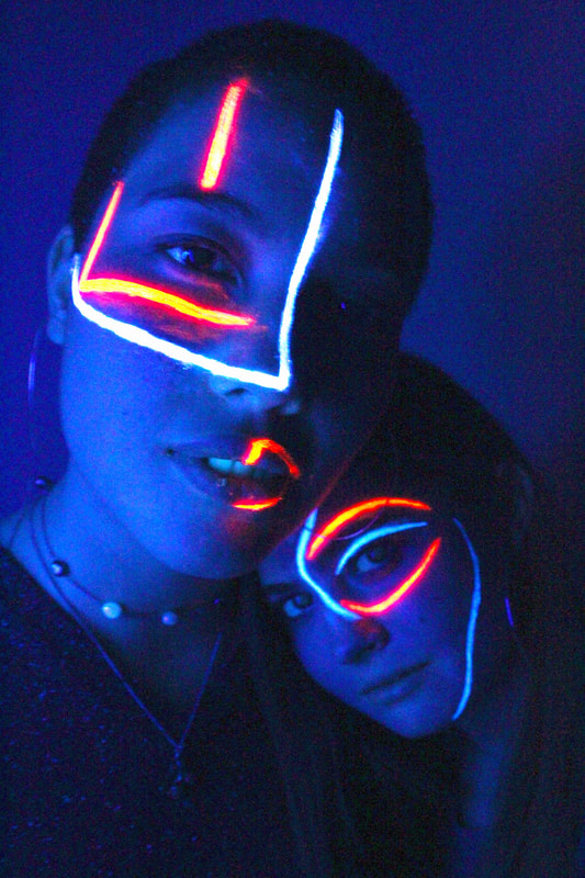
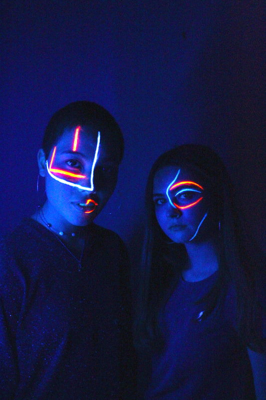
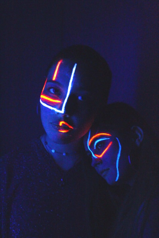
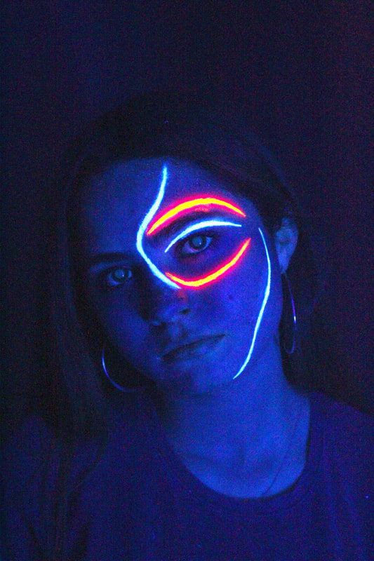
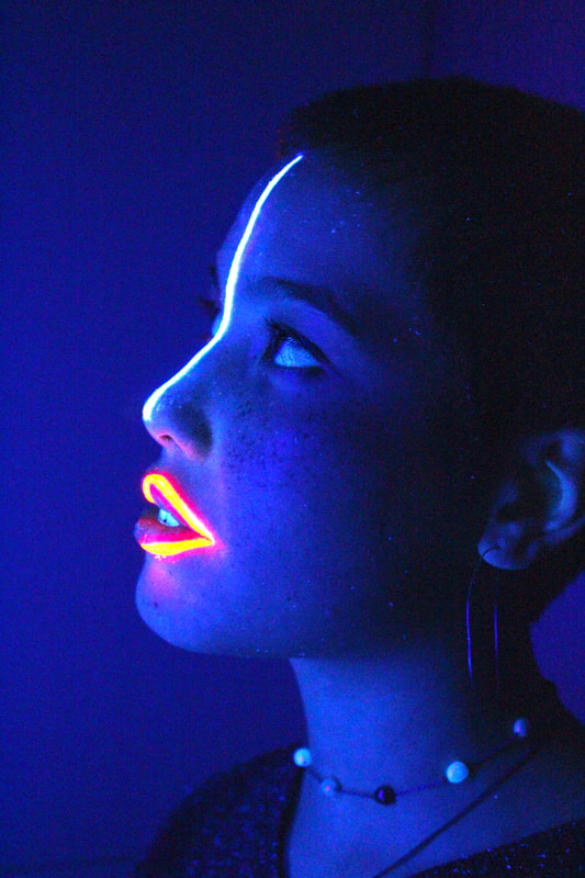
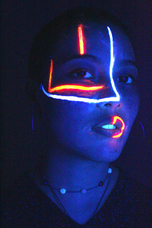
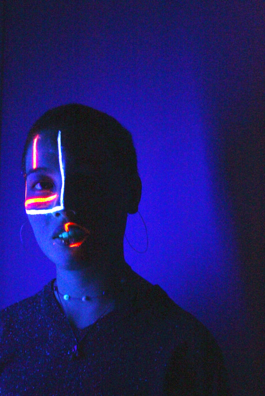
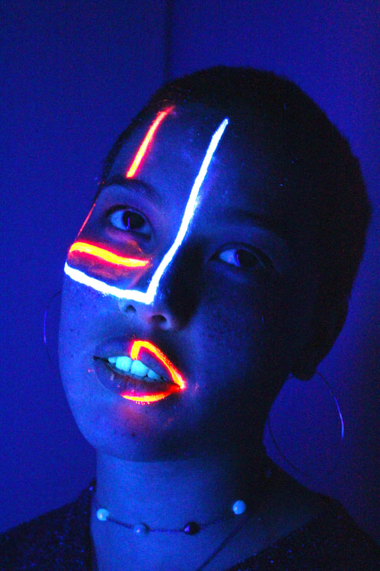
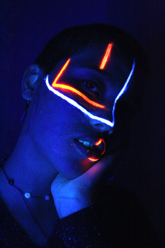
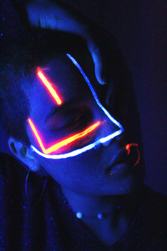
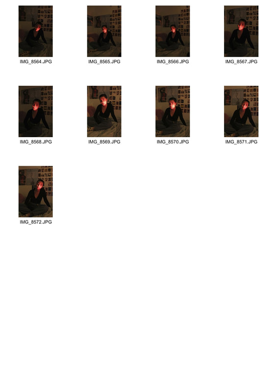
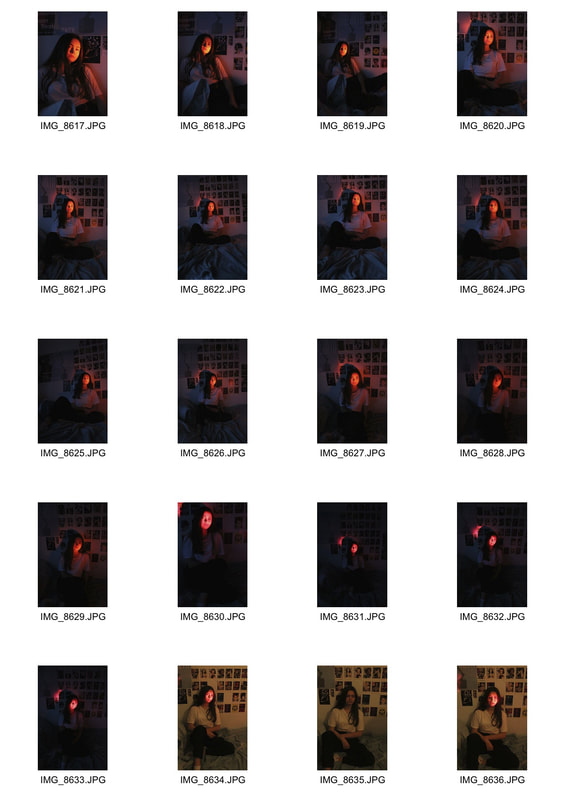
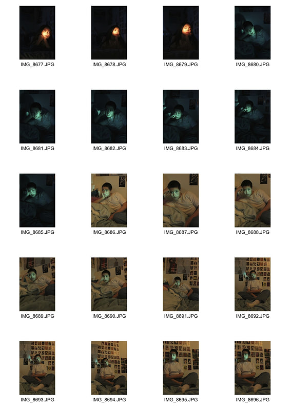
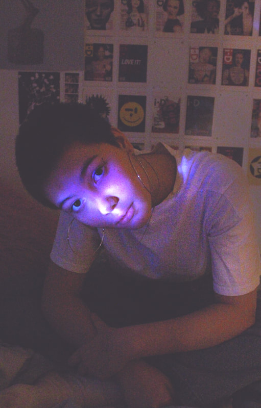
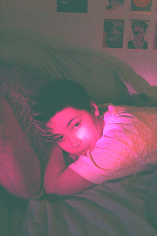
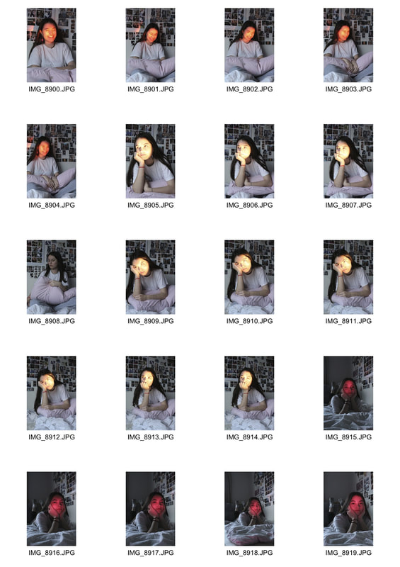
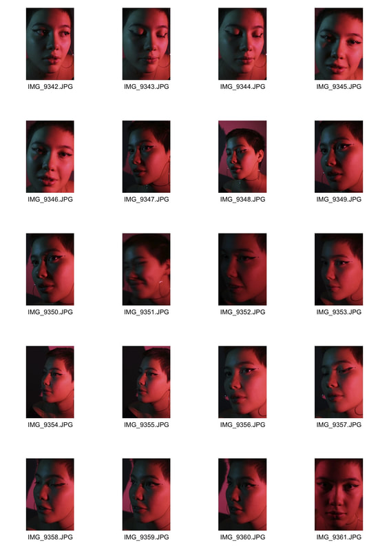
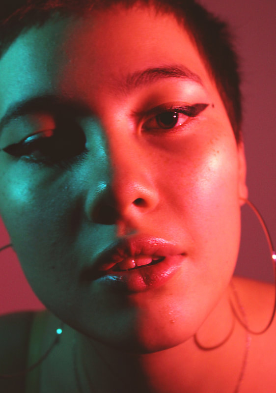
Inspired by the neon photos of Slava Semenyuta I used ultraviolet body paint with a UV light to recreate the 'cosmic' look of his photos. These photos link to the theme of structure because I used the paint to highlight and frame the models face so that even though in some photos he is almost a silhouette, the painted lines imply where his features are, also linking to my theme of structure in colour because I used orange and blue, complementary colours. I used a Slava Semenyuta photo as an inspiration for the pattern painted on the model's face, I used thin straight lines that contoured the shape of his face. I chose to shoot close portraits so that the focus was on the paint and I used a high ISO with a tripod so the colours were visible and sharp. These photos were successful and captured the desired effect, the unintentional blue background projected by the UV light only enhanced the vibrancy of the photos and the theme of colour.
I would like to explore further with uv lighting and facial painting and also the use of multiple colours in a portrait. I would also like to use the highlights and shadows of the face in future portraits.
I would like to explore further with uv lighting and facial painting and also the use of multiple colours in a portrait. I would also like to use the highlights and shadows of the face in future portraits.
|
|
|
|
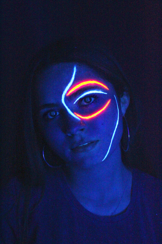
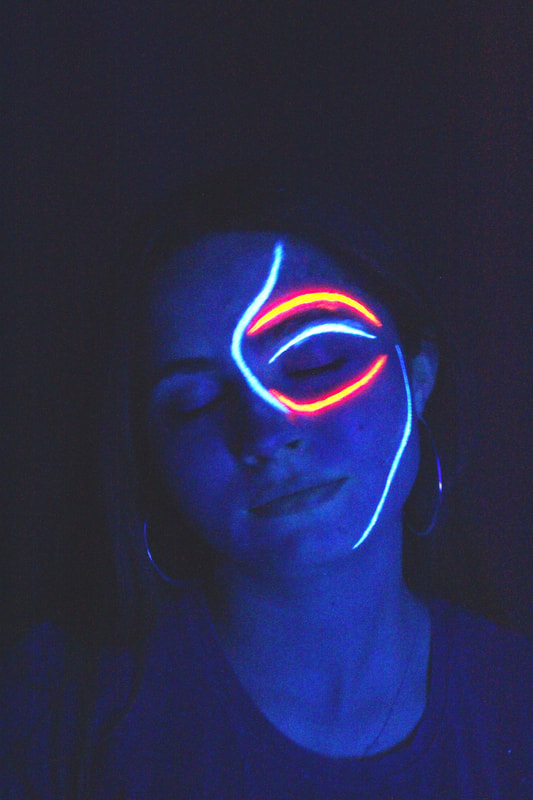
Edited photos
In photoshop i enhanced the vibrancy and saturation of the orange and blue and lowered the exposure of his face to emphasise the contrast.
|
|
|
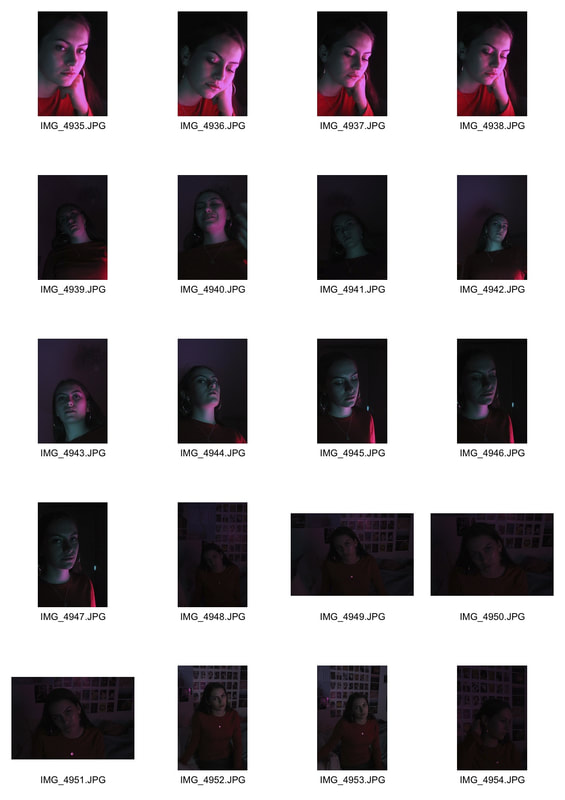
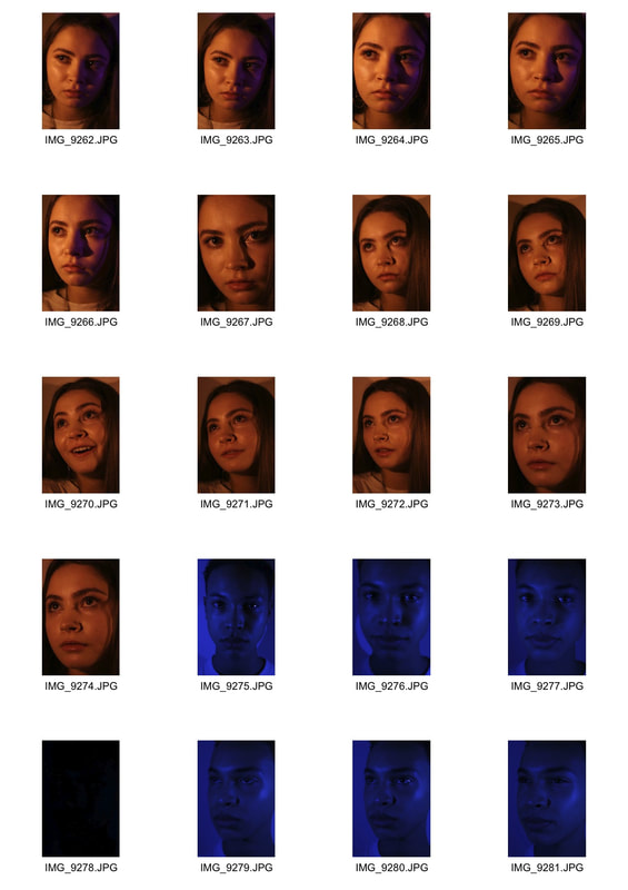
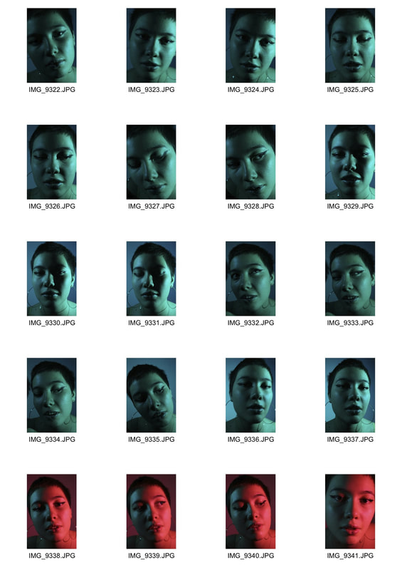
Strand development 2:
coloured lighting
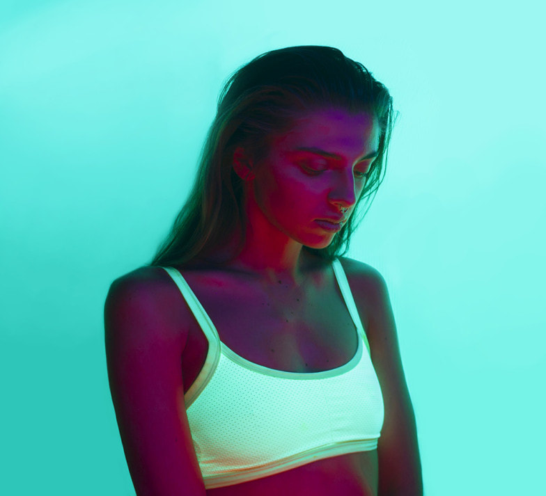
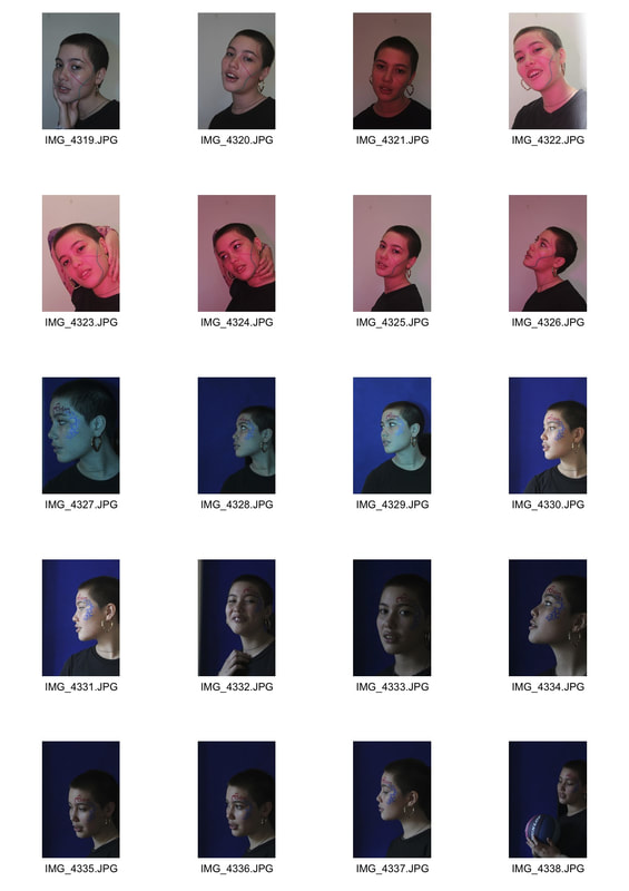
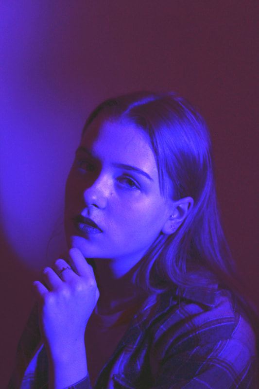
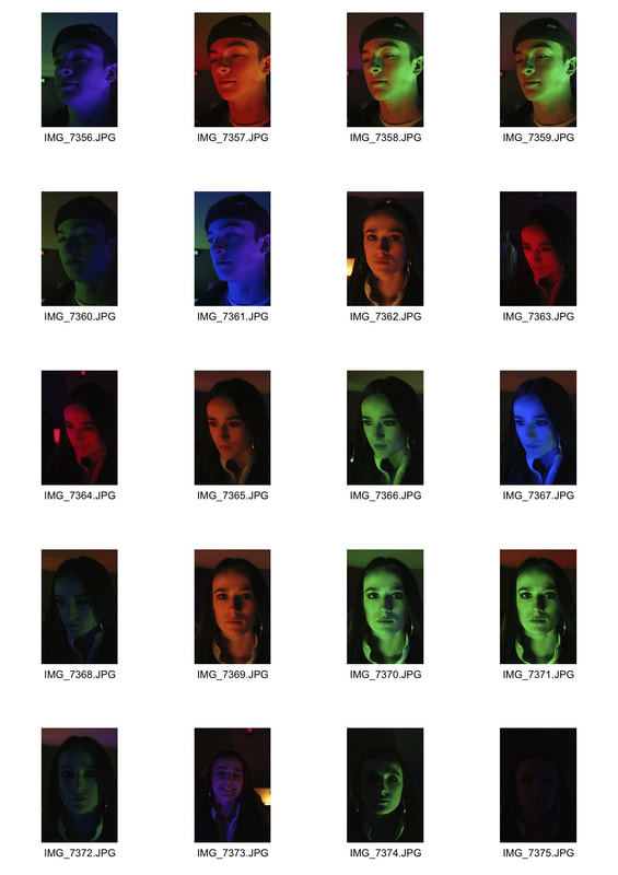
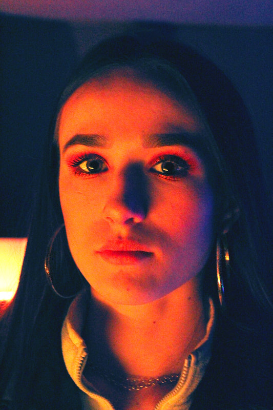
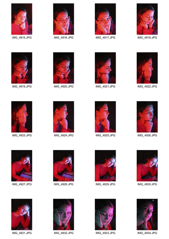
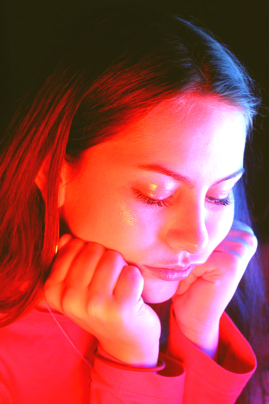
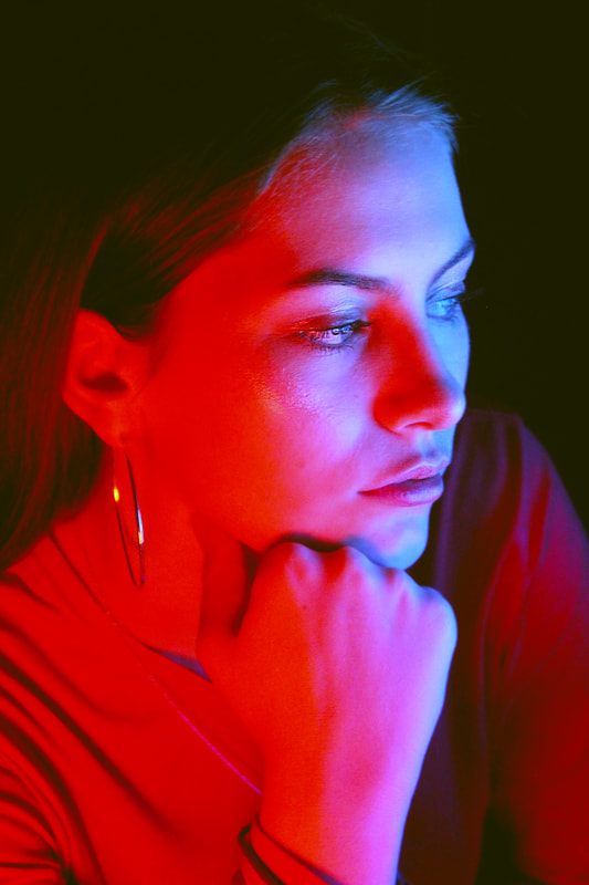
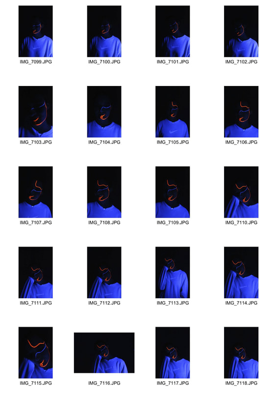
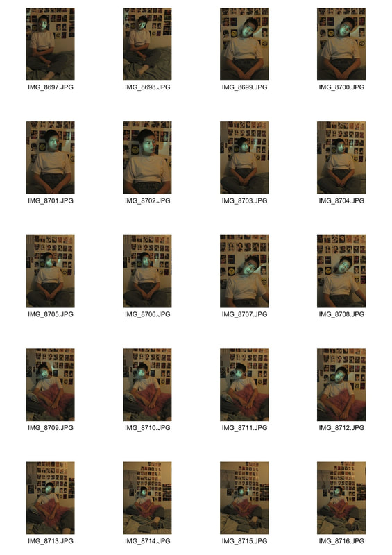
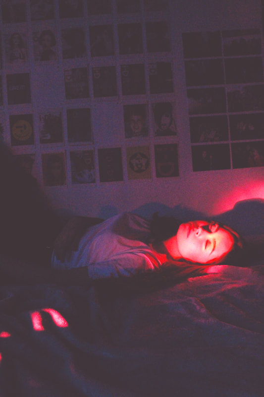
As a further development of Semenyuta's work I tried using different coloured acetates over the studio lights to achieve different coloured highlights and shadows of the portraits. This links to the theme of structure in colour as I used pairs of complimentary colours in the highlights and shadows which structure the face. I wanted to explore the juxtaposition of two contrasting colours to create a combination that interests the eye.
I chose to shoot portraits where I focused on shadows of the face and tried to include her hands to add more surface area for the coloured lighting.
It was very difficult to achieve two colours simultaneously with the lighting so I edited the pictures on photoshop to achieve the desired look, I would like to develop this idea with two different coloured lights from different angles to create a strong contrast and a more explicitly delivered concept.
Edited Photos |
|
|
As mentioned, I edited the colouring of the photos in photoshop to enhance the colours and add a second colour. I tried to use pairs of complimentary colours but this was more difficult with colours such as cyan where the photos were overexposed. I would like to develop the use of coloured lights further in order to achieve a more effective contrast.
|
|
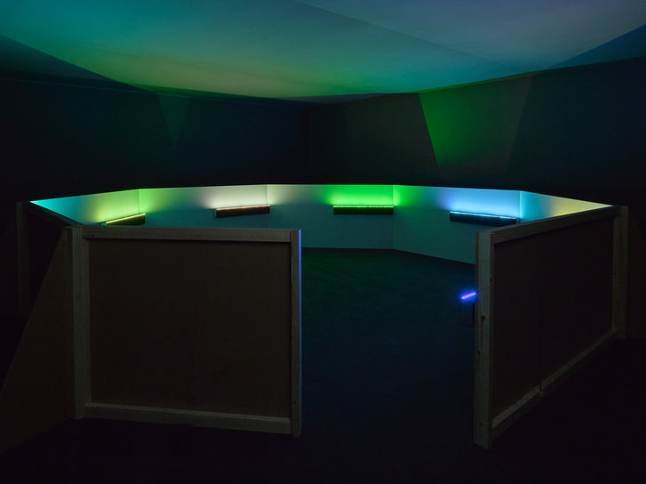
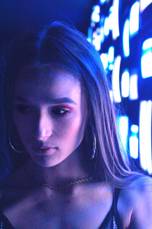
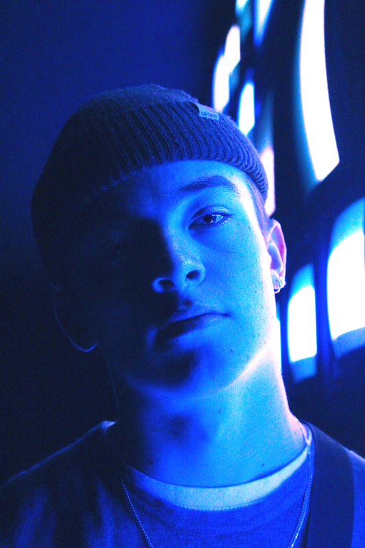
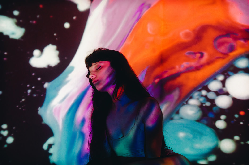
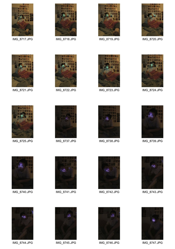
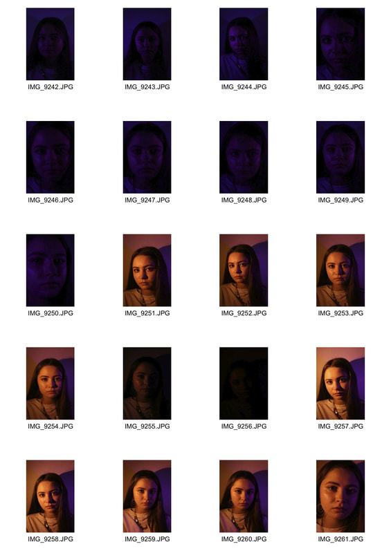
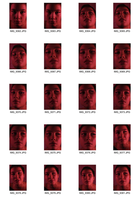
Strand development 3 :
Multi coloured lighting
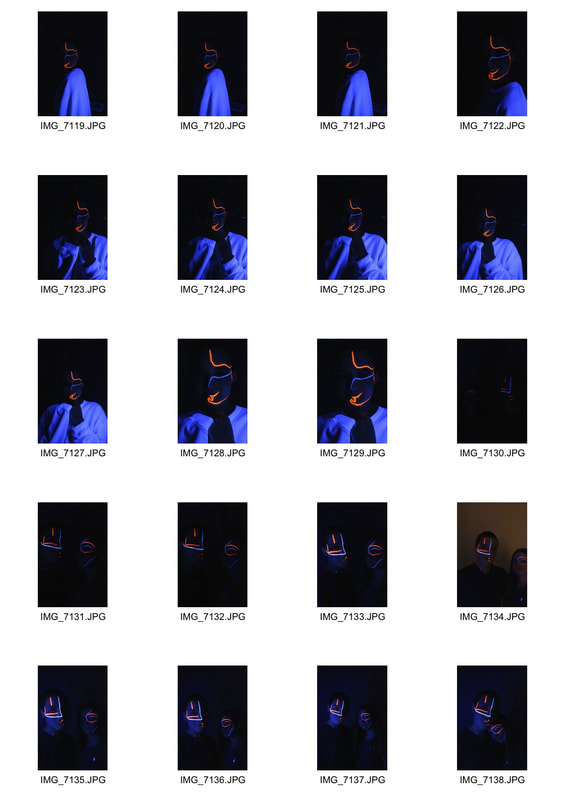
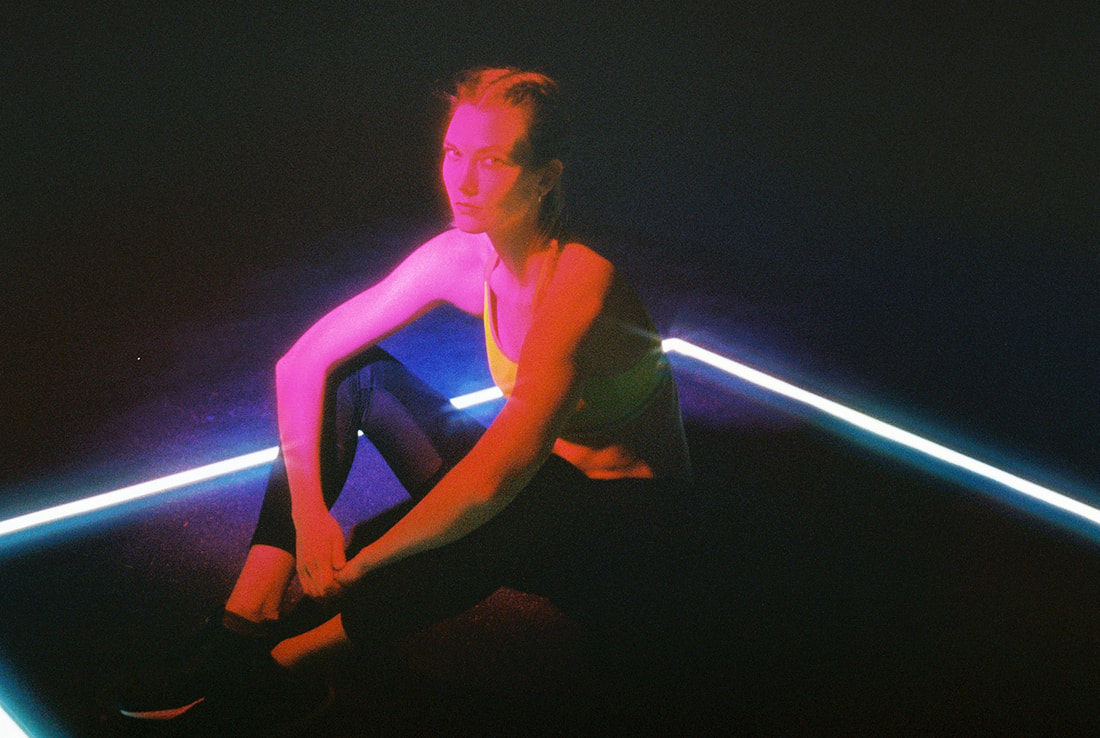
I visited the exhibition 'Everything at Once' at the Strand as it had multiple displays using coloured lights and projections. I wanted multiple coloured lights in the photos that would emphasise the shadows and highlights of the face and looked to achieve distinct pairs of complementary colours. In one exhibit, 'A Chamber for Horowitz' by Haroon Mirza, the lights were very effective and bright, changing at a rapid pace so that I managed to capture the same photo with different colour schemes. I chose to take a range of portraits with lighting on both sides to create shadows and highlights. I used a high ISO as there was low lighting, this picked up the colours effectively but also made the pictures very noisy and not very clear. In future developments I'd like to look at more controlled lighting but with a similar effect.
|
|
|
|
|
|
Edited photos
|
|
|
|
|
|
|
|
|
|
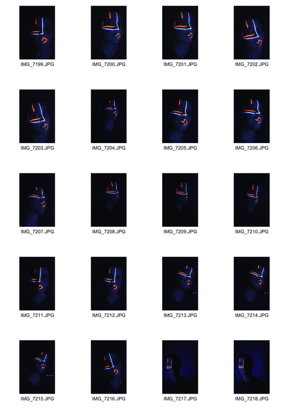
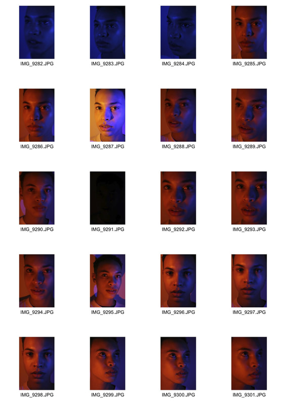
Strand development 4
Artist research- Petra Collins
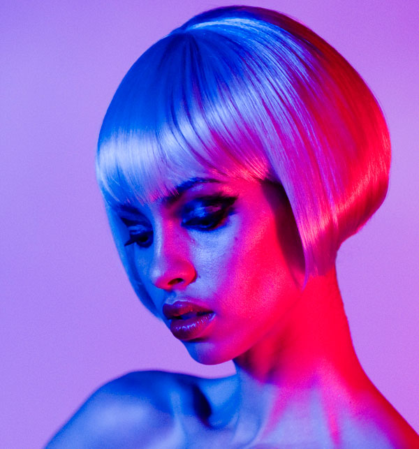
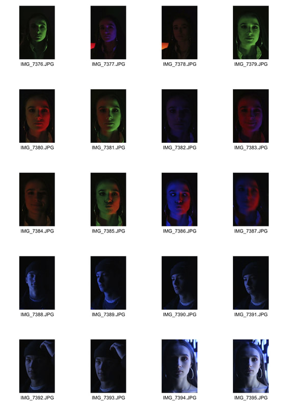
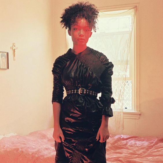
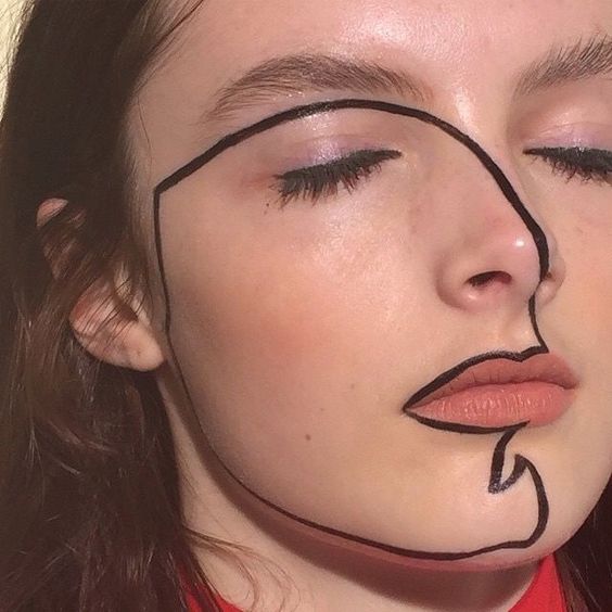
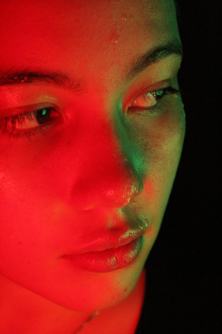
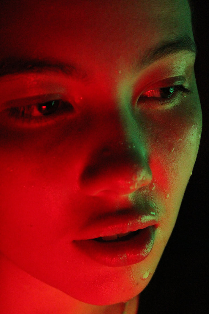
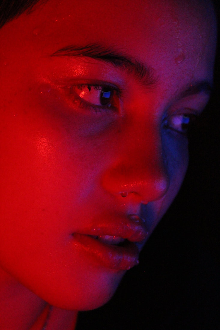
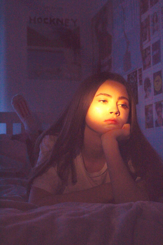
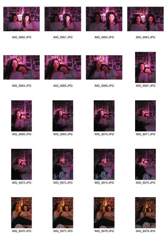
I looked at the work of artist and photographer Petra Collins whose work is renowned for its dream-like and ethereal quality. Colour and vibrancy is a fundamental aspect of most of her photos especially in the series '24 hour psycho' in which she uses two different colours from both sides to create the two toned effect I was looking to achieve. The highlights and shadows of the face being different and contrasting colours create an interesting visual experience and adds the same 'cosmic' atmosphere that Slava Semenyuta desired in his photos.
|
|
My Response
I decided to shoot a series of photos based on Petra Collins' two toned series '24 hour psycho', using pairs of complementary colours to link to my theme of structure in colour, emphasising the contrast of the structure of the face. I took a varied mix of very close portraits to focus solely on facial structure and intricate details, and wider shots creating a bedroom scene as done so by Petra Collins. I created the lighting using a desktop computer and tshirts over a lamp which created the perfect saturation of colour and level of lighting. I used a high ISO of 1600 as the lighting level was still low and an aperture of f.5 as I wanted the facial features to be sharp. My images express my intentions very well which was to develop the concept of multi coloured lighting and carry a strong influence from the photographer throughout. I prefer the close portraits as they show, more explicitly, the contrasting lighting and have a more dramatic effect. After using coloured lighting I would like to experiment more with multiple colours in portraits.
|
|
|
Edited Photos
On photoshop I increased the exposure to resemble the style of Petra Collins' photos and enhanced the saturation of the colours as well as adjusting the colour levels of the photos to make the pairs of colours more explicit .
orange and blue
red and green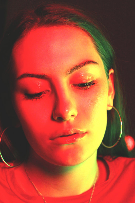
|
magenta and cyan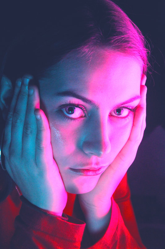
|
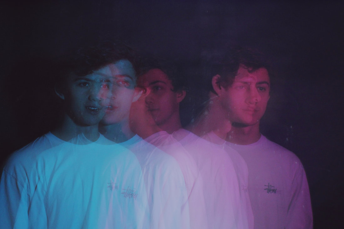
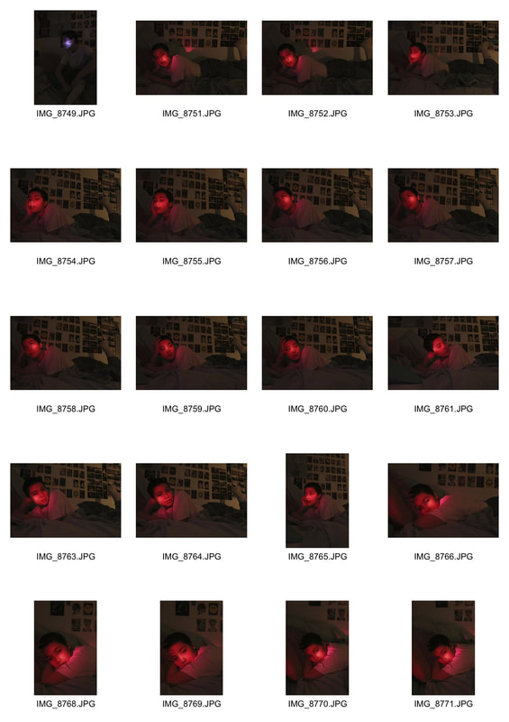
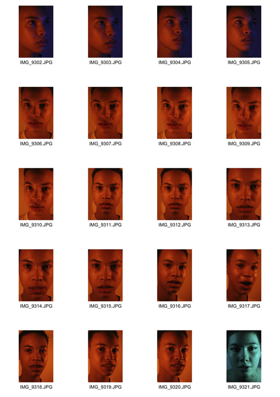
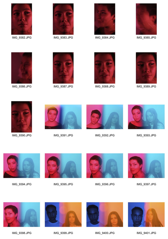
Strand development 5:
strobe/multi exposure
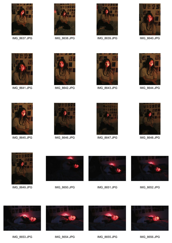
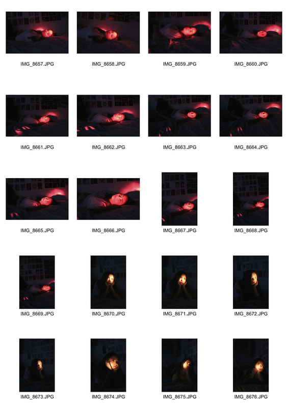
To further develop the effect of multiple colours in a portrait, I decided to use the strobe light and the bulb setting on the camera which captured multiple movements of the figure in one frame. By alternating the colour over the strobe while taking the photo, I was able to create different coloured versions of the same person. This links to my theme of structure in colour as I used pairs of complementary colours in each picture. I had to experiment with the materials put over the lights to achieve a saturated colour, I started by using coloured acetate, some of which did not show up on the camera, I also used translucent folders to achieve a stronger colour. I also experimented with the speed of the strobe light to achieve a sharp image without too many exposures. I also varied the movement in the photos, I started by asking the subjects to turn their heads, but I moved onto asking the subject to move around the frame so that I differentiate the different colours easily and create a more interesting image. I also chose to leave a flash of just white light in the middle of the exposure so that one of the captured figures was more prominent and brighter to create a focal point. While taking the photos I used a tripod so that each frame was sharp.
|
|
|
Edited Photos
|
|
Strand development 6:
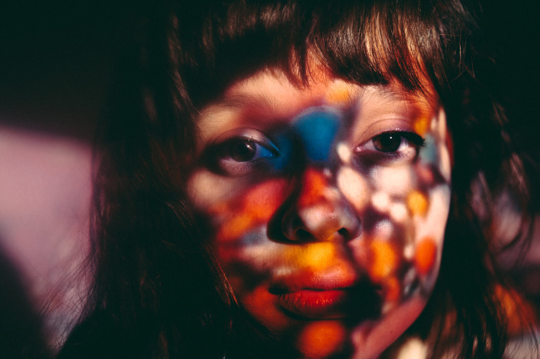
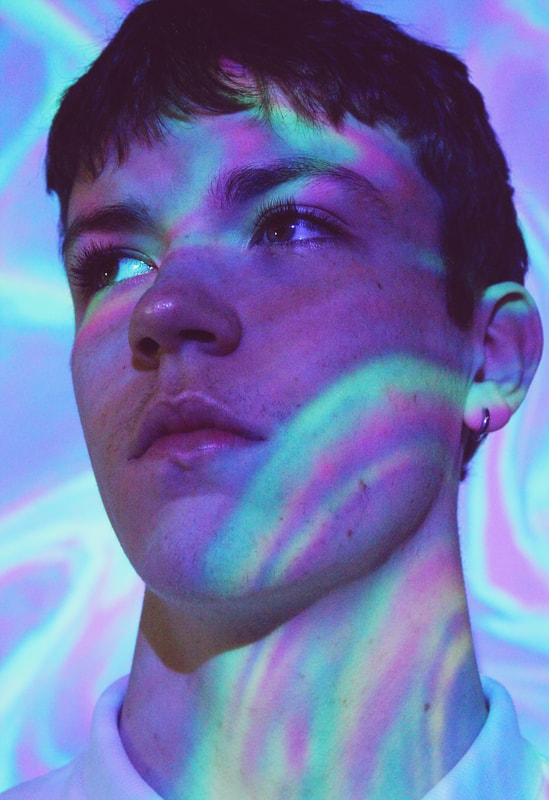
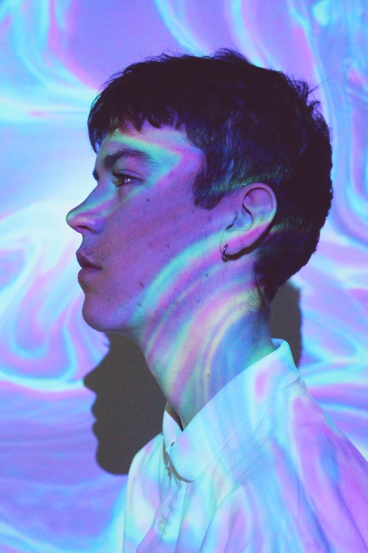
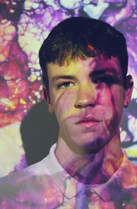
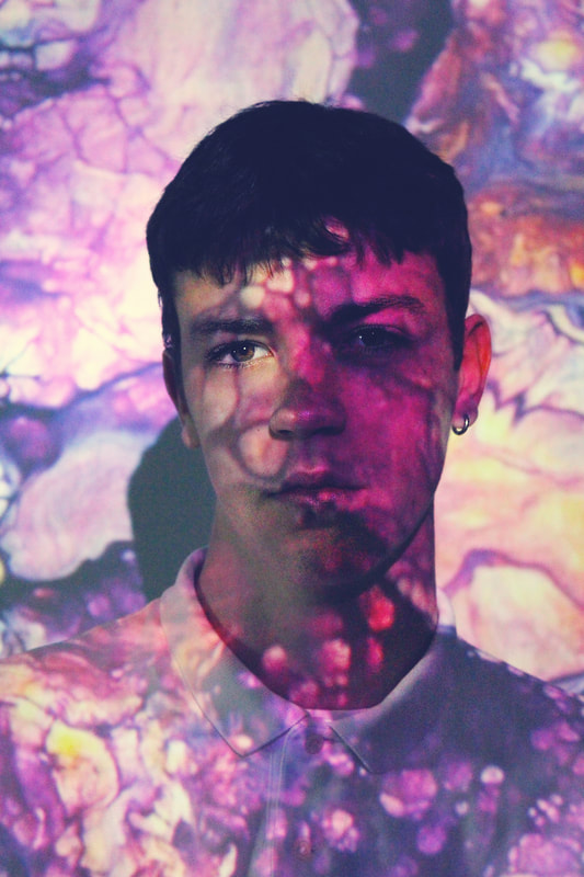
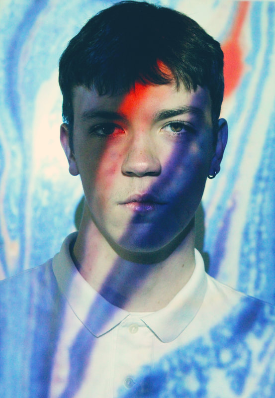
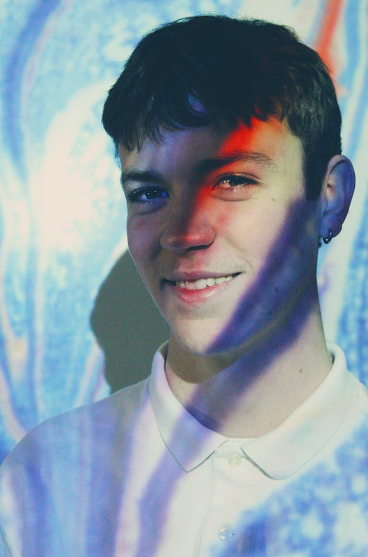
projection
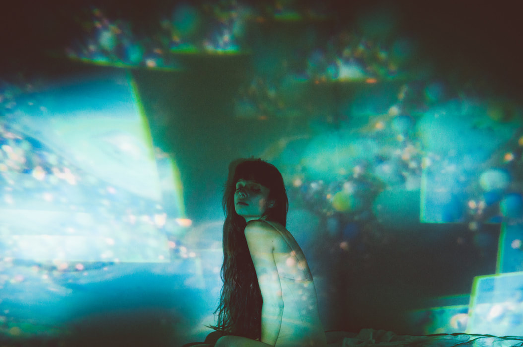
As a further experimentation of lighting a subject with colour, I looked at using projection over the subject and incorporating pairs of complementary colours in patters. I looked at the work of Dennis Auburn and his series 'aura' where he projects vibrant textures and images over the face of the subject. For my response, I used the school projector to take images of marbled colour, still maintaining pairs of complementary colours, and projected them onto my subject. I took a range of portraits at different distances but I decided the close up photos were most successful because it's easier to distinguish the face of the subject amongst the patterns. In future developments I would like to create patterns on the subjects faces.
Dennis Auburn
|
|
|
|
Response
|
|
|
Edited photos
On photoshop, I made the colours brighter and sharpened the features.
|
|
|
|
|
|
Strand development 7:
drawing on photos
In this development I experimented with painting on the photos as a different way of projecting colours onto the subject's face. I used images from pinterest to inspire the patterns painted onto the photo. Although this was effective, it made the portrait look flat in colour and lacking in tone. In future developments I would like to draw directly onto the subject's face to create a more dynamic image.
|
|
|
|
Strand development 8
drawing on faces
Pinterest ideasIn this development I decided to reuse my idea of UV photos with pinterest inspired photos that enhance the structure of the face. i used pairs of complementary colours but even though the photos were vibrant and effective, the colours were very exposed and it's difficult to differentiate them. I used a very high ISO in the low lighting and this created noise in the photos. In future developments I would like to further experiment with using multiple colours and look at the work of Petra Collins.
|
|
|
UV photos
|
|
|
|
|
|
|
|
Edited photos
|
|
|
|
|
|
|
|
|
|
|
|
|
|
|
Strand development 9:
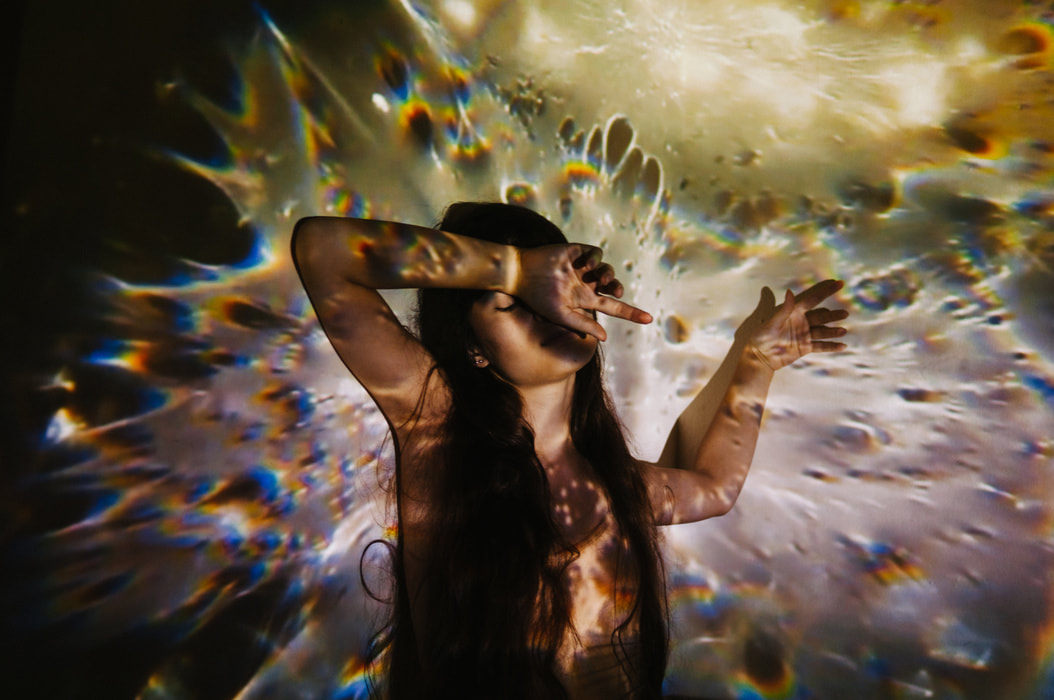
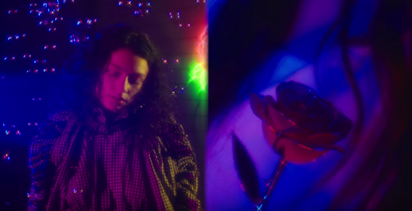
bubbles/light reflection
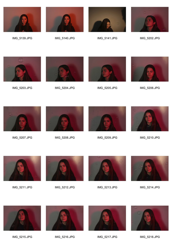
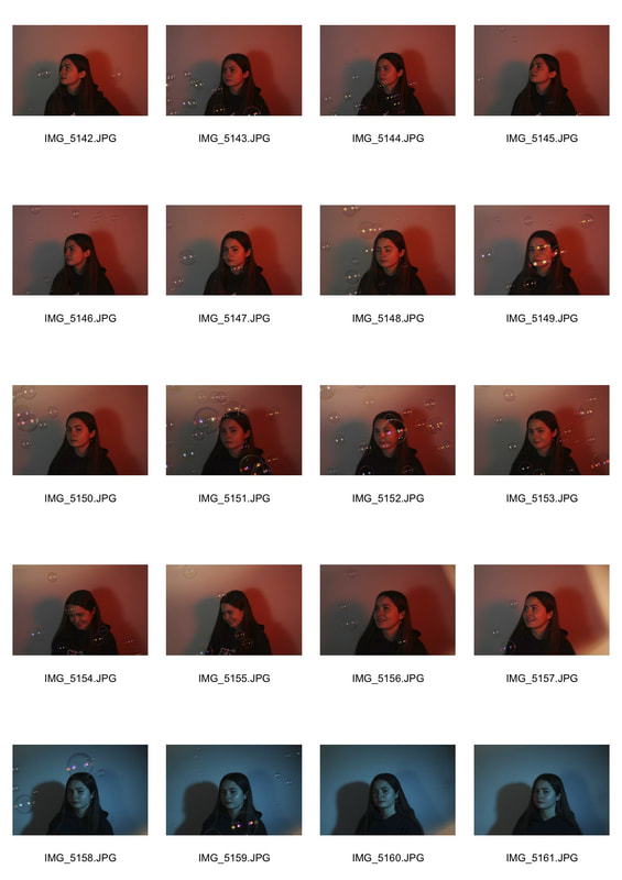
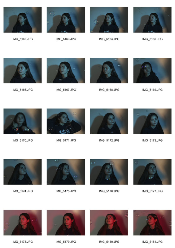
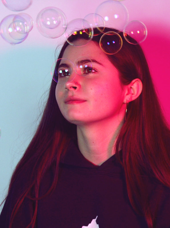
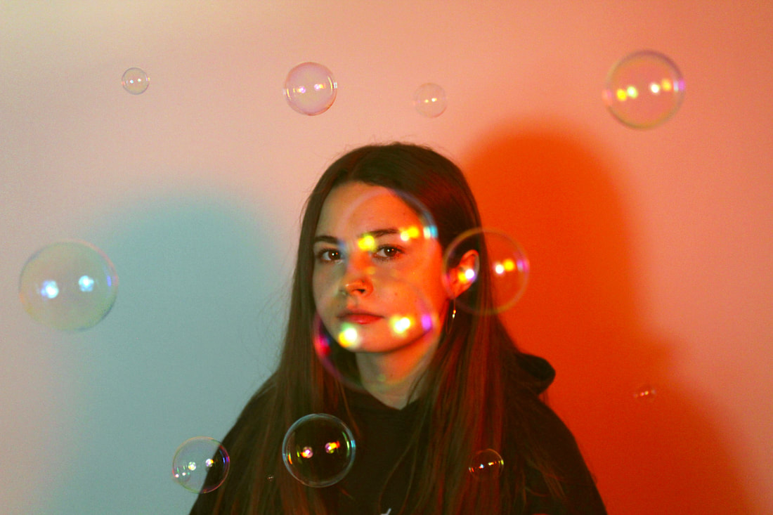
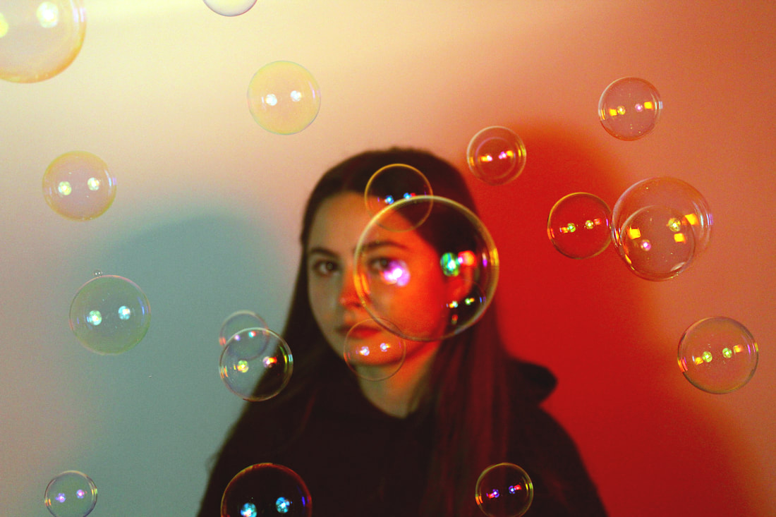
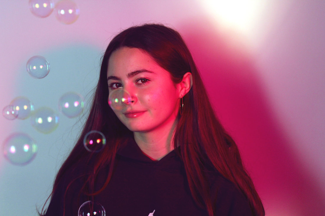
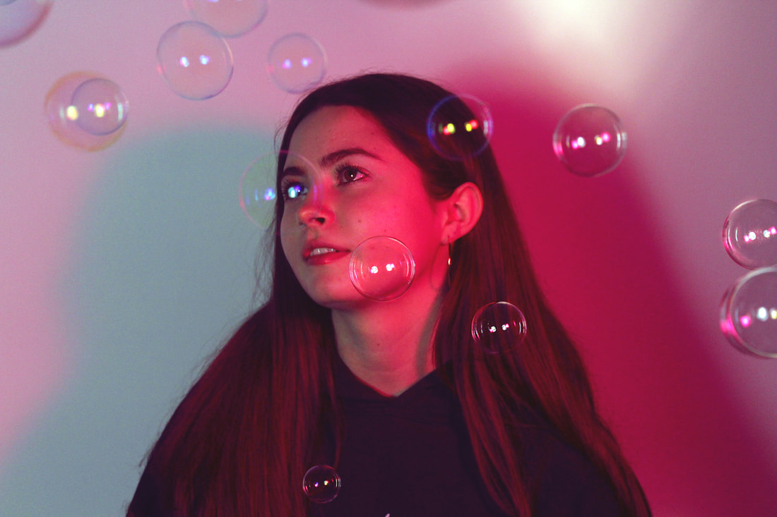
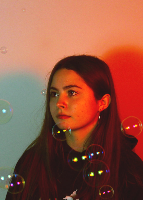
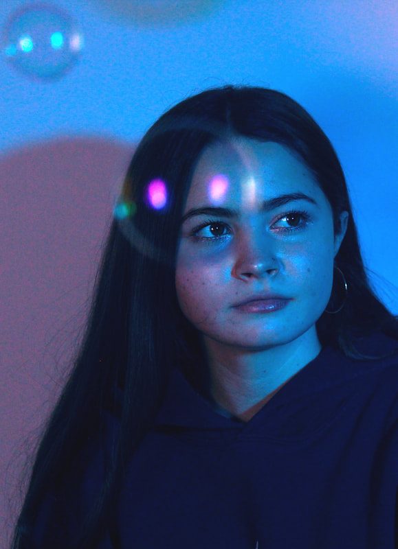
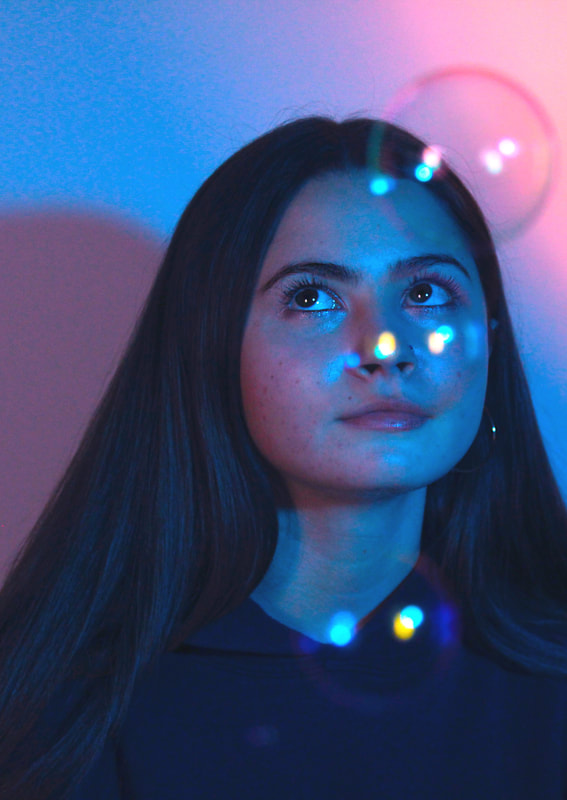
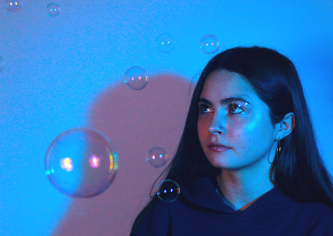
I decided to further develop the idea of multiple colours in a frame by looking at ways of reflecting different colours. In a campaign made by Petra Collins for the clothing company Nordstrom, she uses shots of coloured lights and bubbles, this stood out to me as the different colours were reflected. I decided to shoot a series of portraits with coloured lighting and bubbles so that multiple colours were included in the photo. I used coloured acetate over the studio lights to create the different lighting. I was very happy with the way these photos turned out, I used a tripod to achieve a sharp image and used an ISO of 800 to achieve a bright colourful image. In future developments I would like to look at different photographers an how they use colour.
Nordstrom Spring 2017 campaign by Petra Collins
|
|
|
Edited Photos
|
|
|
|
Strand development 10 :
coloured locations
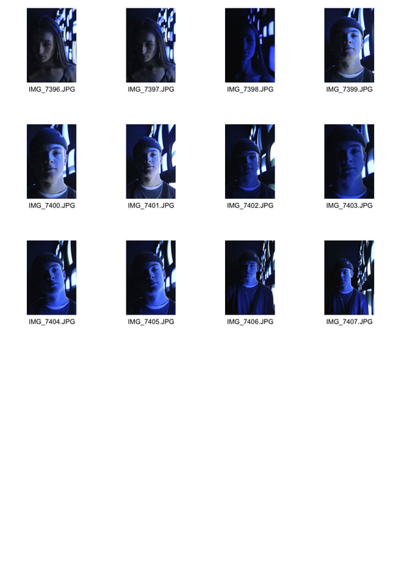
In this development I looked at the photographer Quentin Shih and his use of colour in photos, using coloured locations.
|
|
|
|
|
|
|
|
|
|
|
|
|
|
|
|
|
|
|
|
|
Strand development 11:
close portraits/ details
petra collins
|
|
Response
|
|
|
Edited photos
|
|
|
|
|
|
|
Strand development 12:
close portraits further
Petra Collins series, 24 hour psycho
|
|
Response
|
|
|
|
|
|
|
|
|
|
|
|
|
|
Response
Edited photos
Strand development 12:
Coloured Lens
|
|
|
Edited photos
Strand Development 13:
Coloured Spotlight
Quentin Shih
|
|
Petra Collins
|
|
|
|
|
Response
|
|
|
|
|
|
|
|
Edited photos
|
|
|
|
|
|
Strand development 14:
coloured spotlight further
|
|
|
|
|
|
|
|
|
Edited photos
|
|
|
|
|
|
|
Strand development 15:
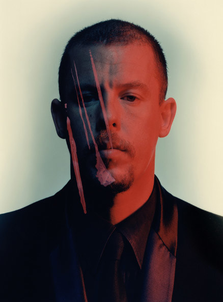
Nadav Kander
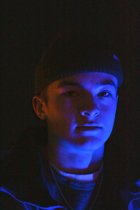
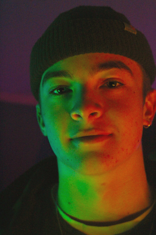
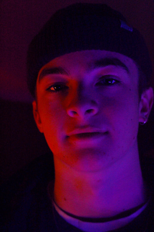
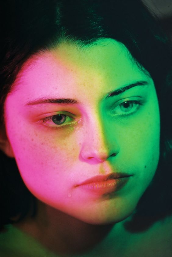
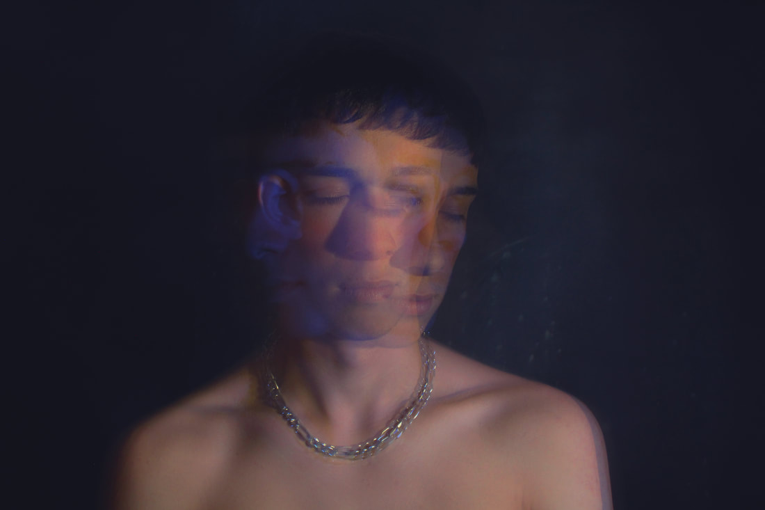
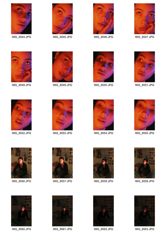
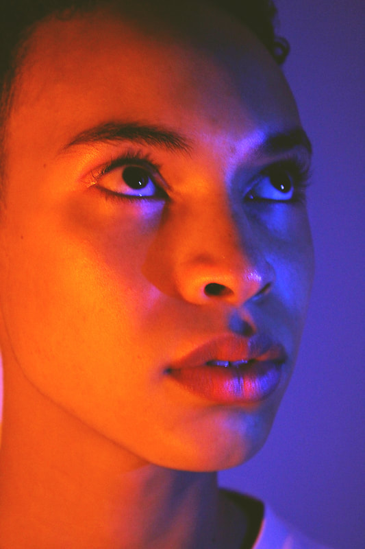
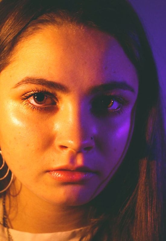
I looked at the photographer Nadav Kander as inspiration for my photography final piece. Kander is a London based photographer, artist and director who is renowned especially for his coloured lighting portraits. In many of his pieces, he uses two different coloured lights to enhance the highlights and shadows, similar to the work I've been looking at for the majority of my project. His portraits have an aesthetic value, focusing on angles, contrast and well-considered composition. I would like to create a series of close portraits inspired by Nadav Kander with pairs of complementary colours.
|
|
Artist and me
|
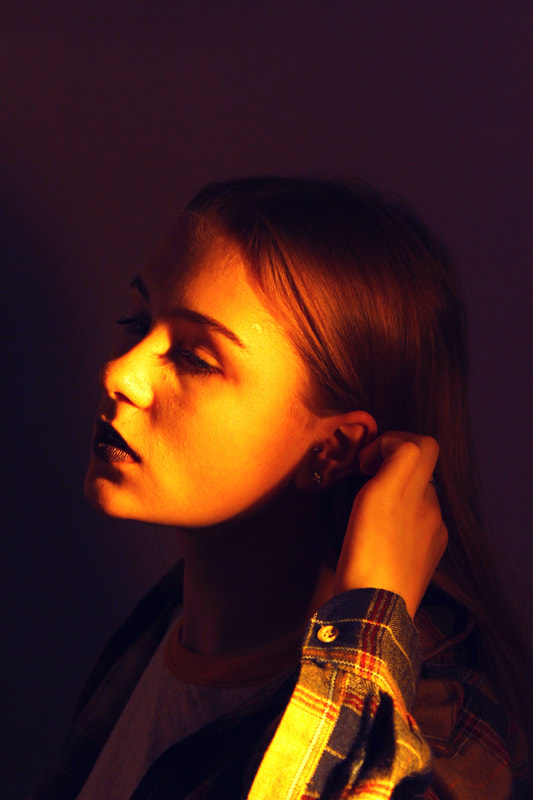
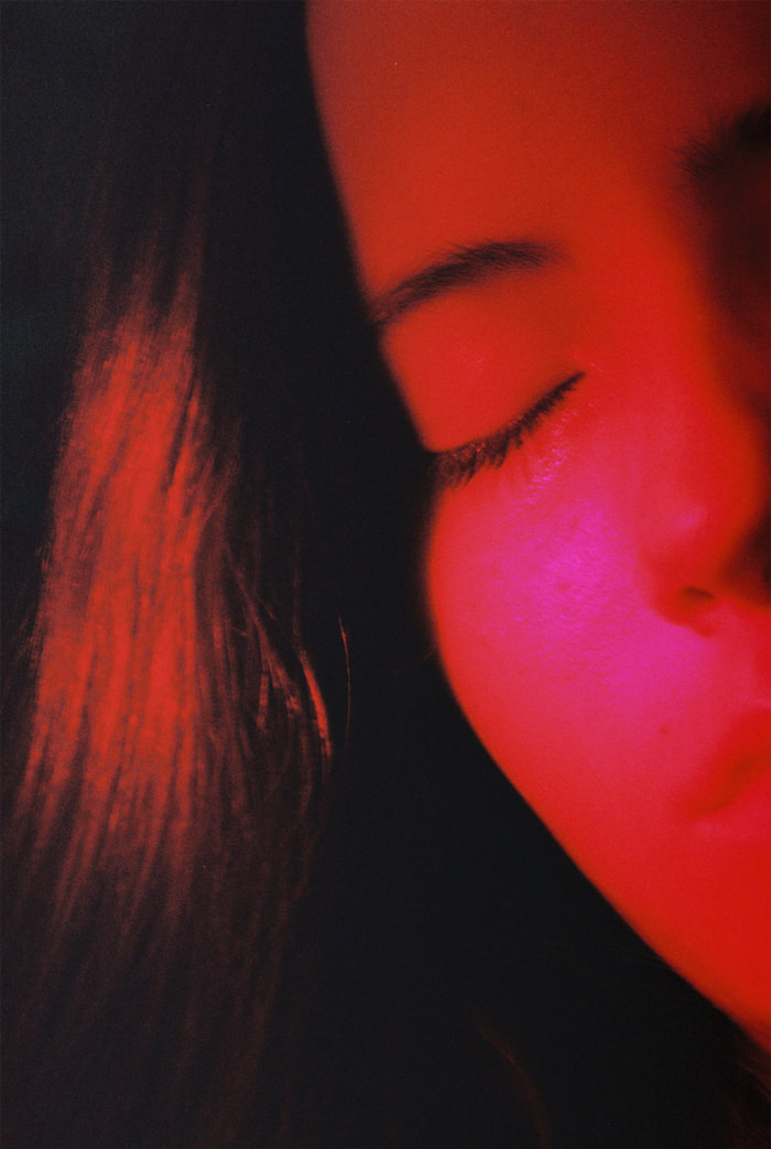
This photograph was taken by the photographer Nadav Kander of the rapper Stormzy for the MOBO awards. The series of photos taken maintained his usual style of coloure portraits using lightings and photoshop. Kander has lit the subject from both sides with the same colour to create solid areas of colour and to draw attention to the features of the face. The lighting also helps to create a symmetry in the photo.
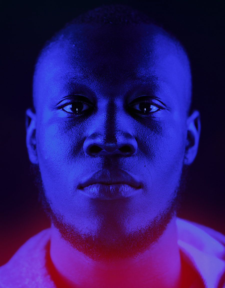
|
This is my photograph inspired by Nadav Kander. I lit the photo with two iphone torches behind blue acrylic to achieve the saturated colour in Kander's portrait. I used a plain background and clothing on my subject to prevent distraction from the face and emphasise the features more. On photoshop I enhanced the shine on the subject's face to resemble the photo of Stormzy and create more of a distinction between the highlights and shadows.
|
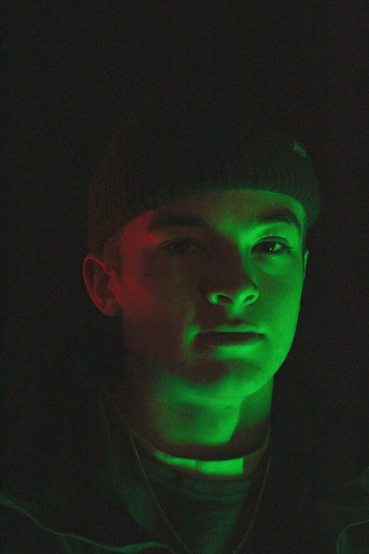
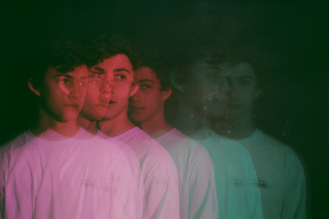
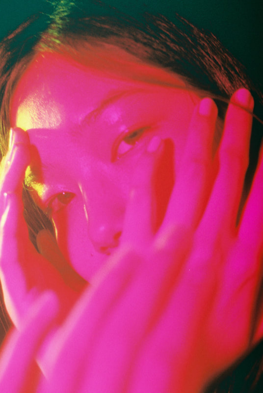
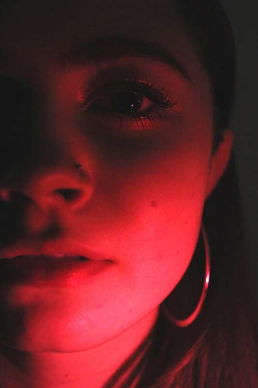
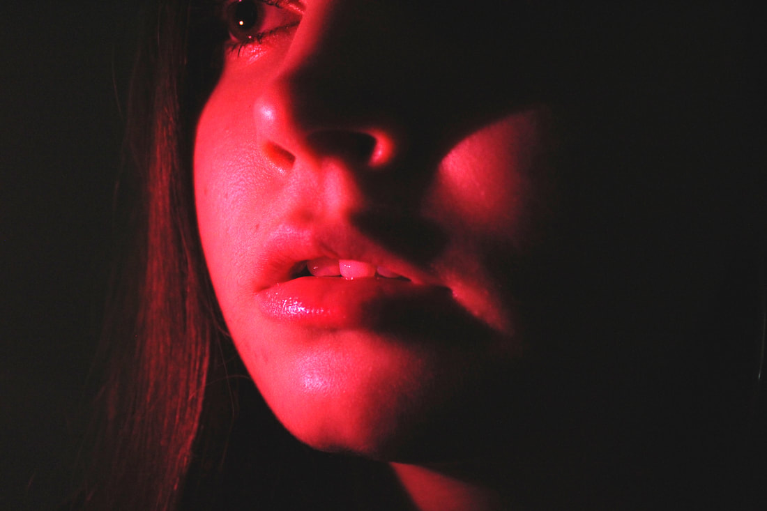
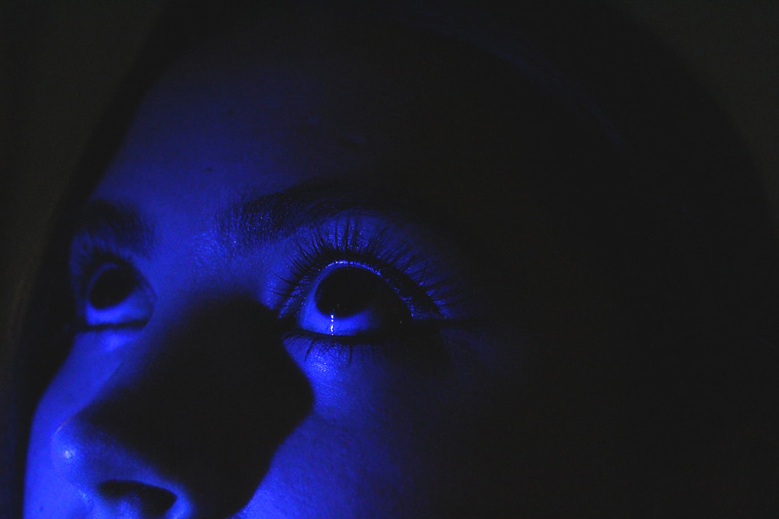
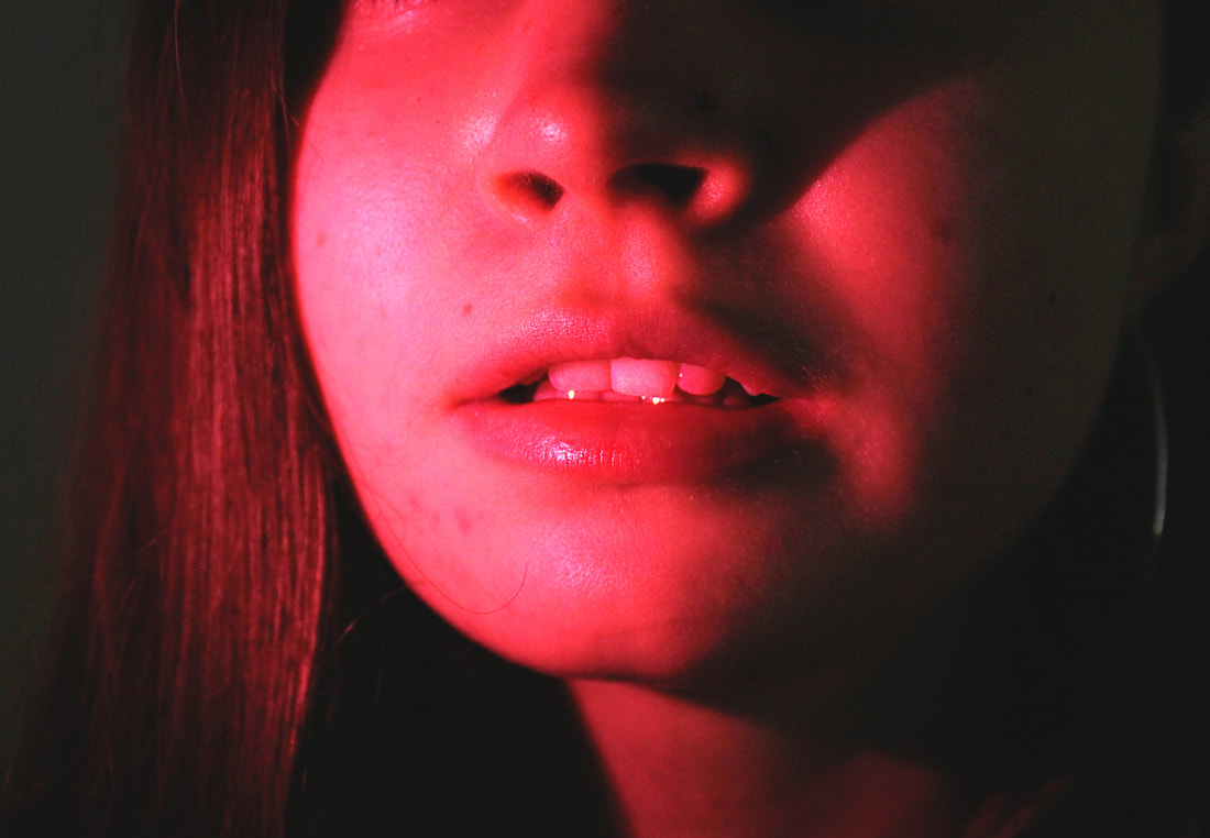
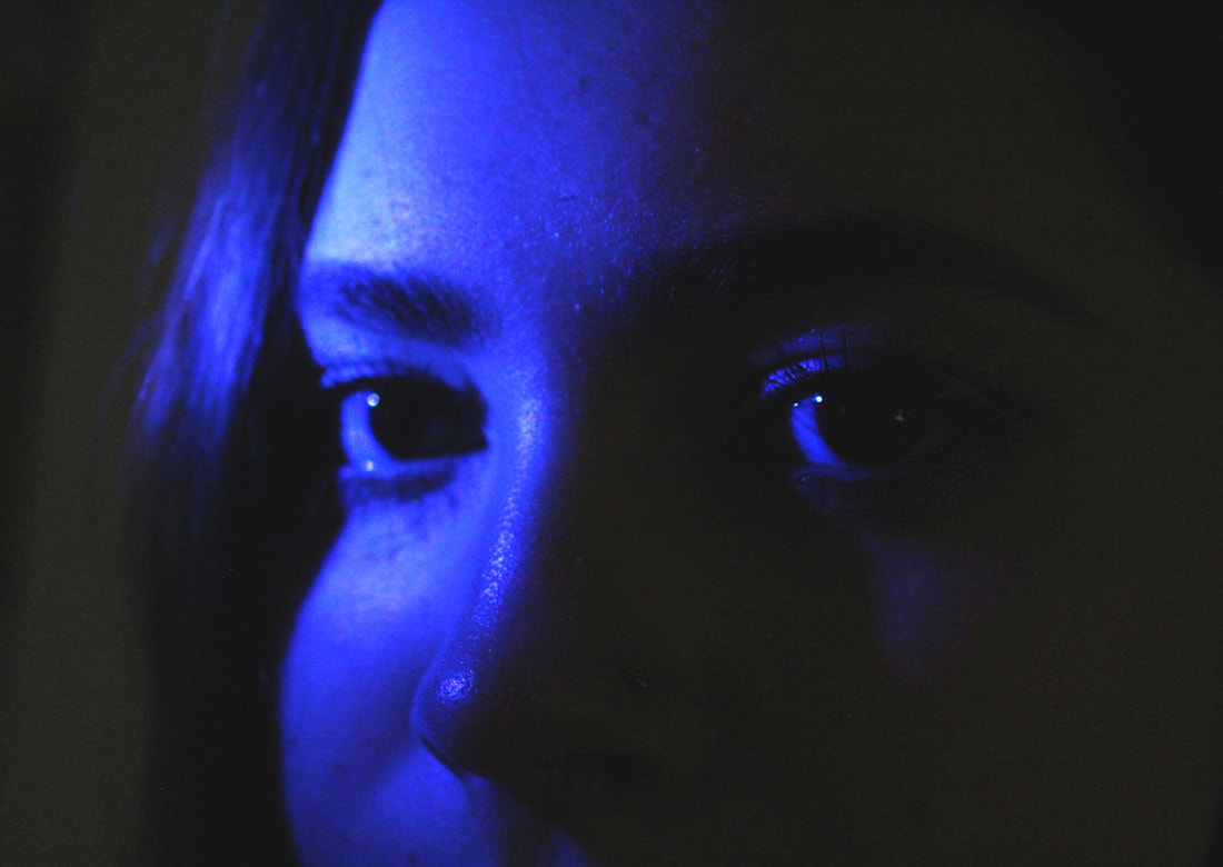
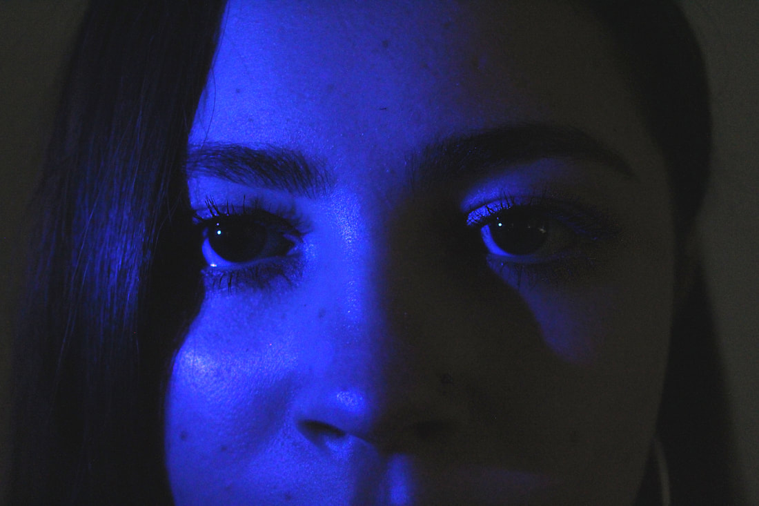
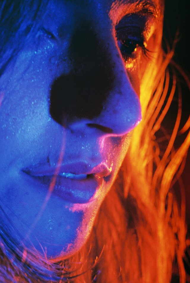
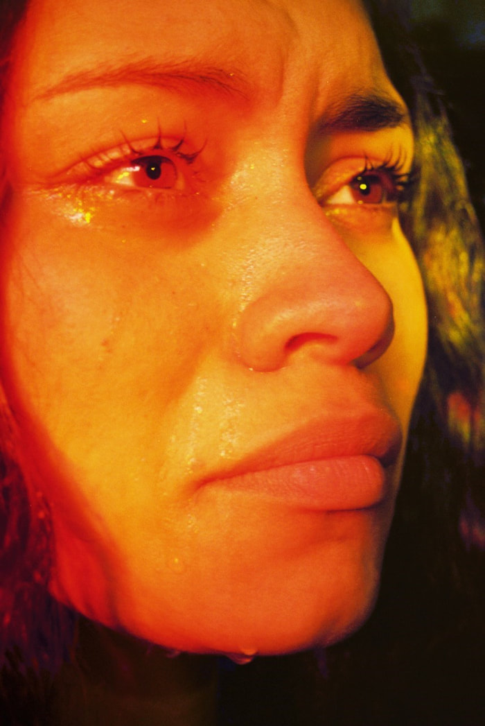
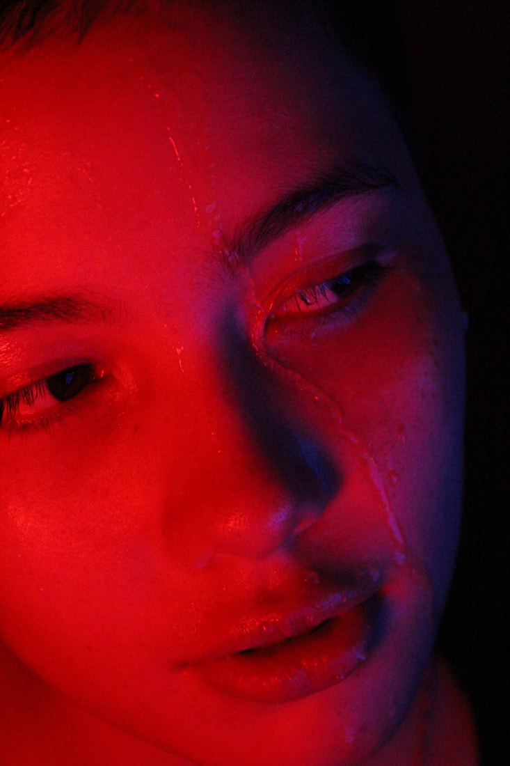
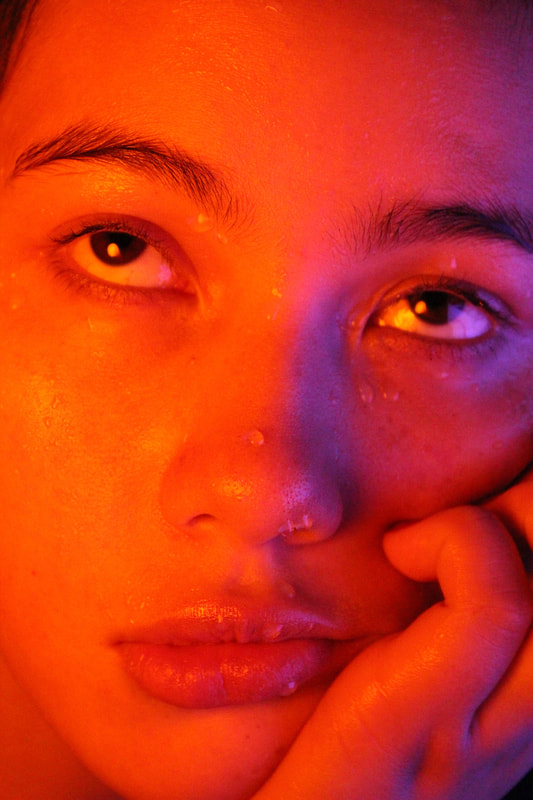
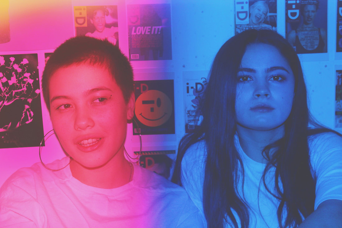
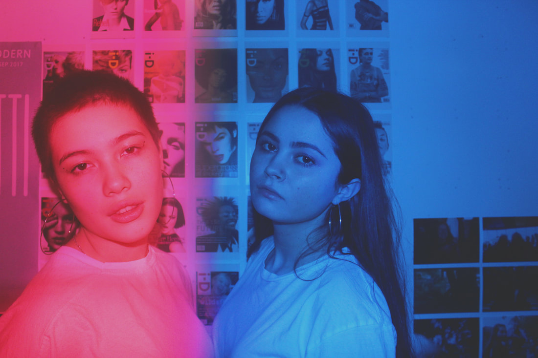
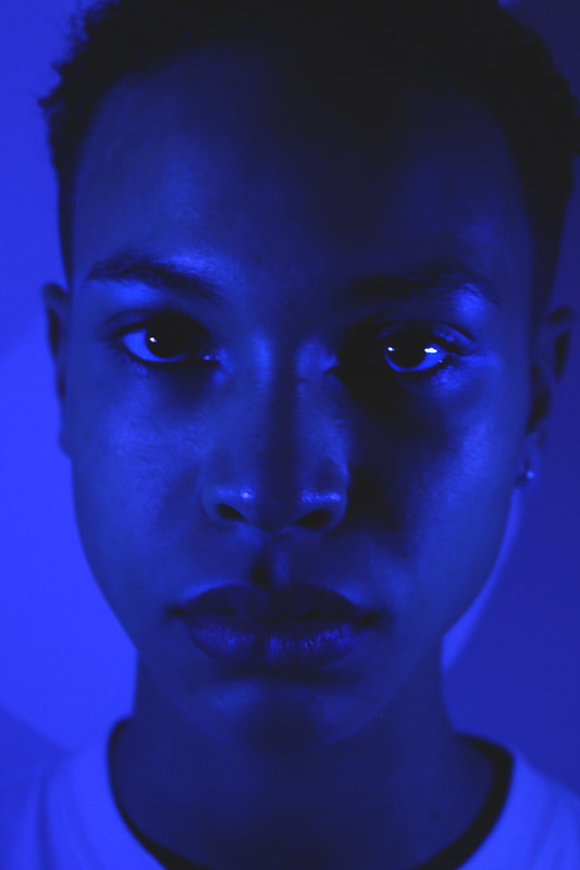
Final Piece
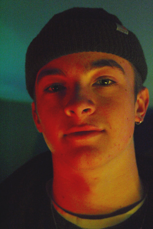
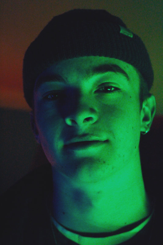
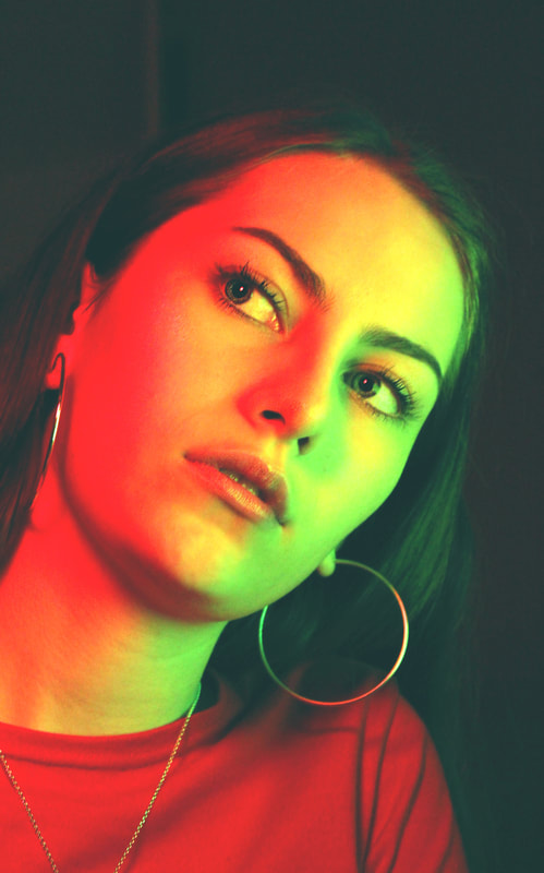
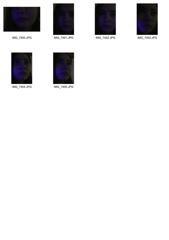
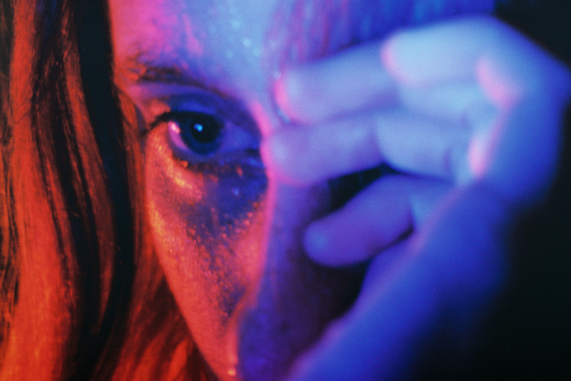
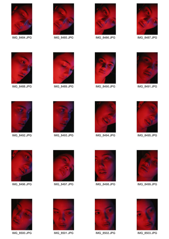
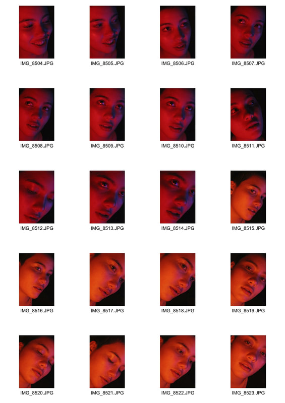
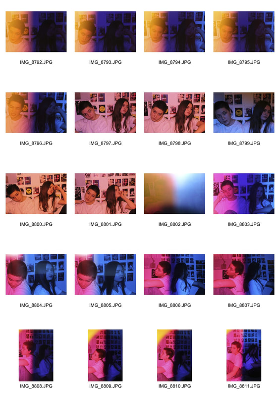
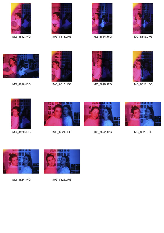
For my final piece I chose to use Nadav Kander's coloured portraits as my inspiration but also refer back to the close up Petra Collins inspired portraits I took previously. I made sure to use plain clothing and backgrounds to keep the main focus as the face of the subject and I tried to focus on the aesthetic value of my photos. I used pairs of complementary coloured acrylics over iphone torches from both sides to light the portraits, creating a split of colour throughout the face, creating a vibrant contrast between the shadows and highlights and creating tonal differentiation and depth in the portrait. I chose to take close, intimate portraits because they were my most successful development and it's easier to successfully light the photos and capture the details of the face. I also experimented again with the half and half coloured photos using acrylics over the lens but these were not as aesthetically clean and effective. I used an ISO of 800 as the lighting was relatively dim and a wide aperture of 5.6 to focus on the facial features and details.
|
|
|
|
|
|
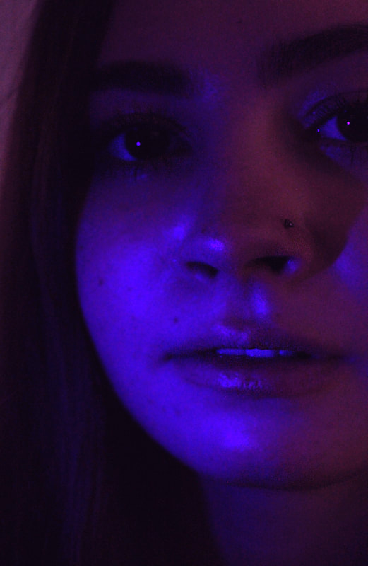
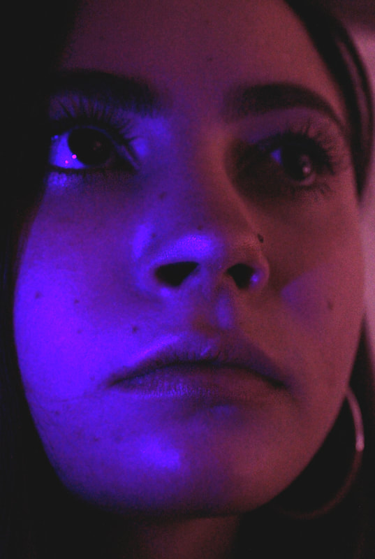
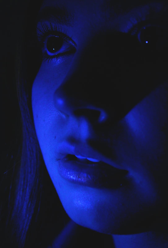
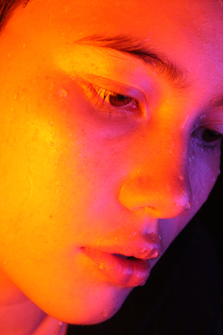
Final photos
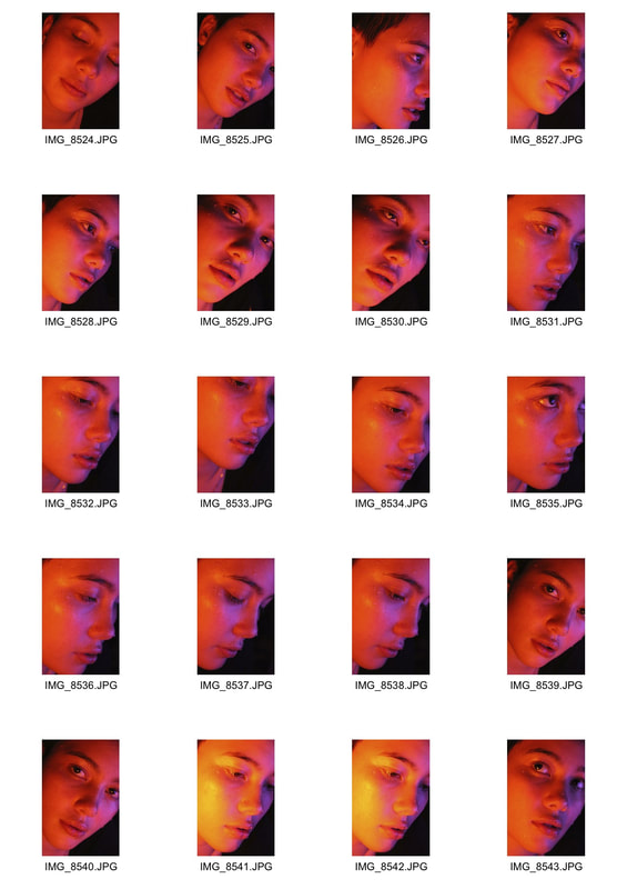
In photoshop I brightened the photos and lowered the exposure to get richer colour as well as raising the saturation. I also altered the colour balance to distinguish the pairs of complementary colours and sharpened the features to create focal points on the subjects face. I also lightened the highlighted areas to create a glossy look similar to Nadav Kander.
|
|
|
