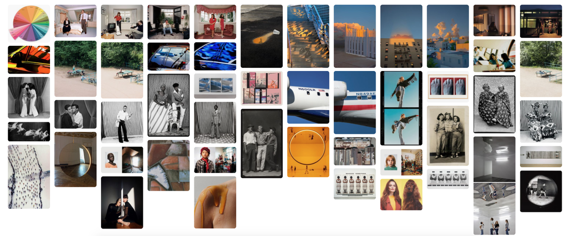
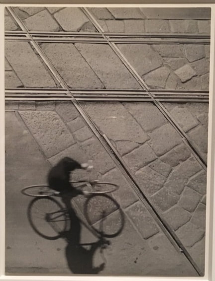
Pinterest board
Exhibition visits
New York MET
|
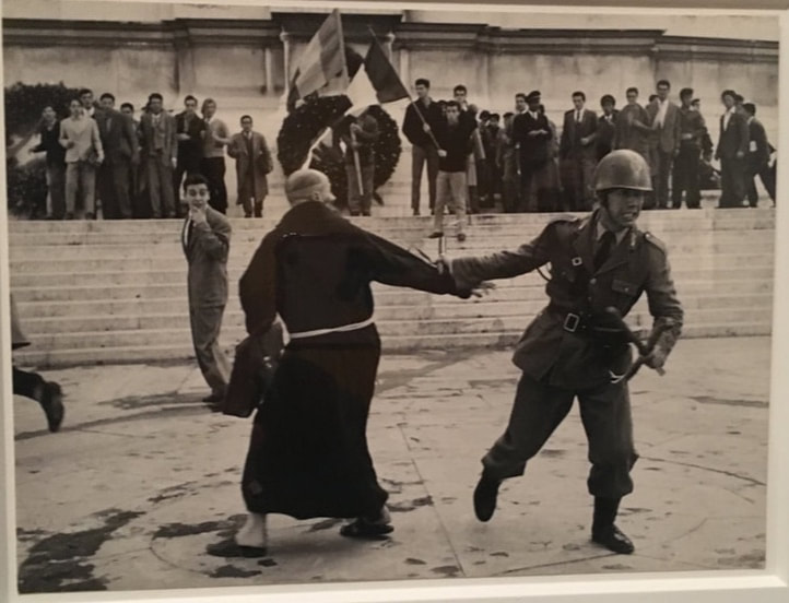
Whilst in the Met museum of art in New York, I looked at a display of photographs from selected post war Italian photographers. These included Roberto Spampinato, Tazio Secchiaroli and Alfredo Camisa. I found it interesting to see the the documentation of Italy and its people, in one period of time, through different photographers' perspectives.
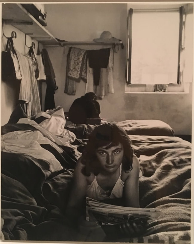
The photo on the left was taken by Tazio Secchiaroli, a famous Italian photographer known for inspiring the classic film 'La Dolce Vita'. Secchiaroli is named as the 'original paparazzi', he would brazenly insert himself into the action of the events occurring around him, capturing volatile in scandalous events in the lives of celebrities, politicians and on the streets. This photo 'Altare della Patria' was taken in Rome in 1956 and shows a friar defending an anti-riot policeman during a clash with neofascists. Secchiaroli captures the fast pace motion of the scene before him in one shot and leaves the viewer wanting to know more of the story. The photo below 'Mondina che legge' was taken by Alfredo Camisa also in 1956. Camisa photographed a young Mondina whilst reading a 'fotoromanzo' an old Italian form of entertainment. Mondine were migrant workers on the rice paddies, they were often young women from the poorer social class. In fascist and postwar Italy, the mondine became symbols of strength and sexuality, identifiable in popular culture from their shorts and wide rimmed hats. |
|
|
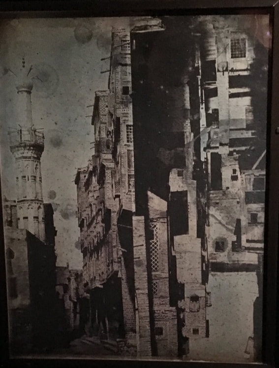
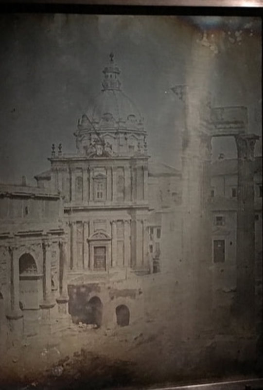
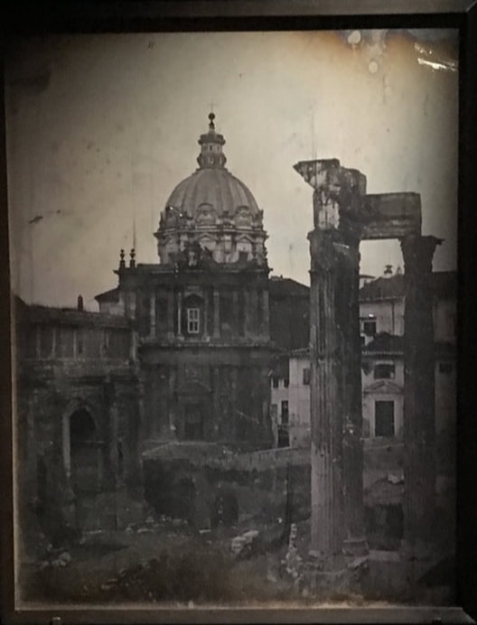
Daguerreotypes of Girault de Prangey
|
In the Met they also had an exhibition of Girault de Prangey's daguerreotypes. In 1842, three years after the introduction of photography, Joseph-Philibert Girault de Prangey set off on a three year photographic tour of the Eastern Mediterranean with a custom-built camera. Girault de Prangey took a inevitably Eurocentric approach to studying 'Arab' architecture however, his engagement with Islamic art which was at that time very rarely pursued, was groundbreaking.
His complicated process of photography involved producing unique mirror images on silvered plates, and he overcame the burden of an oversized camera and cumbersome equipment. He returned to France in 1845 with more than one thousand daguerreotypes, a never-before-seen format. This unparalleled achievement that gave us the world's oldest photographic archive. |
|
|
|
|
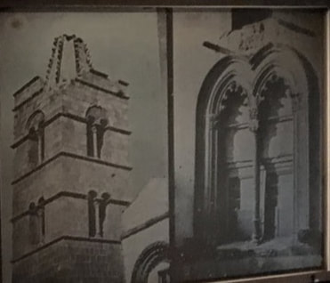
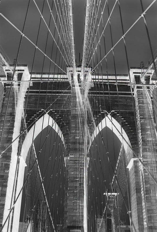
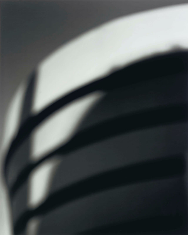
I thought these particular images were visually interesting and link back to the theme of variations and similarities. The two images are identical but are developed in inverted colours. This illustrates how the variation in colour of the image makes a dramatic difference in the depth and appearance of negative space. The image on the right has a higher contrast which creates more distinct layers of depth in the scene.
Don McCullin @ TATE
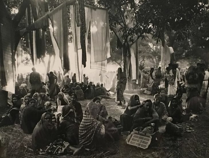
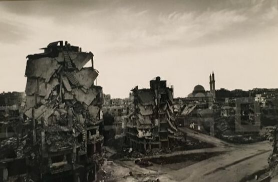
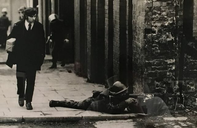
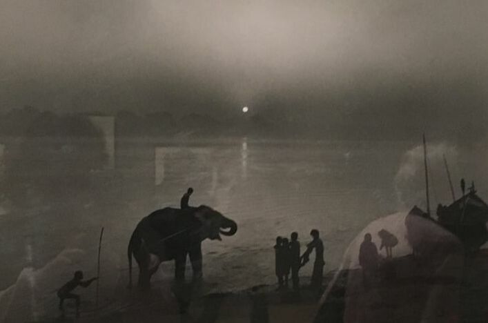
We went to see the photographer Don McCullin's exhibition at the Tate, showing his various collections of work from home and abroad. His work spans sixty years of history and world events, from his growing up in Finsbury Park to his coverage of conflict in a multitude of countries including Vietnam, Cyprus, Berlin, Bangladesh and Congo.
|
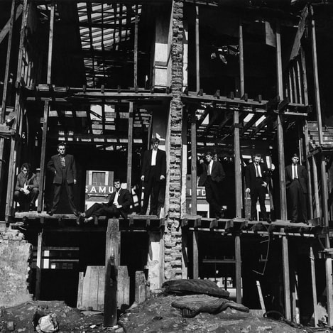
This photo; 'The Guv'nors in their Sunday suits' gave McCullin his first break in photography when the Observer newspaper published the photo. Taken in Finsbury Park in North London, 1958, the photo shows members of the north London gang 'The Guv'nors' who were indirectly implicated in the murder of a policeman at the time. This photo alerted magazine editors to McCullin's intuitive style and carefully considered compositions, the shell of the bombed-out house perfectly frames each member of the gang. The effect of this posed lineup gives the image class and intention, elevating the photo's importance from just a candid group photo. T
The neighbourhood of Finsbury Park in the 1950s was still in partial ruins after the Second World War. McCullin's grew up in poverty, his childhood filled with bigotry, violence and traumatic events such as the death of his father. His father's death from a chronic illness deeply affected McCullin when he was fourteen and throughout his whole life. McCullin explained that he photographed groups of people who were treated harshly in life because he could empathise with them, 'I know the feeling of the people I photograph...It's a case of "I've been there" '. |
|
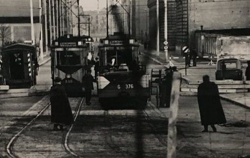
I thought this image, 'Looking into East Berlin' (1961), perfectly illustrates McCullin's creative and effective use of depth of field and layers in an image to describe distance and context. The part of the image in focus shows the other side of the Berlin Wall, East Berlin. There are few people, the streets are relatively empty and the mood of the scene is bleak and desolate. In the foreground, McCullin captures the barbed wire on top of the wall out of focus. Whilst the point of focus is further away, on the streets, the inclusion of the blurred barrier between McCullin and the scene beyond changes the tone of the image. It visually describes the divide between the two areas as well as the people, the barbed wire implies the isolation of the other side, and emphasises the separation of a city once united.
|
|
|

|
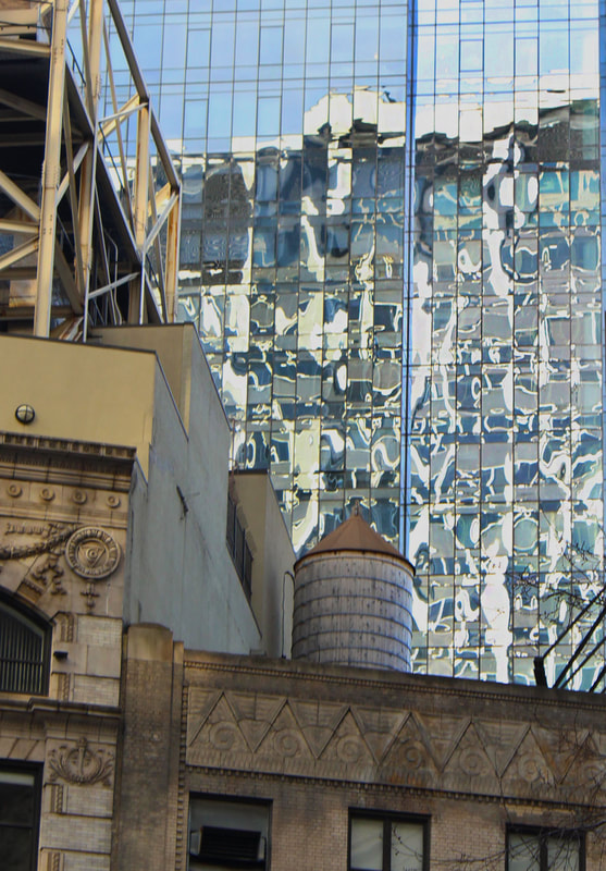
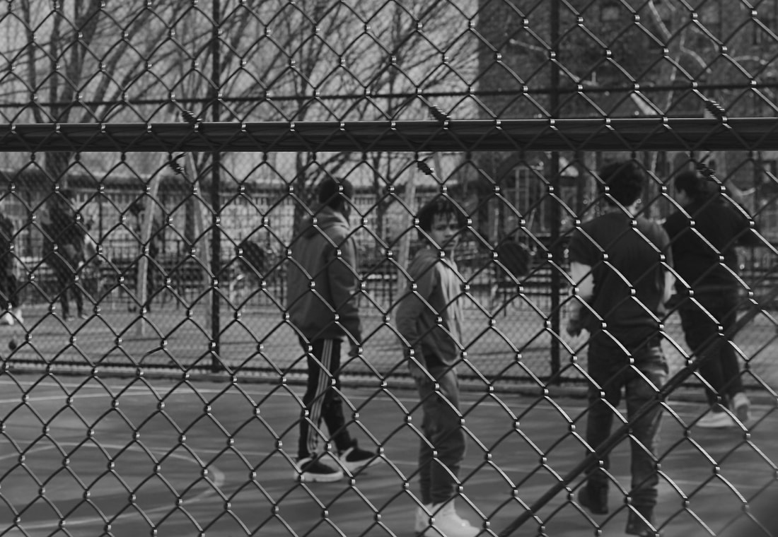
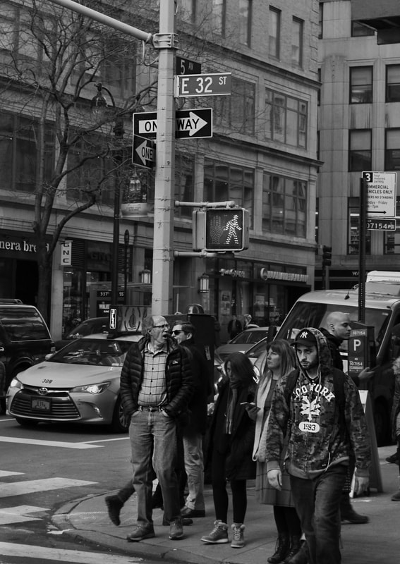
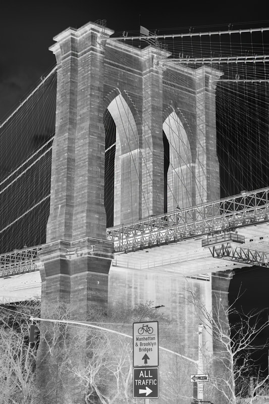
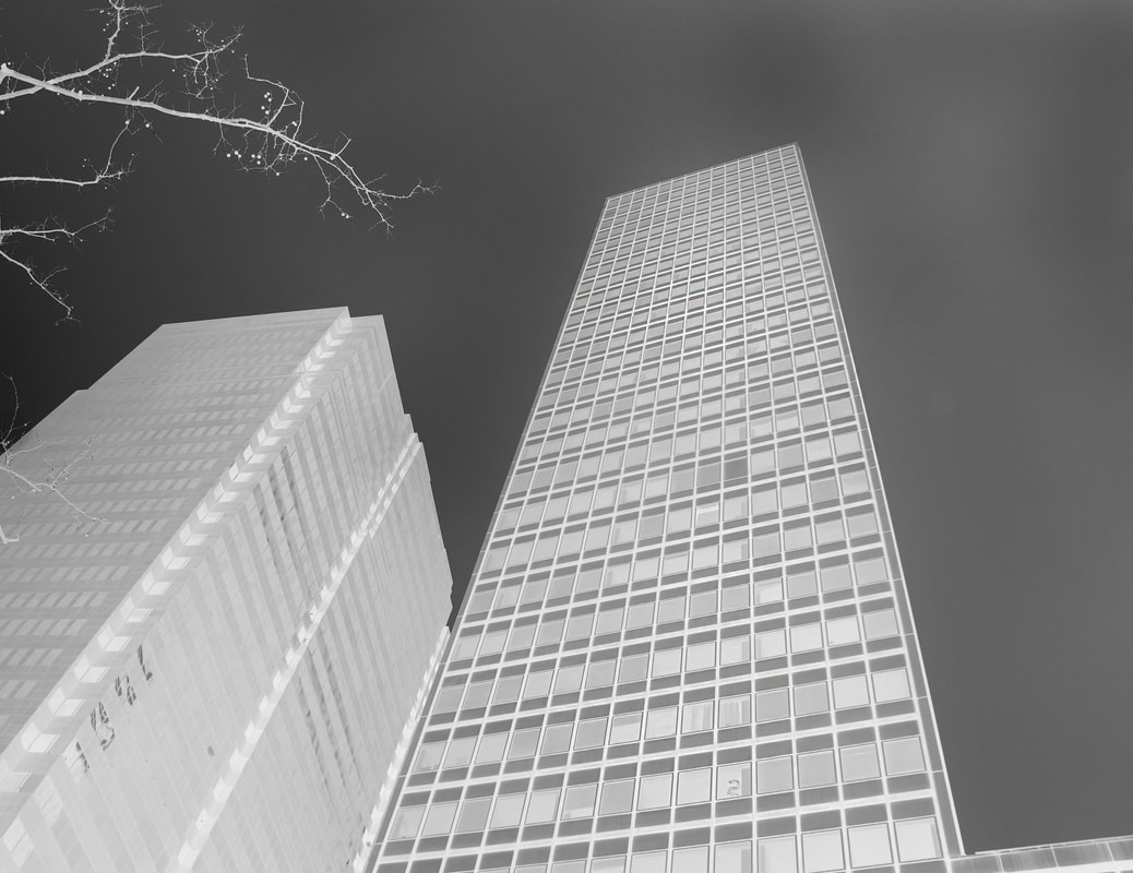
Variations and similarities between cities
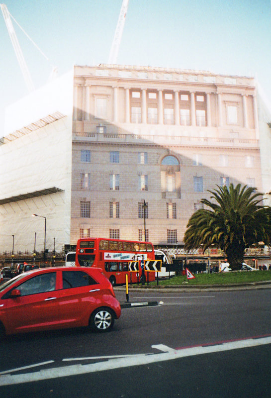
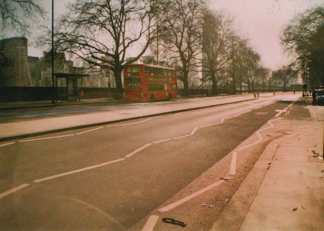
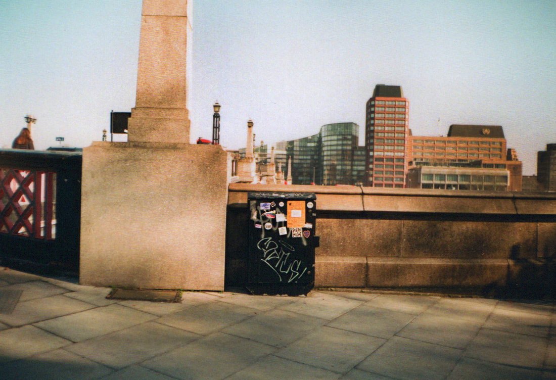
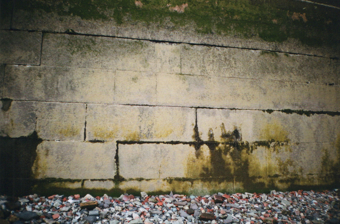
New York
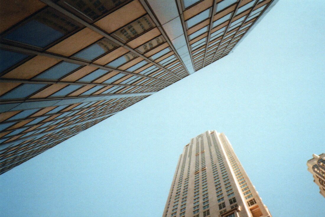
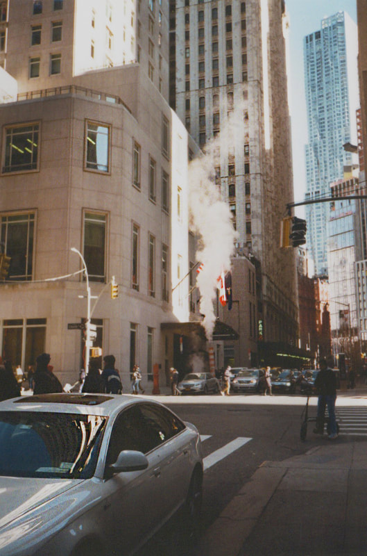
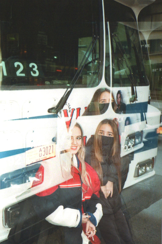
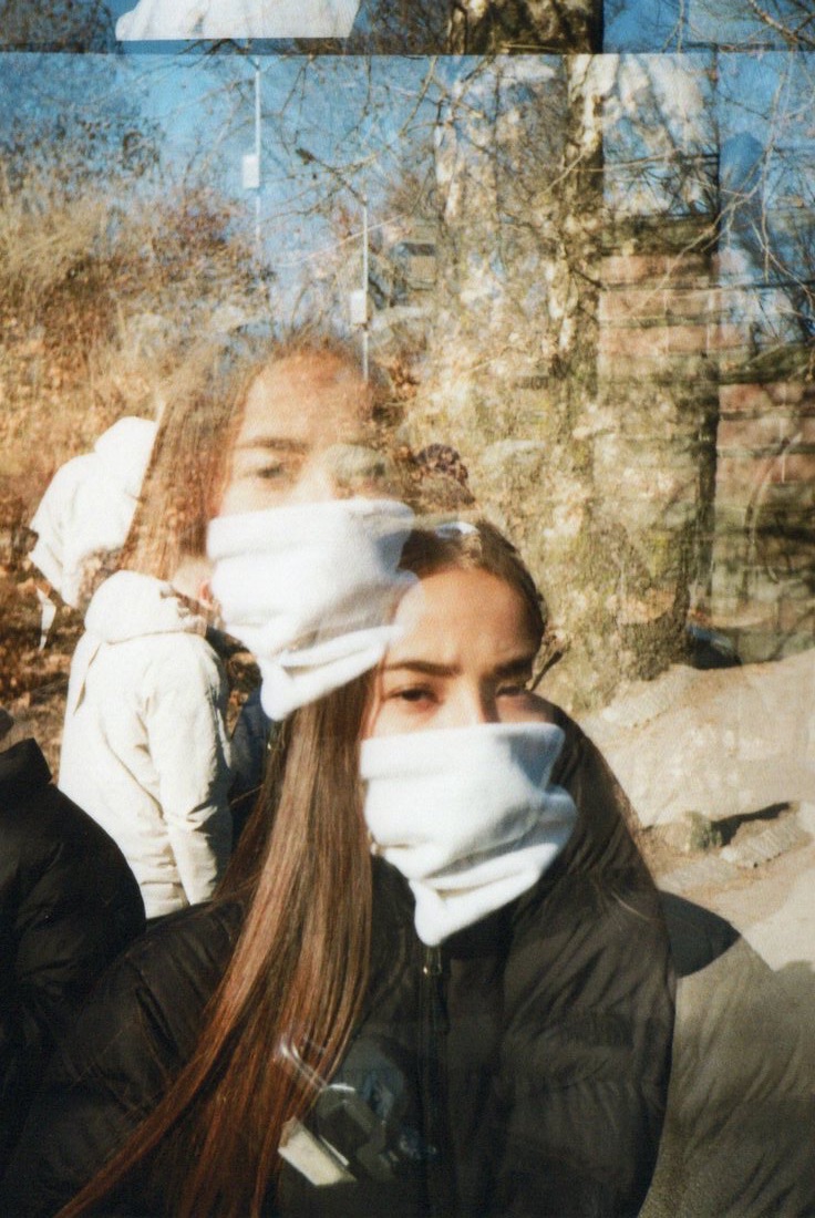
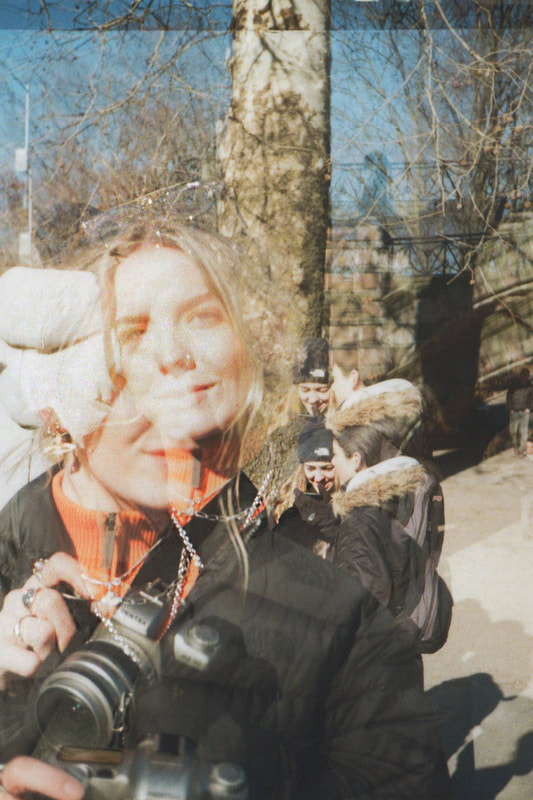
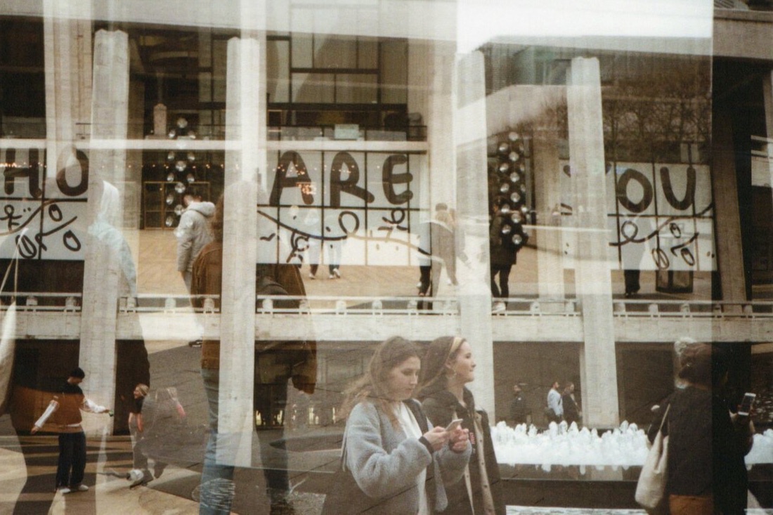
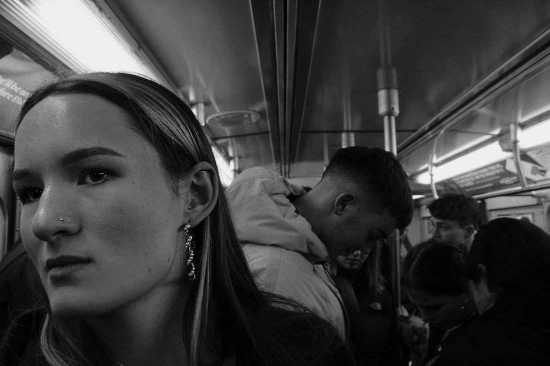
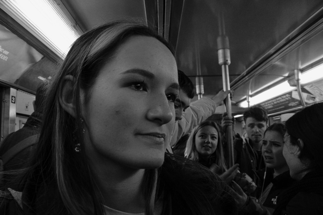
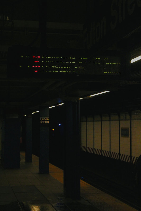
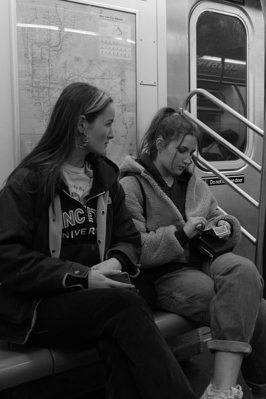
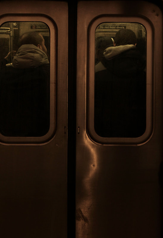
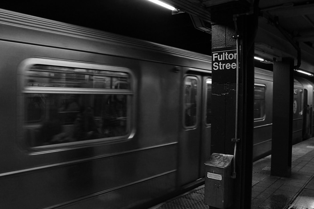
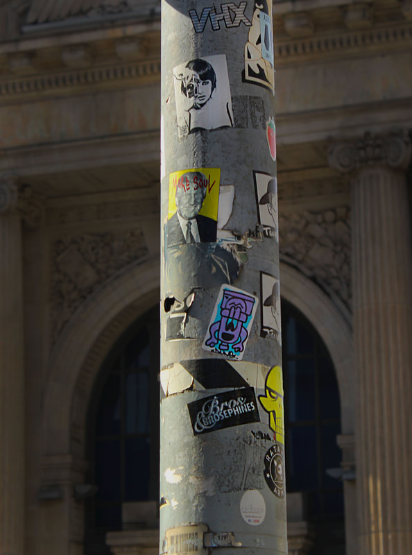
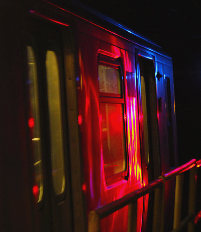
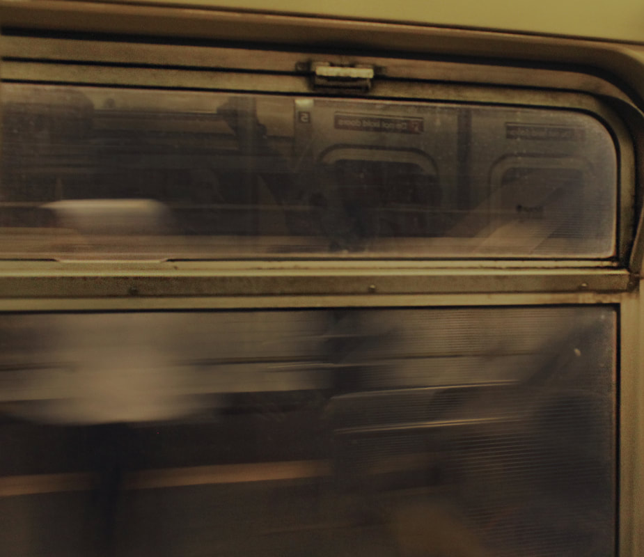
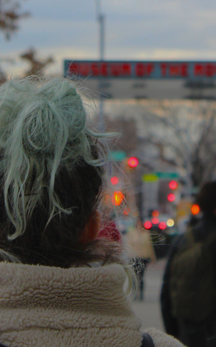
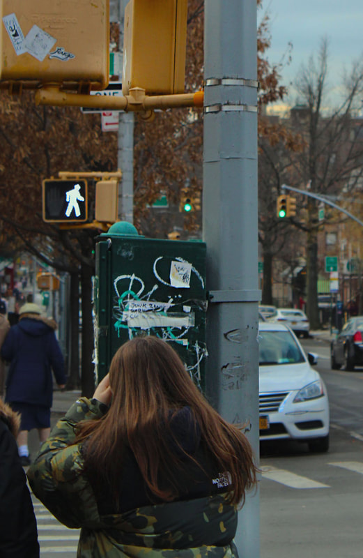
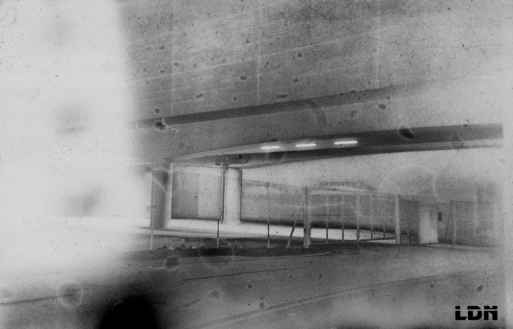
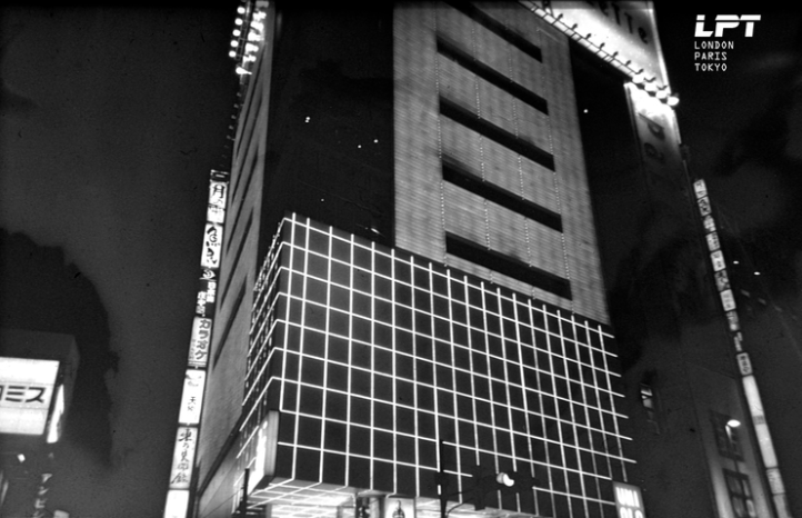
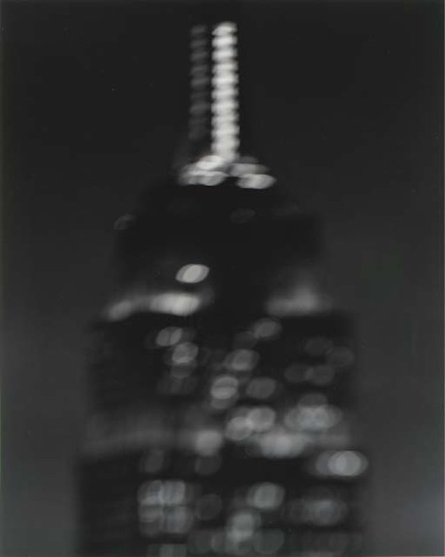
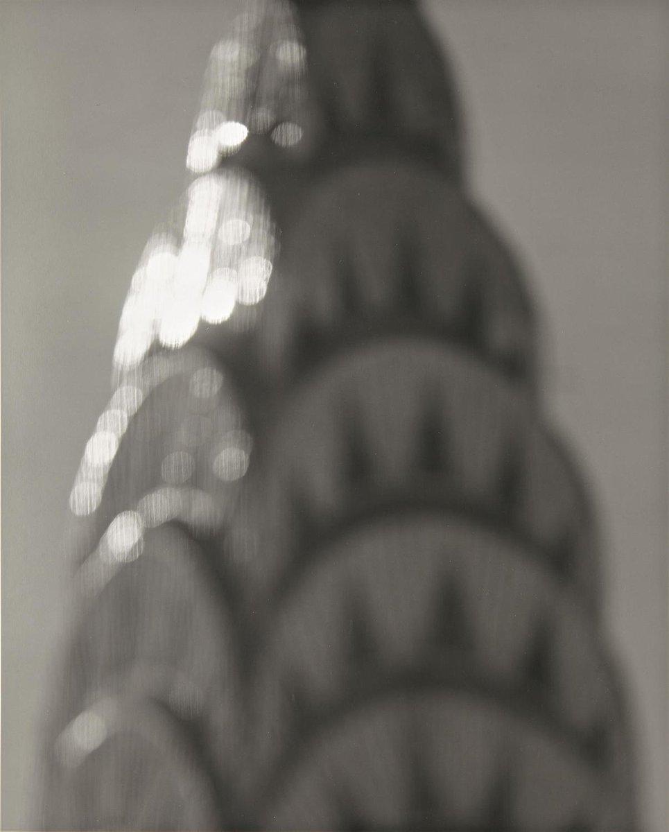
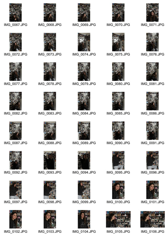
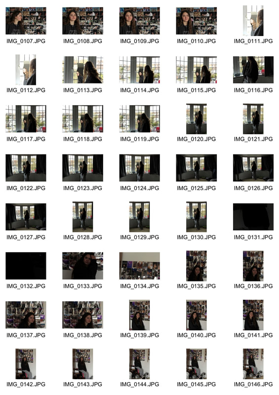
I decided to take a series of photos illustrating and comparing the variations and similarities between two cities; London and New York. I shot on both film and digital cameras. When developing the film there was a problem with the camera resulting in a glitch-like effect on the images, although they are not what I intended, I found the photos to be more dynamic and unique. When taking the photos I tried to focus on details and everyday aspects of the streets to capture an overall atmosphere specific to the city. I photographed what stood out to me such as interesting structures, textures and vibrant colours.
Film
|
|
Digital
|
|
|
|
|
|
|
|
|
|
|
|
|
|
|
Annotation, intentions and conclusions?
London
film
|
|
First Task - Typology
For the first set task we were asked to create our own typology series documenting repeated forms. When the photos are all placed next to each other, it is interesting to compare the subtle differences between multiples of the same object.
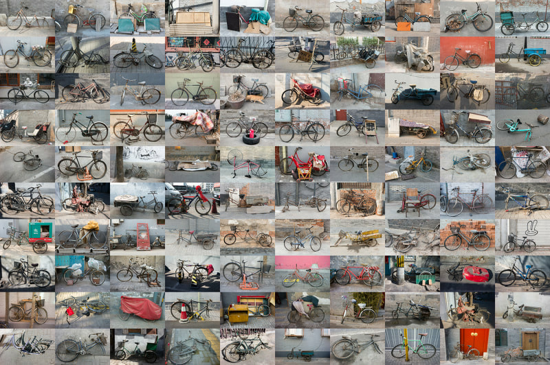
One photographer who creates typology series' is Zhao Xiaomeng. Xiaomeng's series 'Bicycles in Beijing' is a collection of photos of the bicycles around the city. In China bicycles are 'relics of a bygone age' as the car has become the preferred method of transport, and now stand as 'emblems of social marginalisation'. The wide variety of quality and age of the bikes in the photos is an indication of the owner's living conditions and economic circumstances. In this way, the photos serve as portraits of the people themselves, adding an emotive tone to the collage.
One photographer who creates typology series' is Zhao Xiaomeng. Xiaomeng's series 'Bicycles in Beijing' is a collection of photos of the bicycles around the city. In China bicycles are 'relics of a bygone age' as the car has become the preferred method of transport, and now stand as 'emblems of social marginalisation'. The wide variety of quality and age of the bikes in the photos is an indication of the owner's living conditions and economic circumstances. In this way, the photos serve as portraits of the people themselves, adding an emotive tone to the collage.
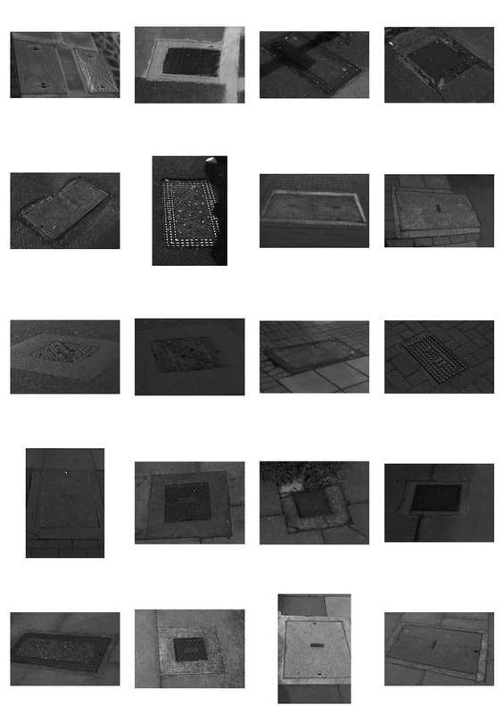
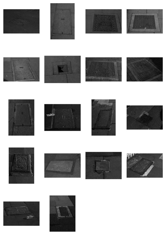
In response to Xiaomeng's piece, I walked around my local area and photographed all the water drains and that I came across. I thought it was interesting how many there were because I would never notice in my day to day life, this lead me to question how much of the street we actually acknowledge when walking around.
|
|
Second Task- City
For the Second set task we were asked to photograph a city in different ways or using different photographing processes.
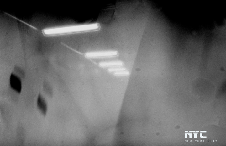
We were asked to look at the work of Anthony Cairns, an artist who stretches the boundaries of the photographic medium. Cairns photographs lots of different cities across the world, exploring how they are similar and how they are different. He explores never-seen-before processes and formats to create his unique and experimental work.
We were asked to look at the work of Anthony Cairns, an artist who stretches the boundaries of the photographic medium. Cairns photographs lots of different cities across the world, exploring how they are similar and how they are different. He explores never-seen-before processes and formats to create his unique and experimental work.
|
|
|
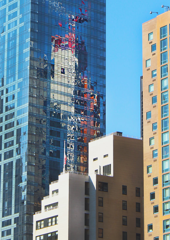
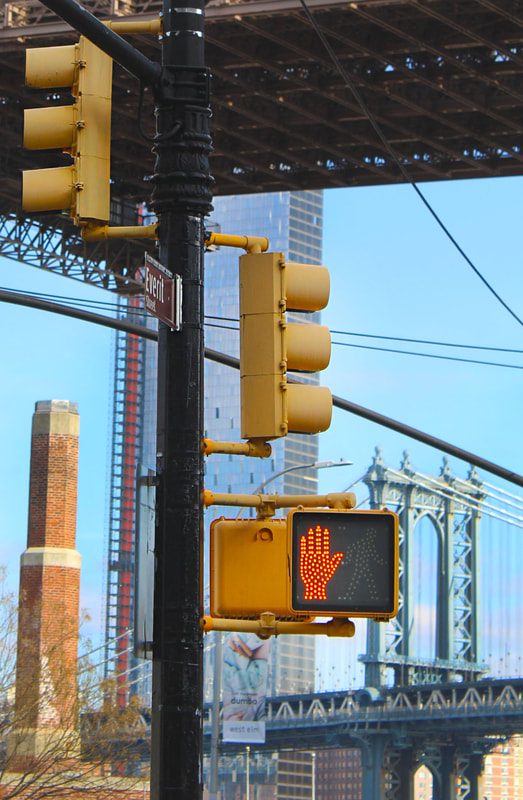
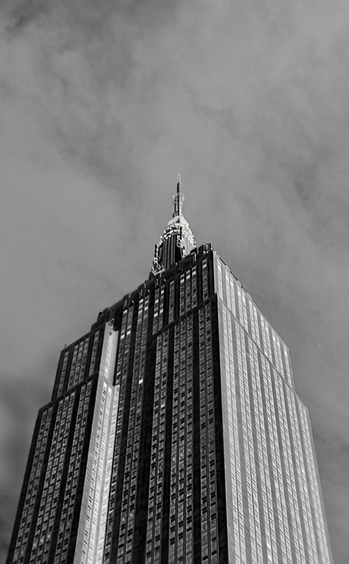
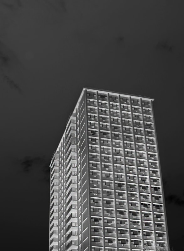
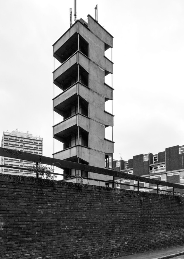
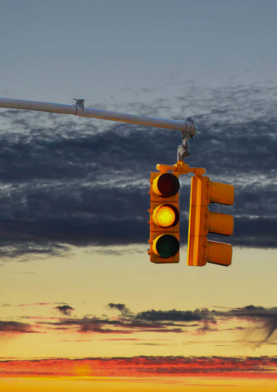
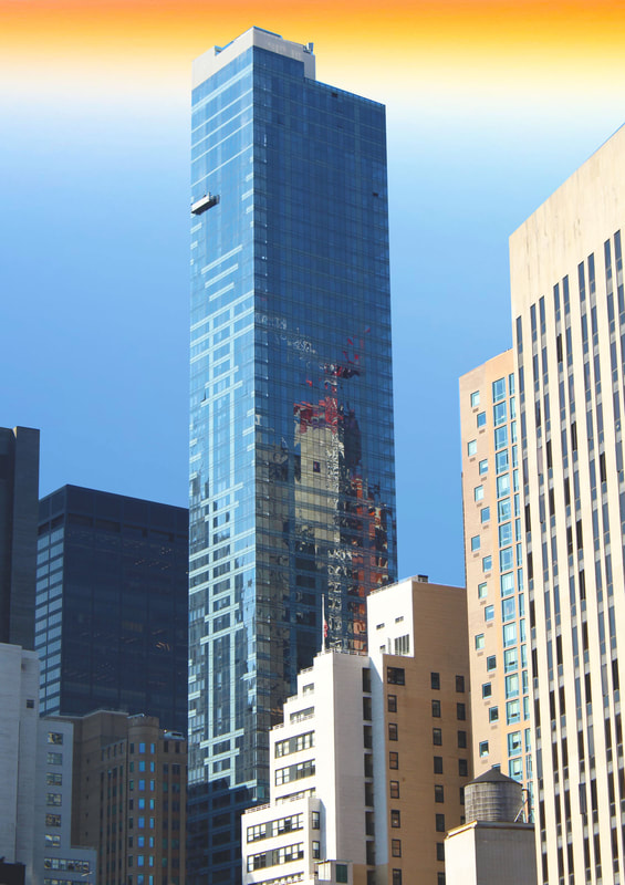
In response to Anthony Cairns work I photographed New York City and used photoshop to turn them black and white before inverting the colours and changing the levels. I tried to photograph a wide variety of shapes and structures, whilst maintaining the recognisable and distinctive 'New York' imagery.
|
|
|
|
|
|
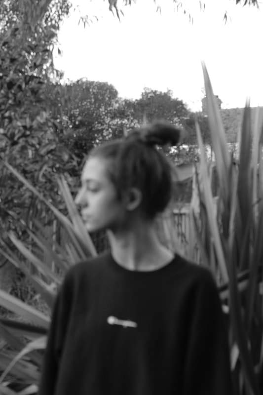
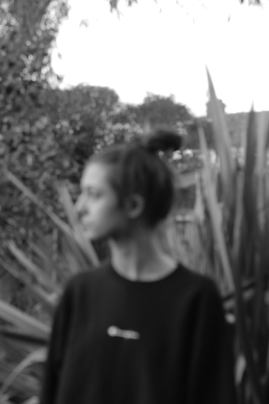
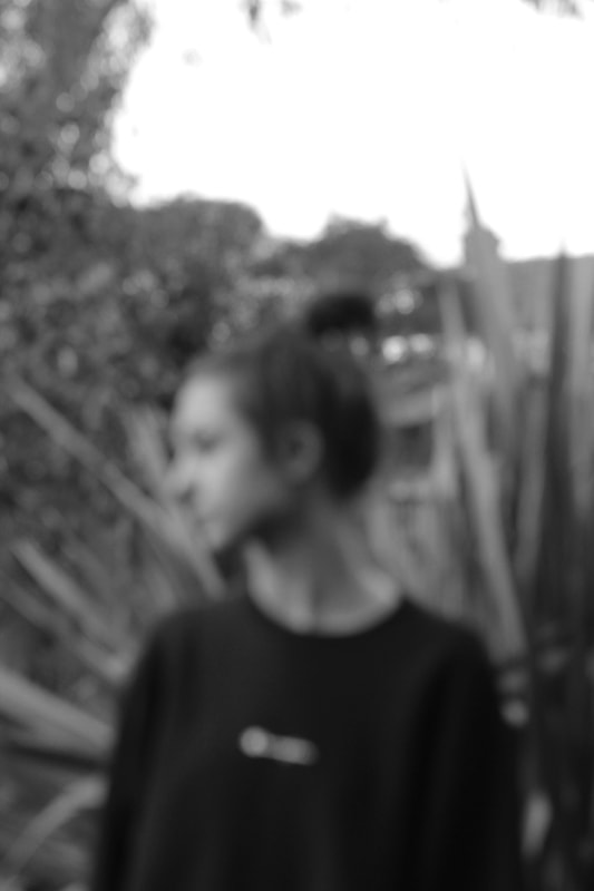
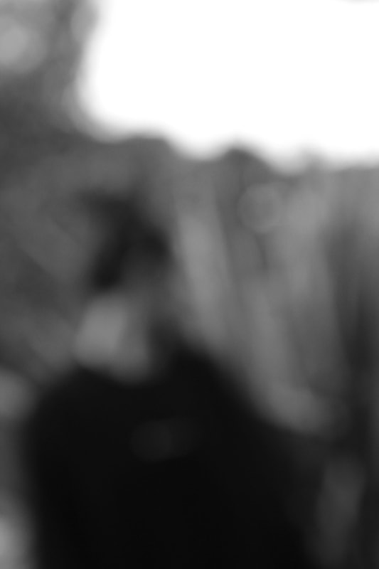
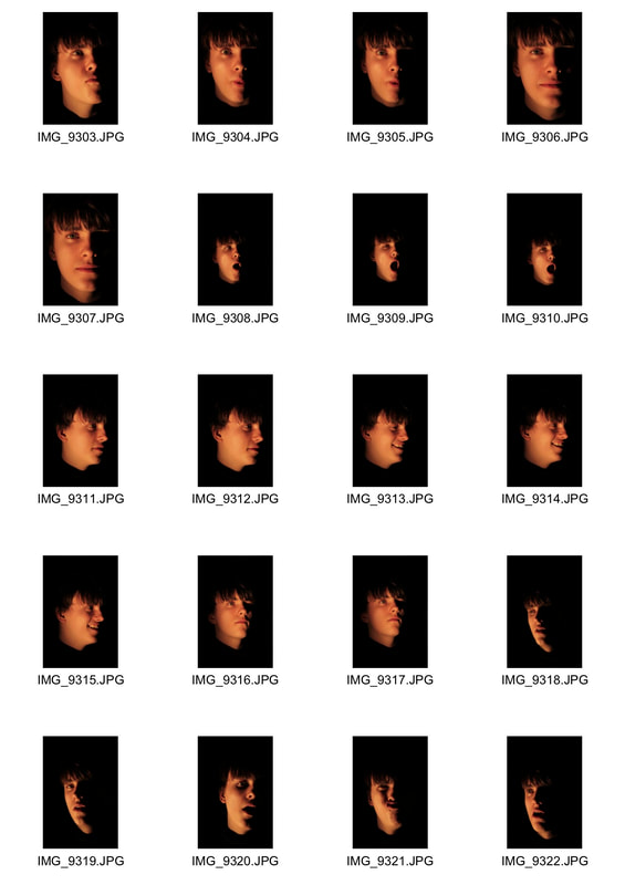
Third Task - Focus
|
|
|
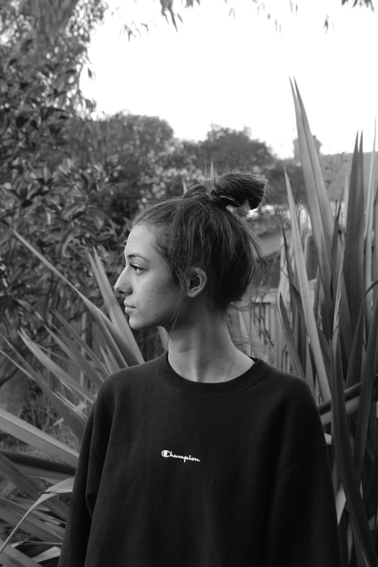
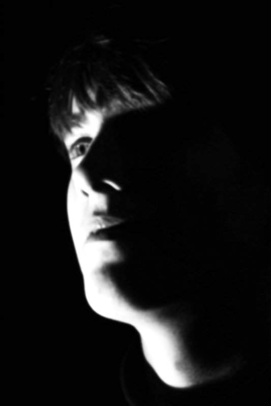
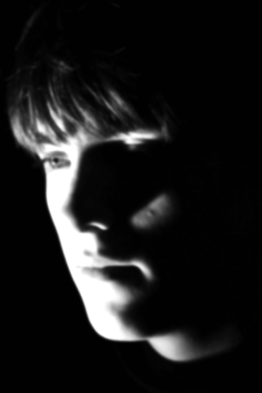
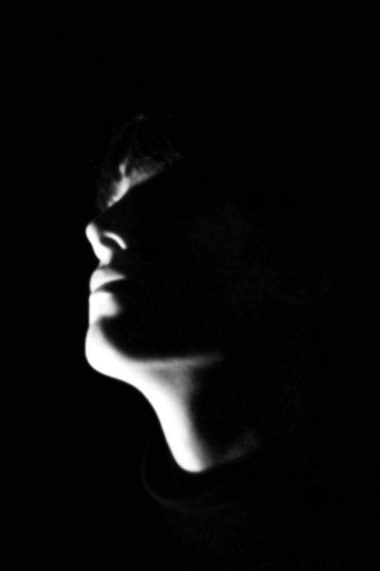
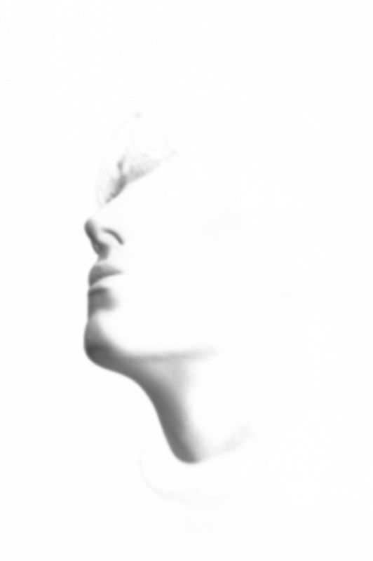
In this task we were asked to explore the idea of identity using variations of focal depth. I chose to photograph my friend Yasmin in a simple side profile stance. Using manual focus I then continuously shot portraits while constantly changing the focus. Looking at the photos, it is interesting to question how the focal depth of a photo can completely change how the viewer looks at the photo. Without a main focal point or distinct lines that would create foreground and background, the image becomes abstracted and is reduced to large shapes of flat colour. Is this when the subject loses its identity? when it becomes unrecognisable for the viewer? It is also interesting to look at the first photo compared with the last photo and question whether the two images convey the
|
|
|
|
|
|
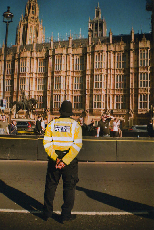
Variations in political opinion
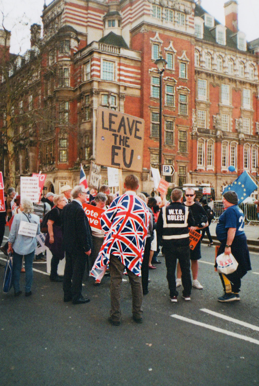
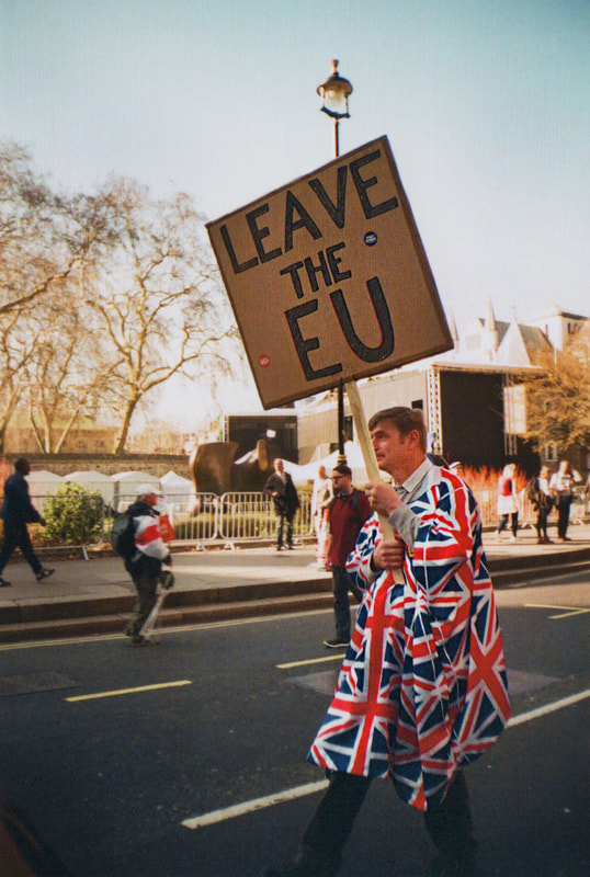
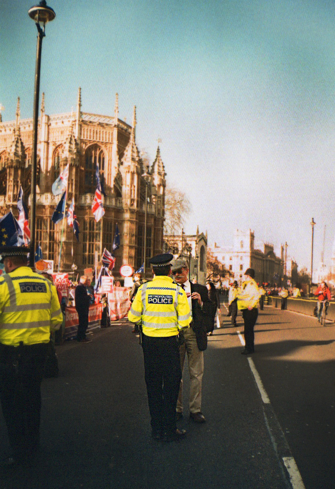
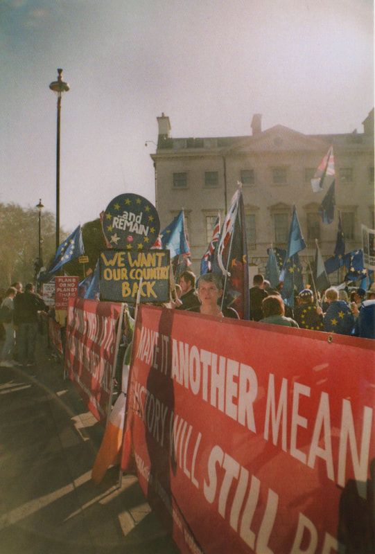
I went to a Brexit protest and photographed passing protesters, civilians and policemen on film. I wanted to focus on individual characters as well as the messages of each side. The vibrance of the colours of the film help to capture an energetic atmosphere.
|
|
|
|
|
Variations and Similarities in Landscapes
Páraic and Kevin McGloughlin
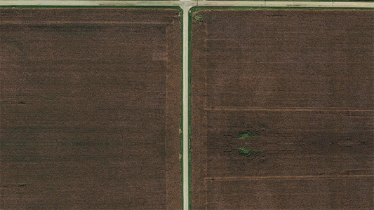
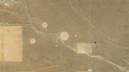
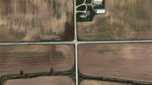
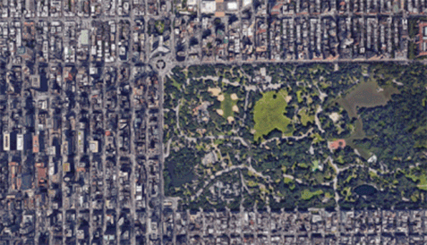
For this set task, we looked at the work of brothers Páraic and Kevin McGloughlin. The artists create videos using thousands of aerial images taken from satellites to compare the similarities between international roadways and urban structures. The speed of the video reduces these images to geometric shapes and lines, creating a clearer comparison between the different locations.
|
|
My Response
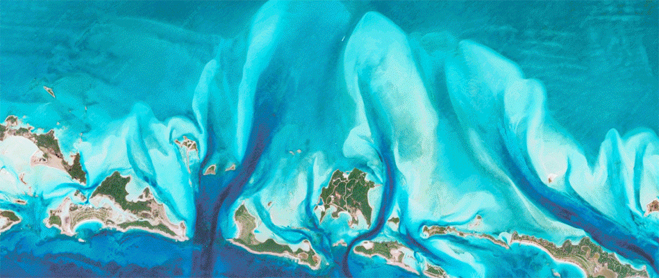
In response, we were asked to use Google Maps to produce our own version of the McGloughlin brothers' work. I started by looking at towns and cities that I have visited, but I then chose to look at unusual natural structures and textures.
|

|
Variations in layout and part
Noémie Goudal
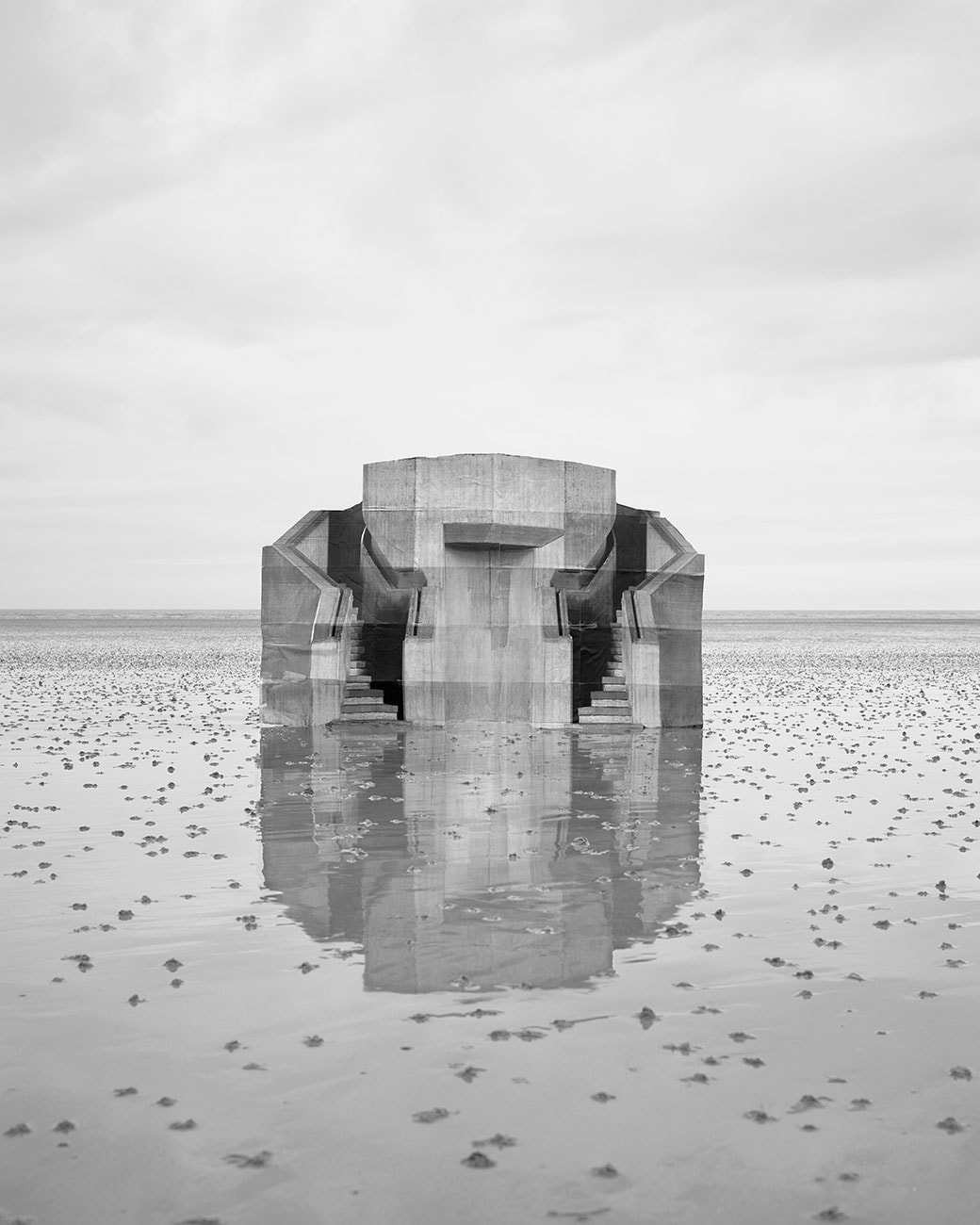
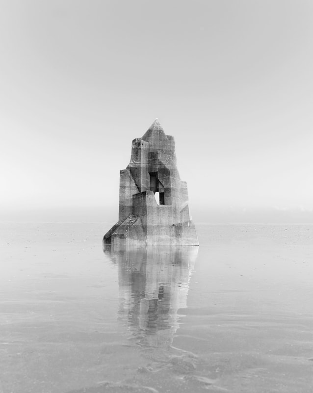
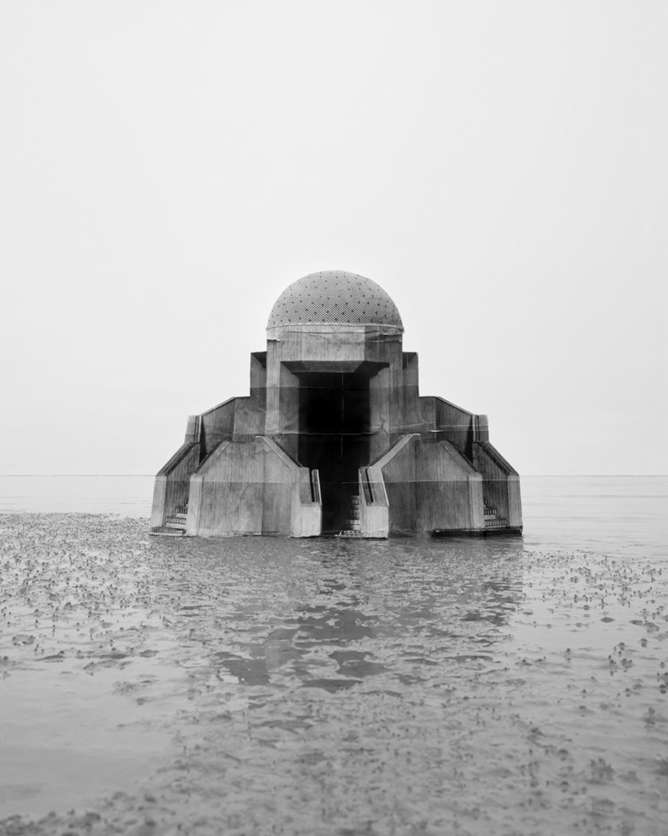
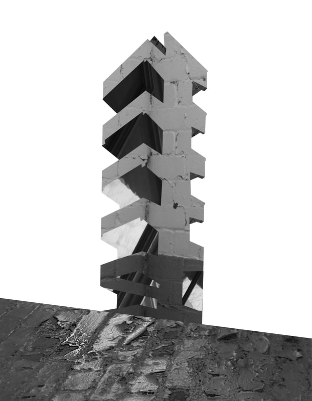
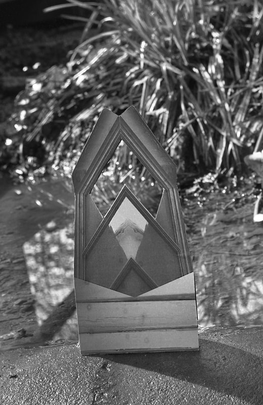
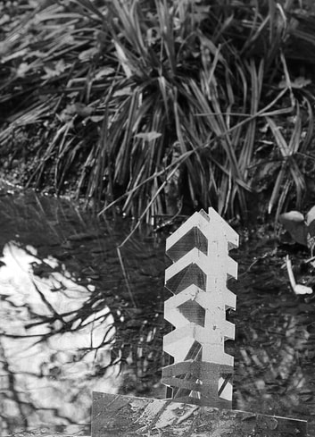
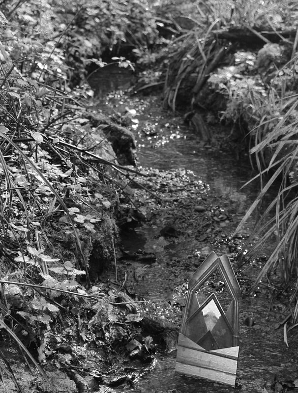
In this task we looked at the work of Noémie Goudal, a photographer who tries to create ambiguity and in her images of nature and manmade structures. Goudal removes an object from its natural environment or context to get the viewer to question what they're looking at. She is interested in the idea of placing a 2D photo in a 3D space, that then becomes 2D again when the whole thing is photographed. She is also interested in how, by placing a material in a space, one is able to change the perspective of a space. These are examples of ways Goudal varies spaces and how we view them.
In this particular series of photos, Goudal photographs fragments of buildings in England and Germany, mounts these on cardboard and places them in a different landscape. The effect is ethereal and unique. The images are completely 2D but they seem to have such a solid, massive quality helped by the reflection in the water. Goudal wanted to create a typology of these edifices, accentuating this by using black and white. She emphasises leaving the images open for interpretation, they have no particular message or meaning, that is to be decided by the viewer.
|
|
|
|
|
|
|
|
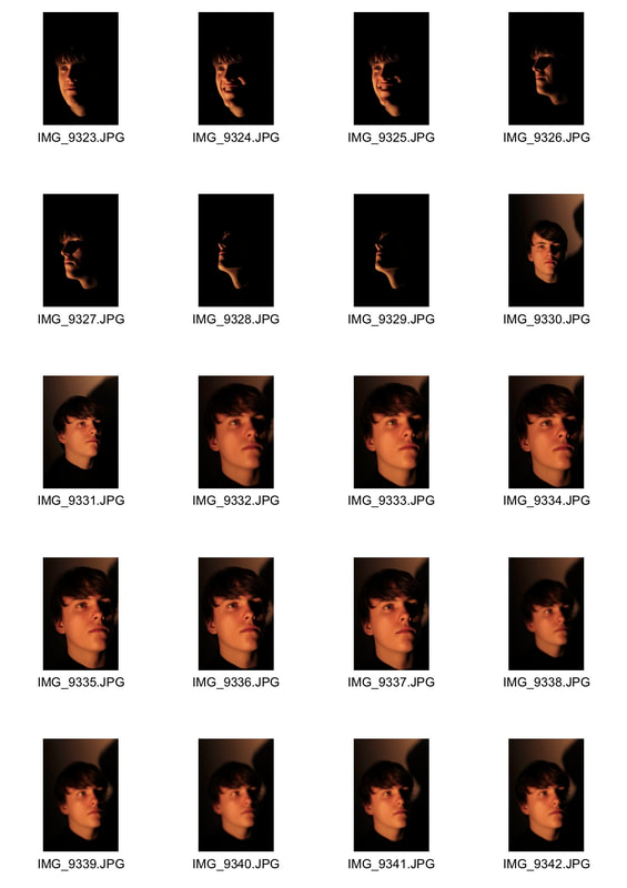
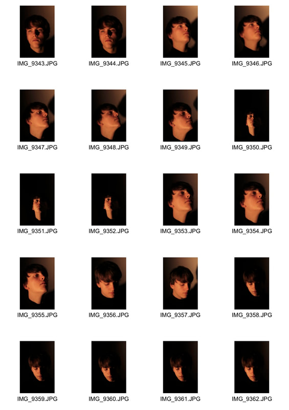
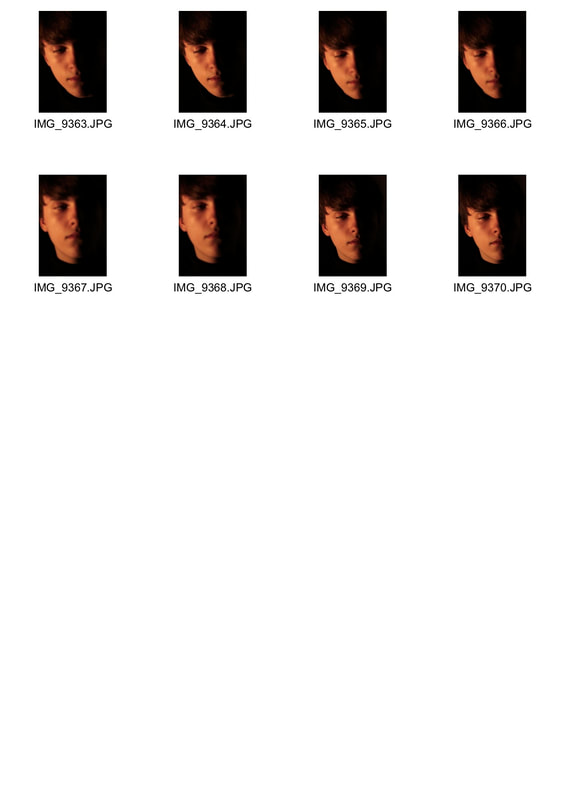
Shadow and Light Portrait Variation
Artist reference- Valerie Kabis
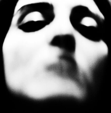
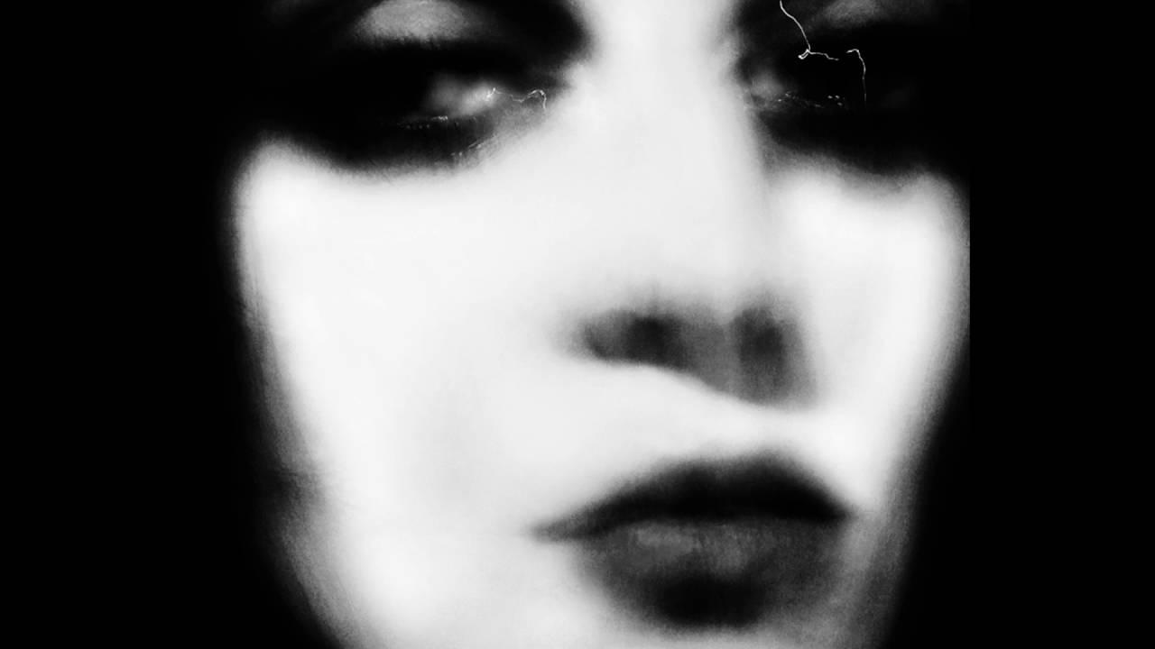
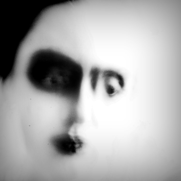
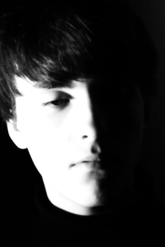
We were asked to look at the work of Valerie Kabis, a photographer who creates these haunting, dark portraits. The use of experimentation and variation with light and shadow limits the tonal range and detail in the photos, leaving us with ghostly impressions of a face. The lack of focus also conveys an energy and implies the motion of the subject; combined with the high contrast and lack of intricate detail the overall impression of these images is that Kabis has captured an ephemeral moment in time. The close crop of solely the face also adds to the impact of the images, there is no background or context to the image, only the expression of the subject. It is very interesting how her experimentation with lighting and composition can elevate the classic portrait to a thought-provoking art piece.
|
|
|
|
My Response
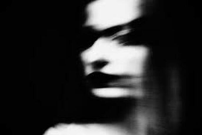
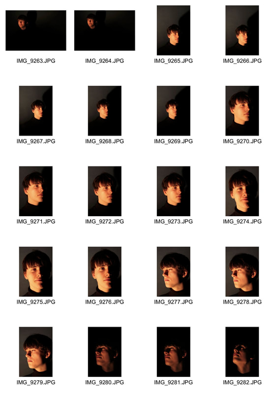
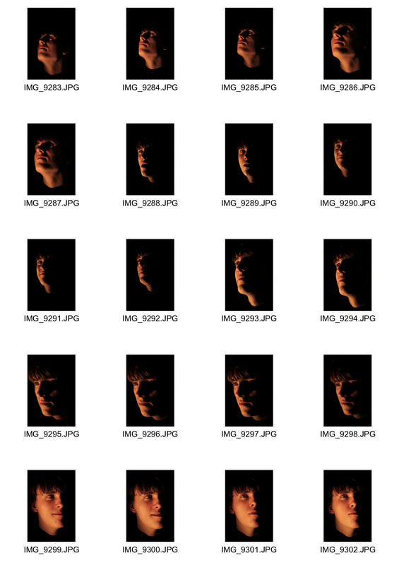
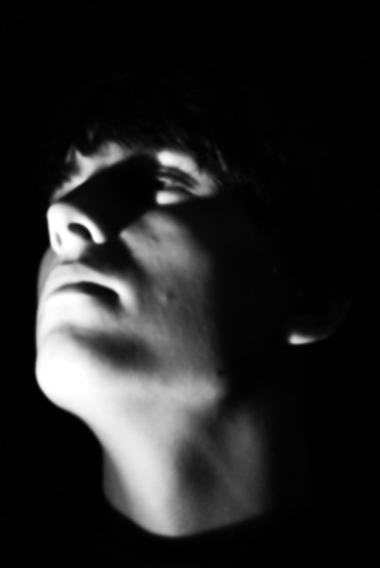
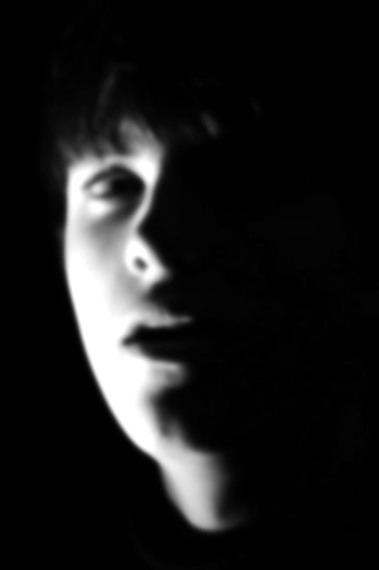
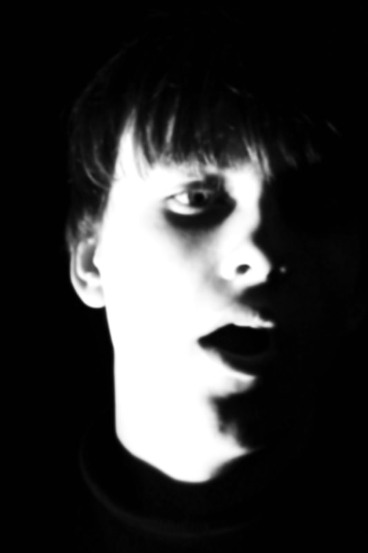
In response I photographed the subject on a dark background and used a single light source on one side to create high contrast and depth. I also used the manual focus to mimic the blurred photos of Valerie Kabis. I tried to experiment with lots of different angles, effecting the shadows and structure of the face.
|
|
|
|
|
|
When editing these photos, I referred back to the artist's images and tried to recreate her style. I turned the images black and white and changed the levels to create a dramatic contrast with very little midtowns. I also blurred the images more and cropped them very close to the face.
|
|
|
|
|
|
|
|
First Strand- combining images
Artist reference - Kanghee Kim
|
|
|
My Response
|
ORIGINAL IMAGE
MERGED IMAGE
|
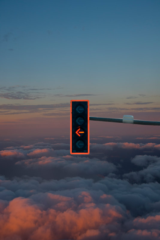
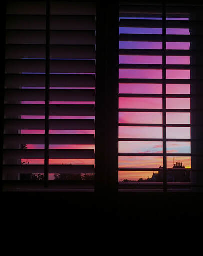
For my first strand I looked at a series by photographer Kanghee Kim called 'Golden Hour'. Kim created a book filled with fantastical images capturing the golden hour - the moments just before sunset or just before sunrise. The series is part of a much larger photographic collection entitled 'Street Errands' , in which she edits her photos, merging images together which portray her everyday errands in different parts of America. Kim's idea is to manipulate images of mundane activity and familiar spaces, and create new surreal scenes. I found the juxtaposition of the ordinary, mundane aspects of the street with the beautiful, natural colours in the sky to be visually intriguing and innovative. I initially found variation in the different times of day and how this affects the colouring of the landscape, but I also think it's interesting to look at creating variation in changing / manipulating photos and how this can transform such a familiar, common object/space.
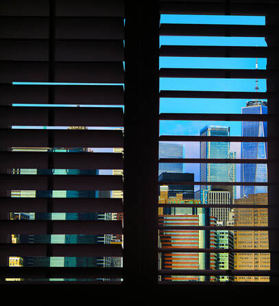
For my own response, I first looked at photographing the sky without merging images together. In this image I photographed the sun setting through a set of blinds to add an aspect of layering and the combination of two spaces. I then edited the colours of photoshop to make them more vibrant and saturated in order to recreate the lucid, dream-like quality of Kanghee Kim's photos.
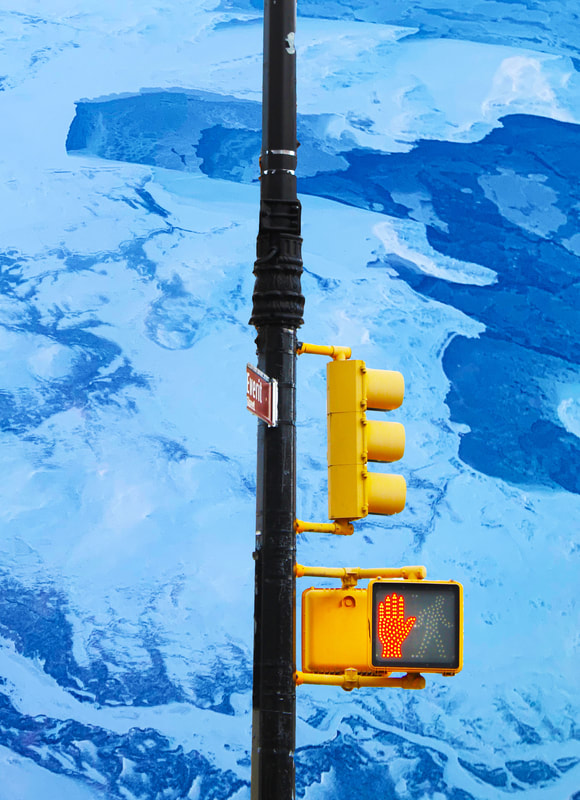
However, I didn't feel that the image had the same fantastical, surreal use of imagery as Kim's images do. I then decided to play around with combining the structure of the blinds with different background. I used images from New York of the skyline, cut out the sunset from the original photo and replaced it with the new image. I made the colours extremely saturated and flat to imitate the 'pop-art', vivid aesthetic of Kim' images. I think the idea of an unrealistic scene is very interesting visually and conceptually. Photography supposedly differs from art because it is a more 'accurate representation of reality', this use of collaging and editing creates an alternate version of reality that doesn't make visual sense. It's a variation and transformation of what is familiar and relatively mundane into an ethereal piece of art. I experimented further with combining my New York photos with photos of the sky, and photos taken from the window of the airplane. I tried using images of buildings and skylines, and also singular objects like traffic lights. I found that the images with large areas of flat colour gave the best outcome and are the most similar to Kim's work. I really like the artistic quality of these images and I think they are successful in responding to Golden Hour series.
|
|
|
|
|
|
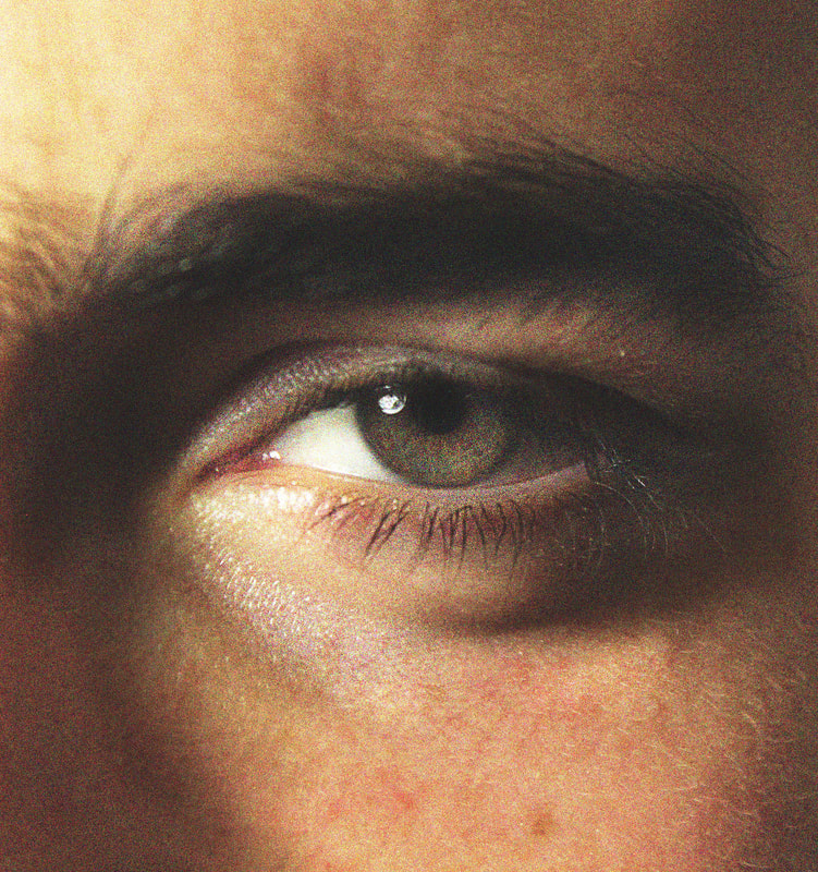
Second Strand- Facial expressions
Artist Reference - Alex Prager
|
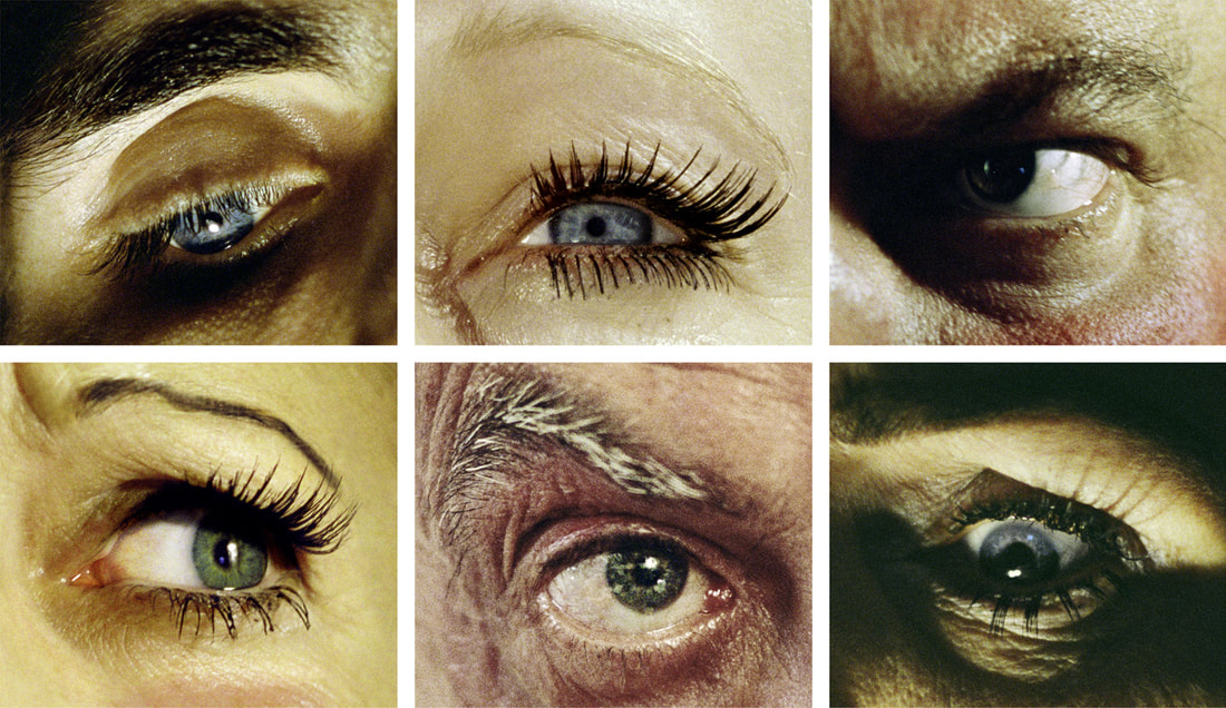
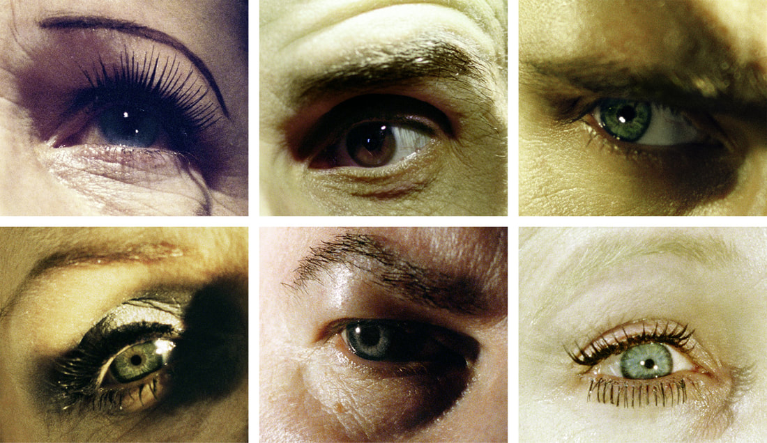
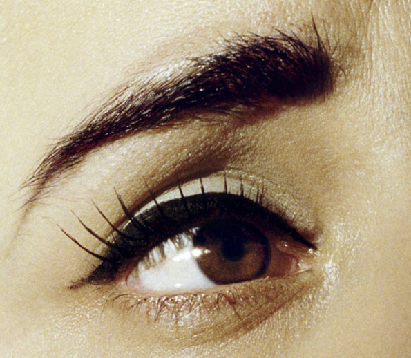
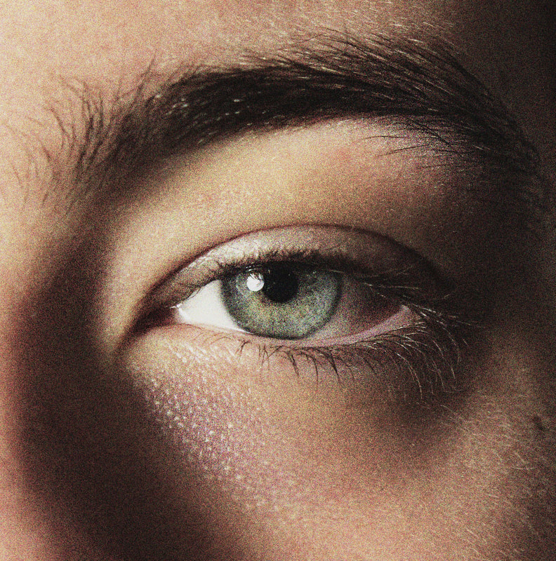
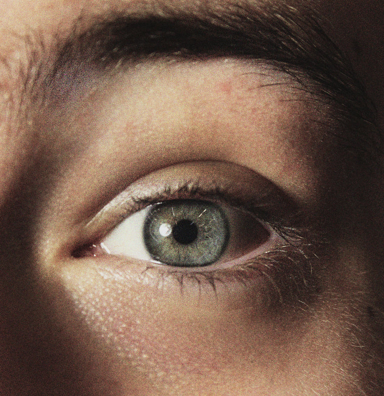
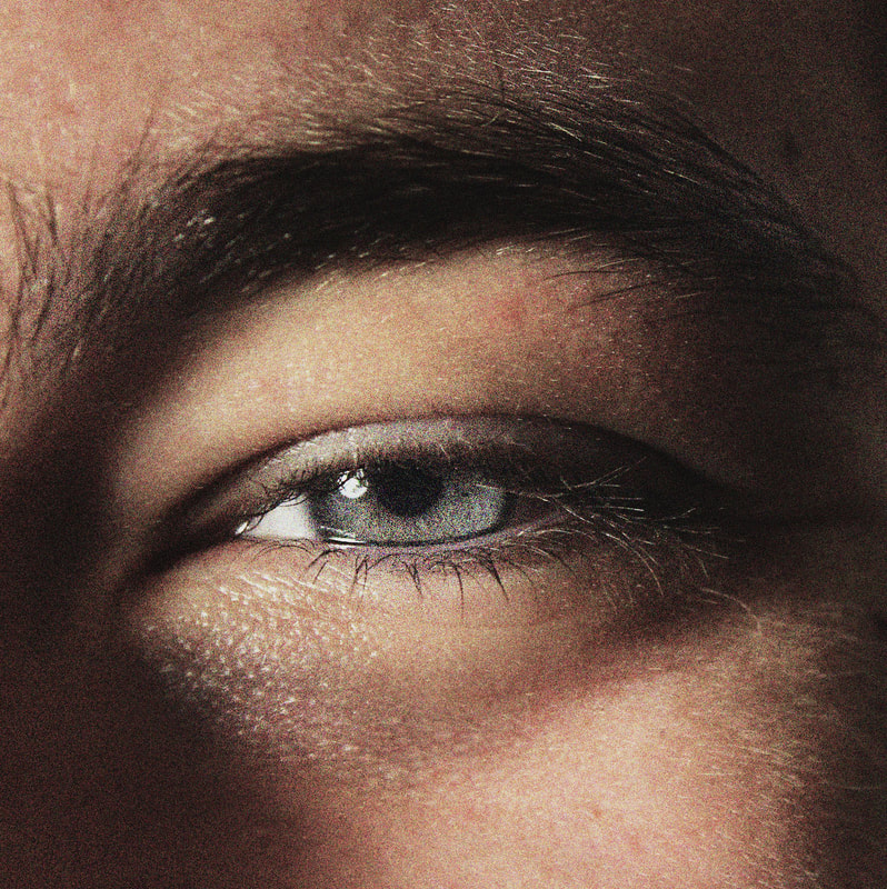
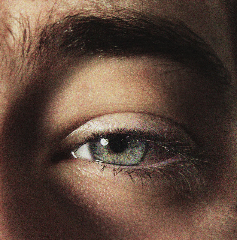
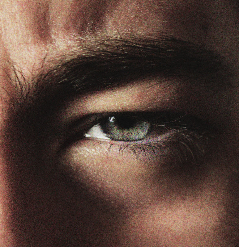
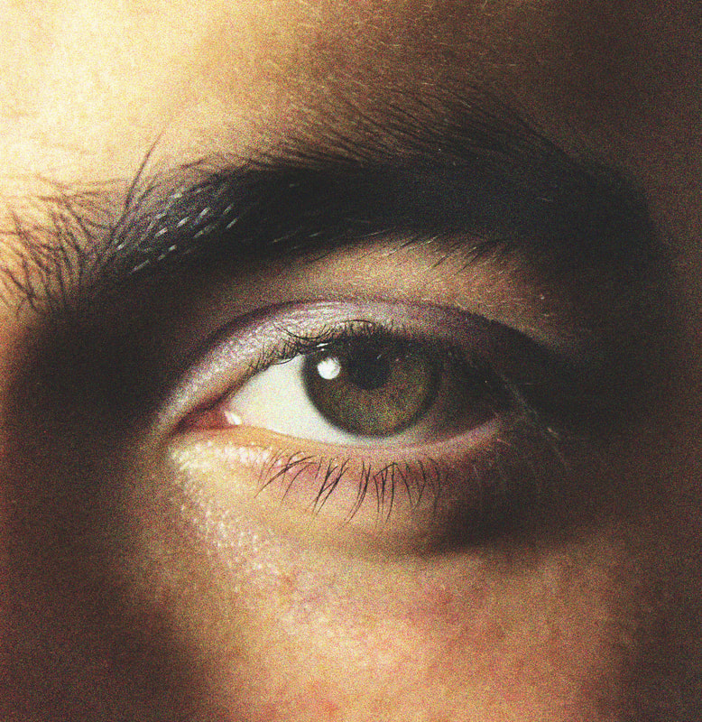
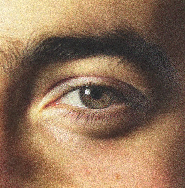
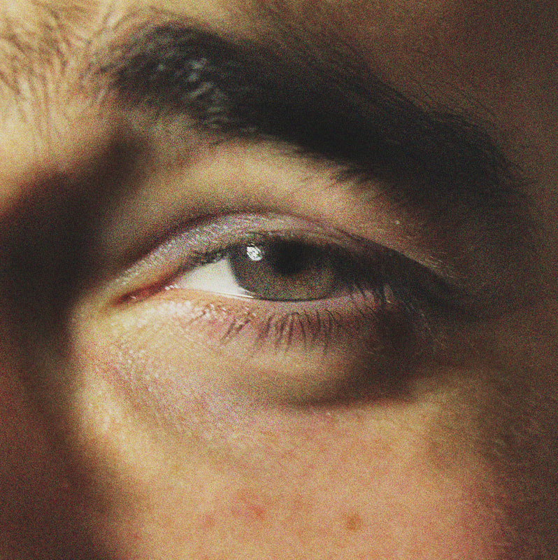
For my Second Strand I looked at the work of Alex Prager, an American photographer and film maker known for creating a 'meticulously designed' mise-en-scène by using staged actors. Her photos have a cinematic quality that elevates a mundane daily scene to an intriguing, dramatic moment in a broader story. I looked at a photo series by Prager called 'Compulsion' (2012), in particular, the gridded arrangement of eyes in dramatic expressions. I found it interesting how subtle or dramatic movements in the eye can imply completely different emotions and contexts for the viewer.
For this strand I'd like to explore the idea of conveying a particular emotion through facial expression, and how this can impact the context, meaning or general atmosphere of any image. I think it would be interesting to test how subtle these variations of expression can be to effect the underlying feeling of the image. |
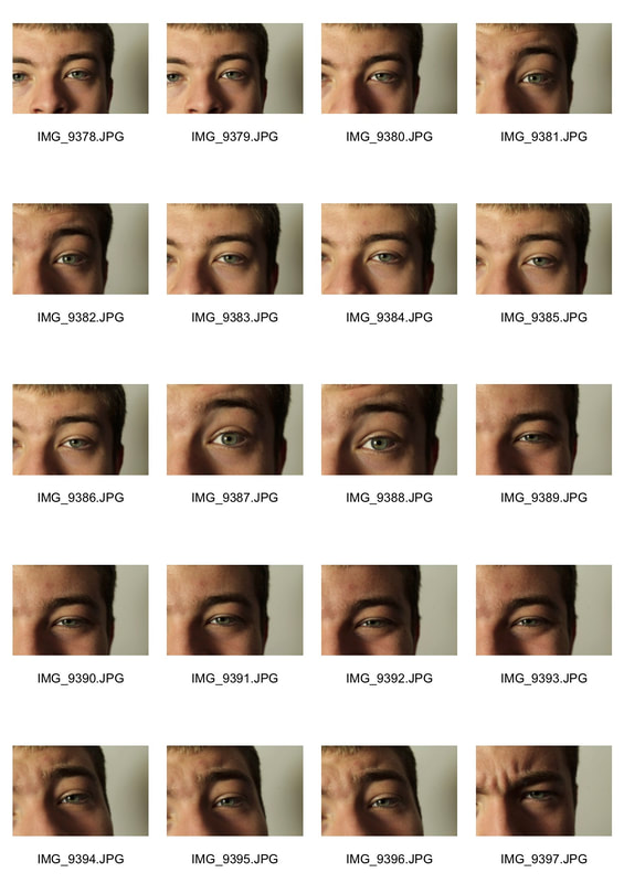
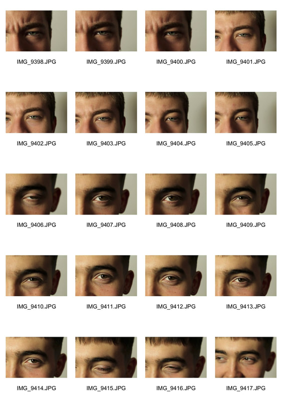
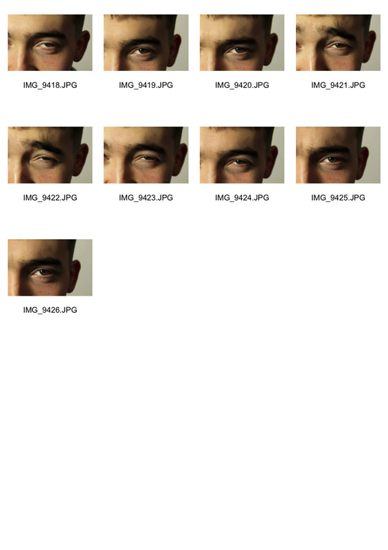
My Response
In responding to the work of Alex Prager, I would like to photograph people's eyes while asking them to make different facial expressions. I want to crop the photos close around the eye to emphasise how an expression can be conveyed solely through the eye.
|
|
|
In the editing process of the photos I cropped them into square close around the eye before trying to recreate the 'classic cinematic' colour scheme that Prager creates. I turned up the contrast and and used a film grain filter as well as desaturating the colours. I think the images were successful in capturing different emotions through variations in the shape of the eye and eyebrow. To improve or create a stronger imitation of Prager's work, I would vary the position of the light source to create a range of shadows in different expressions and how this can affect the emotion conveyed.
|
|
|
|
|
|
|
|
|
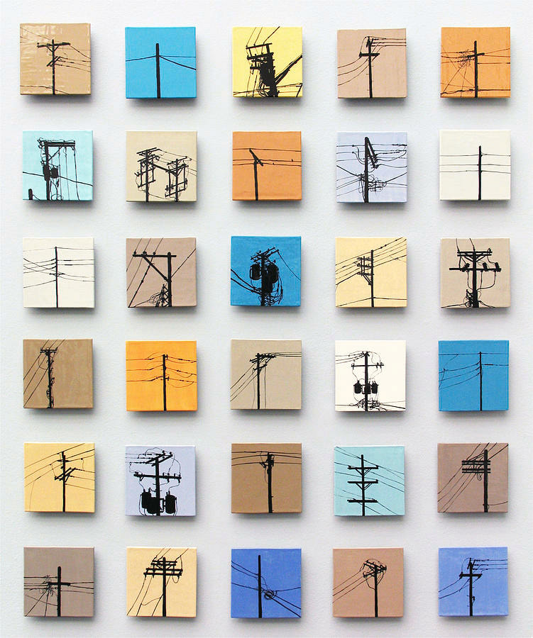
Strand 3- Personal Typologies
Artist reference- Jason Messinger
For this strand I want to revisit the idea of Typologies that we looked at in the set tasks. I am interested in creating typologies of personal items that are seemingly mundane but interesting to compare in a collective. This links to the theme of variation and similarities because in making a typology I can create a study of how we all seem to live different versions of the same lives. How a personal item can reflect the character of its owner and how this varies in different types of people interests me a lot.
I looked at the work of Jason Messinger and his painted tiles. In this particular collection he paints silhouettes of telephone wires onto small tiles of solid colour. The use of flat colour on the tiles and the stencil like form of the wires suggests a Pop Art influence which I am interested in looking into. I think it's interesting how Messinger chooses an aspect of the street that is not usually acknowledged, using a mundane object as the subject of a typology brings more attention to the subtle differences and similarities between the individuals, which we would not normally notice in our daily lives.
I looked at the work of Jason Messinger and his painted tiles. In this particular collection he paints silhouettes of telephone wires onto small tiles of solid colour. The use of flat colour on the tiles and the stencil like form of the wires suggests a Pop Art influence which I am interested in looking into. I think it's interesting how Messinger chooses an aspect of the street that is not usually acknowledged, using a mundane object as the subject of a typology brings more attention to the subtle differences and similarities between the individuals, which we would not normally notice in our daily lives.
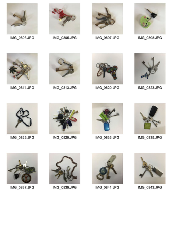
My Response
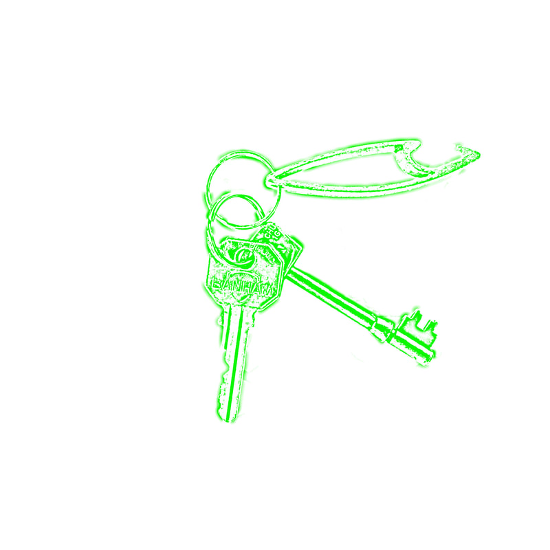
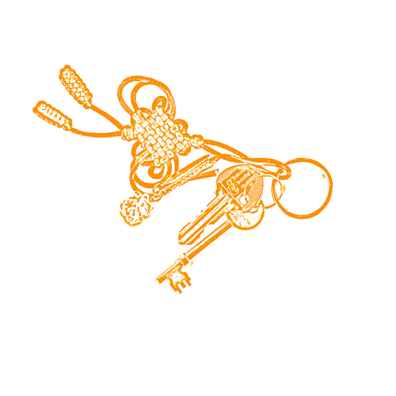
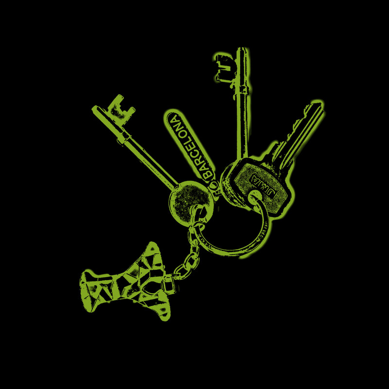
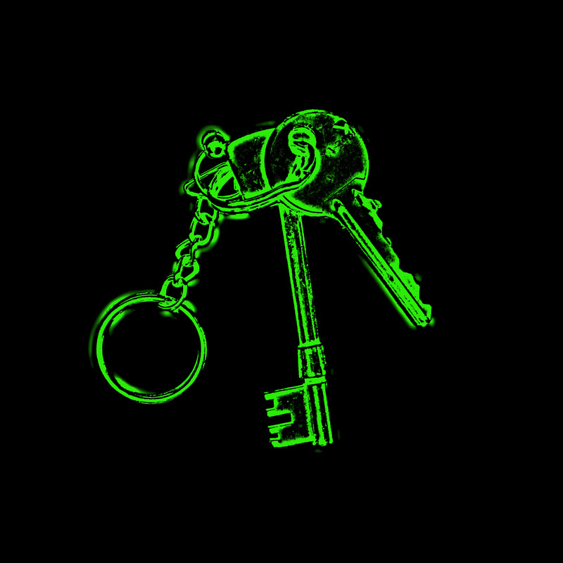
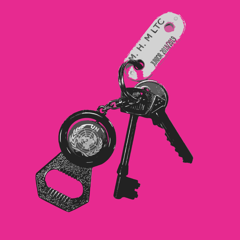
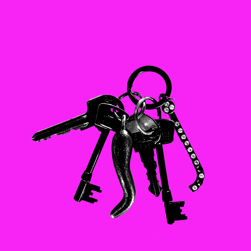
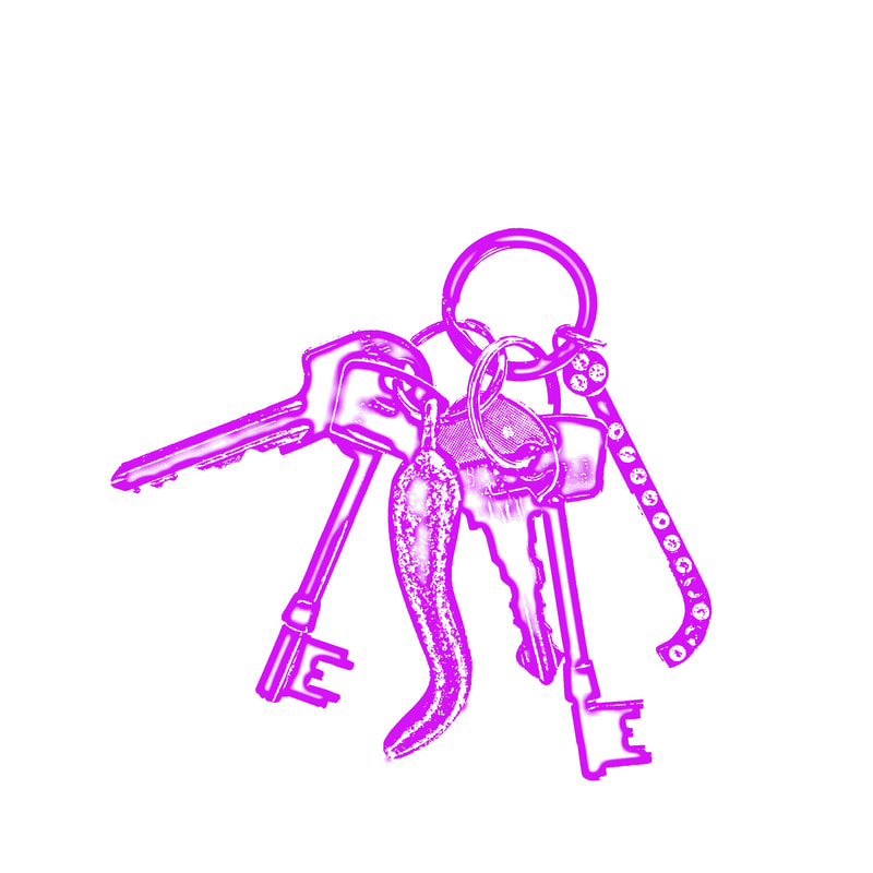
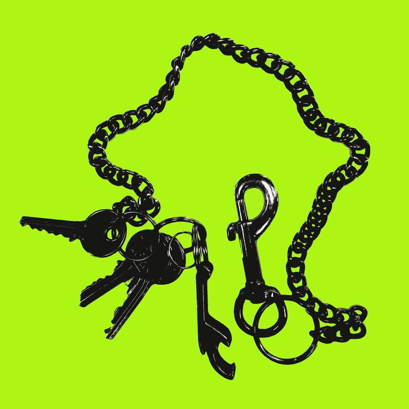
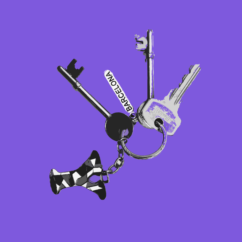
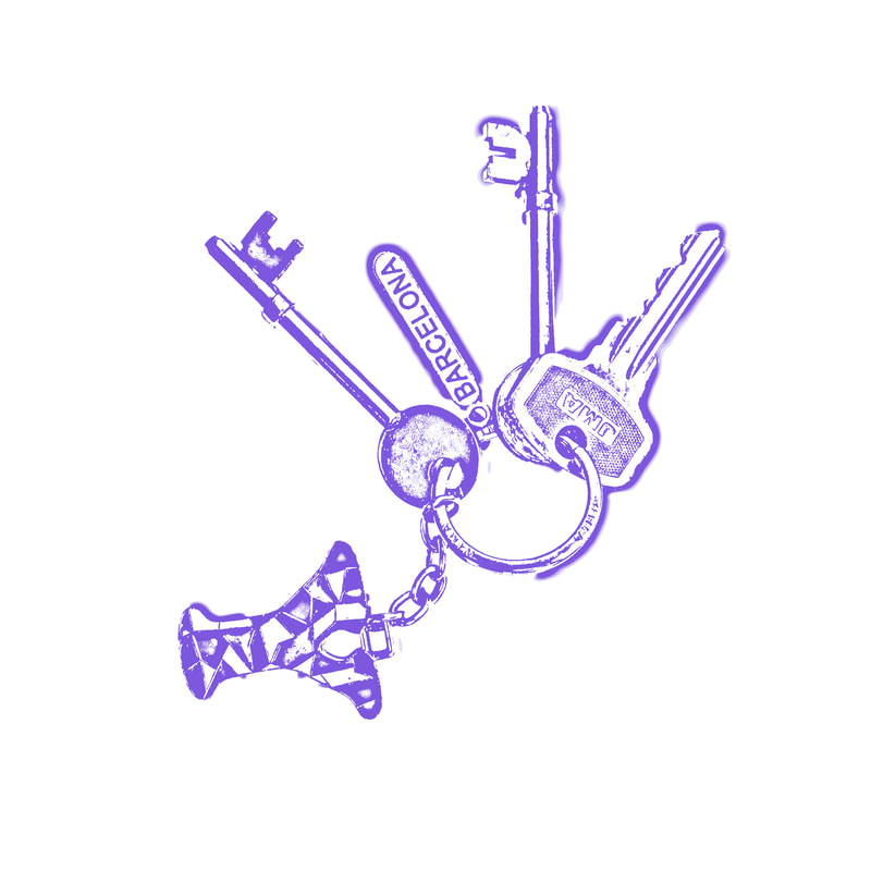
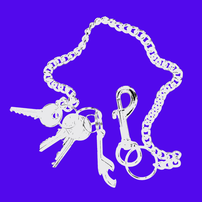
In response to the work of Jason Messinger I would like to create a typology of different people's house keys. I think it will be visually interesting to see how different people personalise their keys, or don't, and how this may be an extension of their personality and style. I will then edit these images in the style of Jason Messinger's paintings to create more consistency between the photos and for aesthetic value.
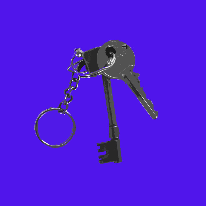
Edited images
In the editing process of these images I wanted to take inspiration from Messinger's style of a black silhouette on a flat coloured background. However I wanted to maintain the details of the different sets of keys and the keyrings attached, so I decided to experiment with using different tools on photoshop to create lots of interesting effects. I removed the keys from the original background and placed it onto colour, as well as inverting some of the images and using different artistic filters. I am happy with the finished product because I think the editing elevates the images from just photos of keys to something visually interesting and artistic. I also think the original concept of comparing the variations between the individual house keys is present and effective, the uniformity of the photos as a whole emphasises the small unique differences.
|

|
|
|
|
|
|
|

|


|
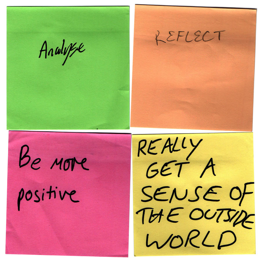
CHOSEN STRANDS -
PERSONAL TYPOLOGIES
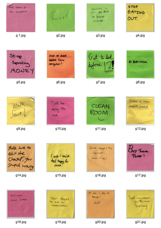
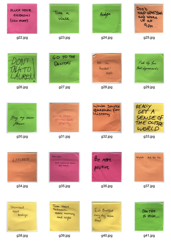
First Development- Notes to self
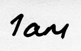
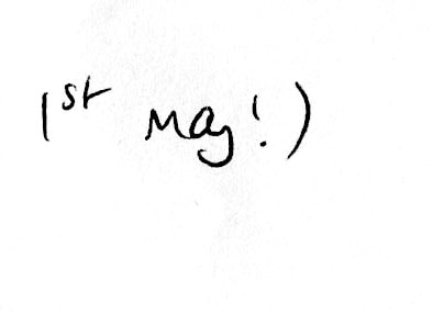
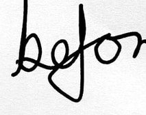
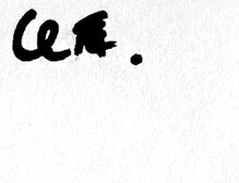
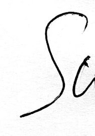
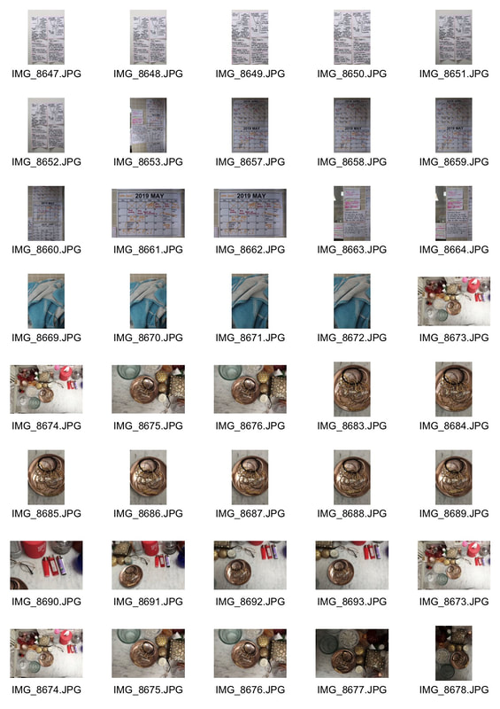
For my first development I will ask different people to write down a personal reminder to themselves on a post it note. I want to look at the variation of content as well as the differences in handwriting and how this may reflect someone's character. I also thought that by using post it notes, the background colour is already solid and reflects the influence of Jason Messinger from my initial strand idea.
|
|
|
By leaving the brief quite vague, I received a wide range of 'reminders' from mundane to philosophical. I found it interesting to compare all of these as a typology, and also to see how a single note with no context can evoke curiosity and a sense of the person's life.
Categorising
After looking at all the post-it notes, I decided to scan them in and create different groups of notes that share the same basic idea.
This makes it clearer to not only see the similarities between many different people, but also the differences. By using a concept as personal as a reminder to oneself it becomes a visual study of how people introspect and what their priorities are.
I think this development was successful in taking something very mundane and, by using repetition, creating a more thought provoking end result. I think the idea of handwriting and the subtle unique variations between different people's writing is a very interesting concept that I would like to develop further.
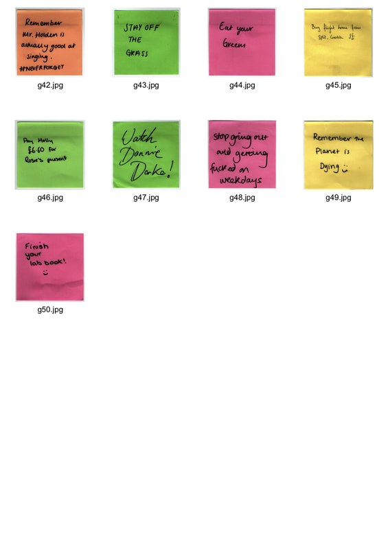
GOOD HABITS
|
BAD HABITS
|
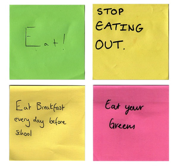
EATING
|
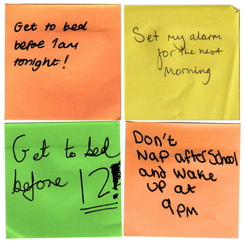
SLEEPING
|
|
|
|
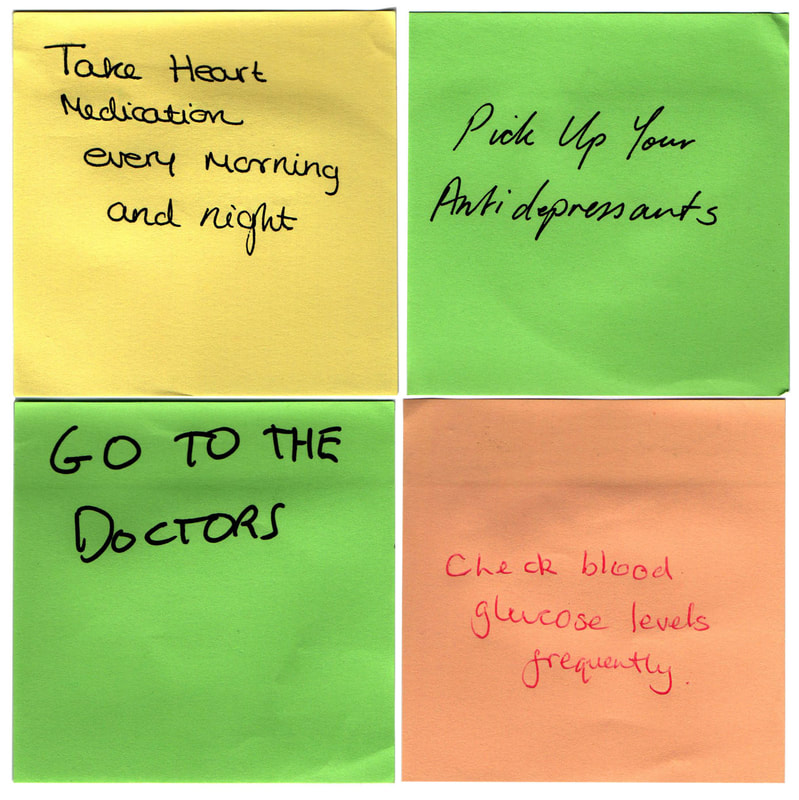
SELF CARE
|
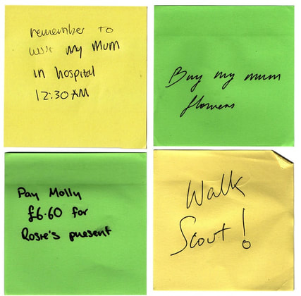
CARING FOR OTHERS
|
LIFE ADVICE
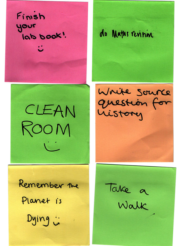
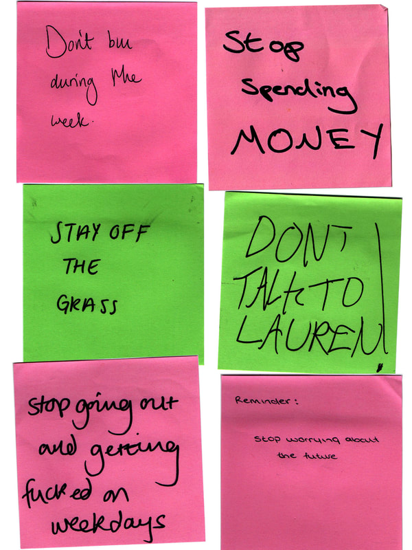
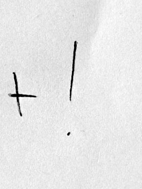
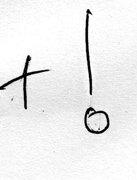
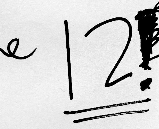
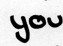
Second Development - Typologies of handwriting
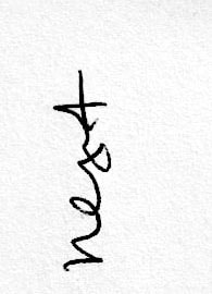
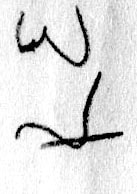
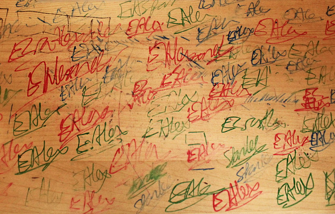
To develop the idea of different handwriting I am going to go through the post it notes and find words that multiple people have used to create typologies emphasising the subtle variations in peoples' writing.
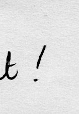
exclamation points
|

|

|

|
|
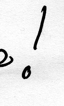
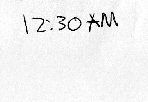
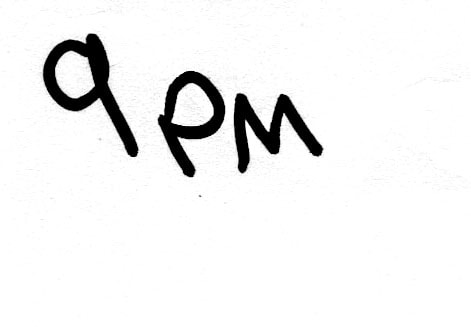
numbers
|
|
|
YOU


|

|

|
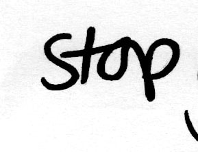
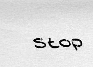
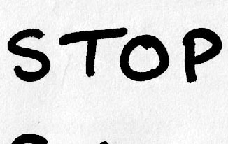
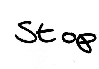
STOP
|
|
|
|
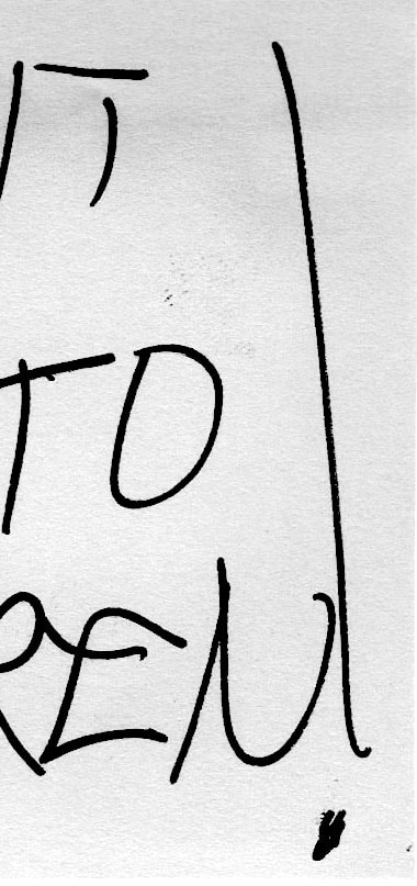
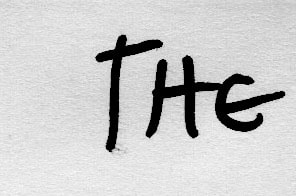
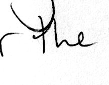
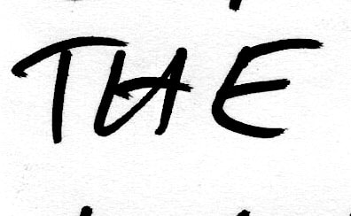
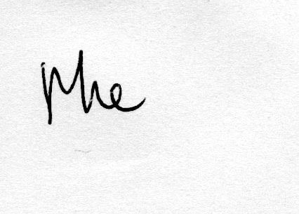
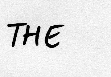
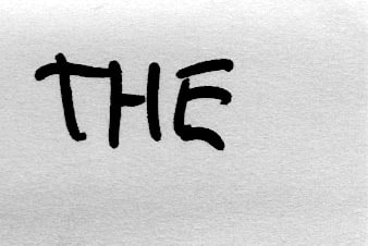
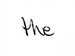
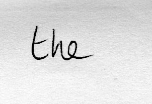
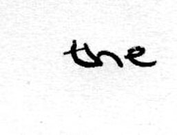
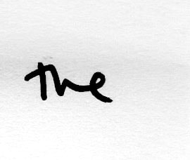
THE
|
|

|
|
|
|
|
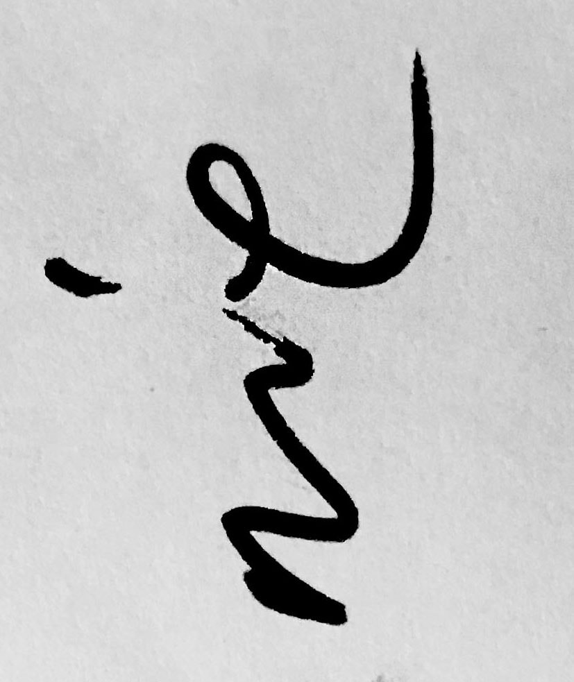
I decided to make these images black and white to maintain the focus on the writing itself. I think it is very interesting to see how we all subconsciously personalise our own handwriting when we all learnt to write the same way as children. When compared next to each-other I think the typologies are successful in showing this and fulfilling my idea. I would like to focus more on handwriting and the actual shape and forms.
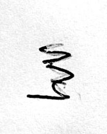
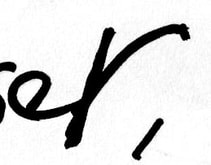
Third Development- Abstracting handwriting
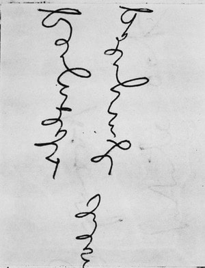
Artist reference- Nancy Hellebrand
I decided to look at the work of Fine Art photographer Nancy Hellebrand. Hellebrand created this series of work untitled 'Handwriting' which involved her abstracting people's handwriting by altering the scale or orientation. She thought that the writing itself expressed more about the person than the content of the message itself. I think it is an interesting idea to focus on solely the form and shapes in the writing and to take something so familiar and make it unrecognisable.
|
|
|
My Response
For my response I revisited the post it notes and tried to pick out very small details of peoples' writing that I thought would be visually interesting. I also made these images black and white in the style of Nancy Hellebrand and tried to maintain a focus on the shapes and lines rather than the words that are formed.
|

|
|
|
|
|
|
|
|
|
|
I think the final images are successful in responding to the work of Nancy Hellebrand and in creating abstracted versions of the handwriting. Rotating the writing worked extremely well to completely separate the shapes and lines from the original words and letters. However, in terms of developing the idea further I would like to combine handwriting with photographs.
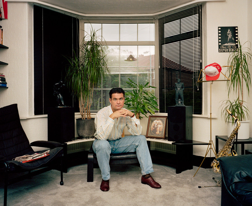
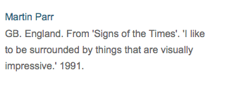
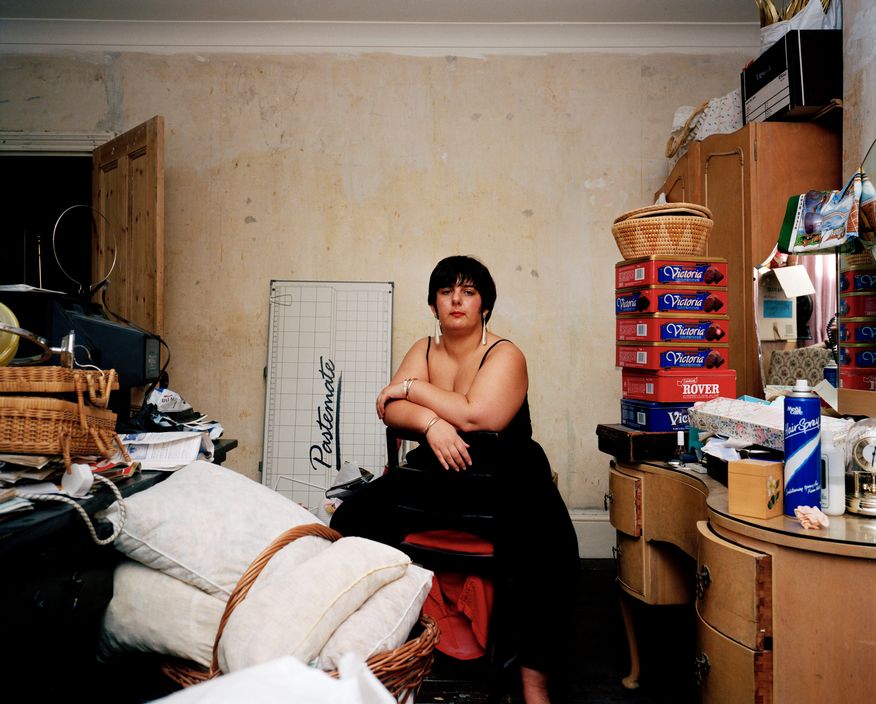
Martin Parr - Signs of the Times
I looked at the work of photographer Martin Parr and his series 'Signs of the Times'. Martin Parr photographed a varied selection of people in their homes and asked them to describe the decor choices or style. It is interesting to not only see how different people consider their own homes to be an extension of their personality, but also how this is translated in their physical appearance. Parr uses a mixture of detail shots and photos of the whole room with the subject. The compositions are consistently quite simple and symmetrical, creating a more uniform typology of the rooms. The expression of all the subjects is also uniform and neutral, allowing their character to be portrayed through their pose, clothing choices and of course, the room itself. In my opinion, the quotes are a vital part of the series because the words can add new meaning to the images and provoke thought from the viewer. It is interesting to see how important people consider their interior choices to be, or how incredibly trivial.
|
|
|
|
|
|
Fourth Development - Households
In response to the work of Martin Parr, I would like to document a subject and their response to different rooms in their house. I would like to use a simple, clean composition like Martin Parr and try to capture a sense of the person in their pose, the rooms themselves, and the written words.
|
|
|
|
|
|
|
|
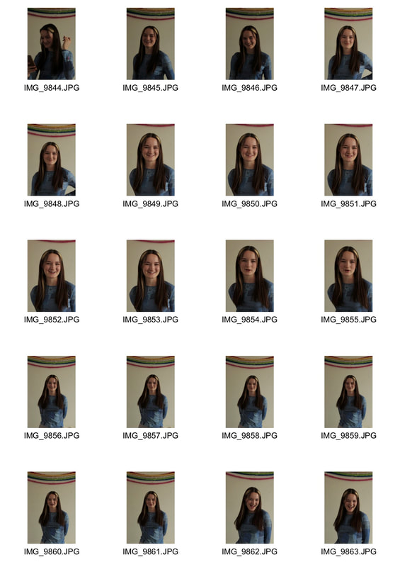
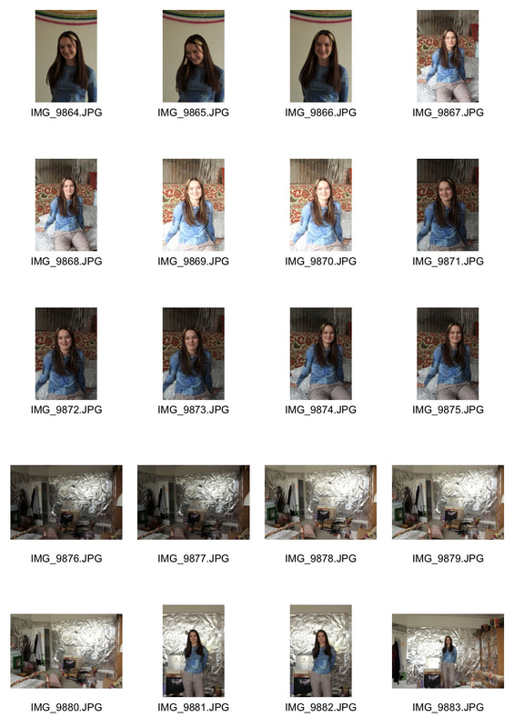
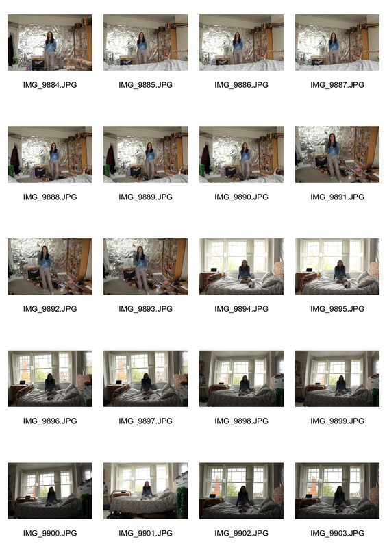
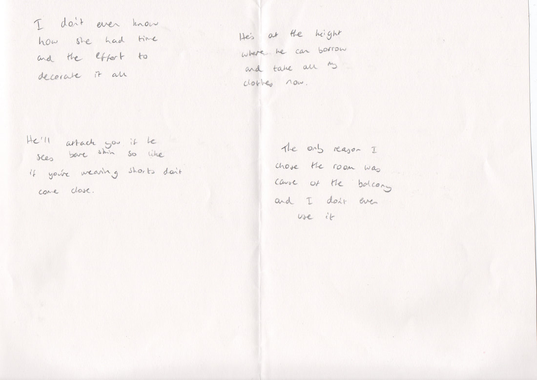
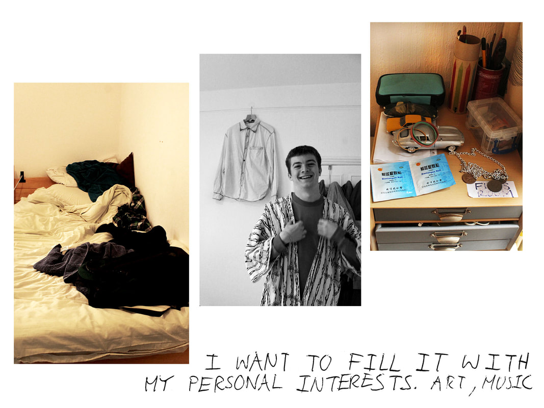
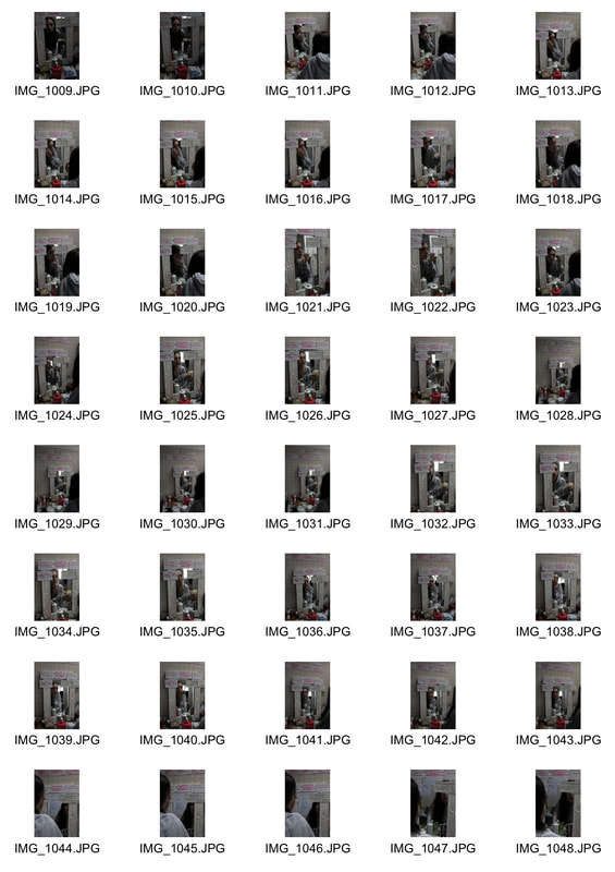
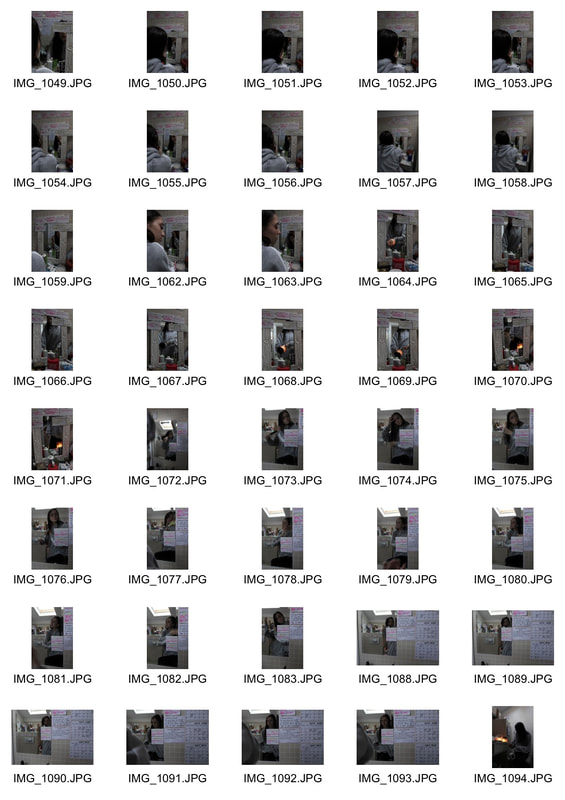
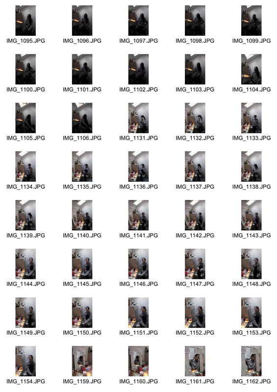
I photographed my friend Maddie in her own bedroom, her sister's bedroom, her brother's bedroom and her garden balcony. I took wide photos of the whole room with the subject included, inspired by Martin Parr. I also took photos of specific areas and small details around the rooms as well as portraits of the subjects. Using all of these images I hope to create a general overview of the subject's personal life and character. I also asked her to handwrite comments about the rooms, her family members and memories she's had to go alongside the images. I chose to use her own handwriting in relation to my prior developments which looked at how people's writing can reflect them.
|
|
Artist Reference- Jim Goldberg
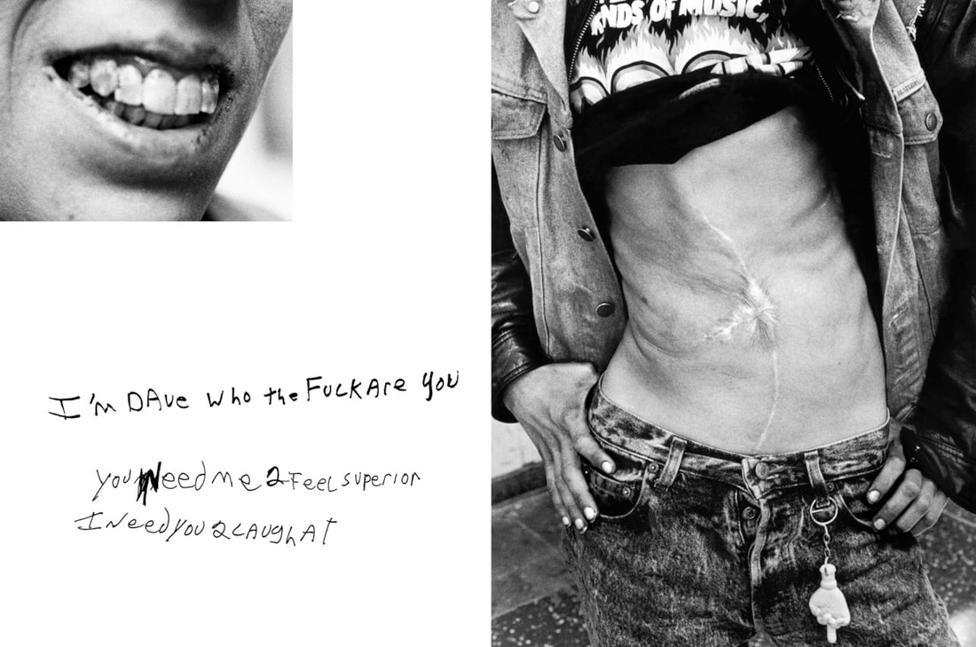
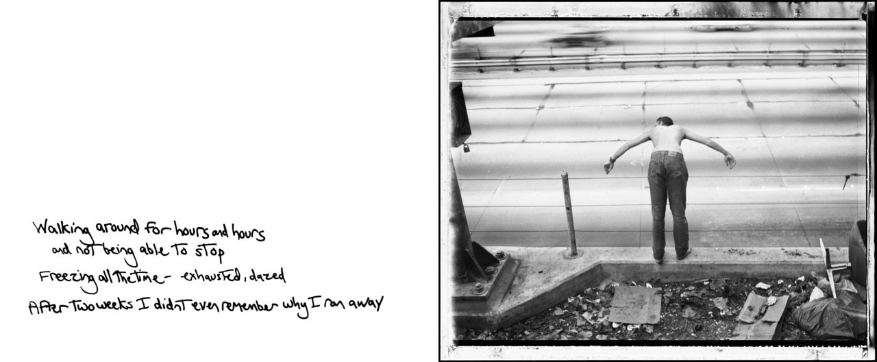
Jim Goldberg is an American photographer renowned for his focused, in- depth photographic studies of ostracised or neglected communities.
I looked at his series ' Raised By Wolves', which explores the lifestyles of a group of marginalised youth living on the streets of California. Goldberg mostly followed several individuals who were compelling and bold before following them around LA. This immersion into their lives and relationship formed between Goldberg and the runaways is translated through the book as he presents an exclusive and intimate insight into their personal lives and histories.
I was mostly interested in Goldberg's style and layout of his books, and how he incorporates handwritten notes with his images. The true personalities, stories and dreams are authentic and raw because the subjects were given an opportunity to share them in their own words with no censor. Goldberg uses a wide range of media in the book; such as photos, fragments of conversation, handwritten notes, drawings and other items. This multi-faceted study of the subjects is extremely effective in documenting the true lives of the individuals, showing every aspect of them as people and how they present themselves.
|
|
Edited images
I took inspiration from Jim Goldberg to edit my images as pages. I put the images on blank documents with the appropriate handwritten response alongside. I think the final edits are successful capturing the subject's personality as well as her personal history and relationship to her family members. I would like to develop this idea by looking solely at the bedroom of multiple subjects and collecting them together, in order to create a typology of people's bedrooms and personal spaces and how it reflects them.
Fifth Development - Bedrooms
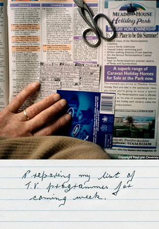
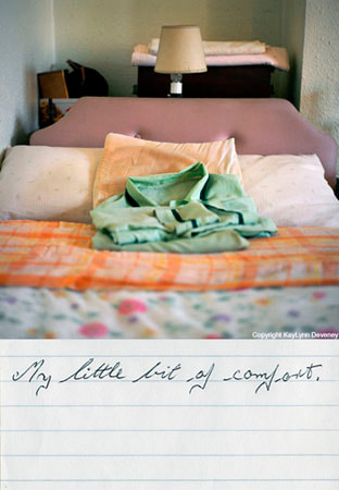
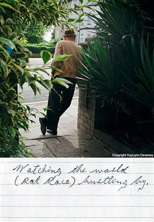
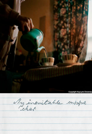
Artist reference- KayLynn Deveney
I looked at the photographer KayLynn Deveney and her series 'The Day to Day Life of Albert Hastings'. Deveney followed Albert Hastings, a local inhabitant, through his daily life, photography his routine activities and small details of his personal life. He then wrote his own captions in response to the images. Deveney describes the importance of the captions saying they create a new context for the photos by either corresponding to the thinking that shaped the image, or interpreting the image in a different way. I think it's extremely interesting to see how people respond to particular images of themselves or of their personal lives. In writing the comments there is a sense of introspection and a moment for thought about his life and what he does on a daily basis. This transcends the series from being documentary photography to being a true critical and reflective self study.
I also think the layout of the images, with the text underneath the individual photos, is effective and is something that I would like to experiment with.
I also think the layout of the images, with the text underneath the individual photos, is effective and is something that I would like to experiment with.
|
|
|
|
My Response
|
|
|

|
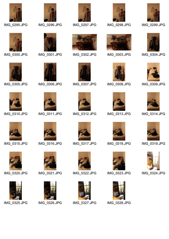
In response to the work of KayLynn Deveney, I photographed my friend Kate in her bedroom and asked her to write short captions about each aspect of her room. In editing these images I then used the same idea as Deveney, placing the text underneath each photo and leaving the texture of the paper in the image. This creates a personalised effect, similar to a diary or photo album. I thought it was particularly interesting to leave any slang, corrections or spelling mistakes in the final edits to keep it authentic and true. I thought it as important to have the subject in each image and have her interact with the object or specific area, in order to create a document of how she lives her life and her relationship with the bedroom itself.
I think these images are effective in following the life of an individual and capturing her relationship to her own personal space, however moving forward I would like to look at multiple subjects to create a typology.
I think these images are effective in following the life of an individual and capturing her relationship to her own personal space, however moving forward I would like to look at multiple subjects to create a typology.
|
|
|
|
|
|
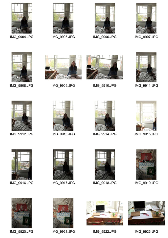
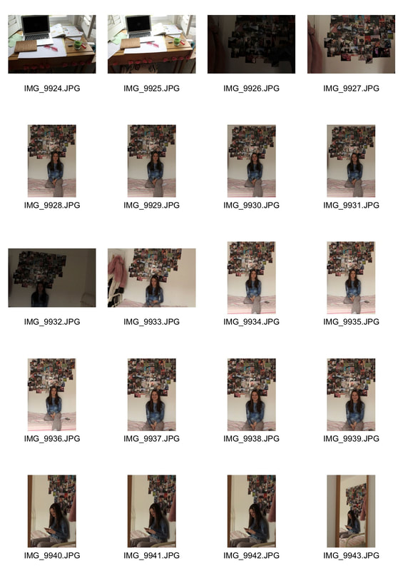
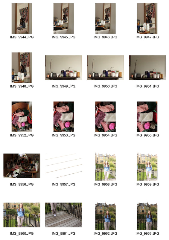
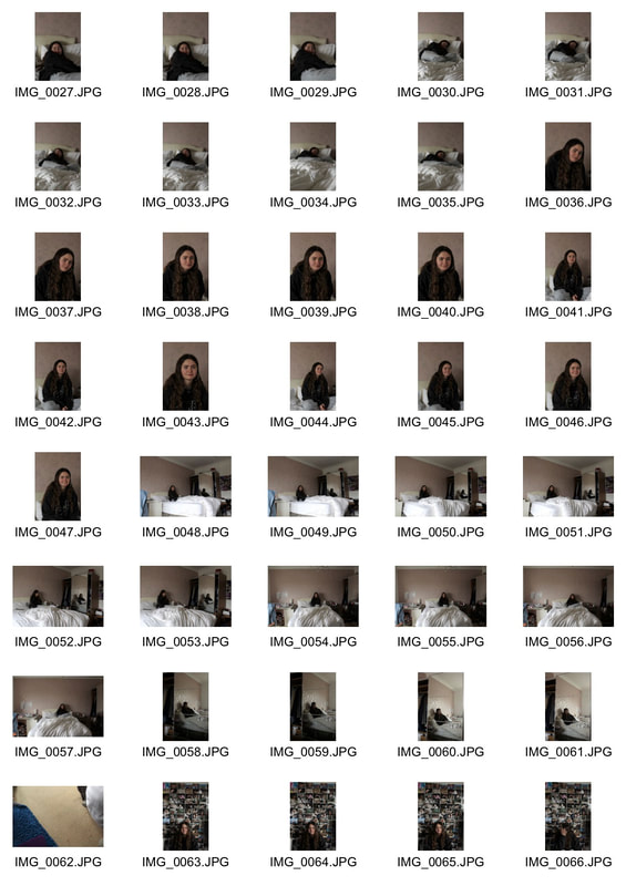
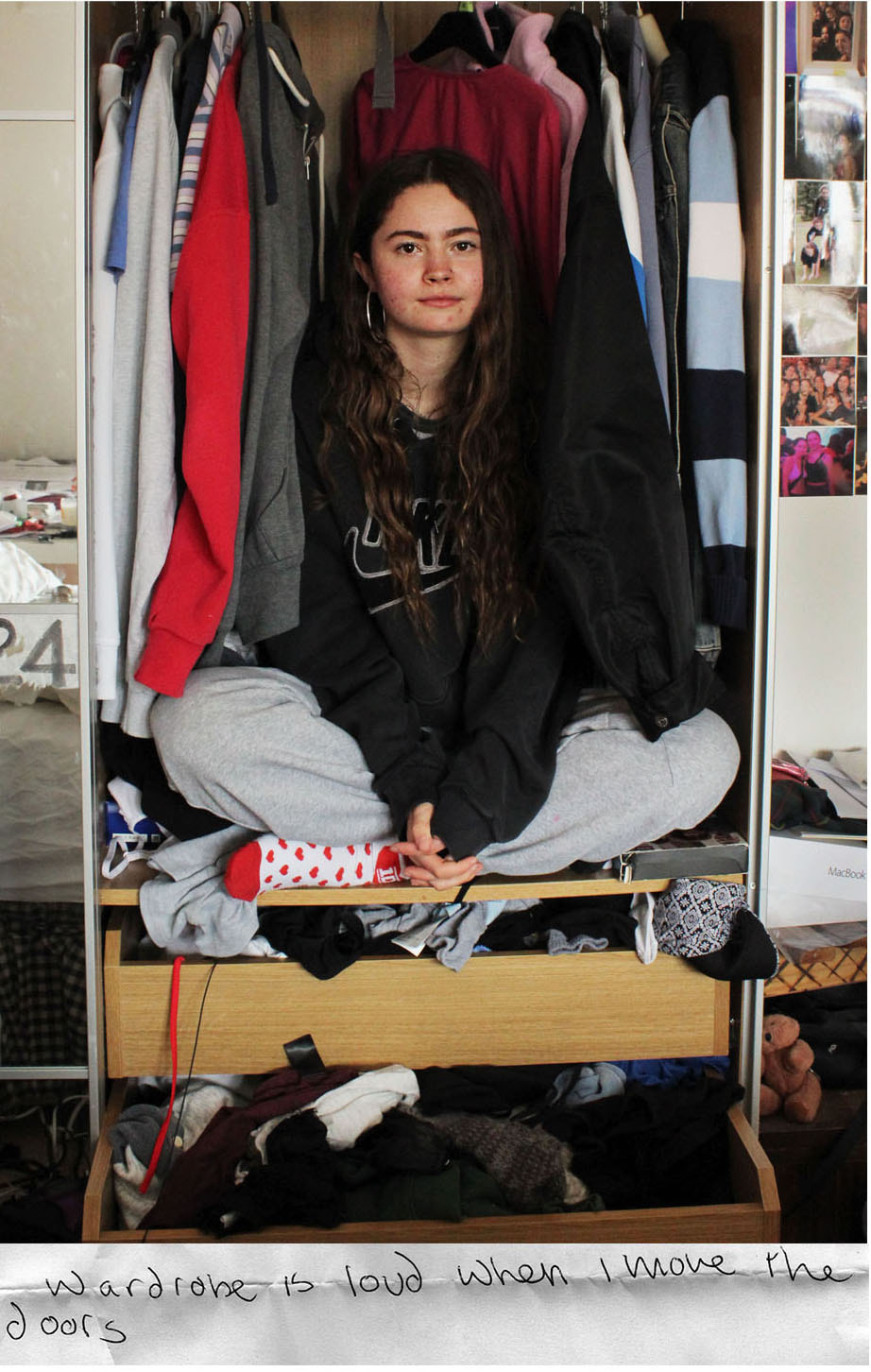
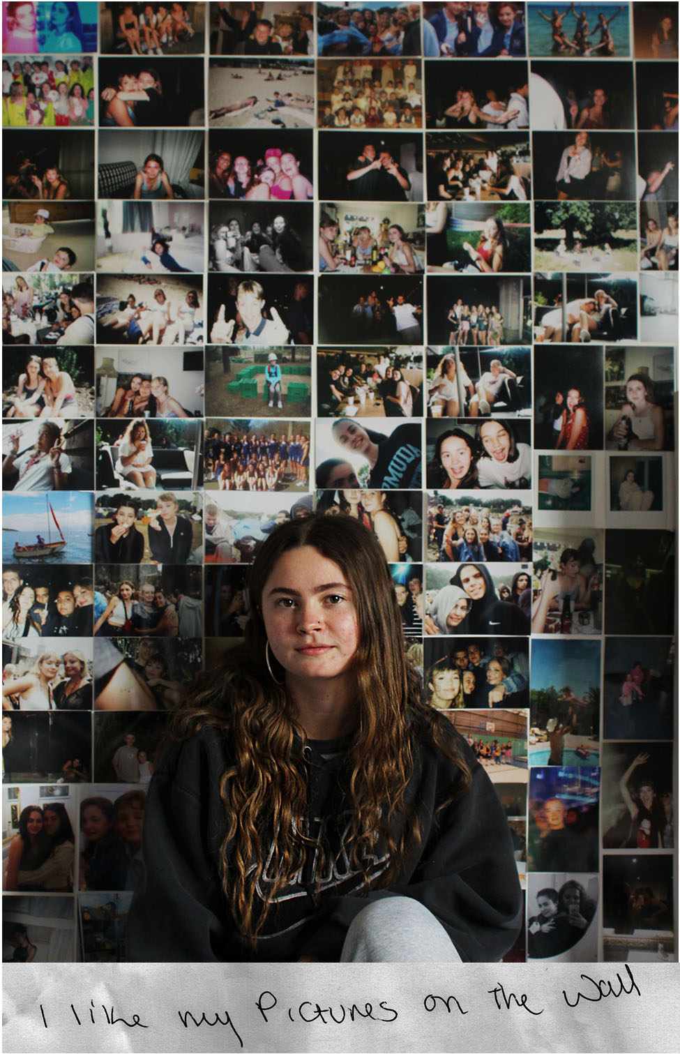
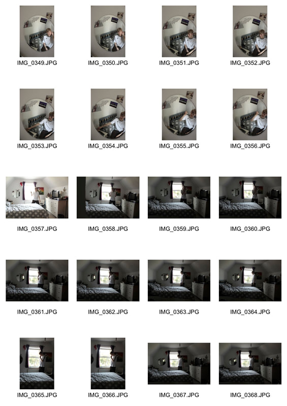
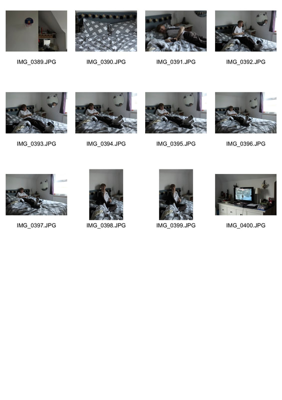
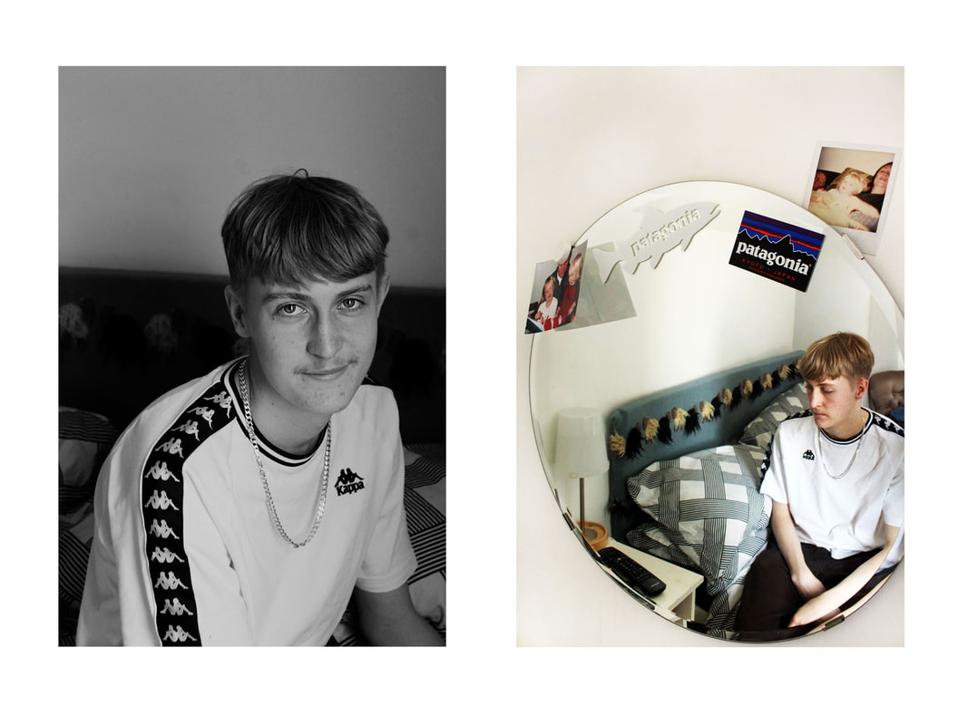
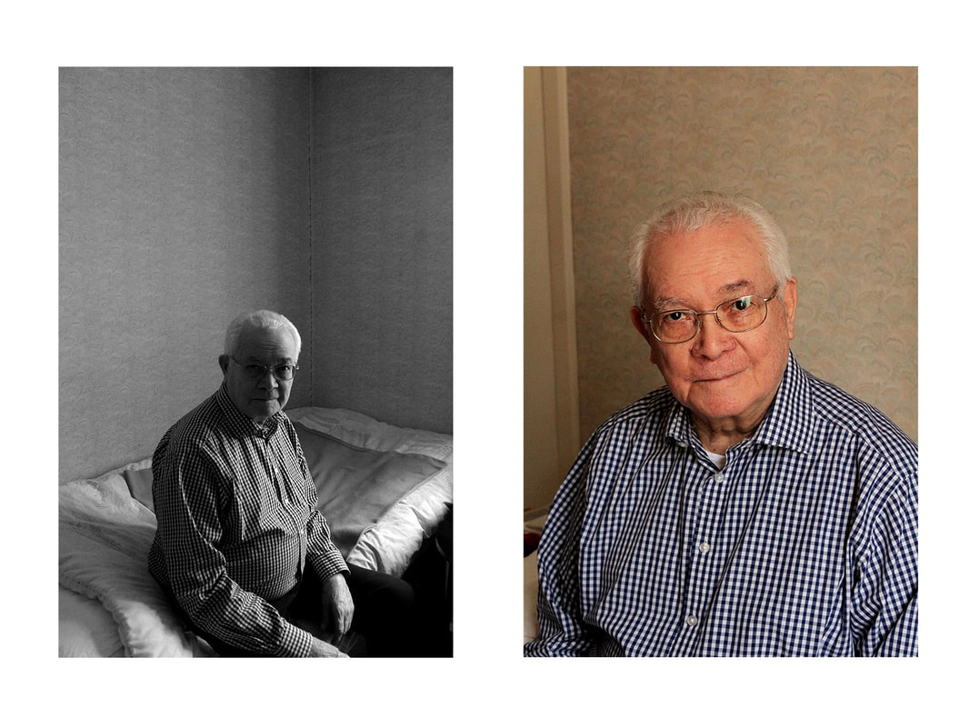
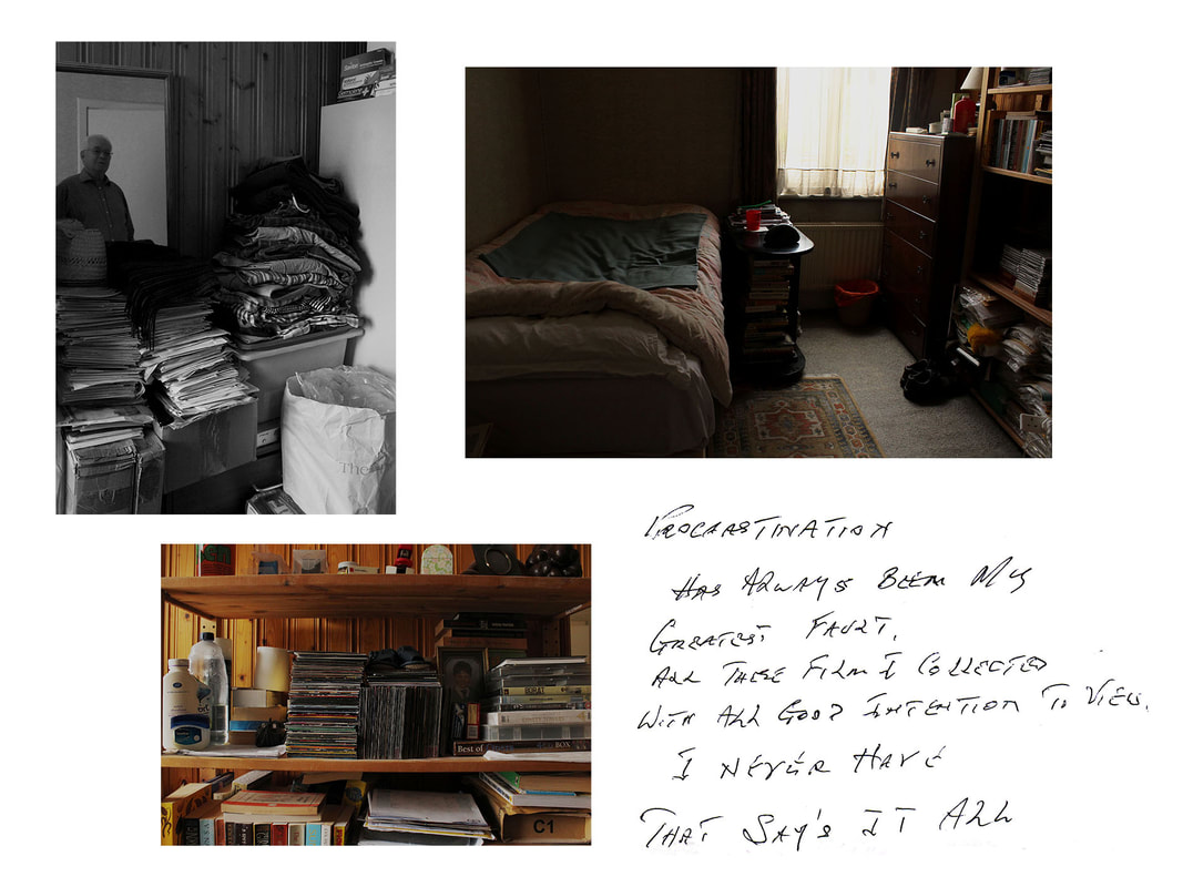
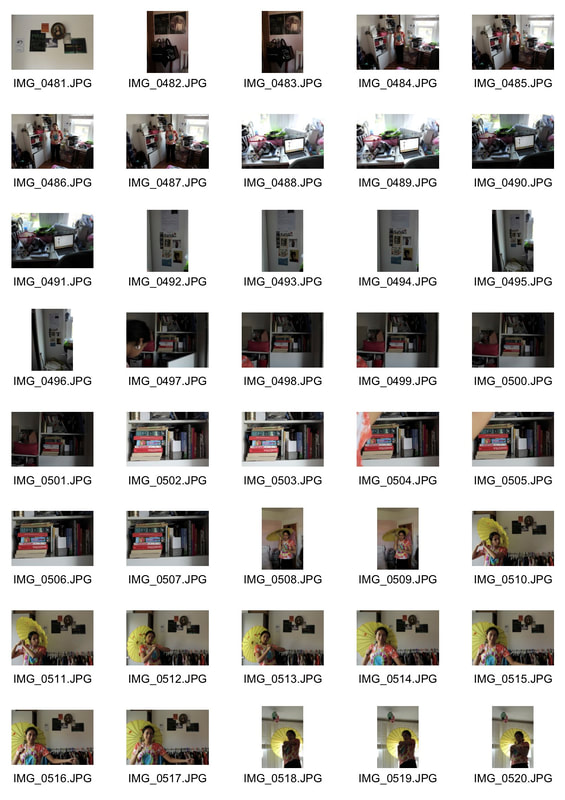
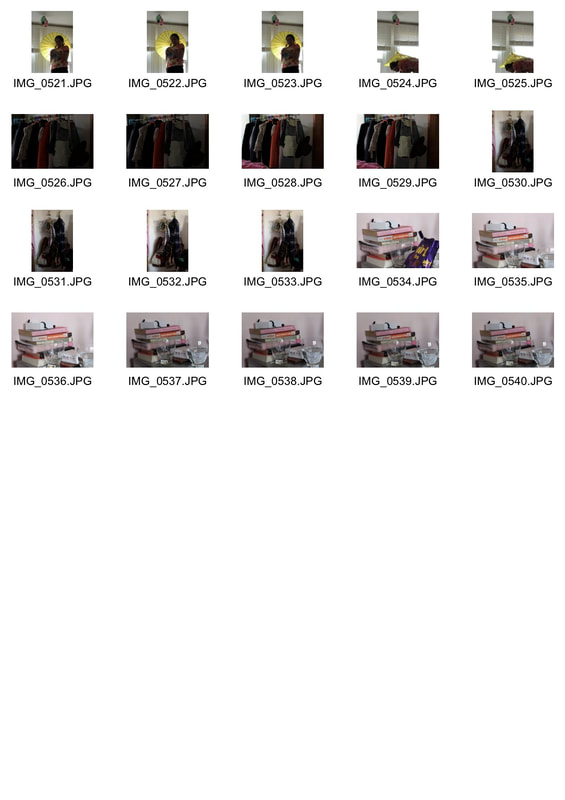
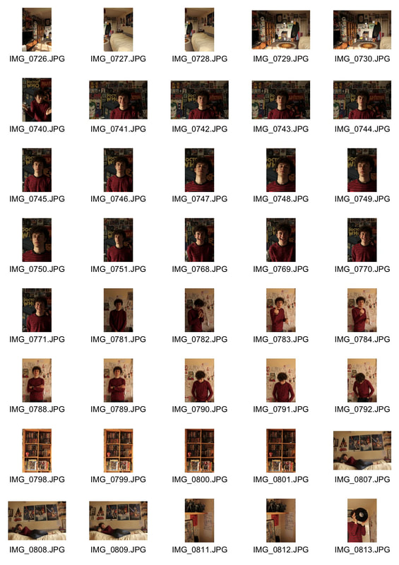
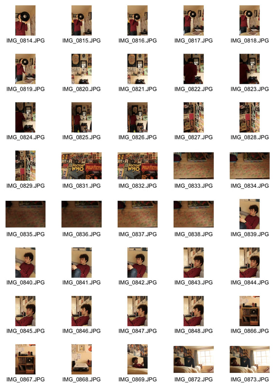
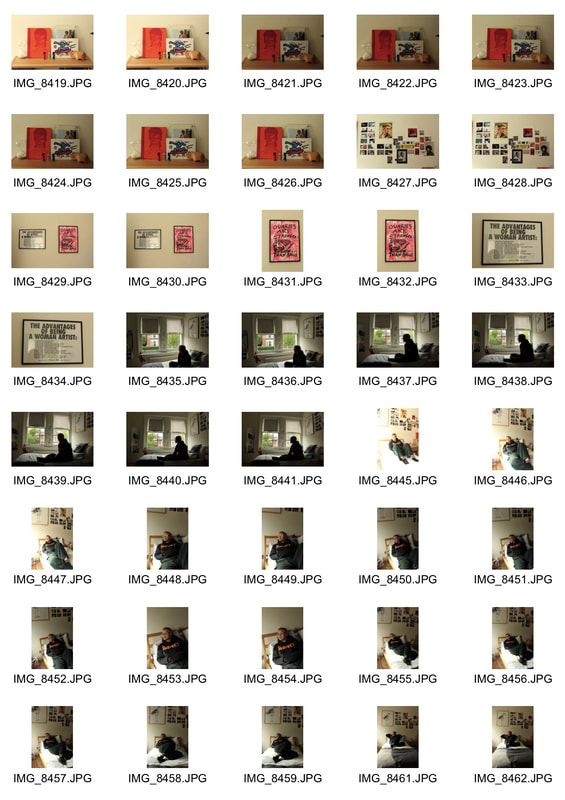
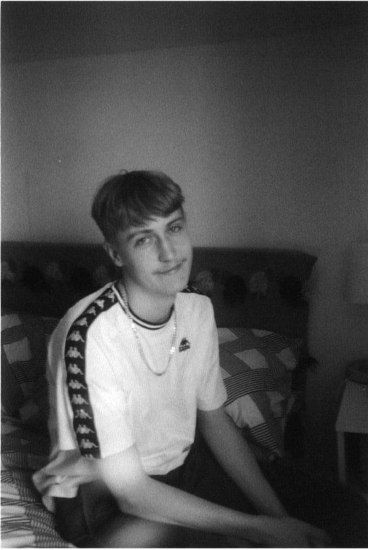
Sixth Development- further bedroom studies
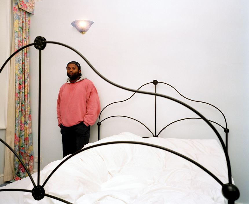
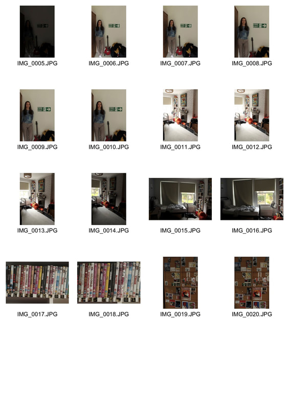
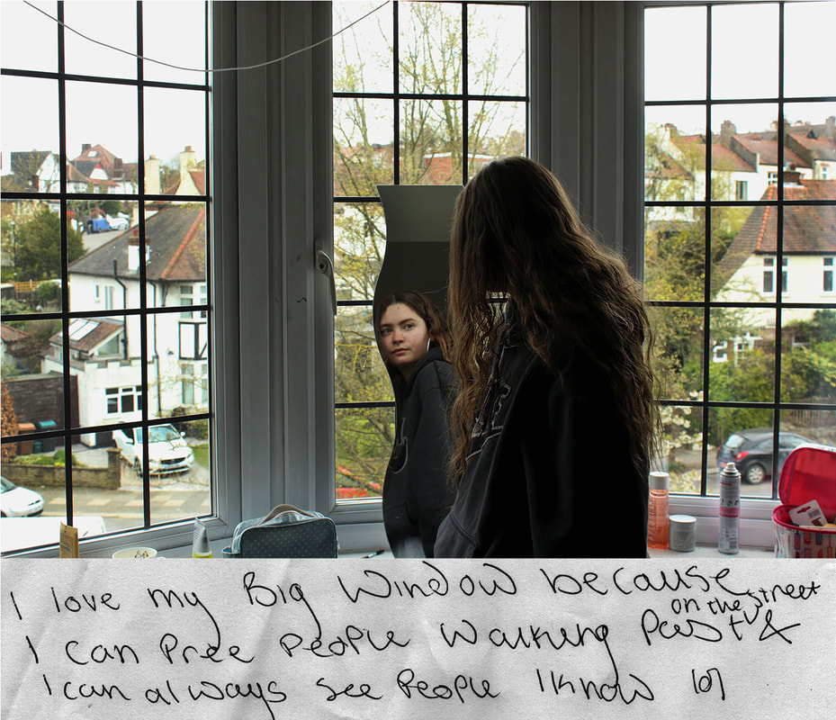
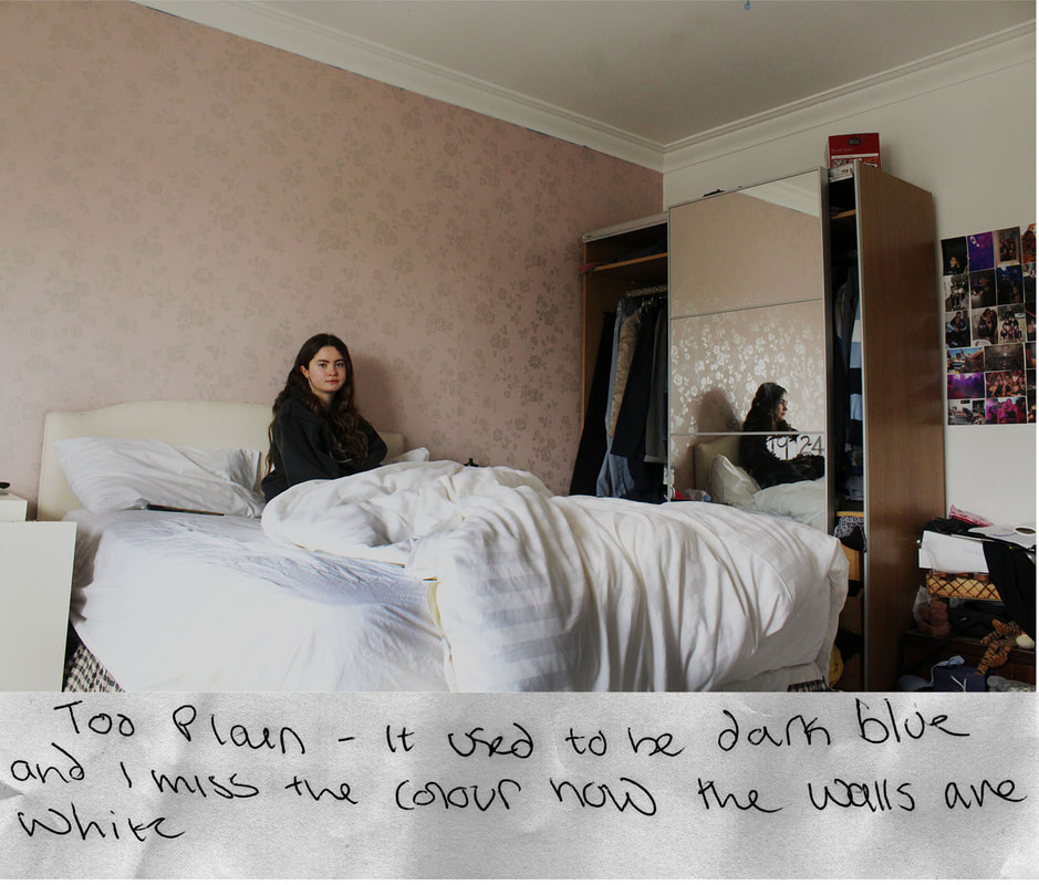
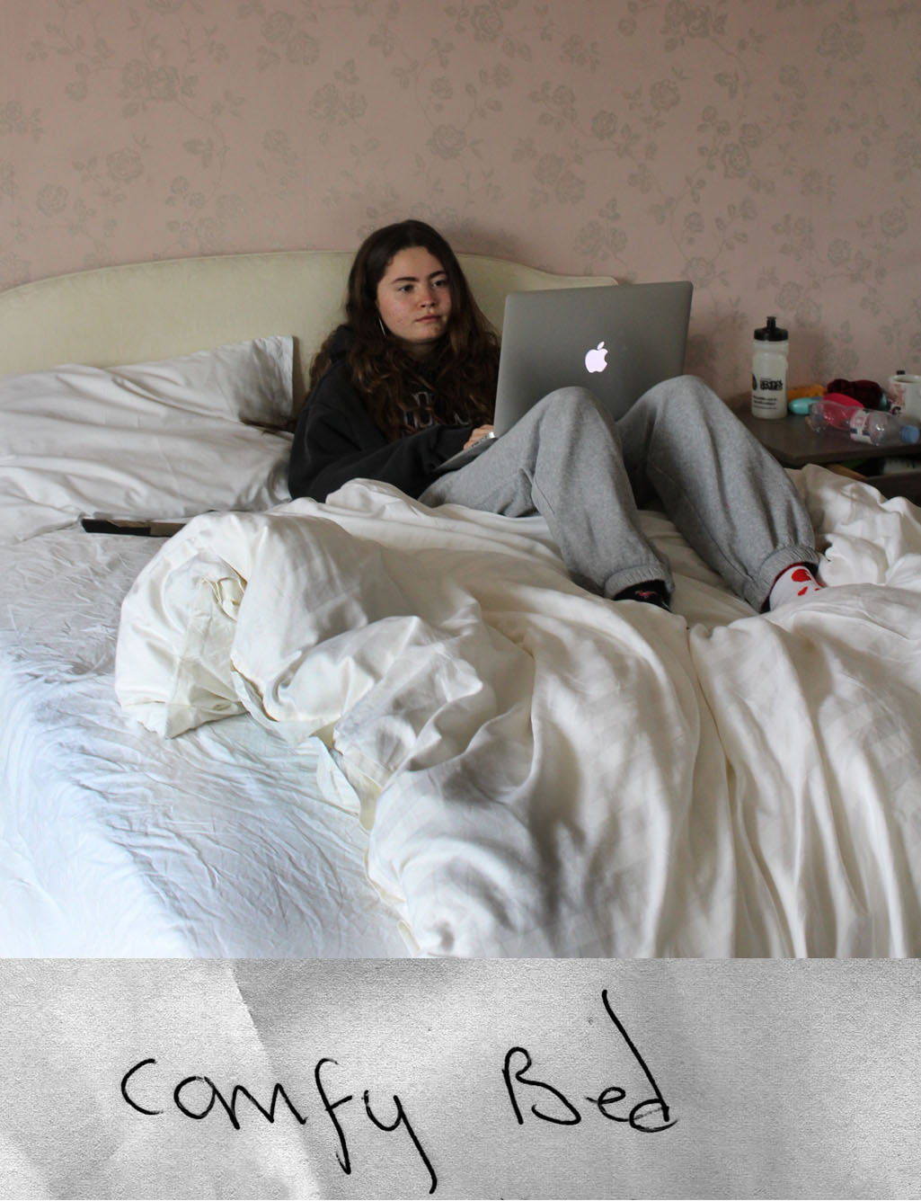
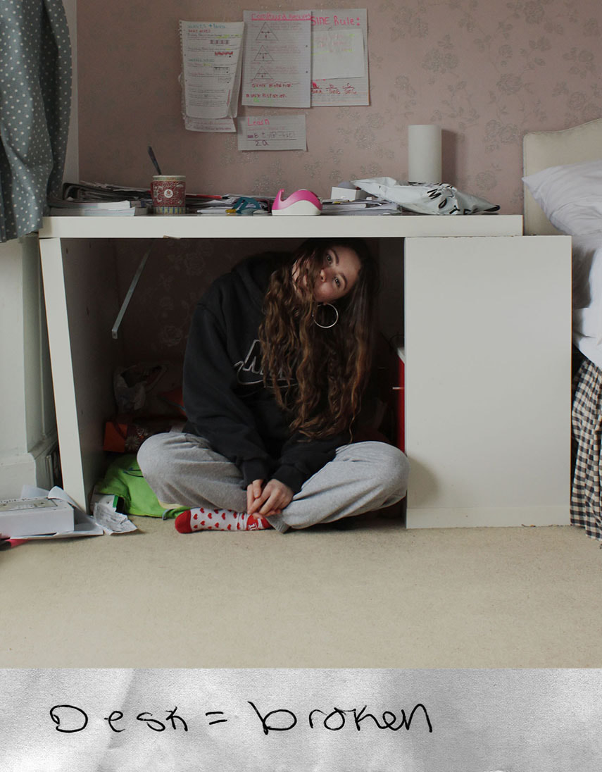
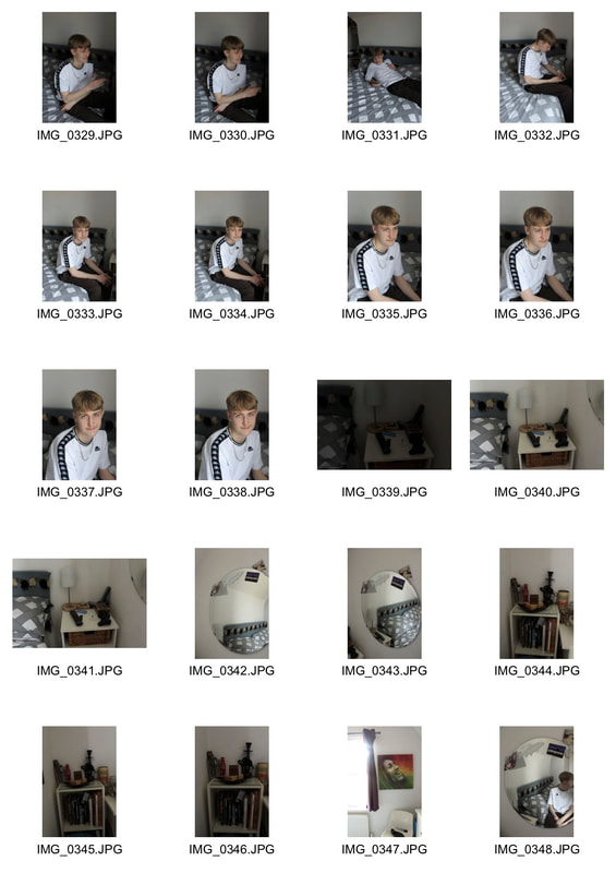
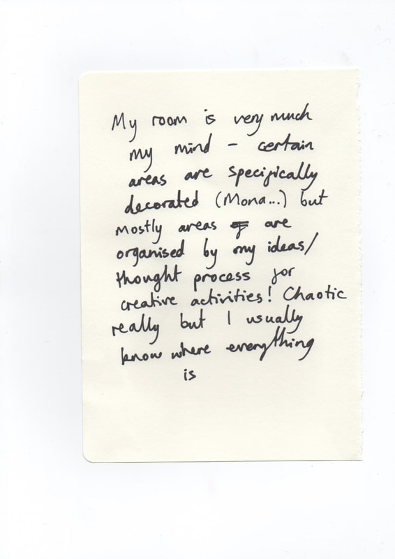
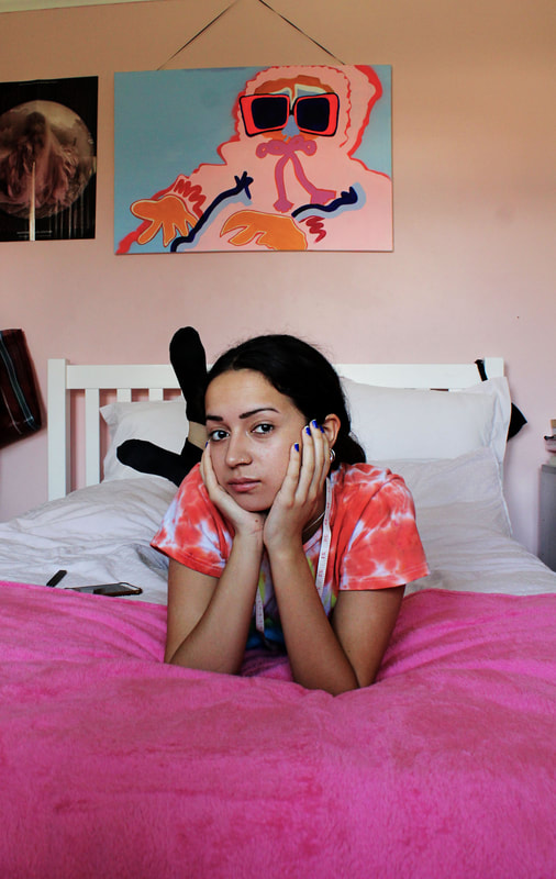
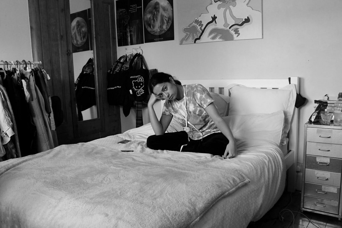
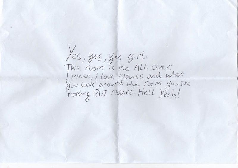
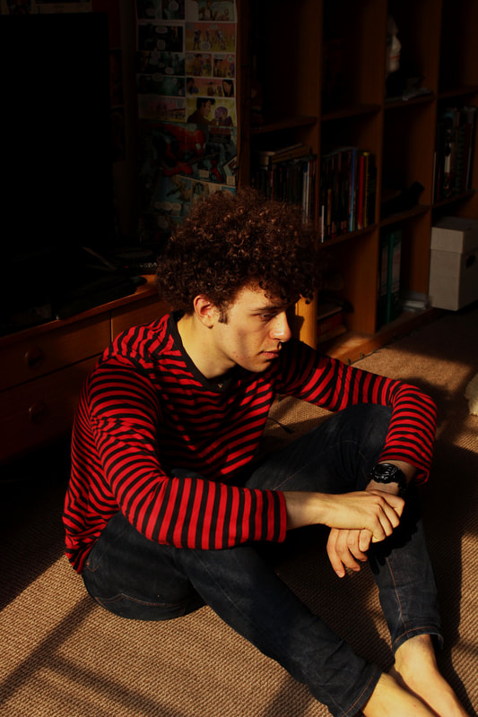
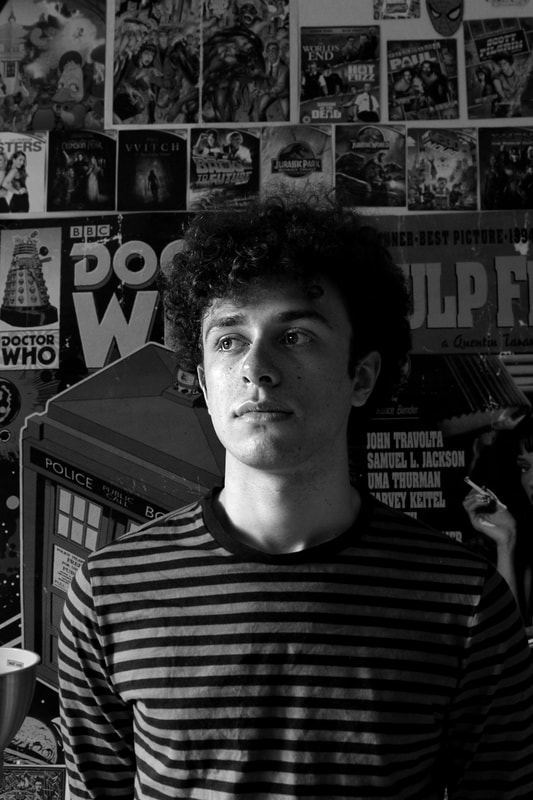
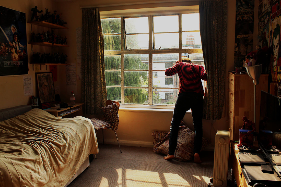
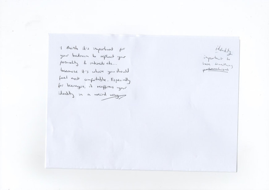
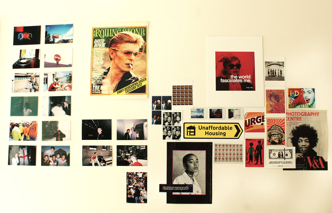
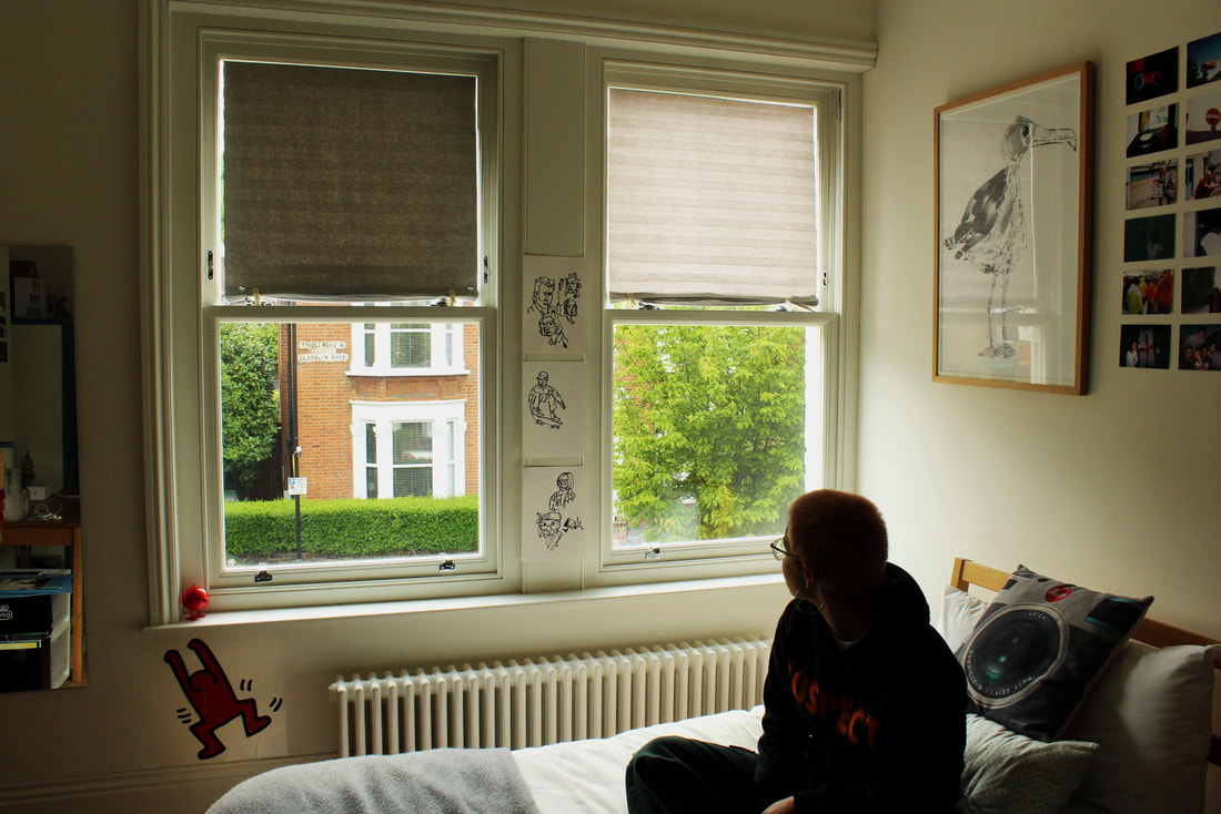
To develop my idea, I went and photographed multiple subjects in their bedrooms inspired by the photography of Martin Parr, and the editing style of Jim Goldberg. I tried to choose people from different age groups, and who have different personal styles and ways of expressing themselves. I took all the photos in natural daylight, photographing the subject on their bed and lots of small details around the room. I tried to photograph similar parts of different bedrooms so that when viewed as a collective, there is a clear but interesting comparison between the different rooms. For example it is interesting to see how messy the beds are, or if there is a lot stuck on the walls, or if the individual collects anything. I also find it interesting to see if people find personalising their bedroom to be significant, or if they personally view the bedroom as an extension of their own personality. For the reason I asked each person to write on a piece of paper whether they think their room represents them as a person and how. I think it is also interesting to see how
I think these images are very successful in responding to the work of Martin Parr as well as fulfilling my brief of creating a typology of personal objects. I think the images share a consistent style but the different bedrooms convey a distinct and individual sense of the subject, which is aided by the handwritten responses. To further develop this idea, I would like to look at personal spaces as well as bedrooms.
I would like to display these images in a book format so I edited the images individually and placed them onto pages alongside the subjects handwriting.
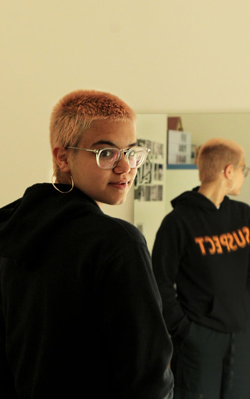
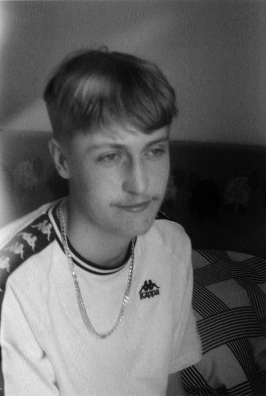
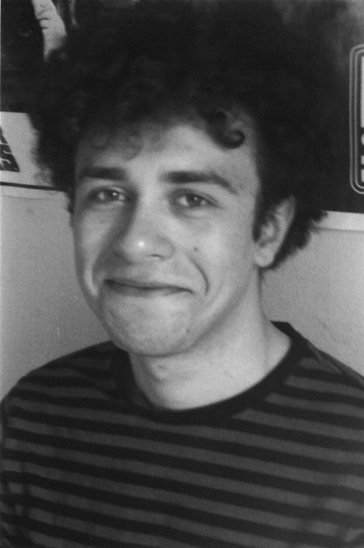
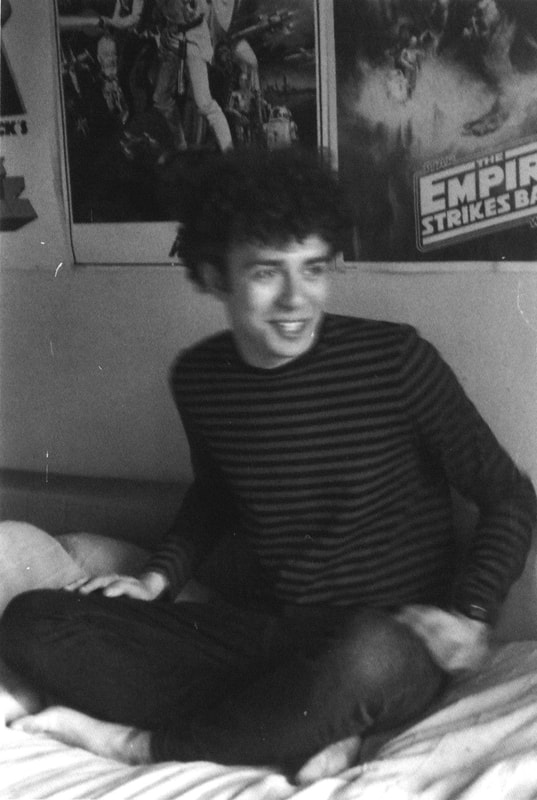
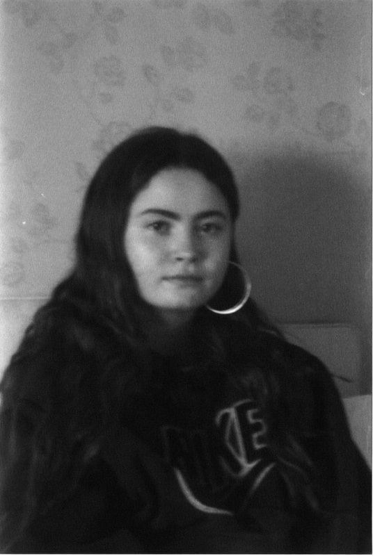
Finley
|
|
|
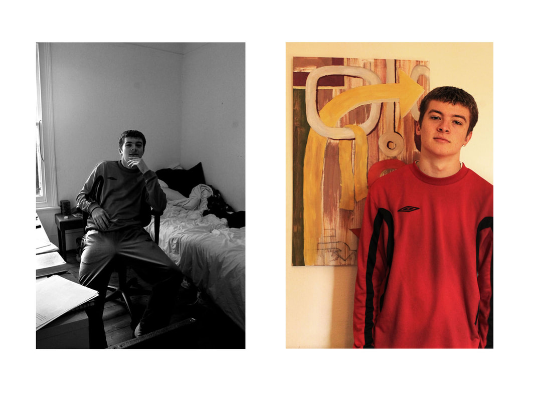
Cormac
|
|
|
|
Kenneth
|
|
|
Gina
|
|
|
|
|
|
|
|
Ezra
|
|
|
|
|
|
|
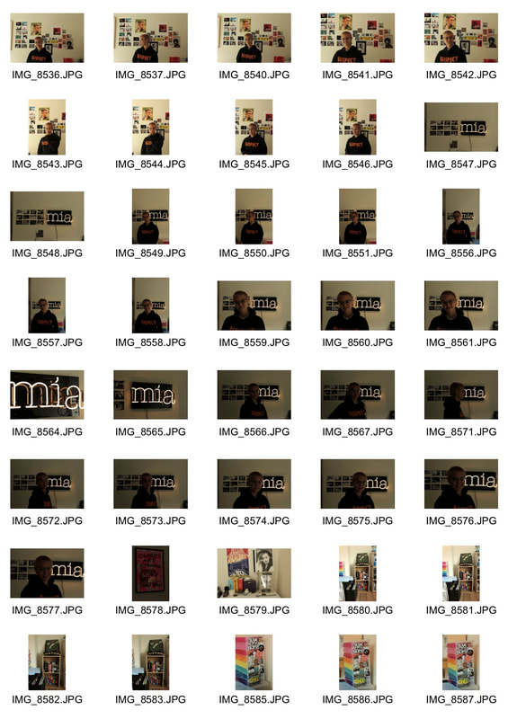
Mia
|
|
|
|
|
|
|
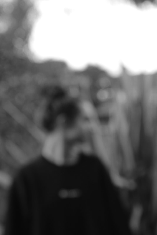
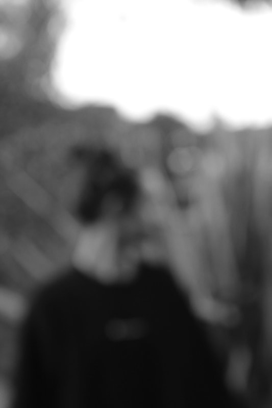
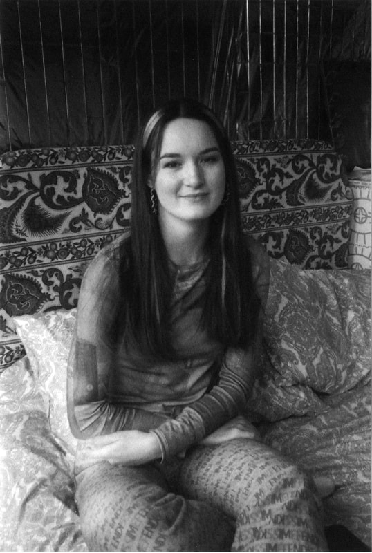
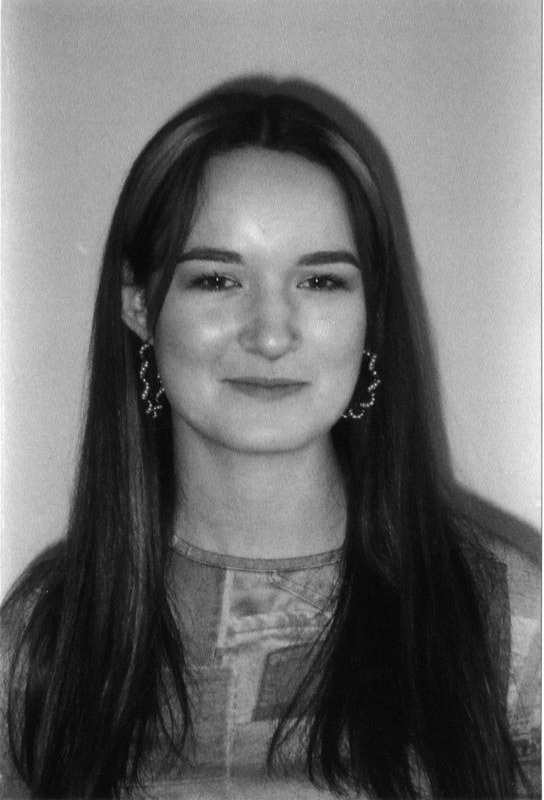
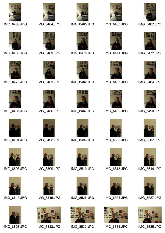
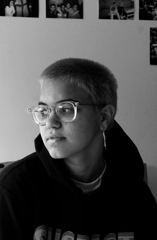
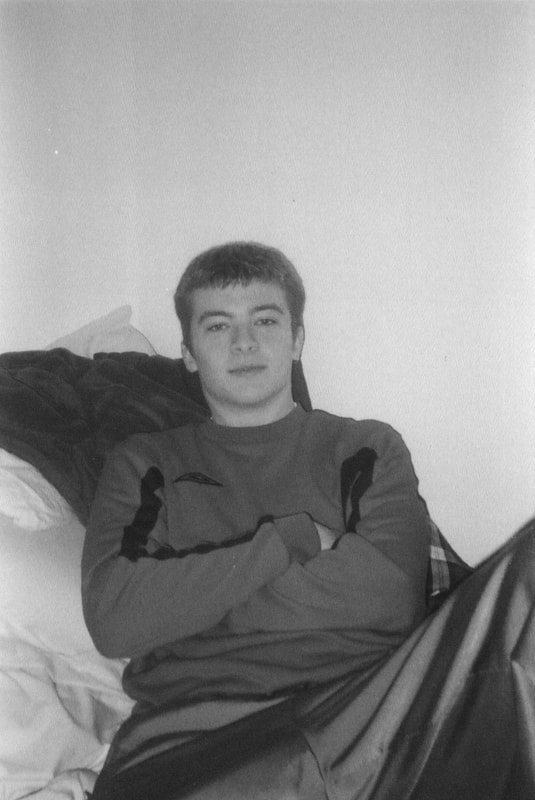
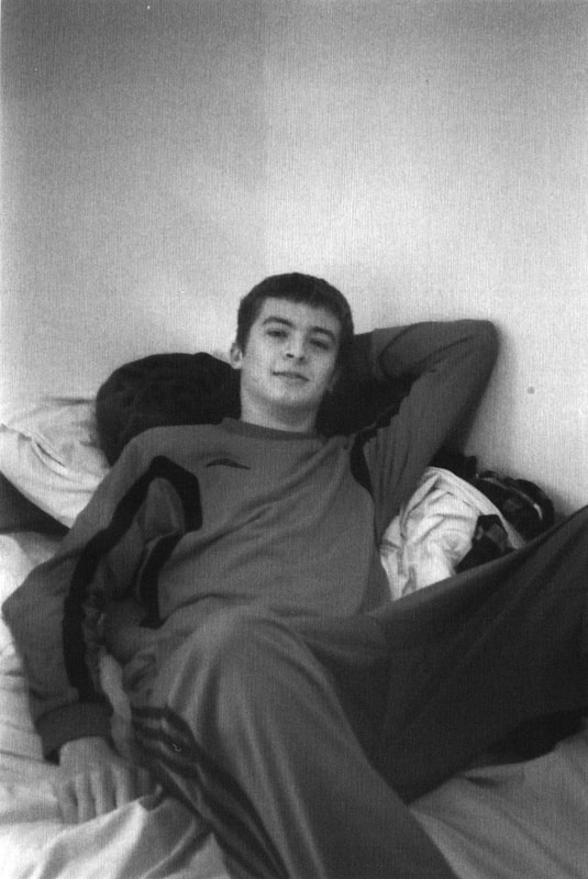
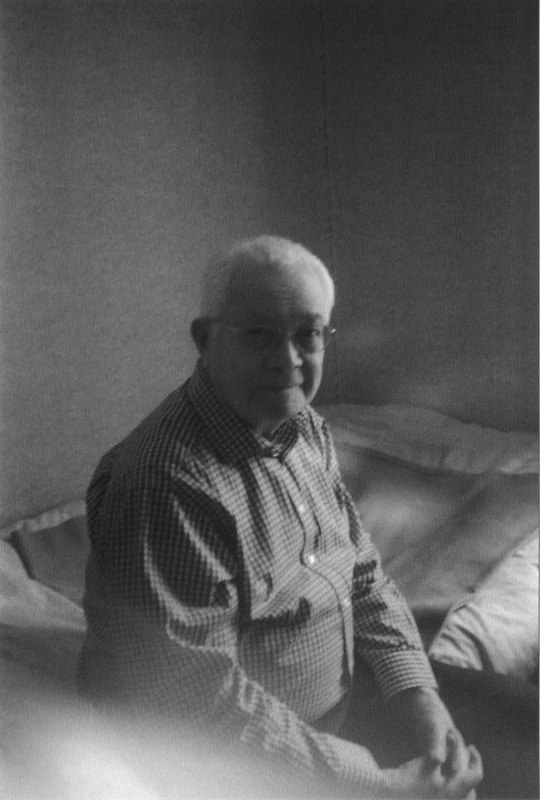
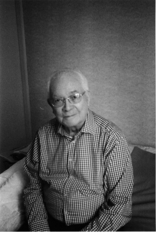
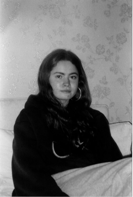
Black and White portraits on film
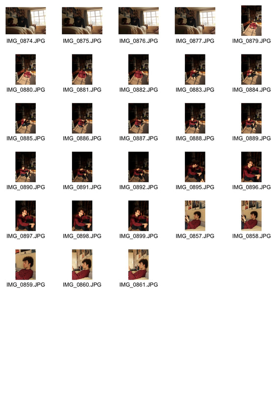
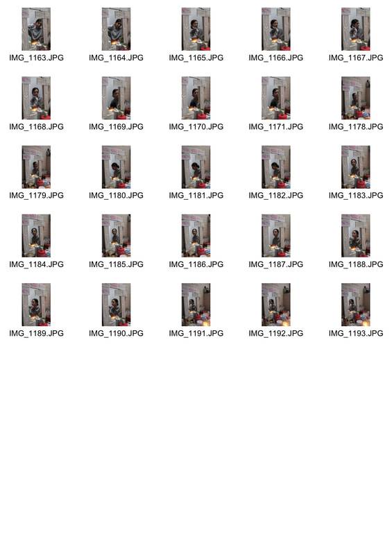
I also photographed each subject on film to experiment with different photographic mediums. I used on black and white film, inspired by Jim Goldberg's photography, and I tried to maintain a consistent typology by getting each subject to sit on their bed. I do not think that I'll use these photos in my final piece because they are too posed and restricted. I prefer the digital photos because I have a more vast selection to choose from and they are a lot more candid and comfortable.
|
|
|
|
|
|
|
|
|
|
|
|
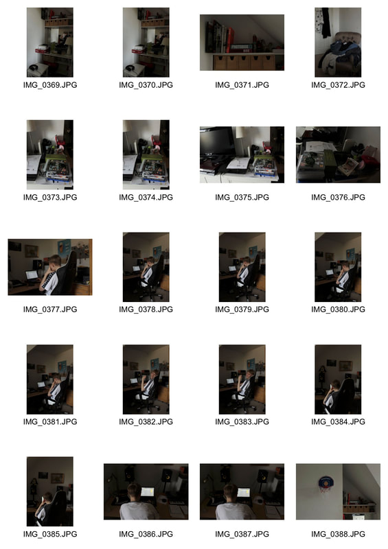
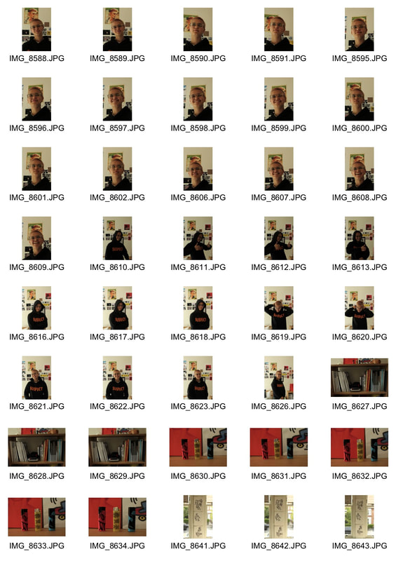
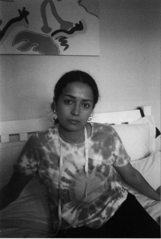
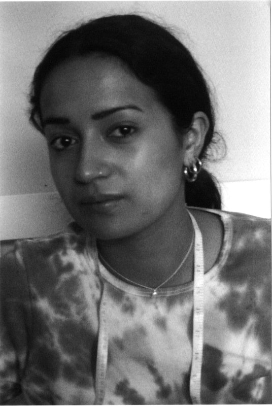
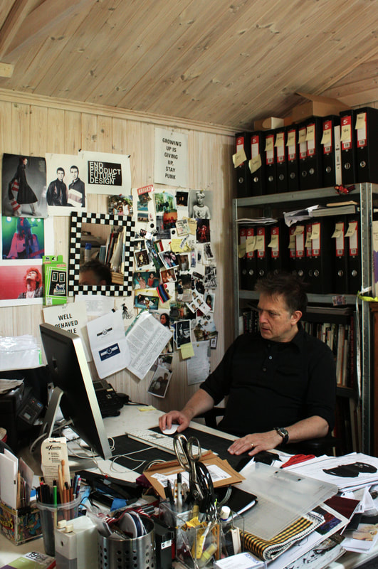
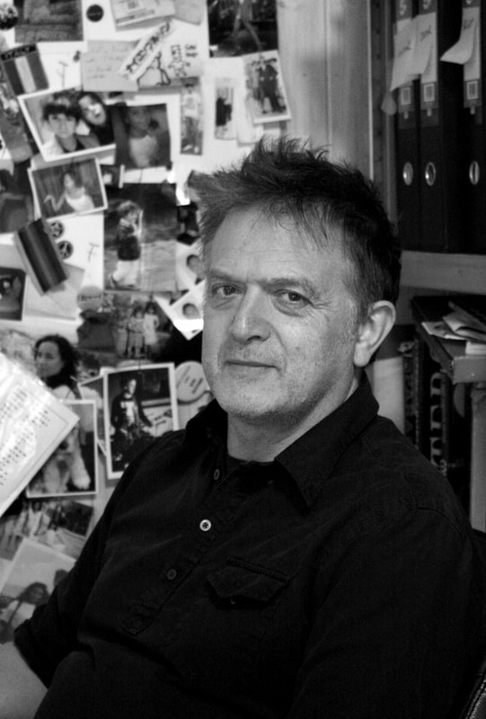
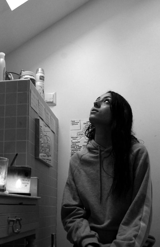
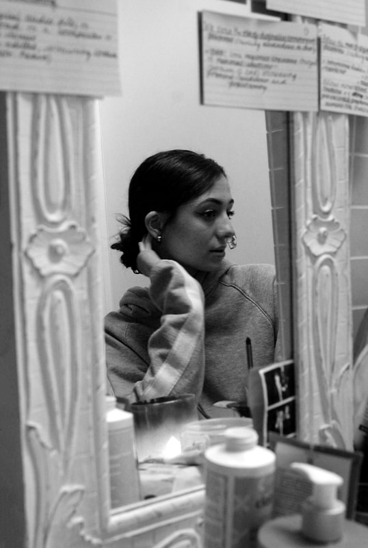
Seventh Development - Personal Spaces
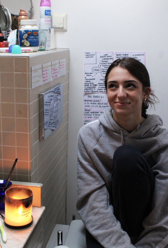
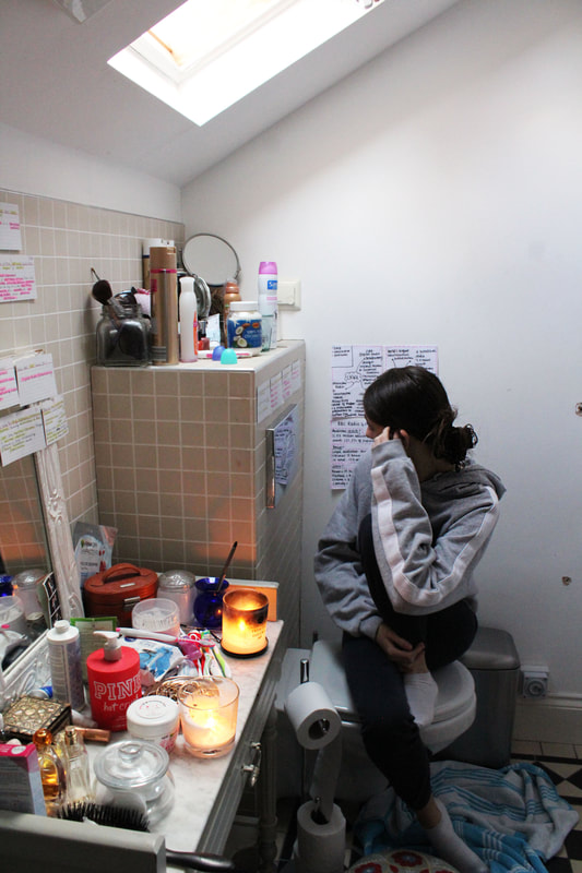
For my next development I photographed people in what they consider to be their personal space, rather than their bedroom. I photographed my Dad in his office and my best friend Yasmin in her bathroom. I think it's interesting to see how people personalise a space to accommodate them, or create a private area to to think. I also think it's interesting to see how people prefer certain areas to their bedrooms because this is typically considered to be one's most intimate, personal space. I tried to reflect intimacy through composition and perspective, photographing the subject in their most comfortable place.
Peter
|
|
|
|
|
|
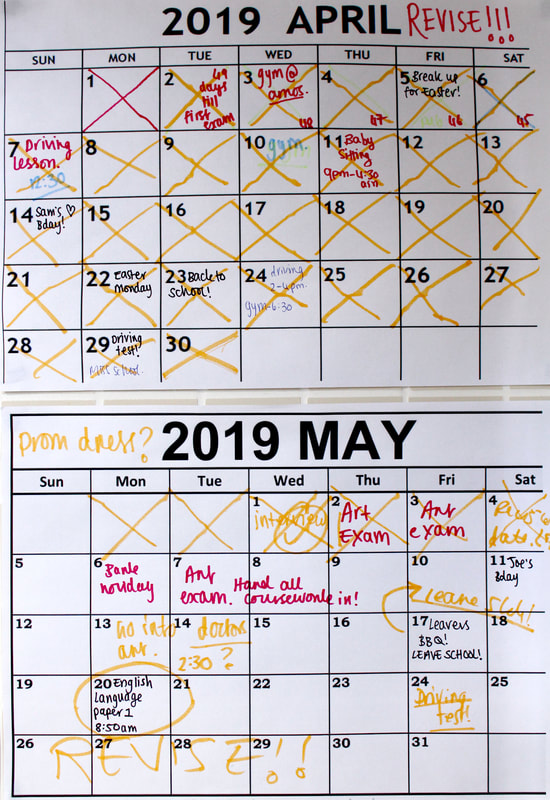
Yasmin
|
|
|
|
|
|
|
|
|
|
